Popovers, a collective term for what you might know as “tooltips”, “overlays”, “modals” or “dialogs”, offer a powerful way to display additional information or actions within a web application. In this tutorial, you’ll learn how to use the new Popover API, a versatile new tool for creating dynamic and customizable popovers.
We’ll walk through the basics of the Popover API, demonstrate its usage with code examples, and discuss the current limitations you should be aware of before leveraging it.
How the Popover API Works
To cover the basics, let’s create a simple popover. We need to start by creating an HTML element that will serve as the container for the popover content.
1. Create the Popover Container Element
This container element will typically be hidden by default and shown when triggered by a user action. To do that, you usually need to leverage JavaScript. In this case, the new Popover API handles that hidden logic.
Be sure to add the popover attribute to your container element and an id with a name of your choice. I used popoverContainer for this example’s id attribute. We’ll need to target the id in a moment.
1 |
<div id="popoverContainer" popover> |
2 |
<p>This is the popover content.</p> |
3 |
</div>
|
2. Initialize the Popover API
The best part of the new Popover API is that we don’t need to implement JavaScript directly to get it to work!
Instead, there are new attributes you can add to specific elements to denote their role in the user experience. Those attributes include:
-
popover: Add this to the element containing the popover. -
id: The typicalidattribute you’ve used in the past with HTML elements will also be required on the element containing the popover. -
popovertarget: Add this attribute to the trigger element to fire events to open the popover container.
In the container element, we define the content that should appear in the popover: text, images, buttons, or any other HTML elements you wish to display.
You might wonder, “How do I actually open the popover?”.
We need an element that triggers the Popover API to do its job. This logic is typically handled with a click event in JavaScript. You could use any old element, but I recommend a <button> element for increased accessibility.
1 |
<button type="button" popovertarget="popoverContainer">Toggle Popover</button> |
2 |
<div id= "popoverContainer" popover> |
3 |
<p>This is the popover content.</p> |
4 |
</div>
|
Testing it Out
Running the code in a supported browser will allow you to click the trigger element and display the popover. Pretty simple (and awesome). You don’t need to style the popover to hide it. You don’t need to use JavaScript to make it appear, or disappear again.
All the bells and whistles come stock with the Popover API.
- Clicking the trigger element toggles its appearance.
- Clicking outside the popover container closes the container.
- It’s easy to style the elements
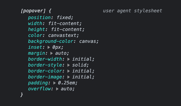
User Agent Styles for Popovers
If you’re interested, here’s what Chrome currently uses in the way of default styles for the popover component:


A More Realistic Modal Example
Here’s an additional example (with more content and styling) to give you a broader take on what’s possible with the new Popover API. I made a fictitious film production agency website with a call to action to watch a video. The popover displays an embedded video after clicking the Watch video button.
This example could be improved with additional JavaScript auto-playing and stopping the video when the popover instance is active and inactive. I’ll cover the JavaScript API coming up.
HTML <dialog> Element vs. Popover API
The <dialog> element and the new Popover API are both powerful tools for creating interactive user interfaces. While they serve similar purposes, they have distinct features and use cases that make them suitable for different scenarios.
What is the HTML <dialog> Element?
The HTML <dialog> element was introduced with HTML5. It provides a built-in way to create modal dialogs or pop-up windows within a web page. The <dialog> element offers a straightforward approach for displaying content that requires user attention or interaction. It supports various features like customizable content, styling, and buttons for actions such as confirming or canceling the dialog.
Advantages of Using <dialog>
One of the main advantages of using the <dialog> element is its simplicity and ease of use. It provides a declarative way to define a modal dialog without requiring additional JavaScript or external libraries. It is well-supported across modern browsers, making it a reliable choice for basic dialog functionality.
One major limitation of the <dialog> element is that it doesn’t support complex interactions or advanced UI components out of the box. If you require more advanced features like tooltips, popovers, or dynamic content loading, you’ll need to resort to custom JavaScript implementations or third-party libraries (cue the Popover API). Additionally, the styling options for <dialog> elements are limited, and customization beyond basic CSS can be challenging.
Contrast to Popover API
The new Popover API allows developers to create dynamic popovers or tooltips. It provides a more flexible and customizable approach compared to the <dialog> element. With the Popover API, developers have fine-grained control over the appearance, positioning, and behavior of popovers.
The Popover API is ideal for scenarios where you need to display additional information in response to user interactions, such as hovering over an element or clicking a button. It works great for creating UI components like tooltips, dropdown menus, or context menus.
However, the Popover API has its own limitations. The Popover API might not be as widespread as the <dialog> element, so (for now) you may need to consider fallbacks or polyfills for compatibility with older browsers.
Popovers are meant for UI components that are on top of other page content, not always visible, and displayed one at a time.
The choice between the <dialog> element and the Popover API depends on the specific use case and requirements of your project. If you need a straightforward, basic modal dialog functionality, and you prioritize simplicity and broad browser support, the <dialog> element is a suitable choice. On the other hand, if you require more advanced interactions, customization, and dynamic content loading, the Popover API provides the flexibility and control necessary for creating complex UI components.
Customization and Advanced Features
The Popover API provides several options for customization.
Popover Target Actions
The default popovertarget attribute means the popover will be toggled once clicked.
You can go in a different direction and add these additional attributes and values.
-
popovertargetaction= "show"– Shows the popover -
popovertargetaction= "hide"– Hides the popover
You might use the hide value to create a close button within the popover. This might be more user-friendly if your users need to know they can click outside the popover to close it.
Manual Popovers
By default, when you leverage the popover attribute, it’s set to popover="auto" behind the scenes. When the popover is open, the default popover will force any other open popovers to close before it opens except for ancestor popovers.
If you want to offer more control to the end user, there’s a setting called popover="manual". This type of popover does not close any other open popovers; you’ll need to manually close them one by one.
Sometimes this experience is preferred for notifications like toasts. These elements appear and can be manually removed without disrupting other page parts.
“A toast is an element that displays a brief, non-critical message in a way that attracts the user’s attention without interrupting the user’s task. Toasts are often displayed in the corner of app UI, and often disappear on a timeout.” — openui.org
Notice how clicking outside the popover no longer dismisses the popover automatically. All I changed was the popover attribute and changed it to popover="manual".
Limitations
While the Popover API is a powerful tool, it also has some limitations (as of June 2023) to consider:
- Browser compatibility: Although most modern browsers support the Popover API, it may not work in older or less commonly used browsers. Always check for compatibility before implementing the API. Check caniuse for more details.
- Responsiveness: The Popover API does not provide built-in support for responsive behavior. You will need to handle responsiveness manually or utilize responsive CSS frameworks.
- Accessibility: Ensure your popovers are accessible to users with disabilities. Provide alternative methods to access the content or use ARIA attributes to improve accessibility.
- No animation support (yet): The ability to animate popovers has yet to be supported. Unfortunately, this means a pretty jarring experience when opening or closing popover containers. There are plans to introduce animation controls soon.
Closing Thoughts
Popovers are valuable to any web application, offering a clean and interactive way to present supplementary information or actions. With the Popover API, we have a powerful tool at our disposal to create customized and engaging UIs that used to take a lot of JavaScript and CSS to do.
Remember to test your implementations across different browsers and consider the limitations and best practices discussed here to provide the best user experience possible. This API is still relatively new, so use it cautiously before shipping to a production environment without thorough testing or fallbacks. An alternative to use for now could be the dialog element.