In this tutorial you will be introduced to some rapid tips and tricks on how to use Figma! We’ll have a look at 26 Figma features, tips and tricks from A to Z. Let’s download Figma and get down to business.


Once you get familiarized with Figma, check out Envato Elements! With one subscription, you’ll have unlimited access to millions of creative digital assets such as graphics, Figma icons, Figma mockups, Figma templates, and more. One simple commercial licensing that you can cancel at any time!
What You Will Learn:
- How to Prototype in Figma
- How to Create an Animation in Figma
- How to Work with Components in Figma
- How to Use Grid in Figma
- How to Work with Figma Shortcuts
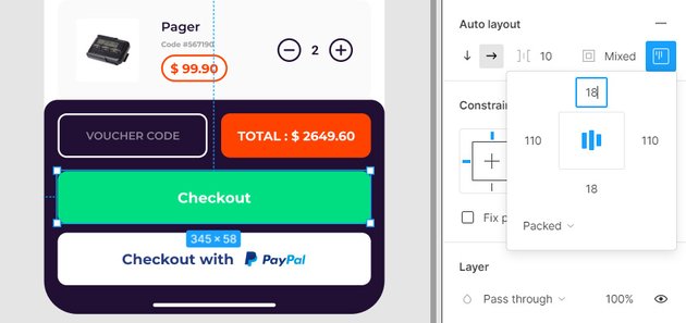
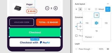
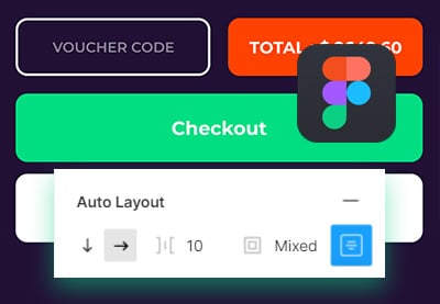
A is for Auto Layout
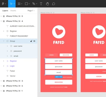
Figma’s auto layout feature allows you to apply dynamic frames that adjust to their contents. You can use this amazing feature to create buttons that resize according to their text, create lists or columns of elements that can be easily rearranged, or you can even nest auto layout frames inside other auto layout frames.
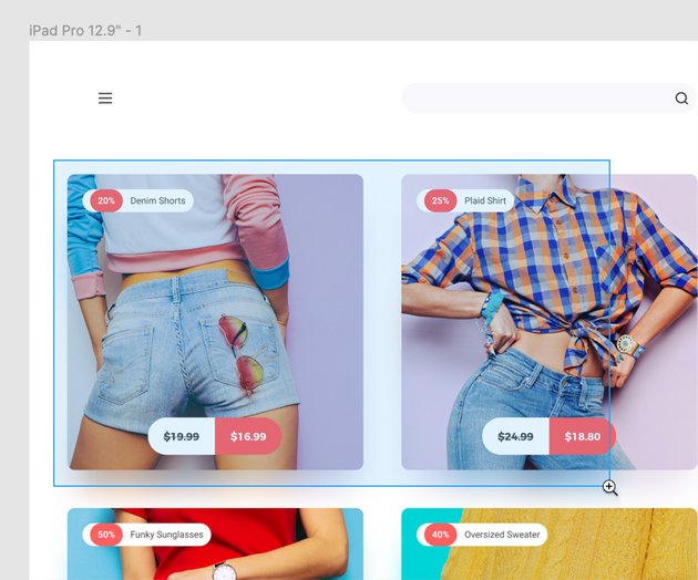
Wanna learn more about Figma auto layout and also design something? Check out this tutorial and create an eCommerce cart design as you practice working with auto layout in Figma: Create a Shopping Cart Design with Figma Auto Layout.

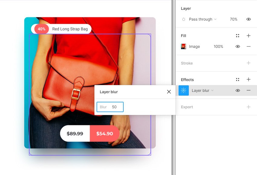
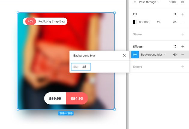
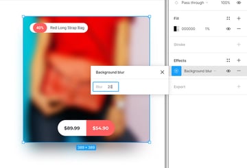
B is for Blurs
Blurs are effects that can be applied to objects in Figma. The two types of Blur effects that can be applied from the right sidebar are Layer Blur and Background Blur.
Layer Blur is the classic type of blur while Background Blur can be used to blur a specific section from your design.


C is for Components
Components are design elements that can be easily reused across your Figma designs. Figma icons and any other type of layer or object can be saved as a Figma component.
Once saved, that design becomes the Main Component. A copy of this main component is called Instance. When you edit the main component the rest of the instances modify simultaneously.
Components are an essential part of any Figma design system. Check out this tutorial if you wish to learn more about the power Figma components as you create this iPad game UI: How to Turbocharge Your Components with Figma Variants.


D is for Design tab
The Design tab from the right sidebar allows you to view, edit or remove the settings of a selected objects from your design.
When nothing is selected, you can adjust the Background settings or explored the styles saved for the opened document.


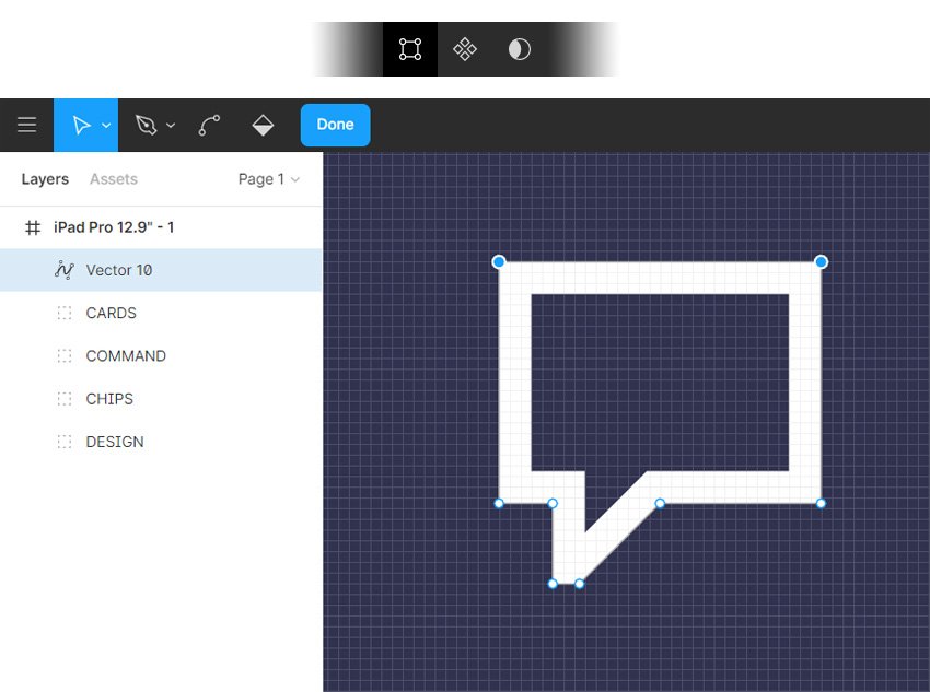
E is for Edit mode
With Edit mode you can add, select or adjust the properties of individual points and lines from a vector shape.
Select the shape that you wish you edit and click the click the Edit Object button from the Toolbar or simply press Enter to switch to Edit mode. Use the tools from the toolbar to adjust the path and when you finish, press Enter or the Done button in the toolbar.


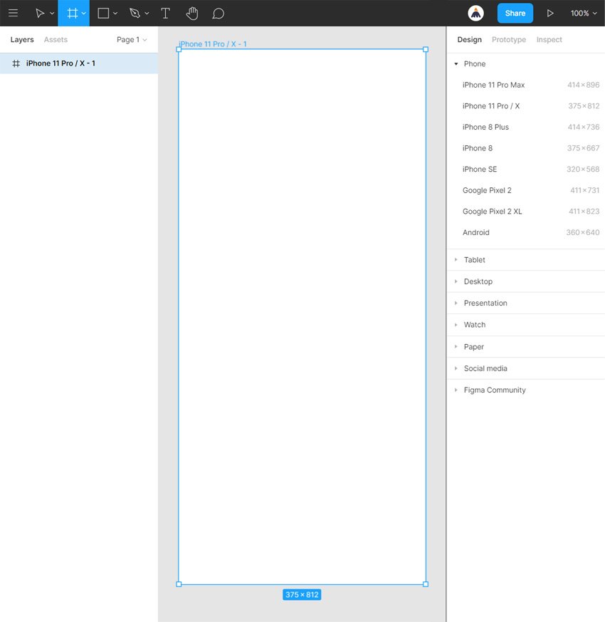
F is for Frames
A Frame represents the area where your design is going to be drawn in Figma. By default, your starting frame is white.
Selecting the Frame tool from the toolbar or pressing the F hotkey will open a list with the most common screen sizes in the right sidebar. You can select one of the preset sizes and add the frame to your design, or you can define your own custom size frame.
Use the bounding box to scale any frame and double click its name to rename it.
G is for Control – G
Using this Figma shortcut you can easily group selected elements from your design. Grouping elements is a good practice when you’re dealing with complex designs. It makes it easier to organize and select multiple design elements with just one click. To ungroup elements inside a group, use the Shift – Control – G keyboard shorcut.
If you wish to explore the rest of Figma’s shortcuts, press the question mark button from the bottom-left corner of the screen and go to Keyboard shortcuts or use the Control – Shift – ? Figma shortcut.


H is for Hand Tool
The H hotkey gives you the Hand tool which can be used whenever you wish to pan and move around a document without accidentally selecting or moving objects.
Alternatively, you can hold down the Space bar to temporarily activate this Figma tool.


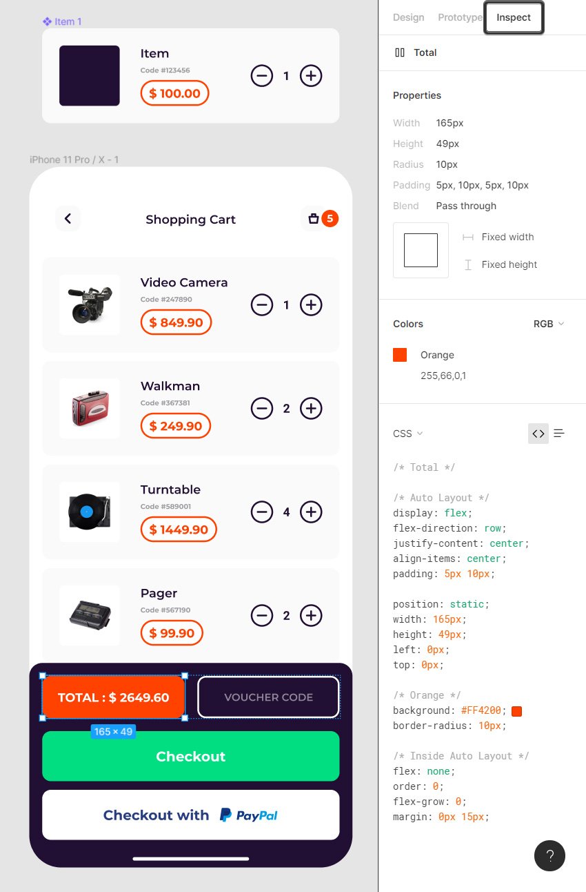
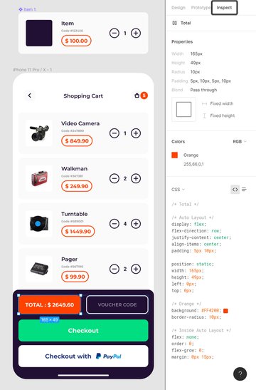
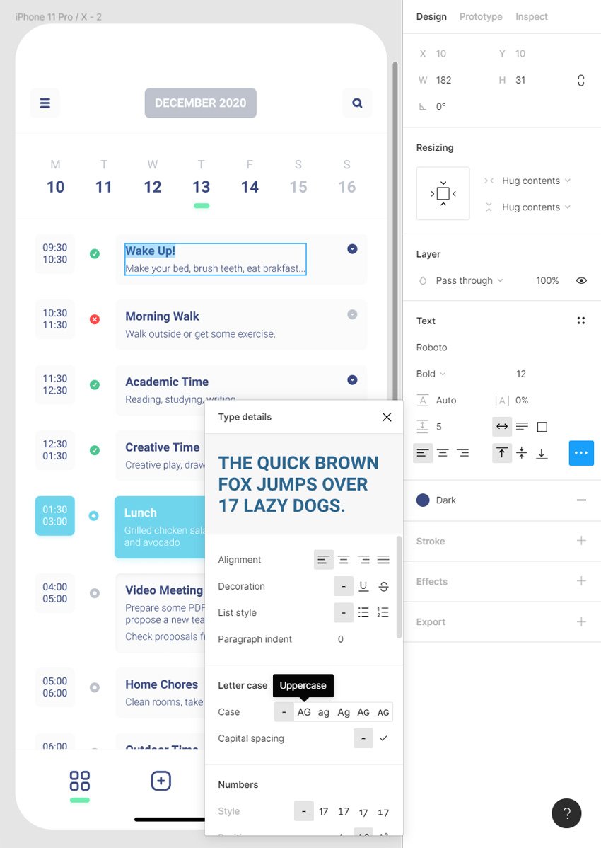
I is for Inspect tab
The Inspect tab can be accessed from the right sidebar and is used to inspect the properties of any element from your design, including frames. Depending on the type of object that you select from, you can inspect: Properties, Content (for text), Typography, Colors, Borders, Shadows, Figma Animations, CSS, iOS or Android Code.
The Inspect tab can also be used by collaborators with whom you share a specific document.
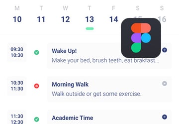
Check out this tutorial if you wish to learn more about the power of the Inspect tab as you create this scheduling app in Figma: How to Use Figma’s Inspect Panel.

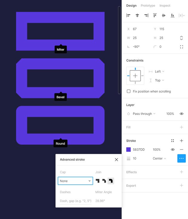
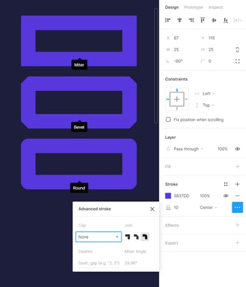
J is for Joins
Joins affect the corner points of a stroke. Strokes settings can be adjusted in the right sidebar. Depending on the type of Join that you select from the right sidebar, you can make the corners appear sharp (Miter Join), rounded (Round Join), or squared (Bevel Join).

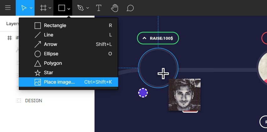
K is for Control – Shift – K
Using this Figma shortcut you can easily access the Place Image tool which allows you to easily import photos inside a Figma document.
You can import a photo directly on the frame which will preserve the original size or you can import a photo inside a shape from the design which will scale your photo and make it fit that shape.


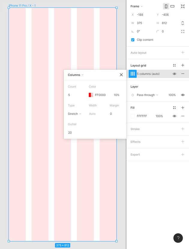
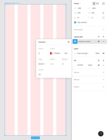
L is for Layour Grid
Whenever you select frame you get the option to enable the Layout Grid in the right sidebar. A Figma grid can be used to define the main structure of a design and to measure, align or easily create pixel perfect objects.
Using the dropdown menu, you can choose between: Grid, Columns or Rows. Depending on the type of grid that you select you will get different editing options. A well put together grid can be the perfect start for a Figma wireframe.
Check out this tutorial to better understand how the grid can ease your work: How to Create a Medical Website Design in Figma.

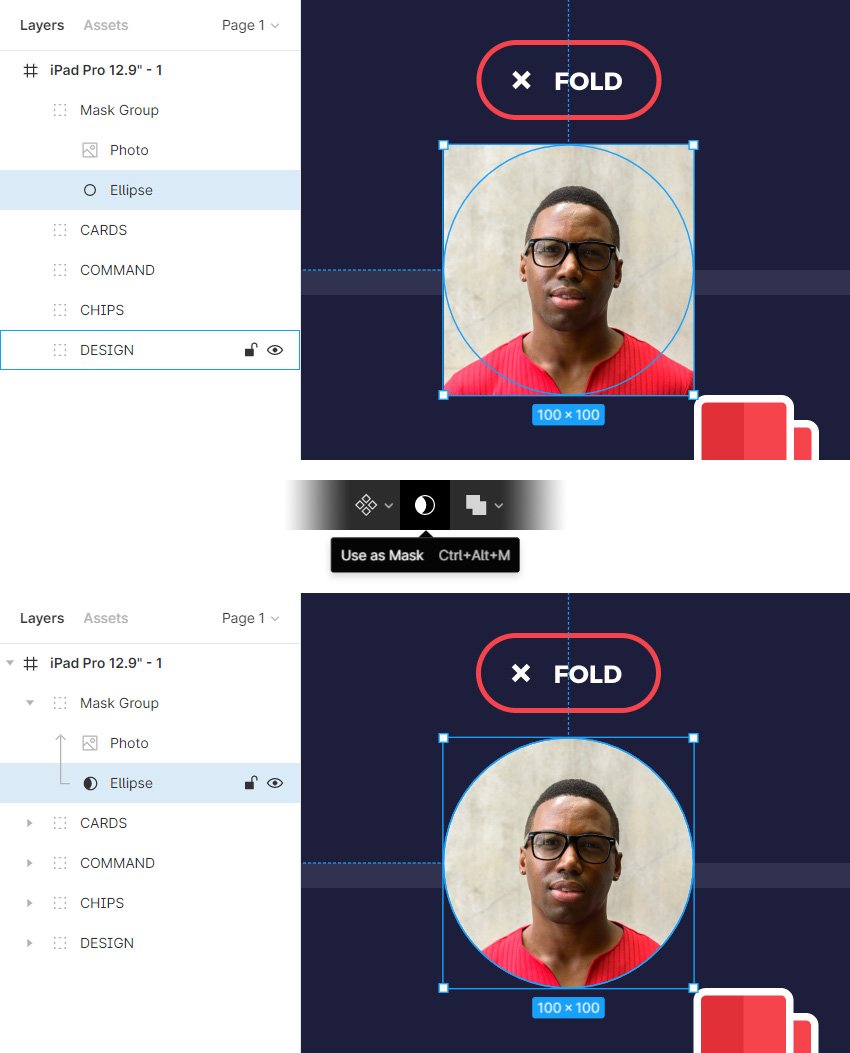
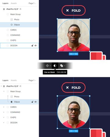
M is for Masking
Masking gives you the possibility to hide parts of design elements in Figma.
When you mask you need to make sure that the object that will act as the mask lies below the object (or objects) that will be masked. Select all the shapes and click the Use as Mask button from the toolbar or press the Control – Alt – M Figma shortcut. This will mask your layer and create a mask group inside the Layers panel.
To edit the content of a masked group just double click it. To adjust the mask double click your masked group twice. To disable a mask, all you have to do is select the mask shape and then click again the Use as Mask button or press the Control – Alt – M Figma shortcut.

N is for Control + N
Use this Figma shortcut to quickly create a new document in Figma.


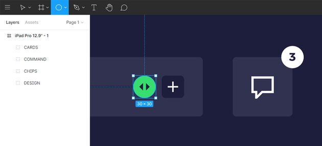
O is for Ellipse Tool
The O hotkey gives you the Ellipse tool which can be used to create ellipse shapes in Figma.
Hold down the Shift key as you click & drag to easily create perfect circles using this Figma tool.


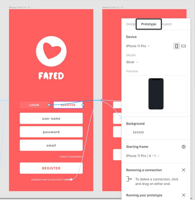
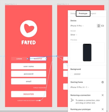
P is for Prototype
A Figma Prototype gives you the possibility to connect frames, apply transitions and create Figma animations that simulate how users will interact with your final design.
To build your own prototype, first you need to switch to the Prototype tab in the right sidebar. In Prototype mode you will be able to connect the frames from your designs, choosing the trigger, the action and the Figma animation that fits your need.
When your prototype is done you can preview the Figma animation using the Present button (little play button) from the upper right corner.
Wanna learn more about Figma prototype and also design something? You could create this dating app template in Figma as you discovers the magi of Figma prototype: Create a Shopping Cart Design with Figma Auto Layout.

Q is for Control – Q
Use this classic Figma shortcut whenever you wish to quickly quit Figma.


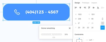
R is for Corner Radius
Corner Radius is one of the two features that can be used to apply rounded corners in Figma. Rounded corners can be applied on any type of vector shapes or frame.
Select your shape/frame and a simply enter a value in the Corner Radius box. If you’re working with a rectangle you can click the Independent corners button and set different values for each corner.
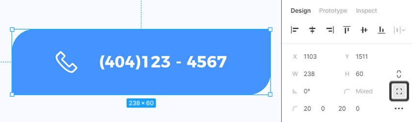

Besides Corner Radius, you can use the Corner smoothing feature to give your corners a seamless continuous curve.


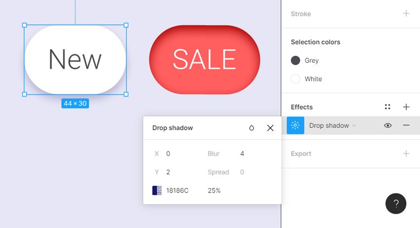
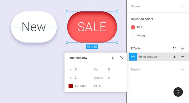
S is for Shadows
Shadows are effects that can be applied to objects in Figma. The two types of Shadow effects that can be applied from the right sidebar are Drop Shadow and Inner Shadow. Depending on the type of effect that you choose you will get different editing options.


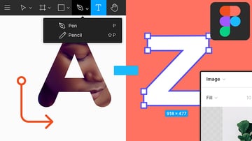
T is for Text
Grab the Text tool or use the T hotkey whenever you wish to add new text in Figma.
Once you click on your frame you can type in the new text. From the right sidebar you can select the font and the other text settings.


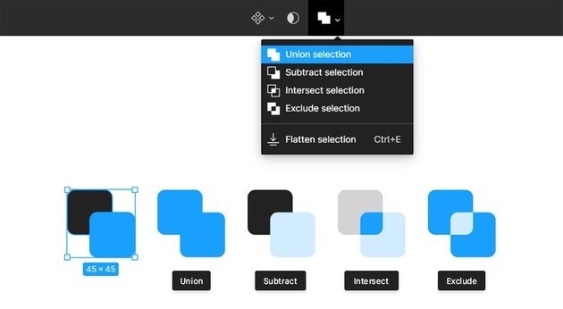
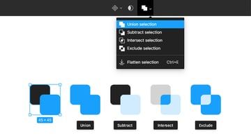
U is for Union selection
Use this boolean operation to easily unite shapes from your design. Just select the shapes that need to be united, go up to your toolbar and select Union selection.
Besides Union selection you can find another three boolean operations in the toolbar: Subtract Selection, Intersect Selection, Exclude Selection.

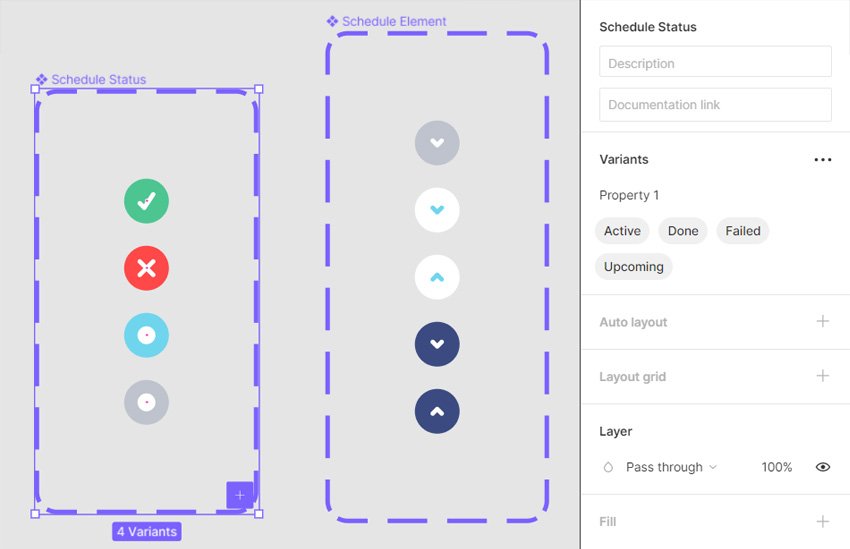
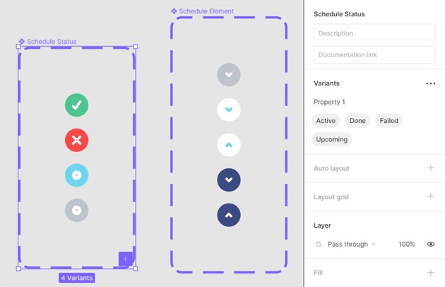
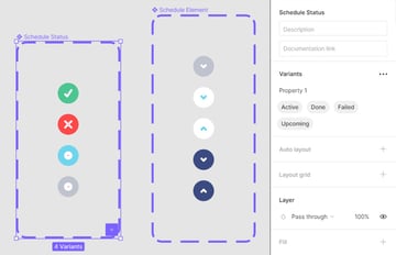
V is for Variants
With Variants you can group several instances of a component in one, and then easily switch between the variants.
Using properties and values you can easily organize your countless variants. Properties and values can be always edited and reorganized as your Figma design system evolves.
Check out this tutorial to better understand how variants work: How to Turbocharge Your Components with Figma Variants.
W is for Control – W
Use this classic Figma shortcut whenever you wish to close your current Figma document.

X is for Control – X
Use this classic Figma shortcut whenever you wish to Cut an element from your design.


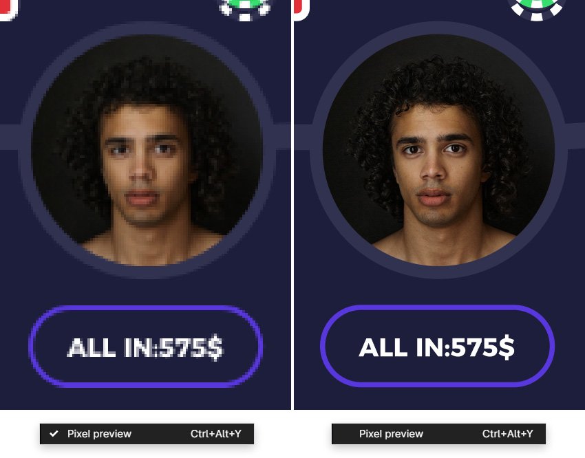
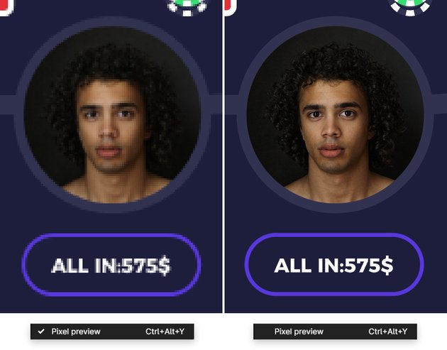
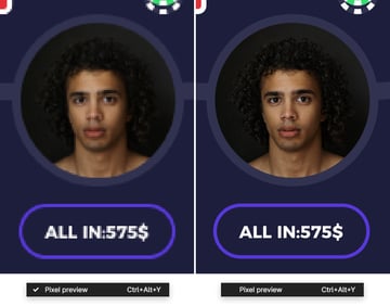
Y is for Control – Alt – Y
This Figma shortcut allows you to enable or disable the Pixel Preview.
Pixel Preview can be useful when you aim to create pixel perfect designs. This features allows you to preview vector shapes in their rasterized format.
Z is for Zooming
Holding down the Z hotkey gives you the Zoom tool which can be used to zoom in or out. Click anywhere on your frame to zoom in or click and drag to define the area on which you wish to zoom it.
To zoom out, hold down the Alt key along with the Z key and click anywhere on the design.


Ready to Try More Figma Tutorials?
Awesome! So now that we have gone through the A to Z of Figma, why not move to the next level and try one of the more in depth tutorials on Envato Tuts+ . Remember to check out Envato Elements where you can find plenty of Figma icons, Figma mockups or Figma templates to inspire you.
Whether you’re working on a Figma design system or you just want to learn more, Envato Tuts+ has got you covered!
 FigmaHow to Work with Auto Layouts, Components, and Dynamic Content in Figma
-
FigmaHow to Create Onboard and Login Screens for a Dating App Template in Figma
-
FigmaHow to Turbocharge Your Components with Figma Variants
-
FigmaHow to Create a Medical Website Design in Figma
-
FigmaHow to Use Figma’s Inspect Panel
-
FigmaCreate a Shopping Cart Design with Figma Auto Layout


