Scenario: someone hands you an Illustrator document with their latest web layout and it’s your job to convert it into working HTML and CSS. Let’s take a look how you can do that.
Note: The aim of this tutorial is not to perfectly recreate the design for web use. Instead, we’re going to use it to explore workflows and features within Illustrator which help us to do so.
The Illustrator File
Let’s start by taking a look at the document in question:
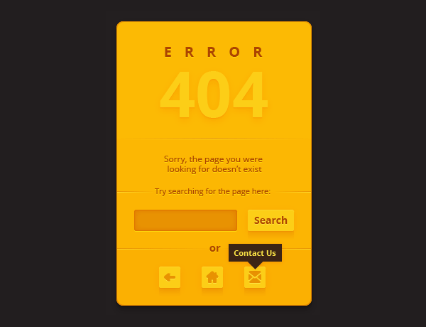
It’s a layout for a 404 page; a page which tells users that whatever they’re looking for can’t be found and that they should perhaps try something else. We can see a heading, some instructional paragraphs, a search form and button, plus some buttons with tooltips at the very bottom.
The whole thing appears to float in the center of the page, both horizontally and vertically. It has a yellow background, some warm accents and drop shadows here and there. Where do we start?
Easy Does it!
We’re not going to reinvent the wheel for this, let’s make this as easy as possible on ourselves. Illustrator isn’t going to output a neat package of HTML, CSS and JavaScript for this, neither are we going to waste our time building everything from scratch, so let’s go and grab a copy of Bootstrap to give this project a kick-start.

I downloaded Bootstrap, stripped out some of the CSS and font files we don’t need, then added an index.html file based on the Cover template by Mark Otto. Four minutes of mouse-clicking and I have myself a basic page which roughly resembles what we’re after.
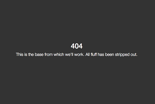
Source files to continue from this point are available in the GitHub repo, in the folder 1-starting-point.
Adding Markup
The next logical step would be to add structural markup to our index.html (again, Illustrator isn’t going to do that for us). We already have a centrally-aligned container, a div with classes inner cover:
<div class="inner cover"> <h1 class="cover-heading">404</h1> <p class="lead">This is the base from which we'll work. All fluff has been stripped out.</p> </div>
Let’s add some extra pieces within that:
<div class="inner cover"> <h1>Error</h1> <h2>404</h2> <p>Sorry, the page you were looking for doesn't exist</p> <p>Try searching for the page here:</p> <!-- more form markup available http://getbootstrap.com/css/#forms --> <form class="form-inline form-search" role="form"> <div class="form-group"> <label class="sr-only" for="searchInput">Search</label> <input type="search" class="form-control" id="searchInput"> </div> <button type="submit" class="btn btn-default">Search</button> </form> <p>Or</p> <!-- buttons --> <a href="#" class="btn btn-primary">back</a> <a href="#" class="btn btn-primary">home</a> <a href="#" class="btn btn-primary">contact us</a> </div>
We’ve added heading tags <h1> and <h2>, some paragraphs, and some typical Bootstrap form markup (you can grab more examples from the Bootstrap docs). The form has a class of form-inline, a native Bootstrap class which places our form elements along one line.
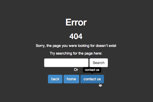
Finally, right at the end, you’ll see three anchors, all with the classes btn and btn-primary. These will serve as our buttons. Here’s what we have at this stage:

At this point we’ve done nothing in terms of styling, not a single line of CSS, yet thanks to Bootstrap we’ve effectively built our page, ready for polishing up.
Let’s Get the Tooltips Working
Something else which Bootstrap is going to help us with; the tooltips. You can read more about the various options available to us in the Bootstrap docs, but for now let’s just add the necessary ingredients to our HTML.
To each button we add an extra class tip used to identify anything which needs a tooltip. We also need a title attribute which dictates what will actually show within the tooltip:
<a href="#" class="btn btn-primary tip" title="back">back</a>
The bootstrap.min.js file which we’re already pulling in has all the JavaScript needed for the tooltips. In fact, it has loads of other JavaScript toys, many of which we don’t even need, so in a production environment it might be wise to only include the things we’re using. Bootstrap tooltips are opt-in, so they don’t work automagically, we need to initialize them. Let’s do that within script tags at the bottom of our page, underneath where we’ve called the other JavaScript:
<script> $ (function(){ $ ('.tip').tooltip() }); </script>
Done. We now have this:
Now Let’s Try Some Styles
I’ve added a third CSS file to the project called theme.css and have pointed to it from the document <head>. But what do we add to the stylesheet?
<link href="css/theme.css" rel="stylesheet">
We’re going to begin with the main container. Select the container object in Illustrator and you’ll notice, in the Layers panel, that it’s been named main.

This is relevant. In a team situation it’s wise to have a common understanding about how objects like this should be named. You’ll see why when we open up the CSS panel.
CSS Properties
Go to Window > CSS Properties to reveal a panel of the same name. With our main object selected this will contain all the relevant styles which we can paste directly into our stylesheet. You’ll see that these styles have been applied to the selector .main, just as our object has been named.

Go ahead and copy what you see, then paste it directly into the theme.css file. In order to have these rules apply to our container element, we’ll need to change the selector to what we’re actually using (keeping the .main selector is a bit risky as we may find this used elsewhere in our overall site). Change .main to .inner.cover and you should see your container element turn a lovely golden yellow, with rounded corners and even a box shadow, all applied with decent cross-browser CSS.
CSS Dimensions
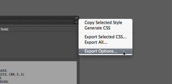
You’ll notice that our CSS rules here don’t include any widths or heights. This is a good thing; Bootstrap is pretty much taking care of all that, so we’re really just looking for aesthetic styles. By changing the CSS Properties Export Options we could have our dimensions included here, but we’ll leave them out.
Our container is a bit wide though, due to styles already applied, so let’s override those dimensions with the following media query:
@media (min-width: 992px) { .masthead, .mastfoot, .cover-container { width: 400px; } }
This overrides rules found in cover.css, giving us a width of 400px on screens at least 992px wide. 400px isn’t exactly true to the design, but I personally find the true dimensions and the font-size a little small, so I’m vetoing it!
While we’re here, I just want to alter the styles so we apply the rounded corners within this media query too. Remove them from the rules you pasted from Illustrator and apply them like this instead:
@media (min-width: 992px) { .masthead, .mastfoot, .cover-container { width: 400px; } .inner.cover { border-radius : 10px; -moz-border-radius : 10px; -webkit-border-radius : 10px; } }
Now we should have something like this on large screens:

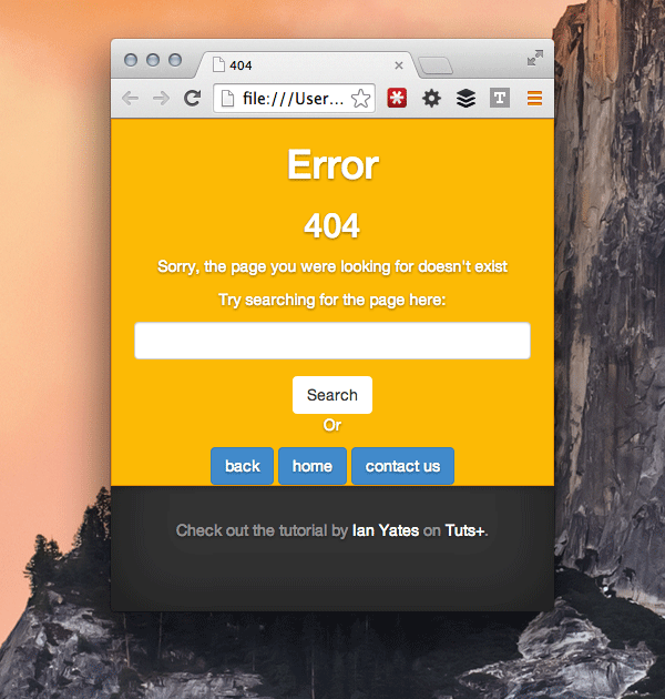
..and this on small screens:
Specific Measurements
We’re not exactly being faithful to the precise dimensions used in the Illustrator document, but that’s not a problem; the web is fluid. Still, our container could use some padding on the bottom, so let’s find out exactly how much our Illustrator design says we should use.
Select the Measure tool in Illustrator (you’ll find it with the Eyedropper tool) and drag the cursor to measure any given area of the design. We can see that the padding we’re after is 25px, so let’s apply that manually to our styles.
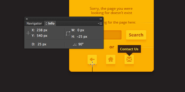
.inner.cover { padding-bottom: 25px;
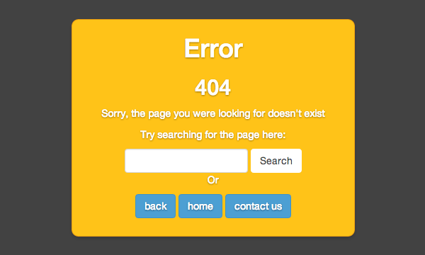
The Other Styles
We have quite a number of styles and objects to deal with here and, if everything were named exactly as it should be, we could (in principle) output a huge pile of CSS from Illustrator to deal with all of it. However, there are some discrepancies with the object naming here (avoiding that would require some close designer/developer communication) and we may end up with some extraneous code that we don’t need.
Instead, work your way patiently from element to element, selecting each object and outputting the relevant CSS. Begin with typography and let’s just see how well Illustrator does.
Fonts
One of the first things you’ll notice is that the CSS for any type object includes: font-family : Open Sans;
Open sans is not a standard system font and won’t display in any browser where the user doesn’t have it installed. You’ll therefore need to head over to Google Fonts and grab the CSS link to pull it into the page through the magic of webfonts.
<link href='http://fonts.googleapis.com/css?family=Open+Sans:400,700' rel='stylesheet' type='text/css'>
Buttons
All has gone fairly well so far, but then we hit the buttons. The search button is actually not bad, but the three buttons below haven’t been given object names, so we see the following in our CSS Properties window:
No CSS code was generated. To create CSS for unnamed objects, either name the object in layers panel, or enable ‘Generate CSS for Unnamed Objects ‘ option in the CSS Export Options dialog.
Go ahead and open up the options as we discussed before, then make sure you’ve checked Generate CSS for Unnamed Objects. The alternative would be to give our buttons a name, but either option is fine here.

Now, with all our buttons selected, we can hit Generate CSS and have the styles output for us. Unfortunately, Illustrator will output complete styles for each individual object, even if they all share the same rules. This seems to be the case even if we use common Graphic Styles, Character Styles, Paragraph Styles, or even give all objects the same name! Room for improvement there, but we can at least grab common styles and apply them to multiple objects manually.
I copied the styles for the search button, then applied it to .btn, .btn:hover to make sure all Bootstrap styles were suitably overwritten. I also added a border: none; to get rid of Bootstrap’s blue border. Let’s see what that gets us!
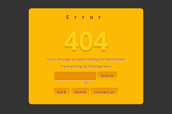
This isn’t bad, but it’s a fair way off perfect. The text-shadows haven’t been adhered to (they’re lacking transparency), the gradients on the buttons aren’t correct and they’re completely missing their box-shadows.
Why?
In short, Illustrator CSS export isn’t yet ready for this kind of complex structure (to be fair, it is very complex). Let’s look at the search button we’re aiming to recreate:

It’s lovely. But take a look at how many fills, gradients and shadows have gone into building it:

Ouch. Hardly surprising that Illustrator said No. Even the border-radius has been left out of the equation because things have become too complex.

Instead, I’m going to just apply some simple styles and sidestep the complex CSS (this tutorial is about what Illustrator can do for us after all..) The amended .btn styles look like this:
.btn, .btn:hover { font-family : Open Sans; font-weight : bold; font-size : 14px; color : #AC4400; text-shadow : 0px 1px 0px rgba(255, 255, 255, 0.3); background : #FDDA2F; border-color: #FDDA2F; border-radius : 4px; }
In terms of CSS efficiency this all leaves a lot to be desired, but we’re working with what Illustrator gives us for the sake of demonstration. You would be wise to go back afterwards and clean up the CSS, perhaps even using a tool such as CSSLint.
Icons
What we’ve generated up to now isn’t bad, so we’ll leave it alone for now. Let’s turn our attention to the button icons. There are a few approaches we could use here:
Exporting Bitmaps
By selecting each graphic, you can generate CSS in much the same way that we have before. Illustrator will opt to export complex paths as png files, then use those images as backgrounds for your elements.

You’ll be given a group of assets to use:
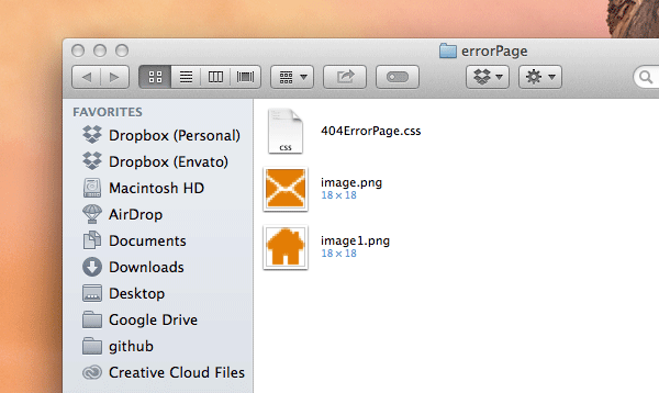
But, again, it’s not perfect, and will omit certain aspects of the design, outputting questionable styles in other cases, so this approach will take some refining on your part. This approach also fails to take retina displays into account, potentially giving us sub-standard graphics on certain screens. Anyway, the outputted CSS for these graphics looks like this:
.image { background-image : url(image.png); background-repeat : no-repeat; }
SVG
My preference, as a web designer, would be to go for SVG in this case, something which Illustrator is getting very good at.
First, select an icon, then copy it to the clipboard in the usual way (command + C). The SVG data for that object is now available for you to paste into a text editor (amazing). Open up a new file in your web project, call it “icon-contact.svg” and paste the clipboard contents into it.
You can now add that SVG as an image directly in the markup of your index.html:
<a href="#" class="btn btn-primary tip" title="contact us"> <img src="img/icon-contact.svg" alt=""> </a>

There are all kinds of ways you can implement SVG into a web page; via CSS, by first converting the XML into base64, pasting it into your markup inline, the choice is yours (take a look at SVG Files: From Illustrator to the Web for more information). Our approach works just fine though, at least in modern browsers, so we’ll stick with it.
Repeat the process for the other icons, and..
We’re Done!
With a little bit more tweaking (I’ve added some padding to the form element) you should have something which resembles this:
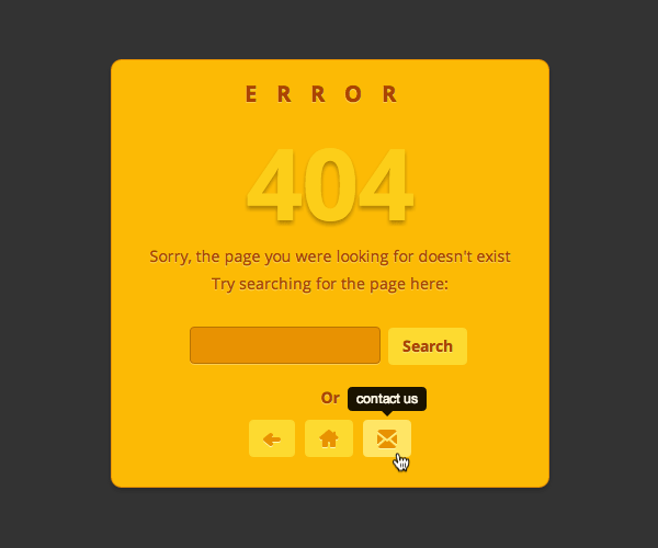
Not bad! It doesn’t 100% reflect the Illustrator graphic, but considering we’ve relied chiefly on styles output by Illustrator I think we can be pretty pleased. Any further improvements will have to be made by hand, Illustrator has done all it can for us at this point.
Do you have any tips which could help Illustrator directly improve this web layout? Let us know in the comments!
