 Some say web design has become boring. Current trends and high-end techniques establish the rules for the creatives, playing a low-down trick on the community. Everyone wants to be in the mainstream, and release products that go viral; it means that a million interfaces are likely to have the same features.
Of course, content can save the day. Still, the truth is that a lot of those interfaces are going to look the same.
For several years now, the hamburger menu icon has run the show. It is difficult to call it a “craze” these days; it is shamelessly overused, and feels like a must-have for responsive interfaces. Without a doubt it has benefits: it is handy, compact, and intuitive… but still, it is boring.
I mean, it is just three lines that sit on the right or left upper corner, and that’s all—a primitive glyph that calls to action. There are several options on the wild nowadays. They serve navigation’s primary role, and at the same time look different trying hard not to feel dull. Some of them are a breath of fresh air while others just are well-forgotten old solutions that were revamped.
1. Navigation with vertical lettering
Vertical lettering is a brand-new trend these days. It looks increasingly fresh, and naturally stands out from the usual horizontally-oriented content. What’s more, it takes less space: just a narrow line. Nonetheless, it is visually weighty since it is stretched almost to the height of the screen. Compact, informative and zingy—an ideal solution for contemporary designs.
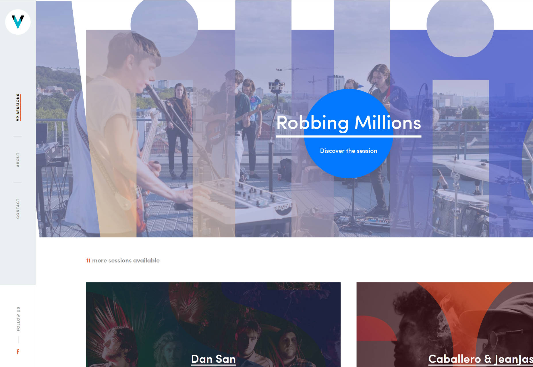
VR Sessions brings home to us how to implement this type of navigation successfully. The team has turned its navigation 90 degrees, and placed it in a dedicated panel along with the logo. Nice and ingenious.
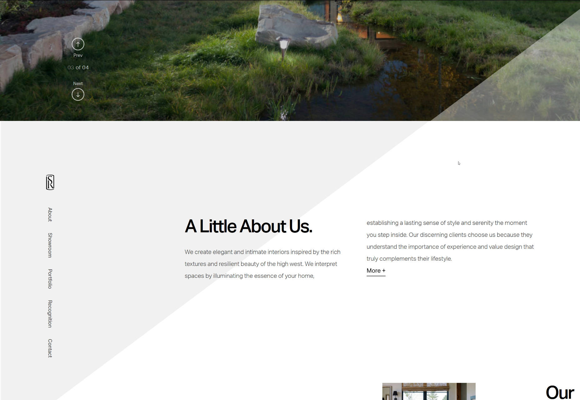
In the beginning, the Snake River Interiors website features a banal nav bar in the header; however, when you begin to scroll down, it smoothly transforms into the menu with vertical typography that sticks to the left side and follows the visitors. It certainly does the trick here.
2. Menu scattered around the perimeter of the screen
It is not a widely-used solution, and usually, it requires a proper environment, like a centered layout with perceptible gutters around the structure; nevertheless, it is a good way to give some zest to your navigation. Predictably, you may think that this concept is ideal only for small websites that have no more than four inner directories since there are just four corners. Well, that is not exactly correct. Take a look at the front page of Proud and Punch.
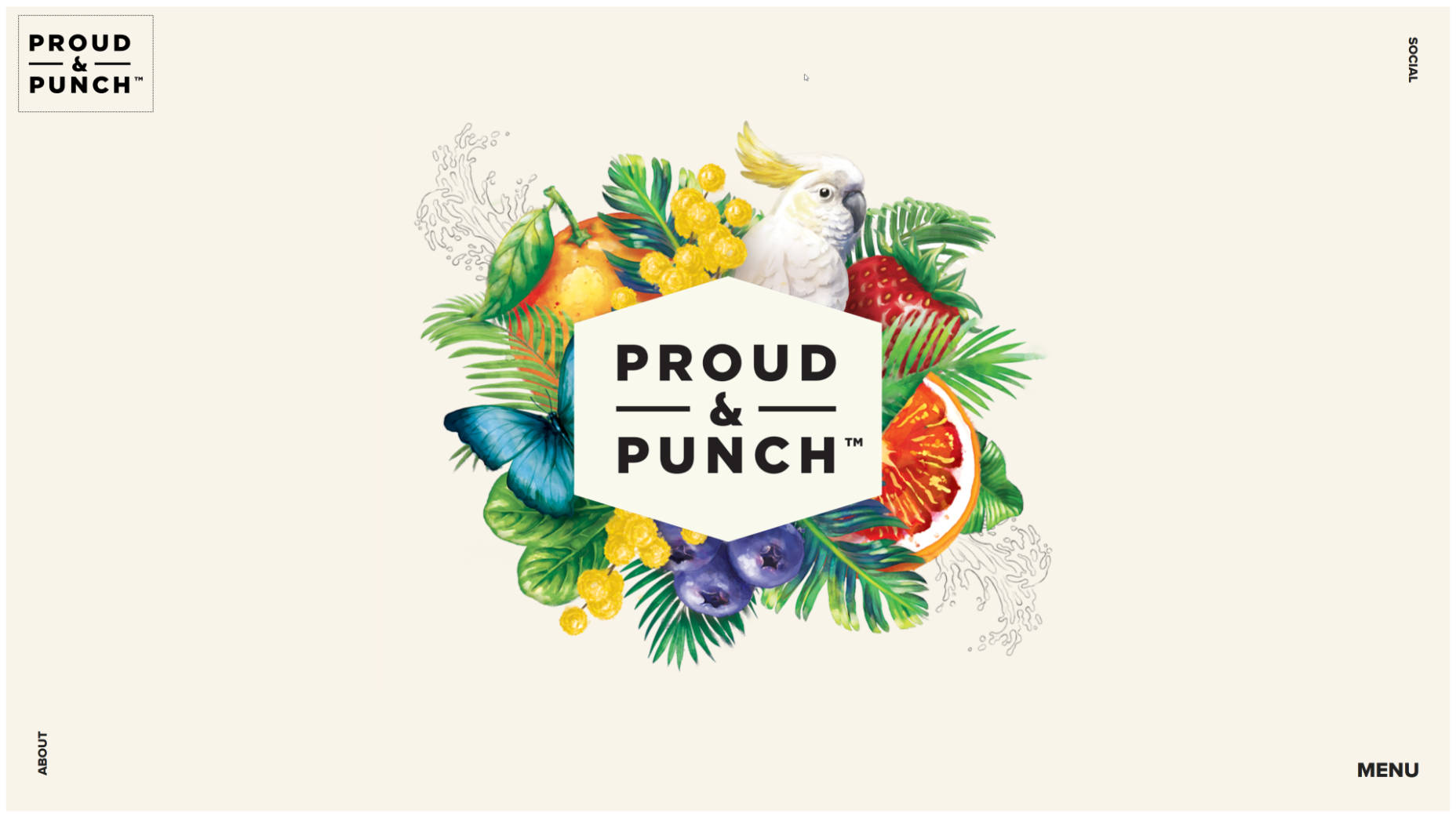
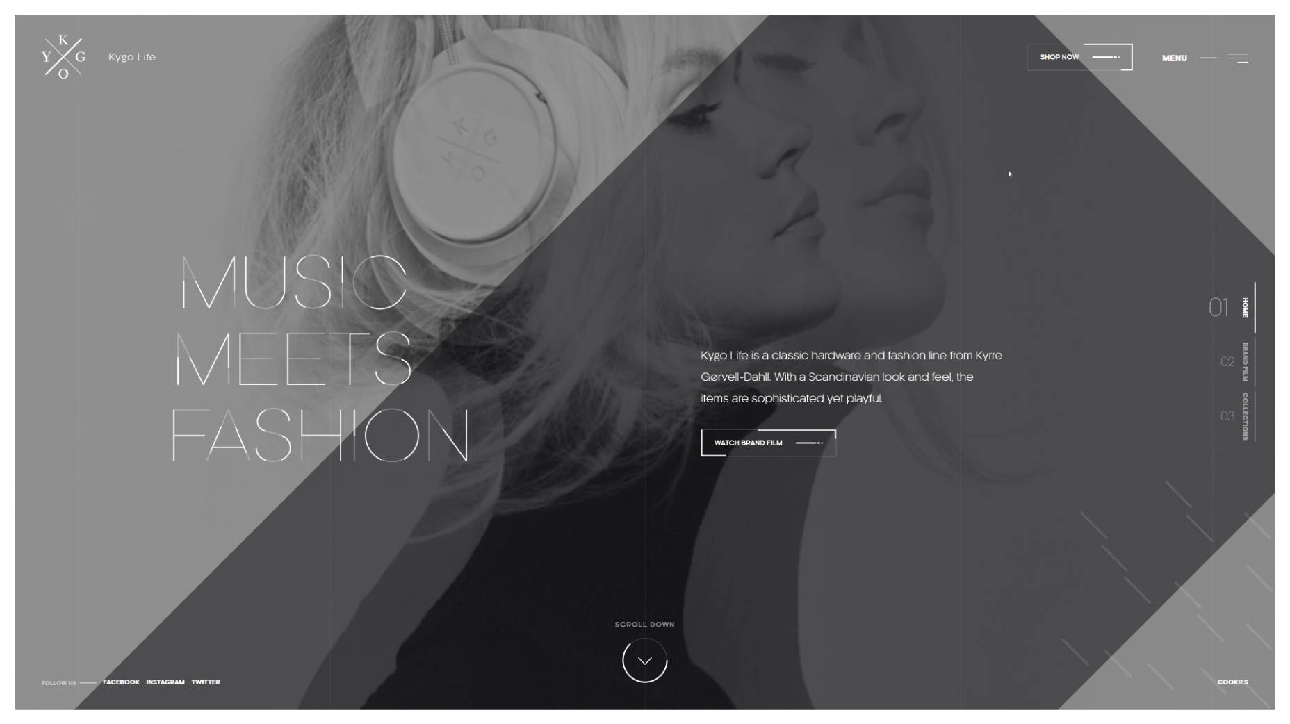
Each corner is reserved for its piece of information: logotype, socials, menu icon and quick access to the ‘about’ section. The team has skillfully identified their priorities, and kept everything neat and simple; whereas the team behind the Kygo Life did not limit itself at all, using the free space as effectively as possible. The homepage features lots of stuff that is located on the border of the page: CTAs, navigation indicators, social media, logotype, and some other things, resulting in a nifty design.
3. Ultra-narrow slide-out menu
Sidebars make a return. It is not dramatic, but still pretty perceptible. They are slicker, thinner, more compact and more elegant than before. In point of fact, it is just one ultra-narrow column that houses several elements: logotype, menu icon and depending on artist’s preferences it can be social icons, link to portfolio or standard icon-based pagination of the hero slider. Usually, it is located on the left side and seamlessly integrated. As for behavior, in the majority of cases, it just slides out revealing all the hidden elements like in mobile apps.
The personal portfolio of Maison Ullens features one of these. The homepage is split into two unequal parts. The first one is a sidebar with the logotype and link to the menu and the second one is the primary content area. The solution naturally directs the attention towards the ‘welcome’ area and at the same time unobtrusively establishes a focal point.
4. Soaring vertical menu
You might say, “That’s ancient history.” Much like a horizontal menu, vertical navigation seems to be banal and trivial. However, in the era of the hamburger menu button, it too looks like a craze. It can be used both against the solid color and transparent backgrounds. It can be placed anywhere; but as a rule, it’s paired with the logo.
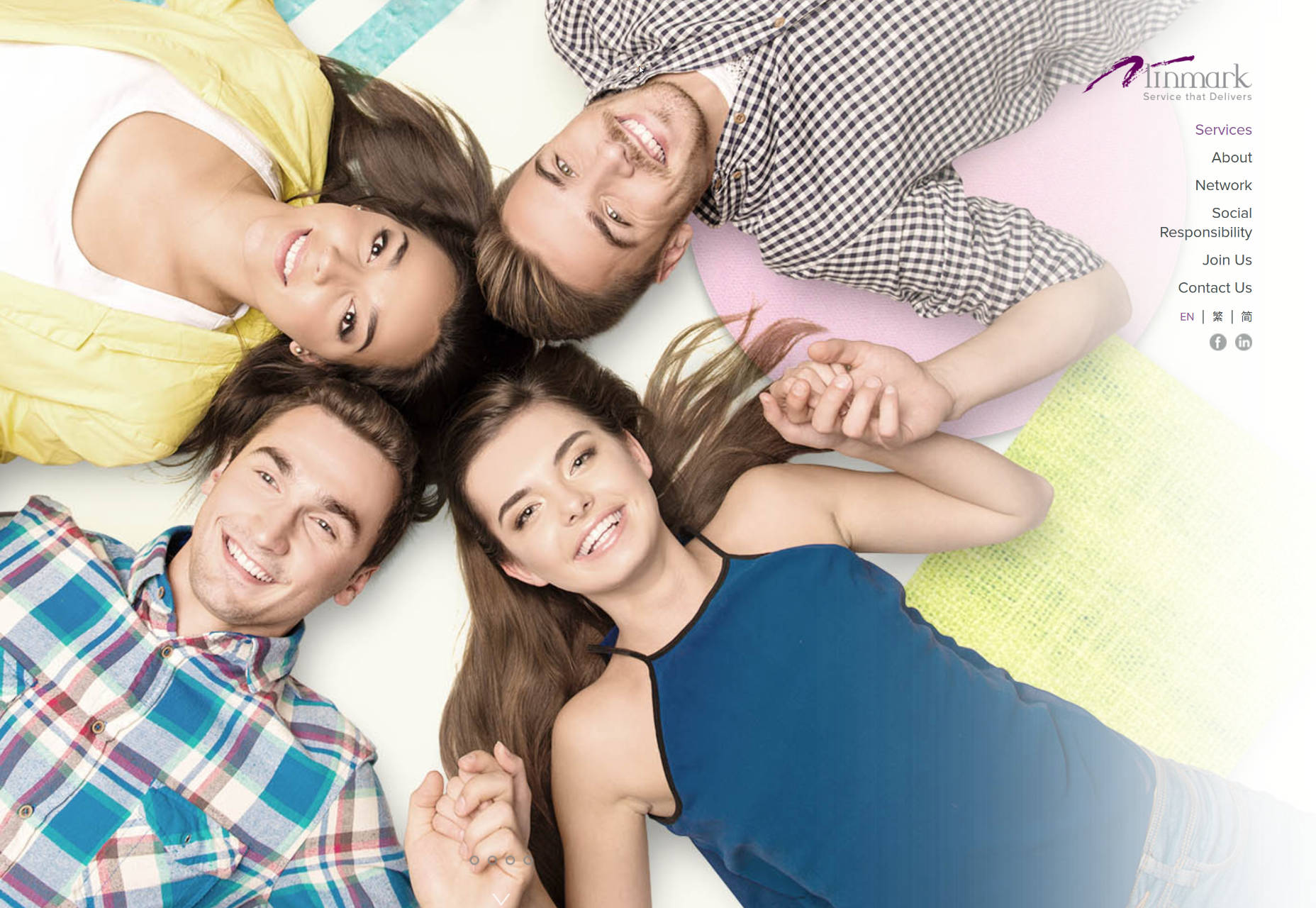
For example, Linmark; the team utilizes a traditional vertical navigation that is carefully arranged on the right side of the screen. It starts with the type-based logotype and ends with the set of social media links presented as icons. The right side of each slide is intentionally whitened so that the component gets the necessary contrast to hit the optimal readability. The solution feels unusual.
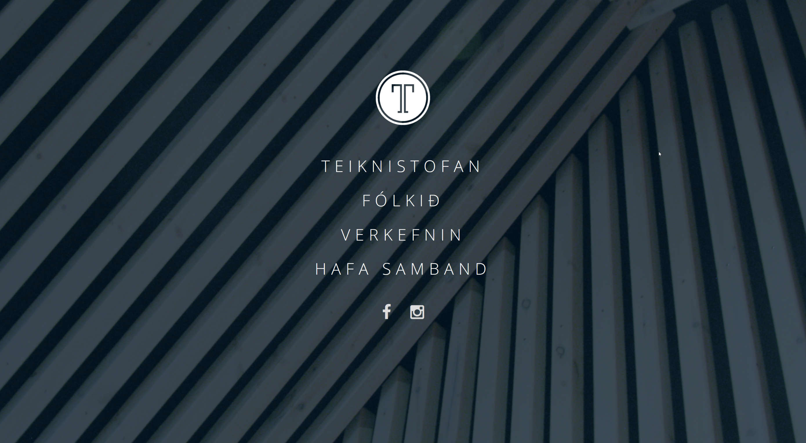
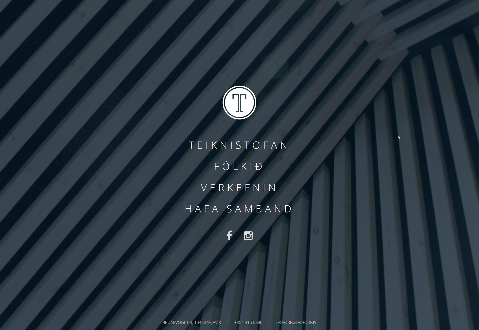
Tvihorf welcomes online visitors with the activated menu that is presented as a conventional vertical navigation where options are carefully arranged line by line. It occupies the leading position, but not dominant. As you may expect, located in the heart of the page, it predictably catches the eye from the first seconds. It looks neat, crisp and subtle, going perfectly well with the logotype and prevailing businesslike atmosphere.
Conclusion
As the saying goes, small details make a big difference; and such a common element of the website design as the menu is capable of enriching the general aesthetic, adding some nice twists to the structure, and enhancing the user experience when it stands out from the crowd. These four types of navigation might not impress your visitors with their incredible dynamic behavior, nor intricate realization.
They will just feel unique, refreshing and original.
| 20 Royalty-Free Epic Cinematic Action Music Tracks – only $29! |
 |
p img {display:inline-block; margin-right:10px;}
.alignleft {float:left;}
p.showcase {clear:both;}
body#browserfriendly p, body#podcast p, div#emailbody p{margin:0;}