Advertisement
It is said that the main goal of the web design studio is to perceive their client.
When you learn all about your client’s personality, values, and most importantly, business goals, you come up with a concept – a visual outline of the future website.
Sometimes, however, it turns out that your vision does not exactly match your client’s.
In this case, what is the way to reach synergy between your work and their expectations, without having to abandon everything that you’ve put so much effort into?
In this article, we will give practical recommendations on how to sell your concept to the client.
Let us start with the preliminary stage, and make sure everything is taken into account before you actually start designing.
Concept evolution

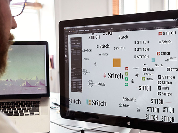
Image source: Simon Walker[1]
A good concept is preceded by several means of data accumulation. Before the designer starts having any ideas regarding the future website, they must learn and understand the following:
- The client’s Request for Proposal (RFP). This is usually a document or a letter where the client states their general demands and requirements of the future site. Some RFP’s are brief, and some are detailed to the extent of the Technical Description.
In any event, this piece of data should give you the idea of what kind of website you are supposed to build.
- The Brand Book, and (or) the marketing strategy. For accomplished brands, or the ones thoroughly prepared to hit the market, a brand book is a given. There, it is clearly stated what you can and cannot do with the logo, style, outlay, background, fonts and associated text.
If your client is a start-up or a small business, and do not represent or possess a distinctive brand, then you at least need to have their marketing strategy to see how they are planning to position, complete and monetize. A combination of the brand book and the marketing strategy would literally trim the chances of your concept being rejected to almost a zero.
- A Mood Board of the client’s emotional expectations. This piece is based on your personal meeting with the client. During the meeting, your major purpose should be to define the level of personal commitment they are willing to make in this project.
Creative people, celebrities and start-uppers often see their website as a certain reflection of their personal values and ambitions. If this is the case, the mood board is obligatory.
Having skipped it, you may find out that your concept will differ drastically from what your client envisions. Here[2] is a helpful material on how to create pinpoint and informative mood boards.
- The Prototype. You sketch up the site’s skeleton and approve it with the client. The prototype is loosely based on the type of website the client wants (e.g. promotional, corporate, social media, eCommerce), and the Target Audience (TA) which the client plans to market it to (either by age, gender, income or lifestyle).
If we compare the website to the building, then the prototype is an architectural sketch – black-&-white and schematic – and represents the structure, but in no event, the visual looks.
Having all this crucial data assembled, you must upload it onto the designer’s head, or in other words, create the technical task for your designer.
If everything is done properly, and all the information is correct and relevant, at the stage of concept creation, the designer will possess excessive information on what must be done, and there is a good chance for him to hit the right note from the first try.
Concept grinding

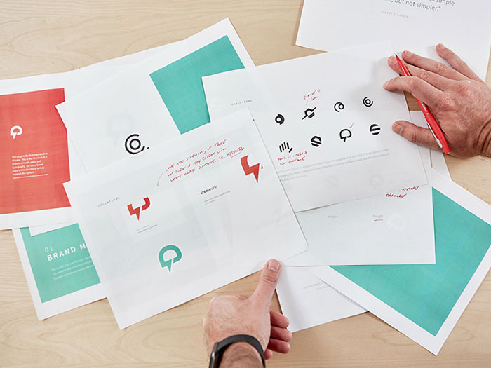
Image source: Summer Teal Simpson Hitch[3]
So, your designer has come up with a series of images that would serve as the visual outline for the future website. Let us call it a “beta concept”. The beta concept has to be approved within your company before presenting it to the client.
Sit down with your designers and front-end developers and brainstorm on pros and cons of the beta concept. Test it from all angles with your UX specialist. Try to identify points or elements which you feel may confuse the client, or be unconvincing to him.
It is a good idea to polish the beta concept to such extent that you are a hundred percent sure it would work for your client. Because if you are not – it will without a doubt show during your presentation.
Concept presentation

Image source: UI Presentation Kit[4]
Some sales managers often head start with switching on the presentation and cycling through the slides. We consider this a bad practice, and here is why.
If your client chose you as a developer for their website, they probably trusted your judgement to some extent. However, they did not witness all the work you’ve done to give birth to the concept, so it’s fair to expect that they might not be overly enthusiastic about your concept from the very start.
Therefore, we would suggest starting with revision of the project’s objective, business goals, and the emotion which it must invoke in the TA, however obvious it may seem to you after numerous working hours devoted to the project. That way you will have your client tuned to the right frequency.

Image source: Bill S Kenney[5]
When you start the presentation, act in the user’s canvas. Work out the typical user scenario based on personas and market studies, presented by the client, and stick to it at all times.
Do not give comments like, “We’ve put this pretty button right here” or “This menu section contains this content”. Remember – you are not convincing your client that you’ve done a good job. You are convincing them that the site flawlessly fulfills its objectives.
Even in the best case, your client will probably not agree to everything without a single remark. It might be some minor elements that they would not particularly like, or it can be pictures or text that they would feel to be out-of-place.

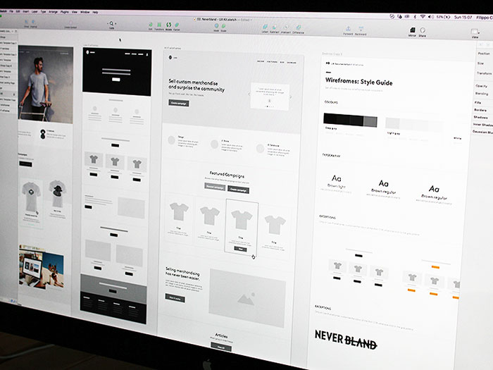
Image source: Filippo Chiumiento[6]
When you see this happening, consider 90% of the job done: the client has agreed to your concept, and all that is left is to polish the rough edges.
Continue sticking to the “user-centered” approach. Suggest similar solutions, and explain why they would be good for the future user.
Avoid asking the client how they would like it to be. The last thing you need is their recommendation. Always propose your vision, and explain why it is good from the user’s perspective, even if it’s not exactly fitting in the client’s judgement.
Concept objections
Even if you have done everything right up to this point, there are clients who just would not have your concept that way. Let us see how we can deal with such situations.
Generally, the rejection scenarios may be rounded down to two: “Not good at all” and “Not sure if it will do”.
The “Not good at all”
Surprisingly, this is the easier one for you to handle. The client is positive about his decision to reject the concept, which means that you will have to do another design iteration.
In this case, what you have to do is basically re-launch the process of client’s goals and values identification, and by the end of the meeting, pull the desired vision out of the client’s head. A good idea here would be to draw a new mood board right in the course of the meeting.
Offer your hypotheses to confirm or disprove the client’s judgement on the particular points (e.g. “Do I get it right that this element is…”). Gather all the proper data for the rework, and revert to the first stage of the concept evolution.
The “Not sure it will do”
This one will require some patience and skill, because the client cannot decide if the concept works for him or not. And you have to understand their hesitation. Here, you must do your best to defend your overall concept idea, while suggesting to alter the minor elements.
Juggle through fonts, pictures, textual content, color palette, but do not make the client think you’re willing to start over from scratch. Neither your company, nor the client need that. At the end of the day, you must come up with the list of things to improve, while leaving the concept canvas as it was.
In order to stand by your concept in delicate negotiations, here is the list of things that will come of use.
The arsenal for client persuasion
- Presentational skills. The atmosphere at your presentation has to be amicable, but not informal. Have faith in your concept, and understand what its strong points are. Try to instill confidence in your client that the concept is perfect. If you show the slightest doubt or uncertainty, it will instantly multiply by several times in the client’s mind.
- Analysis of client’s expectations. Identify what is important for you client to see in your concept, and emphasize these points during your presentation. Show that you wish to deliver a product which would work flawlessly for the client, but make it clear that you are the expert.
- Understanding of design tools and methods. The negotiations will require that you provide alterations and counter-proposals to certain elements of the concept right on the spot. Therefore, you should know how it was made, and what it was made of.
- Experience. It’s good to have at least one successfully completed project in the field of the client’s business behind your back. That way, you are familiar with the peculiarities and specifics of the client’s business, which would further add up to your authority in his eyes.
A good sales manager knows how to minimize the risk of the concept not being approved, even before starting to work on it. However, you cannot get inside your client’s mind, so always be ready with one or two alternative solutions for the elements that you feel uneasy about in your concept.
Demonstrate confidence that every flaw can be dealt with easily, and that the end product will be just as impeccable as its picture in the client’s head.
