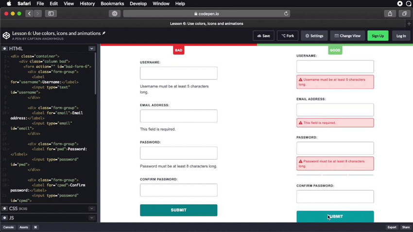
One of the most important but often neglected aspects of form design is the display of error messages. Helpful and well-designed error messages can improve the user experience, while confusing ones can lead to frustration. Learn how to get it right in our new short course, Best Practices for Displaying Form Errors.
What You’ll Learn
Submitting forms doesn’t always go as planned. Users might not enter information in the expected format, or they might forget to enter all the necessary data. In these cases, the user should get an error message.
In this course, Adi Purdila will show you some best practices for displaying such error messages so that you can offer a great user experience.
You’ll learn about microcopy, inline validation, password strength indicators, using animation, and more.
Watch the Introduction
Take the Course
You can take our new course straight away with a subscription to Envato Elements. For a single low monthly fee, you get access not only to this course, but also to our growing library of over 1,000 video courses and industry-leading eBooks on Envato Tuts+.
Plus you can download unlimited items from the huge Envato Elements library of over a million creative assets. Create with unique fonts, photos, graphics and templates, and deliver better projects faster.
