
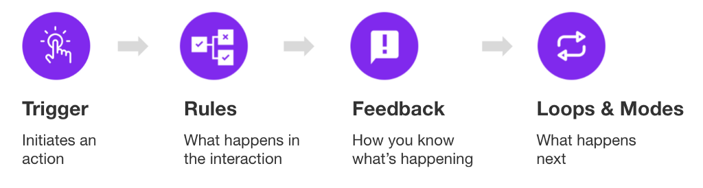
The beauty about micro-interactions is that it’s a digital conversation users can initiate with the system or the system can initiate with the user.
Let’s start with what they are
Micro-Interactions are a heuristic approach to meaningful feedback responses that let users know when an action is performed. Simply put, the user has to constantly know what happens when an action is performed. It’s a human tendency to expect something to happen when we interact with something. Take for instance the act of pushing the gas pedal in your car. The feedback response is acceleration and/or the sound of the engine. The fact that neither happens would indicate that something is wrong. Therefore, a UI without a good micro-interactive feedback response can lead to a frustrated user.
These simple yet small instances allow a component and a user to communicate with each other. As with any interaction, there is an action and a reaction. A user completes an action and the micro-interaction provides the instant reaction to the user’s action. 🤔
Microinteractions are meant to be simple, brief, and should feel effortless. They are meant to do things like enhancing navigations, offering subtle recommendations to customers, controlling an ongoing process through instant feedback, and making it easier for users to interact with a single piece of data.
What they are not
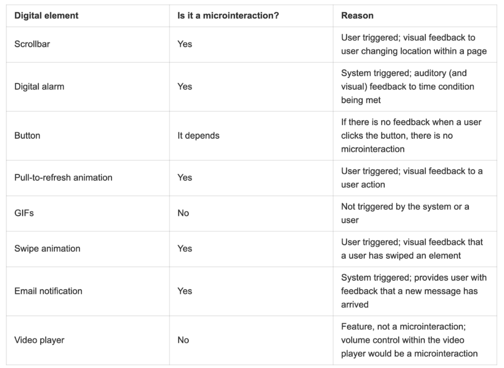
Elements that are static and always present on the screen are not micro-interactions because they do not have a trigger. Additionally, flows composed of multiple actions where users are navigating from one screen to another are not micro-interactions. Below is a table of some examples of what are and what are not micro-interactions.
Source: https://www.nngroup.com/articles/microinteractions/
How do micro-interactions work?
User-initiated triggers can consist of a GUI (Graphical User Interface) command or can be gestural or voice-based. When a micro-interaction is triggered by a command, a visual feedback element will usually be placed in close proximity to that trigger.
Source: https://www.nngroup.com/articles/microinteractions
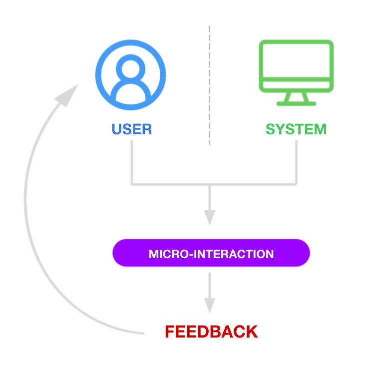
For example, a push notification on your phone triggered by the system is a GUI command. A user command would be something like a swipe/drag gesture or tap that opens a drawer or modal of information.
Why are micro-interactions important?
Simply put, it can improve a product’s user experience. The psychology of heuristics is interesting. The idea suggests that cognitive biases influence how people think and react. People are limited by the amount of time they have to make a choice as well as the amount of information we have at our disposal. Our level of intelligence and accuracy of perception also influence the decision-making process. The result of these limitations forces us to rely on mental shortcuts to help us navigate and make sense of the world. Hence–the heuristic approach to using micro-interaction which piggybacks off of these mental shortcuts.
Within the digital space of products, a simple change in the color of a button as one hovers, or an abrupt wiggle with the color red to indicate an error feeds us those mental shortcuts we need to let users know something went wrong or something is meant to be interacted with.
Source: https://www.verywellmind.com/what-is-a-heuristic-2795235
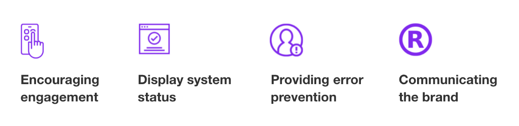
Micro-interactions can improve a product’s user experience by:
Now that we got that out of the way, let’s jump into Adobe XD and look at a list of different types of micro-interactions that we can create using XD’s prototyping features.
1. Confirming a Process
This is an example of keeping a user in the loop. Imagine uploading something without a system response signifying that an action is taking place. By adding some simple animation and a progress bar, a user can tell how far along an upload is. You can even go as far as adding a numerical value in the form of percentages or time to further inform the user how far along the upload progress is.
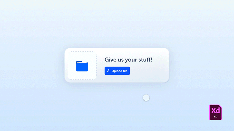
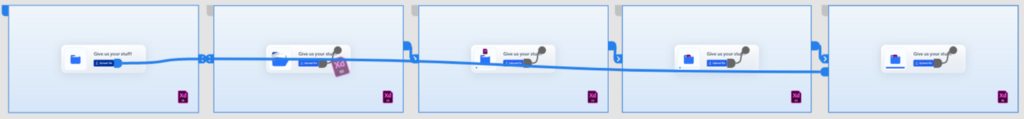
Adobe XD allows us to create these fun and complex micro-interaction using their robust prototyping features. Each phase of the animation is built in individual artboards and linked together with different prototyping interactions. In this particular animation, we are using a hover state for the button with a tap trigger to enable a series of animations controlled by the time trigger. If you’re familiar with motion design in After Effects, each artboard can be perceived as a keyframe sequence. One key reminder is to make sure your naming conventions in your layers panel are consistent throughout each artboard. Otherwise, it can get a bit wonky.
2. Action Button Interaction
An action button is any button that leads to an action when triggered by the user. An action button can lead a user to a hidden menu, download a file, or even give the user more options for different actions. The clip below is an example of an action button meant to consolidate multiple actions within one interaction… Now say that five times fast.

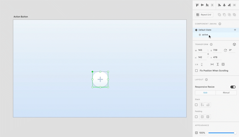
With Adobe XD’s component states feature, this interaction can be created without any extra artboards. All you have to do is create all of the necessary elements, group them, turn them into a component (command+k), and create a new state. The default state would be all of the options minimized in size and hidden behind the ‘+’ button, while the active state will be adjusted by positioning each item in a visible location within the vicinity of the ‘+’ button. That way the relationship between each object remains intact.
Once you’ve created each state, go into Prototype mode and auto-animate your component. Set the tap trigger and auto-animate from default to active (with an easing of ‘Snap’ at 0.3s) and do the same from active to default (easing to ‘ease-out’). This should create some smooth motion with a nice little snap to the objects as they reveal. Pretty cool, huh?
3. Error Alerts
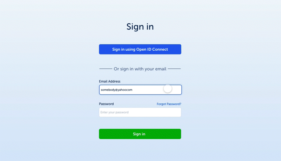
Error alerts can be both system triggers and user triggers. A user-triggered error can be the input of a wrong password. Whereas a system trigger error can be the notification that your cell phone battery is critically low. Error alerts are an essential interaction meant to keep everything running smoothly. The goal should be to present errors to the user in a clear and non-intimidating manner with supporting information for the least confusion.
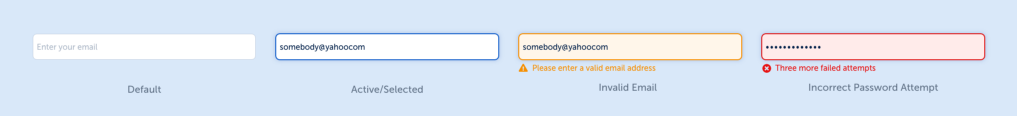
This is another state-filled feature where I’ve created multiple states for the input container. The animation you see is a result of auto-animating from one state to another (as seen in the email input field above), and the password error with the shake/wiggle animation is a result of auto-animating multiple artboards by offsetting the input field a few pixels to the left from the center point and then offset to the right a few pixels. Doing that multiple times to create a short time trigger between artboards to sell the effect. Making sure to bring the input field back to the center in the last artboard.
The modal that pops up is to further alert the user of an error while also giving them the option to reset their password. This is triggered by the user as they attempt to sign in without the right credentials to further signify the current state of their login efforts. This is created using the overlay action in prototype mode triggered by tapping the sign-in button.
4. Swipe Gestures
Swipe gestures are a very intuitive approach to micro-interactions within touch devices. In the world of heuristics, it makes the user feel one with a digital product because of the wizardry behind the commands of motion/dragging gestures versus the rudiments of tapping. Also, the transitions that can be created are very smooth and can avoid loading time by shape-shifting objects and/or reveal new information hidden in drawers, cards, and pages. These triggers are purely user-driven and are best suited for touch devices. Drag triggers can be accomplished on desktop and are likely best interacted with touchpads.
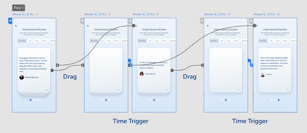
This one is fairly simple to create and it all depends on your creativity on how you want it to animate the gestures. As you can see in my version, I have cards stacked on top of each other giving the perception of depth and dimension. As a user swipes, the card appears to fall at an angle. That was intentional. I tilted the card 45 degrees and moved it off the screen downward as if it were falling off an edge. Then the card behind it expands and moves up in line with an added time (trigger) delay which reveals the content .3 sec after the card has positioned itself. How will you create a swipe animation in your XD prototype?
5. Interactive Data
One of my favorite parts about the usability of micro-interactions revolves around the realm of data visuals. Data can be overwhelming and it’s easy for users to quickly look the other way when presented with data. So how do we display large amounts of data, simply?
By making data interactive, it allows us the ability to create modular displays with interactive components that keep data sets invisible until interacted with. It also makes for fun animation that brings boring charts and tables to life.

Here I demonstrated three simple interactions. A hover state to display percentages of a circle graph, a carousel showing different variants of data within a circle graph, and tap triggers for the line graph to show data for each day in the timeline.
The hover state interaction was simple, make the graph a component and create a hover state that displays the data. Then minimize the opacity to ‘0’ for the data you don't want to see in the default state.
The other interactive circle graph is a bit more complex and may take Howard Pinsky’s youtube tutorial to get it right. He makes creating circle graphs look easy.
https://medium.com/media/20f793eea5ccdc056d59fb14bbadfe3f/href
The last interaction is just a tap trigger placed on different parts of the line graph. Each trigger is auto-animated to a different state. Whereas each state is linked to an invisible node in the timeline in order to make the interaction occur.
To summarize…
Micro-interactions are meant to be created with the intention behind what you’ve thoroughly understood about the user base. Keep animations simple, brief, and make them feel effortless. In other words, Keep It Simple Stupid!
Just to recap, here are six reasons why micro-interactions are useful.
- Controlling an ongoing process through instant feedback
- Offering subtle recommendations to customers
- Accomplishing a single task much more easily
- Enhancing navigation
- Making it easier for users to interact with a single piece of data
- Viewing or creating a small piece of content, like a status message
Download Free XD file
Follow me on Dribbble
Resources:
Designing Micro-Interactions––by Dan Saffer
Microinteractions in User Experience (NNG)––by Alita Joyce
Heuristics and Cognitive Bias — by Kendra Cherry
Micro-interactions: Why, when and how––by Vamsi Batchu

Building micro-interactions in Adobe XD was originally published in UX Collective on Medium, where people are continuing the conversation by highlighting and responding to this story.