One of the most common user interface elements for presenting your data is a table. It turns out that there are many aspects to control when working with tables, such as:
- defining columns and headers
- various cell formats (text, numbers, check boxes)
- resizing
- filtering
- dynamic growing
- styling
In this two-part series, you will learn about the ins and outs of working with tabular data in React using the React Bootstrap Table component. You’ll be able to create sophisticated and professional-looking tables with little effort and yet be able to customize every aspect.
Getting Started
To start, you should be familiar with React itself. If you need a primer on React, Envato Tuts+ has a great series to help you get started with React. In this tutorial, we’ll focus on working with React Bootstrap Table2.
To start, create a react app with the create-react-app command. You can learn how to set create-react-app up in React Crash Course for Beginners.
create-react-app react-table-app
now navigate to the project folder and install React Bootstrap Table 2 and Bootstrap.
cd react-table-app
npm install react-bootstrap-table-next --save
npm install --save [email protected]
Create a Basic Table
We will start with a basic table. We first import the BootstrapTable component and CSS as shown below.
import logo from './logo.svg';
import './App.css';
import React, { Component } from 'react';
import '../node_modules/bootstrap/dist/css/bootstrap.min.css';
import BootstrapTable from 'react-bootstrap-table-next';
First, we initialize the data and column variables and then assign the data to the BootstrapTable component. The data contains the names of some characters from the hilarious show Arrested Development.
const data = [
  {id: 1, name: 'Gob', value: '2'},
  {id: 2, name: 'Buster', value: '5'},
  {id: 3, name: 'George Michael', value: '4'}
];
const columns = [{
  dataField: 'id',
  text: 'Product ID'
}, {
  dataField: 'name',
  text: 'Product Name'
}, {
  dataField: 'value',
  text: 'Product value'
}];
The Bootstrap component takes in the following attributes.
keyFielddatacolumns
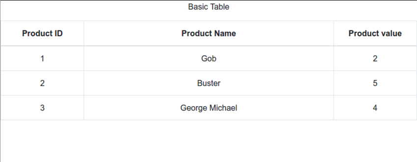
The render() method renders a table with three columns: “ID”, “Name”, and “Value”.
class App extends Component {
  render() {
    return (
      <div className="App">
        <p className="Table-header">Basic Table</p>

        <BootstrapTable keyField='id' data={ person } columns={ columns } />
      </div>
    );
  }
}
To view the table, issue the command, npm start--reload. The configuration created by create-react-app watches over your code and recompile whenever you change anything, so you only need to run it once. Then, every change will automatically be reflected.
Compiled successfully!

You can now view my-table-app in the browser.

  Local:            https://localhost:3002
  On Your Network:  http://192.168.43.206:3002

Note that the development build is not optimized.
To create a production build, use npm run build.
Here is the result:
.png)
Note that each column has exactly the same width.
Working With Columns
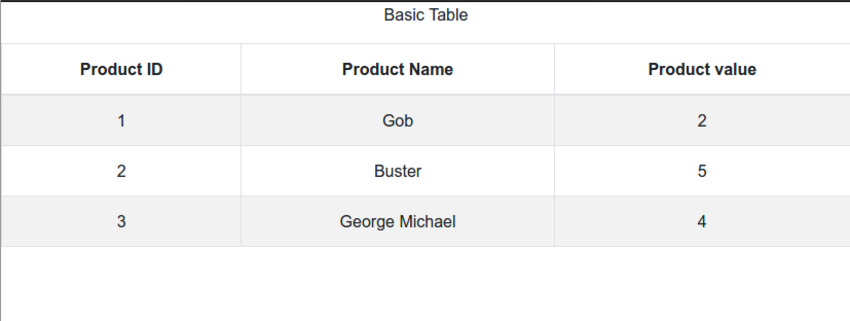
You can control many aspects of the columns. In particular, the column widths can be specified in absolute units,, as percentages, or left unspecified. The column width of unspecified columns is the remainder divided equally. For example, for our basic table, let’s specify the columns as follows:
- first column: 20%
- first column: 60%
- first column: 20%
You can also manage the alignment of text and columns as well as the style of headers and columns. Here is an example of how to specify different column widths, text alignment, and custom styles:
const columns = [{
  dataField: 'id',
  text: 'Product ID',
  headerStyle: (colum, colIndex) => {
          return { width: '20%', textAlign: 'center' };
        }
}, {
  dataField: 'name',
  text: 'Product Name',
  sort: true,
  headerStyle: (colum, colIndex) => {
          return { width: '60%', textAlign: 'center' };
        }
}, {
  dataField: 'value',
  text: 'Product value',
  headerStyle: (colum, colIndex) => {
          return { width: '20%', textAlign: 'center' };
        }

}];
The table now looks like this:
Styling Your Table
You saw how to style individual columns and headers, but styling can go much further. React Bootstrap Table 2 provides a lot of options for customization. First, you can simply add the striped and hover attributes to the BootstrapTable component to get alternate background colors on each row.
Let’s apply the striped and hover properties to our table.
class App extends Component {
  render() {
    return (
      <div className="App">
        <p className="Table-header">Basic Table</p>

        <BootstrapTable
        striped
        hover
        keyField='id'
        keyField='id'
        data={ person }
        columns={ columns }
        />
      </div>
    );
  }
}
Check out how you would style different columns with different colors.
const columns = [{
  dataField: 'id',
  text: 'Product ID',
  style: { backgroundColor: #00afb9 }
}, {
  dataField: 'name',
  text: 'Product Name',
  style: { backgroundColor: #fdfcdc }
}, {
  dataField: 'value',
  text: 'Product value',
  style: { backgroundColor: #fed9b7 }
}];
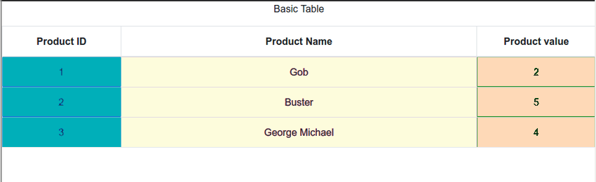
Table Sort
React Bootstrap Table 2 allows sortable columns. This is done by giving an attribute of sort: true in the columns definition.
const columns = [{
  dataField: 'id',
  text: 'Product ID',
  style: { backgroundColor: #00afb9 }
}, {
  dataField: 'name',
  text: 'Product Name',
  style: { backgroundColor: #fdfcdc },
  sort: true
}, {
  dataField: 'value',
  text: 'Product value',
      style: { backgroundColor: #fed9b7 }
}];
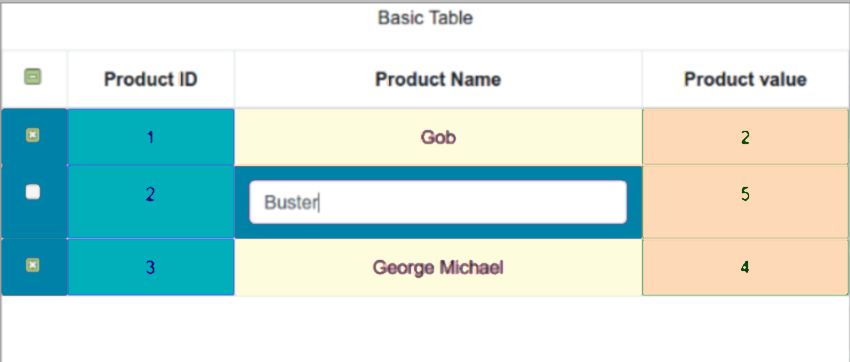
Selecting Rows
Once you have your data in a table, you may want to select some rows to perform some operations on them. React Bootstrap Table 2 provides a wide variety of selection options. All the options are organized in a single object you pass to the component as the selectRow attribute. Here are some of the selection options:
- single selection mode (radio button)
- multi-selection mode (checkbox)
- configurable column selection width
- select on row click: by default you must click the selector (radio button or checkbox)
- hide selection column (useful if select on row click is true)
- change background color on selection
- initial selected rows
- selection hooks (on single row or when all rows are selected).
The following components demonstrate many of these options:
Other Libraries for Data Tables in React
Lets explore other open-source React table libraries.
react-virtualized
react-virtualized is perfect for displaying a large amount of data efficiently when rendering large lists and tabular data.
react-virtualized uses a technique called virtual rendering to display extensive data efficiently. Virtual rendering only renders what is visible. For example, if you have a large list that contains a thousand items, react-virtualized will only show a fraction of the data (ones that fit on the screen) at any given moment the ones that fit on the screen) until the user scrolls to show more. Other features include:
- supports rendering of grids, lists, tables, masonry, and collections
- ability to auto-resize components
- ability to display items in reverse order
- ability to customize CSS classes and styles
react-table
react-table is a lightweight open-source library that allows for fast and extendable datagrids for React. It also supports hooks. Some of its best features include:
- highly customizable
- supports sorting, filters, row selection, column ordering, and row expansion
- fully controllable API
- animatable and virtualizable
- resizable
React Data Grid
React Data Grid is another open-source library that uses bootstrap and is perfect for editing tables. It also has a stunning UI. Features include:
- column sorting, searching, filtering, and grouping
- ability to edit columns
- expand columns to show more data
Conclusion
In this tutorial, we created a simple React application using react-create-app, added react-bootstrap-table2, populated a table with data, worked with columns, styled the table, and selected rows.
In the next part, we’ll continue the journey by expanding rows, adding rows, deleting rows, and covering pagination, cell editing, and advanced customization. Stay tuned.

