Some of the most fun I’ve had this year is playing Wordle with my friends and family.
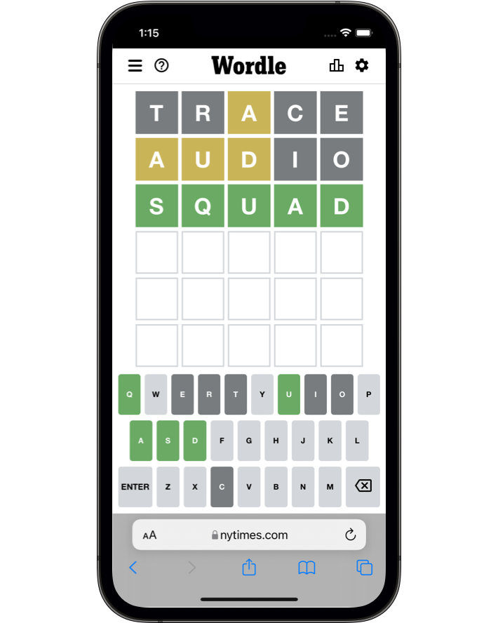
But I’m a product designer and a programmer, so as I played, I couldn’t help but notice some strange things about how it was constructed. I was right in the middle of making my own product School Morning Routine, so I was very interested to see what I could learn from Wordle. But the deeper I dug, the more truly bizarre and fascinating design decisions I discovered.
It turns out that this hugely successful game was made by one person named Josh Wardle as a side project during a COVID lockdown.
And he broke all the rules.
He made a software product in a way that, honestly, would probably be laughed out of any software architecture design review. But he broke the rules, and it worked. He made something beautiful that delights millions of people every day and he made a fat stack of cash doing it.
When someone does something that shouldn’t work, and it does, then I want to find out why. So let’s dive in, let’s pull Wordle apart and see what we can learn.
What Josh Wardle chose NOT to do.
Design is about trade-offs. Design is the art of deciding how to allocate limited resources under constraints. Design is about deciding what NOT to do.
And Josh Wardle decided NOT to do a lot of things.
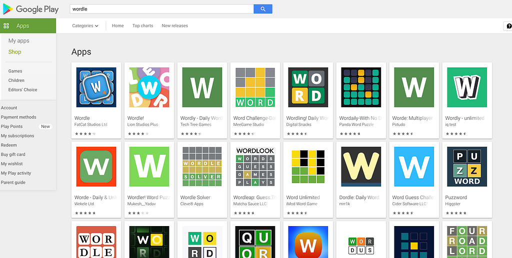
No native apps. So… the top mobile game of 2022 doesn’t even have a native iOS or Android app. It’s just a website. This would have saved a heap of development time. But it has also lead to plenty of confusion. Many people when they first hear about the game don’t realise that it is only a website, so they go onto the App Store or Google Play to download it and are tricked into downloading a cheap clone.
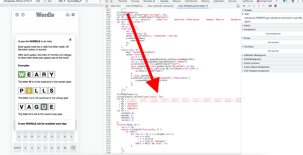
No front-end framework. No React, no Vue.js, no Svelte. It’s just made with good old fashioned HTML, CSS and JavaScript wrapped up in Web Components. Which means the whole game is only 60kb (including the dictionary of all possible 5 letter English words!) and somehow the page loads in a blazingly fast ~30ms.

No user accounts, no social sign in. User accounts are notoriously difficult to implement. They introduce a whole host of security concerns that are tricky to get right. So obviously, it’s much easier to just not have user accounts. But no user accounts means that users can’t keep their game result statistics in sync between multiple devices. There’s also no way to use email marketing to promote the game.
No back end. Again, skipping making a back end saves a lot of time. But without a back end, there’s no way to implement even the most basic anti-cheating measures. In fact, anyone can play tomorrow’s word by changing their phone’s date to tomorrow. Heck, anyone can read the answers for the next several years by just reading the source code in the browser!
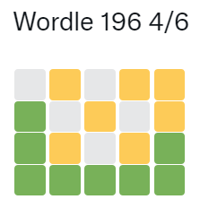
No in app social network. The top viral game of 2022 doesn’t have chat, friend connections or multiplayer. It went viral by simply allowing users to share their daily score on their existing social media platforms. Which again… has no anti-cheating measures. That little box people share isn’t even an image. It’s just text and those boxes are emojis. Anyone can simply edit them before sharing. Just change 4/6 to 3/6…
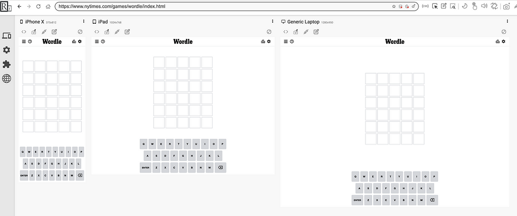
No responsive design. While most designers see white space and instinctively want to fill it, Josh Wardle didn’t. He made Wordle scale to any screen by designing for the smallest screen possible then just accepting that there will be white space on larger screens. This is the simplest responsive design solution I’ve ever seen and would have saved a mammoth amount of effort.
No custom artwork. All this game uses for its visual design is one common free font “Clear Sans” and a handful of simple colours. Even the original app icon is just a “W” using Clear Sans and the primary colour. It probably took all of about 5 minutes to make.

No DRM or even the most basic IP protection. Wordle may just earn the dubious prize of being the easiest to steal app that has ever been made. The source code is tiny and easily copied or reproduced. The source code doesn’t even have a license. The only license I can see is for a 3rd party library that must be included. This has all lead to a cottage industry forming around cloning the game.
So… is Wordle good?
Yes! In spite of all the problems I’ve listed above, somehow Wordle is still amazing.
Viral mobile games are often a bit weird. If you remember the Flappy Bird craze, you know that sometimes an odd little game just gets lucky, hits a nerve in the global zeitgeist and goes viral.
Wordle is not Flappy Bird. No-one is playing Wordle to be ironic. It is gorgeously crafted from top to bottom. It is a perfect little game that deserves every bit of its success.
So why is Wordle so good?
By choosing not to do all the things above, Josh Wardle gave himself time to focus on what matters. This is what he DID do.
He played it himself, every day. The heart of good design is empathy. Understanding the user, what they care about, what they want. By far the easiest way to empathise with the user… is to be one.
He even went so far as to ask his girlfriend to make the answer list so he won’t know the answer and can play it himself every day.
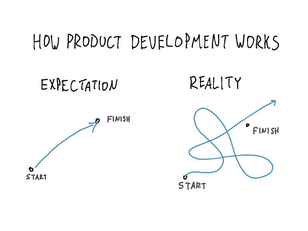
He made it perfectly balanced and fun. Balance takes time. Product development isn’t a straight line. If you look at the core loop, even the slight delay before revealing every tile when you enter a guess, it shows attention to detail. Only time can do that.
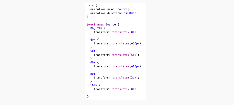
He made the animations elegant and performant. Animations are hard. Making them elegant is difficult. Making them performant is almost impossible. The fact that he accomplished this with such a simple elegant solution shows careful attention to detail.
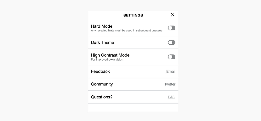
He made it for everyone. Unlike most apps and games Wordle was carefully designed to work really well on cheap low end devices. Or for users with poor internet connections. He even added an option for improved colour vision.
He made bold design decisions. Like only allowing players to play once per day. Bold decisions are often quite simple to code, but they actually take a lot of energy and mental space.
He made it solid as a rock. You don’t realise how solid Wordle is until you try a clone. The authors of Wordle clones obviously don’t have the same attention to detail. So you’ll find hard-to-click buttons, poor touch support, unnecessary scroll bars popping up. The clones are a mess, which demonstrates just how well Wordle is made.
So what can we learn?
This is the lesson I took away from Wordle:
To make sure that you have time and energy to get important things right, you need to ruthlessly challenge what you consider important.
Often when we start software products there’s just an assumption that you’ll need a mobile app, you’ll need a back end and you’ll need user accounts. Making those things takes an absolute tonne of work. Wordle teaches us to challenge those assumptions.
In the 1990s, Extreme Programming popularised a concept called “You aren’t going to need it” or YAGNI for short. The idea is that you shouldn’t add functionality until it’s needed. I can’t think of a better example of YANGI than Wordle.
Pushing this further, what we can learn from Wordle is an even older idea: simplicity in design.
“Everything should be as simple as it can be, but not simpler” — Albert Einstein (apocryphal)
“Before you leave the house, look in the mirror and remove one accessory.” — Coco Chanel
“Less is more.” -Mies Van Der Rohe
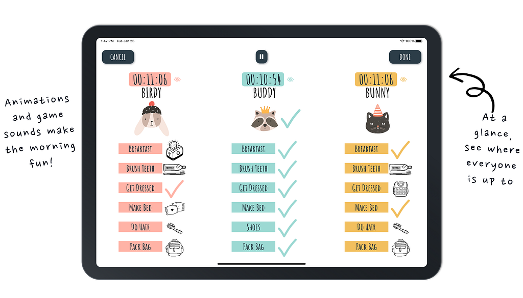
That’s how Wordle has inspired and shaped my product design. In particular, it gave me the courage to make some bold choices in deciding what NOT to do in School Morning Routine. I actually trimmed back my feature list and skipped using a few cool new open source libraries. I did that so that I had the time and mental space to make the basics absolutely perfect.
As developers and product designers, we love to get excited about the complicated solutions that giant tech companies use to solve giant complicated problems. But sometimes I like to get just as excited about a guy who found some elegant solutions to normal sized problems. About a guy who was bold enough to skip some of the hard stuff and made something delightful.
Resources
If you’d like to learn more these are some other great resources I can recommend:
YAGNI by Martin Fowler is a fantastic deep dive into YAGNI, how it works and when to use it.
Choose Boring Technology by Dan McKinley presents the wonderfully radical idea that software developers should choose boring technology instead of endlessly chasing shiny new things.
The Lean Startup by Eric Ries was released in 2008 and transformed the way we think about minimizing waste while creating innovative products and services. Terms like MVP were coined to challenge the idea that product releases need to be fully featured and perfect. Instead arguing that even a cheap and cheerful solution is good if it helps us learn and find product market fit.
Wordle is a masterclass in product design simplicity was originally published in UX Collective on Medium, where people are continuing the conversation by highlighting and responding to this story.