Disruptive design patterns — an uncharted territory
From Apple’s Dynamic Island to TikTok’s vertical video swipe: Are new design patterns going viral faster than ever?
Interface design patterns are recurring proven solutions for solving digital experiences. They are a part of a product designer’s menu of possibilities. With the popularity of libraries and design systems, many visual conventions have become the foundational principles that support a product’s scalable experience. But while some designers will tirelessly defend the practical nature and convenience of systems thinking applied to products, others will argue that this approach is too strict and the primary nemesis of innovation. Which is, to be fair, an understandable conclusion given how creativity is engrained in the job, but it’s also arguably an uncharted territory for the current state of digital design.
Reducing cognitive load
According to the psychological phenomenon mere-exposure effect, we’re all creatures of habit who gravitate towards things that are common to our own personal environment. In other words, people prefer familiar things. Our perceptual fluency is constantly being reconstructed as we make new associations with people, nature, and products. Think of reaching for a TV remote and not immediately finding the volume button. This simple annoyance reveals just how aligned our brains are to patterns in our everyday lives, even if we’re not always aware of it.
By definition, interface design patterns are built to be consistently used and widely accessible: Instantly recognizing tiny elements in a (not so) small screen (or, really, in any product) is essential so that users don’t have to continually adapt their habits when switching between devices, platforms, and software. That’s why Dieter Rams thinks good design is as little design as possible, but is that universally true? If you’re used to the Western, minimalist-leaning design aesthetic, you might experience an initial shock when viewing a Chinese app, for instance. That happens because Asian markets generally have a different cultural view on what good design looks like, and often perceive Western design as empty and sparse.
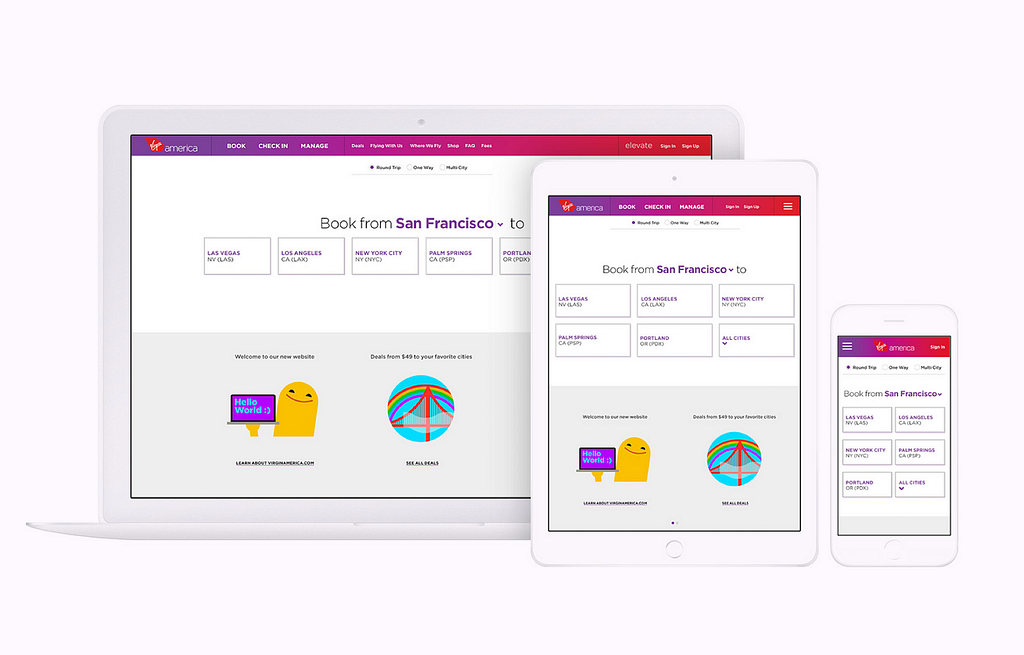
At the heart of the tech industry is a drive for innovation and transformation, and, every now and then, new design standards do go on to spread into other products. In 2014, Work & Co’s Virgin America site redesign was the very first fully responsive airline website, transforming the environment of online travel for the years to come. Before, while a ticket could still be purchased on a phone without a responsive website (with lots of pinching and zooming in, of course), the ability to make a purchase on a website that adapts to any platform transformed how, where, and when we book travel. Websites that fully adjust to any screen size, mobile or otherwise, were only just starting to be adopted. Designing a whole journey that accommodates a purchasing flow from planning to boarding — and that also fits in the palm of your hand — was once a challenge too ambitious even for big players. It’s almost impossible to imagine a world where you can’t book a flight on your phone (or do anything else, really), but technology evolves alongside with user behavior, and we have risk takers to thank for that.

Repetition, repetition, repetition
On the web, we are used to an ever-evolving group of unspoken conventions and norms slowly introduced as people learned how to use personal computers: left-click opens applications, touch-and-hold for more options, and so on. Traditional resources like Nielsen’s 10 Usability Heuristics and Jakob’s Law are some of the tools designers leaned on to start shaping the internet as we knew it almost 30 years ago. Big tech companies followed suit by adopting guidelines, systems, and libraries that streamline the product development process.
Once users are accustomed to a process, adopting a different pattern causes some discomfort, in the best scenario, and worst case, an unusable experience. Experiences that hook users in from the beginning are a crucial part of the process of retaining your audience long-term. An appropriate level of friction — that is, close to none — will most likely play a big role in preventing product abandonment because people find it too difficult to learn how to use it. iOS app retention rates are 25% after day 1, and only about 4% after 30 days, which indicates that people make a quick decision on whether a product is useful to them or not worth their time. Designers don’t want to rely on users offering a second chance, so a product must be as straightforward as possible from start to finish.
This can make introducing new patterns uncomfortable because, as designers, we’ve been taught that once rules are established, you’re not supposed to break them or make major changes in one fell swoop. That is, unless you’re Apple.
Apple’s Notch & Dynamic Island
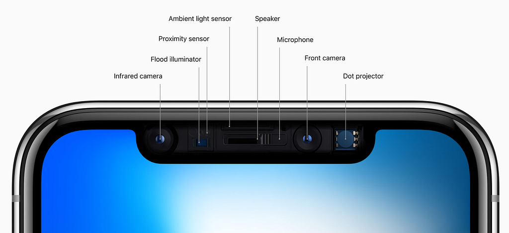
Back in 2017, users expressed mixed feelings when Apple introduced the iPhone X that notoriously omitted the long-established home button, opting instead for Face ID technology to replace the Touch ID sensor. This modification, made to fit in with a brand new bezel-less redesign, also resulted in the highly recognizable — and equally highly controversial — notch.

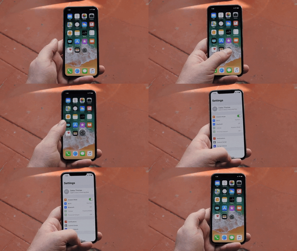
These changes temporarily introduced a new level of complexity to the iPhone’s usability. Still, many loyal fans were happy to quickly learn how to interact with the home indicator: a thin software bar that came to solve how we multitask on the iPhone. On the other hand, a majority of users still want Touch ID to make a comeback, an ask that gained force when face masks began to disrupt Face ID’s effectiveness. As for the notch, it’s still there, even years after competitor flagship phones have innovated with alternate solutions such as hole-punch and under-display cameras.

In fact, not only did Apple keep the notch, it extended the design decision to MacBooks while introducing the Dynamic Island. On iPhone 14 Pro and Pro Max models, users now have quick access to contextual features (such as alerts, activity in progress, timer, and more), both in the home screen and in apps. To access its full potential, a touch and hold interaction expands the Island into a widget-like module that presents more details about the activity in place.
The move to bring the notch and Dynamic island to other products is a decision that highlights Apple’s values, brand and product recognition. This is a wonderful example of an interface design pattern that walks the line between introducing a progressive enhancement and an overly-disruptive new feature. (Remember, “disruptive” didn’t always have the positive sentiment it has today.)

Ultimately, these kinds of decisions should be a balancing act between introducing design patterns that push products forward versus favoring behavioral consistency. That’s not to say considering such impacts on users of all ability levels isn’t important. Older audiences, for example, might have completely different expectations on how much they’re willing to learn each time they interact with a new product. But, if you’re Apple, you can rest assured: Most of your users have shown their willingness to adapt, and will probably embrace otherwise controversial decisions. But it leads to the question: Can other companies be as bold with new patterns?
TikTok’s unfamiliar design patterns
TikTok, for example, has designed a wildly popular platform built around an intuitive interface design pattern that all but eliminates choice. TikTok’s UI keeps users focused on consuming (and perhaps over-consuming) short-format video content. To do so, TikTok was not afraid to break multiple mobile app principles: various undiscoverable swipe gestures, white text overlaid on video, small tappable areas, lack of hierarchy, just to name a few. Still, the app’s habit loop mentality makes users overlook the long and unavoidable learning curve to platform proficiency. Users just getting the hang of TikTok can count on randomly swiping to find what they’re looking for, then discovering features by accident.
With more than 2.6 billion active users in 2022, TikTok is so successful that several competitors have adopted similar design patterns: Reels on Instagram, Stories on Facebook, Shorts on YouTube, Fast Laughs on Netflix, and many others all take advantage of deep-rooted habits users formed on the app. Recently, Twitter announced that they’re rolling out an immersive viewing and discovery video experience and, needless to say, it looks just like TikTok.
While it’s true that people are not necessarily aware of the psychological connections that happen when they interact with products, frustration is often the most immediate response when encountering a foreign pattern in design. We expect user flows to consist of millisecond choices that are so plain and obvious, our brains barely even recognize that we’re making decisions at all. However, the success of both companies speaks for itself.
There’s no arguing that disrupting design patterns can transform how people consume products and content, but are some going too far, forgetting why standards are widely popular and adopted? According to accessibility experts, audiences with cognitive disabilities might have a harder time navigating new patterns, and would certainly benefit from clear, focused content that doesn’t rely on the user’s memory to make sense.
Finding the right new patterns
Each year, Apple excels in hyping up new hardware and software, promising new experiences users will not only love, but will be able to adopt quickly and easily. On the other hand, TikTok’s eventual successors are likely to keep emerging, but will they survive? If it’s true that history repeats itself, consider the fall of the promising app Vine, the viral selfie video app precursor to TikTok, which also banked on endless bite-size content and was shut down mainly due to competition. Companies often jump into trends quickly, motivated by a fear of missing out, only to join a saturated market with more-of-the-same products that ultimately don’t hit the mark in the long run.
In a quest to catch up with the popular vertical feed format, Instagram had a taste of what it feels like for product changes to backfire: In early 2022, the company took a step back and decided to pause TikTok-like changes to the app. The response came after users reacted with negative comments on switching the focus of the photo-sharing feed to a video discovery format. Adam Mosseri, Head of Instagram, stated:
“I’m glad we took a risk — if we’re not failing every once in a while, we’re not thinking big enough or bold enough.”
Mosseri also explained that the move was a natural effort to respond to trends that show a consistent growth of video relative to photos; people now spend 30% more time watching Reels than ever. Instagram quickly realized that they needed to innovate in the video space to cater for diverse audiences, but changing the core of their product so dramatically did not sit well with many users.
Breaking design rules and experimenting with patterns seems to be a risky recipe that works for some better than others, so how should designers decide if and when it’s the right move to push boundaries? We may never have an answer to this question, but the truth most likely lies in the intersection of a convention driven approach and innovation. So, next time you’re designing a new interface paradigm or chatting with an engineer, ask yourself about the risks involved in the known versus the unknown with the following questions.
- Does the new design use intuitive patterns that prioritize consistency?
- Are you in any way disregarding accessibility practices in favor of a feature or a visual direction?
- How tech-savvy are your users and can the newly-introduced experience be easily adopted by current and future, more-diverse audiences?
- Can and will your design decisions be validated through properly conducted user research and user testing?
Being mindful of these practices will help you guide decisions and ensure you don’t change things just because you can. After all, creating experiences that are both disruptive and intuitive can feel like exploring uncharted territory, but standing out from the crowd takes great effort and at least a touch of discomfort.
Disruptive design patterns — an uncharted territory was originally published in UX Collective on Medium, where people are continuing the conversation by highlighting and responding to this story.