Whether you are a big fan of the Demon Slayer manga series or not, this tutorial is a great opportunity to learn new techniques whilst creating the Demon Slayer logo.
This includes how to create the grunge look of the Demon Slayer fonts and how to create the logo’s background circle using only brush strokes. Before jumping in, we’ll briefly learn more about this iconic manga!
About Demon Slayer
This Shonen manga phenomenon has cemented itself as a game changer in recent years. From being the ninth best-selling manga series of all time to having one the best animated adaptations in the industry, Demon Slayer, aka “Kimetsu no Yaiba”, has captured the imagination of millions around the world! Its visual imagery and bold character design have now become just as recognizable as other fellow giants of the genre like Naruto or Dragon Ball.


Whether you’re looking at the Japanese or English version of the logo, you can always tell when it’s demon-slaying time thanks to the characteristics of its highly stylized design. It depicts a jagged, almost slashed, red and black crescent with an equally tattered, grungy, brush-like text that clearly evokes a visceral and legendary feeling. It’s a highly appropriate sentiment given the nature of the story and the topics it covers. After all, this isn’t exactly a comedy.
Unlike with other series, there haven’t been many variations to the logo since it was first published in 2016. While some consider it to be rather basic with only two main colors, you know that sometimes, simpler is better.
What You’ll Learn in This Demon Slayer Logo Tutorial
- How to draw the Demon Slayer emblem in Adobe Illustrator
- How to create the style of Demon Slayer fonts
- How to create the Demon Slayer background circle
What You’ll Need
You’ll need the following fonts in order to complete this project:
1. How to Open a New Document in Adobe Illustrator
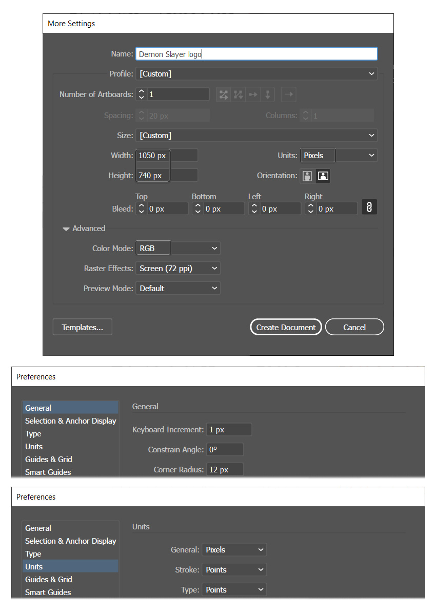
Launch Illustrator and go to File > New to open the New Document window. There, type the name of the document and set up the dimensions as shown. Keep the Units to Pixels and the Color Mode to RGB. Once you’re done, hit Create Document.
In the image below, you can see the other settings that I prefer to use while working in Illustrator. You can access them by going to Edit > Preferences.
2. How to Create the Demon Slayer Logo Text
Step 1
One of the Demon Slayer fonts is actually the main attraction of the logo, which is the grunge-looking Demon Slayer text. Let’s learn how to recreate it in the following steps.
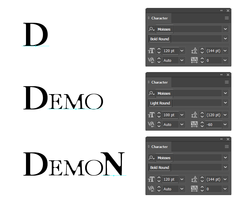
First, grab the Type Tool (T) and start writing the text on your artboard. The font used is Moisses, but we have different settings:
- For the letter D, use the Moisses Bold Round font with a size of 120 pt.
- For the letters EMO, use the Moisses Light Round font, size of 100 pt. In the Set the tracking for the selected characters field, choose -60 to bring the letters closer to each other.
- For the letter N, use the Moisses Bold Round font with a size of 120 pt.
Step 2
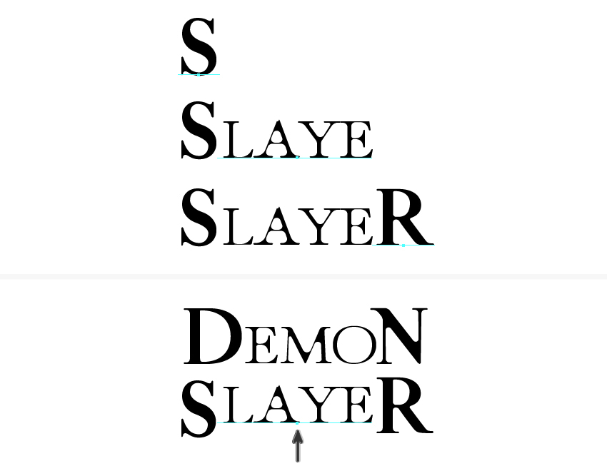
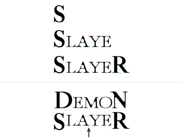
Use the same settings for the word SLAYER. Once you’re done, select only the LAYE piece of text and move it upwards as shown.
Step 3
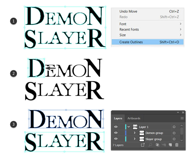
While the text stays selected, go to Type > Create Outlines in order to turn the text font into filled letter shapes. Follow up with Object > Ungroup (Shift-Control-G) (1).
Next, select only the letter D and make it thinner by dragging the bounding box from the right side to the left (2). Before you continue, make sure to Group (Control-G) all the letters in the word DEMON and make another group with all the letters in the word SLAYER (3).

Step 4
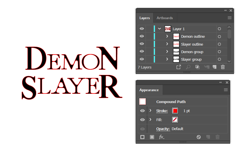
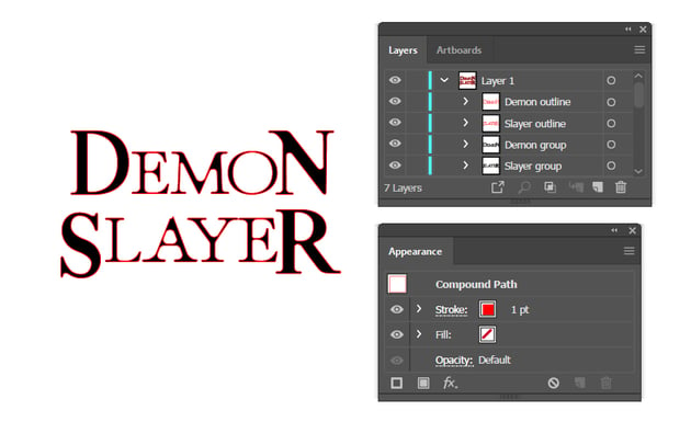
Copy and Paste in Place (Shift-Control-V) the two groups of letters. Remove the black fill color and just apply a 1 pt Stroke using red or any other color.

Step 5
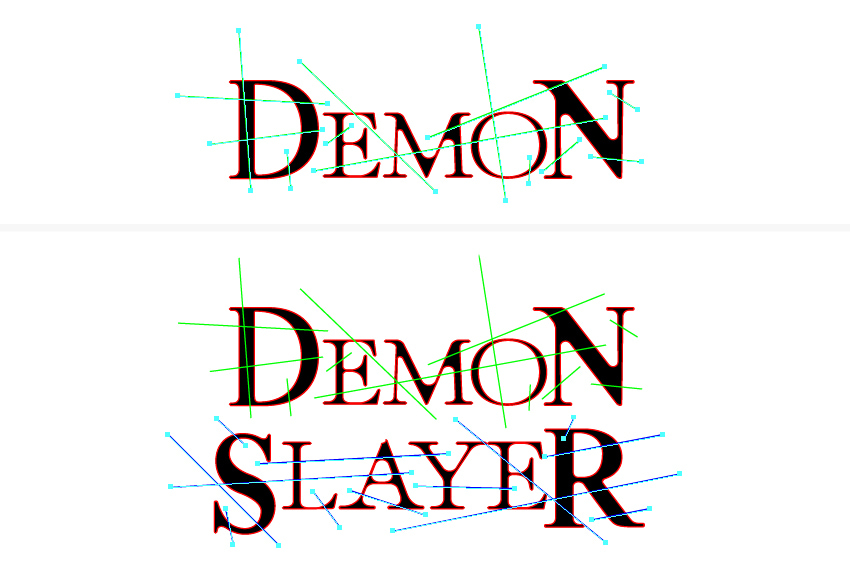
Next, grab the Pen Tool (P) or the Line Segment Tool () and draw a bunch of straight lines over the word DEMON. What we are trying to achieve here is to cut the word into small pieces.
Once done, continue to draw lines over the word SLAYER too. In the end, make sure to Group (Control-G) all the green lines and make a separate group of all the blue lines.

Step 6
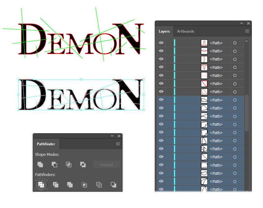
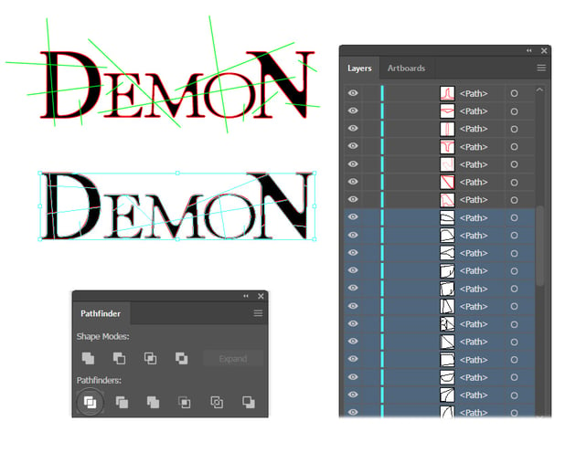
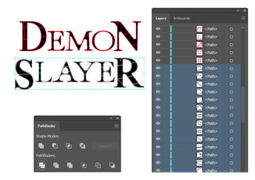
Let’s focus on the word DEMON for the moment. Select the red outline along with the group of green lines, and press Divide in the Pathfinder panel. This will cut the letters into small pieces.
Before you continue, open the resulting group of small red shapes in the Layers panel and, at the end of it, you will find a bunch of shapes having no stroke and no fill. Remove all of them.

Step 7
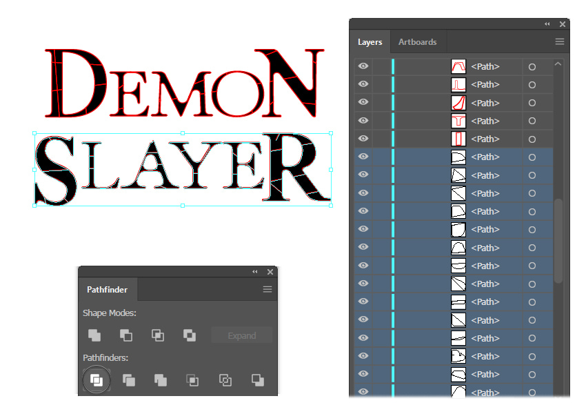
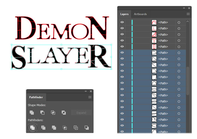
Repeat the technique explained in the previous step for the word SLAYER. Select the red outline along with the group of blue lines and press Divide in the Pathfinder panel. After that, go to the Layers panel and remove all the no-stroke and no-fill shapes from the resulting group of small red shapes.
Step 8
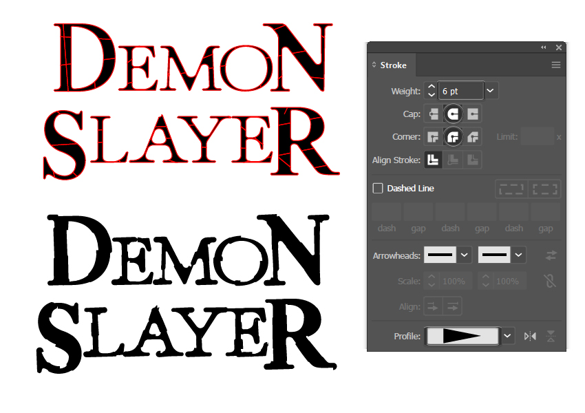
At this stage, we will obtain the grunge look of the Demon Slayer logo text. Select the group of small red shapes over the word DEMON and replace the existing 1 pt red Stroke with the following settings:
- Stroke Color: black
- Stroke Weight: 6 pt
- Cap: Round Cap
- Corner: Round Join
- Profile: Width Profile 4
Continue with the word SLAYER and apply the same settings to obtain the rough look. The logo text is starting to look like the original Demon Slayer symbol, right?


Step 9
Once you’re done with all the black grunge strokes, select everything on your artboard and then Copy and Paste in Place (Shift-Control-V) to make copies of the entire logo text. Follow up with Object > Expand Appearance to expand all the strokes.
While the copies of the logo text are still selected, press Unite in the Pathfinder panel, followed by Object > Compound Path > Make. You will obtain a compound path of the entire Demon Slayer text, like the blue one in the image below.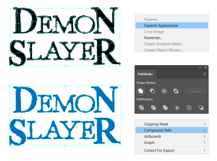


Step 10
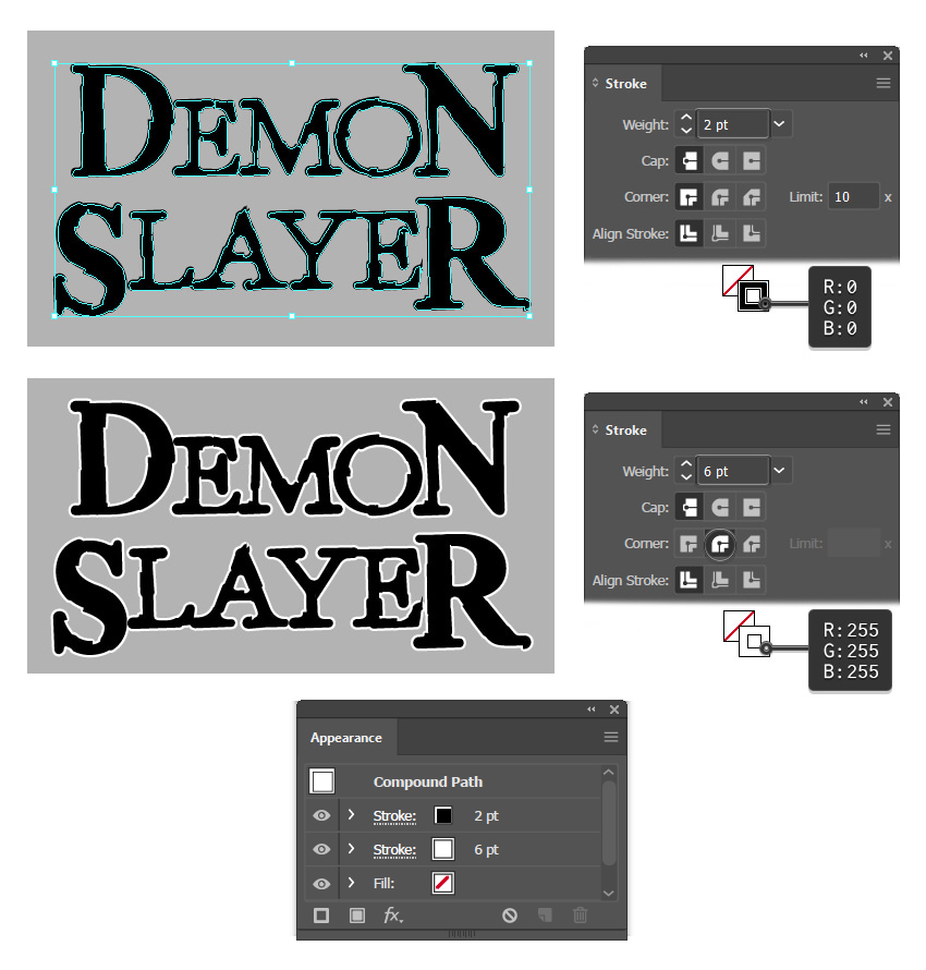
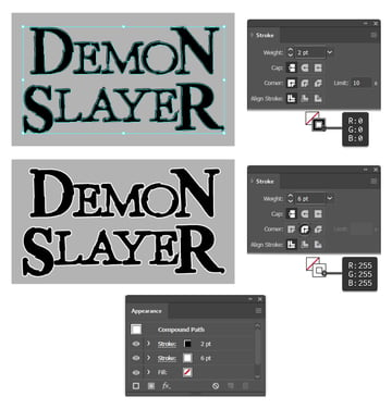
Send the compound path obtained in the previous step behind everything by going to Object > Arrange > Send to Back (Shift-Control-[). Give it a 2 pt Stroke using black to make the text a bit bolder.
Add a second stroke attribute by clicking on Add New Stroke at the bottom of the Appearance panel. For this one, apply a 6 pt Stroke using white, and press the Round Join option in the Stroke panel.
The Demon Slayer vector text is done at this point, and we will continue with the background circle behind it.

3. How to Create the Demon Slayer Symbol Background
Step 1
The Demon Slayer emblem comprises the big Demon Slayer text and the background circle with the moon-like black and red strokes. We will create a very similar background in the following steps.
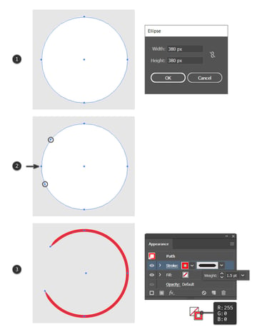
Grab the Ellipse Tool (L) and draw a 380 x 380 px circle on your artboard. Choose white as the fill color (1). Switch to the Add Anchor Point Tool (+) and add extra two points on the left side of the circle as indicated. Next, select only the middle left point of the circle using the Direct Selection Tool (A), and press the Delete key on your keyboard to remove it and cut the shape. You will now have an open path (2).
Apply a 1.5 pt Stroke using bright red, and use the Tapered Stroke Art Brush that you can find by going to Brush Libraries Menu > Artistic > Artistic_Ink (3).


Step 2
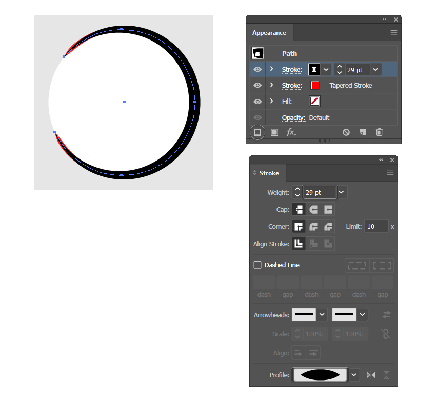
While the path stays selected, add a new stroke attribute by pressing Add New Stroke at the bottom of the Appearance panel. Choose a 29 pt Stroke using black and the Width Profile 1 in the Stroke panel.


Step 3
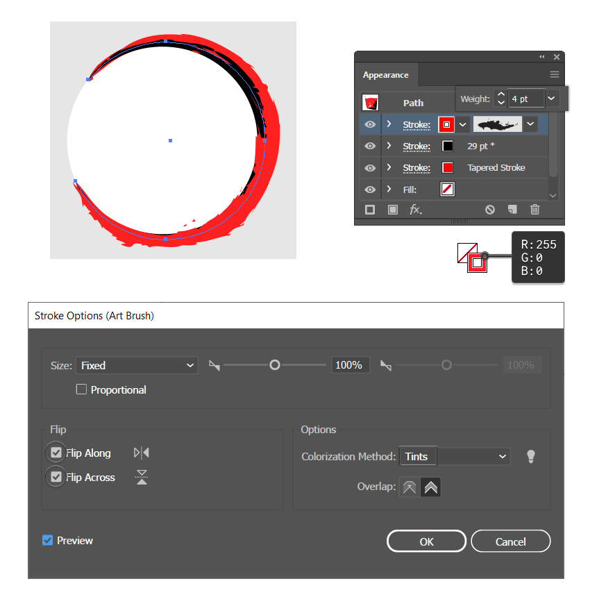
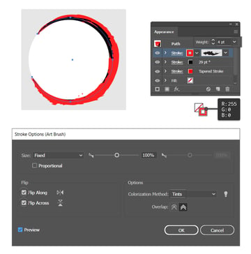
While the path is still selected, add a third stroke attribute at the top of the Appearance panel. Apply a 4 pt Stroke using bright red and the Charcoal-Rough Art Brush, which you can find by going to Brush Libraries Menu > Artistic > Artistic_ChalkCharcoalPencil.
Next, double-click on this stroke attribute in the Appearance panel to open the Stroke Options window. There, make sure to check the Flip Along and Flip Across boxes. Also, choose Tints as the Colorization Method so the stroke looks nice and red. Hit OK.

Step 4
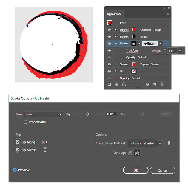
While the path is still selected, add a fourth stroke attribute in the Appearance panel, but position it above the first red Tapered Stroke. Apply a 5 pt Stroke using black and the Charcoal-Rough Art Brush again. Open the Stroke Options window, and make sure to check the Flip Along and Flip Across boxes. Choose Tints and Shades as the Colorization Method so the brush looks nice and black. Hit OK.
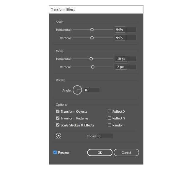
Keep the path and this stroke attribute selected in the Appearance panel, and apply the Transform effect by going to Effect > Distort & Transform > Transform.

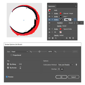
Here are the settings for the Transform effect. We are basically scaling down this black Charcoal-Rough stroke and moving it to the left so it becomes more visible under the red Charcoal-Rough stroke. Hit OK.


Step 5
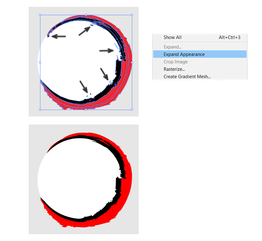
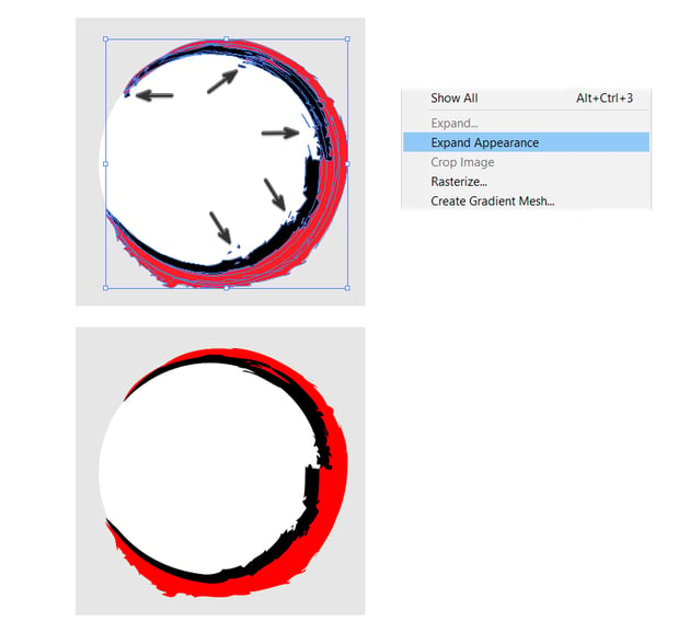
Select the stroked path and go to Object > Expand Appearance in order to turn all the brush strokes into filled shapes. If all the shapes are colored with bright red and rich black, then this is the time to fix this. Also, use the Direct Selection Tool (A) to clean up the background a bit by removing some of the tiny pieces that are loose.

Step 6
We are almost done. Let’s add just a few more details at the top to make it as similar to the original Demon Slayer symbol as possible.
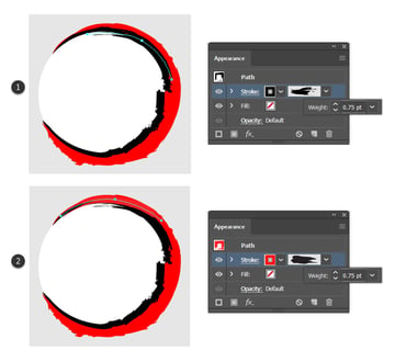
Use the Pen Tool (P) to draw a curved path at the top as shown below. Give it a 0.75 pt Stroke using black and the Quick Brush 1 Art Brush that you can find by going to Brush Libraries Menu > Artistic > Artistic_Paintbrush. In the Stroke Options window, check the Flip Along and Flip Across boxes and choose Tints as the Colorization Method (1).
Continue to draw another curved path at the top of the circle background. Give it a 0.75 pt Stroke using red and the Brush 3 Art Brush from the Brush Libraries Menu > Artistic > Artistic_Paintbrush. In the Stroke Options window, make sure to check the Flip Along box and set the Colorization Method to Tints (2).


Step 7
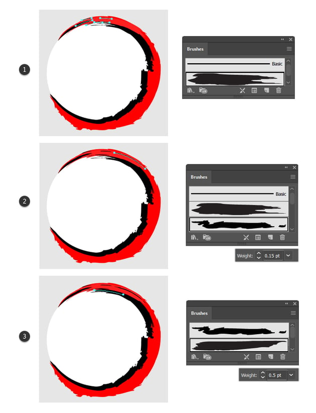
Still using the Pen Tool (P), draw a few more paths at the top, but much shorter this time. Use the Brush 3 Art Brush again and the stroke color black, but choose a different Stroke Weight for each one, like 0.05 pt, 0.1 pt, and 0.15 pt (1).
Draw the next path in the upper right side of the circle background. Give it a 0.15 pt Stroke using black and the Dry Brush 10 from the Brush Libraries Menu > Artistic > Artistic_Paintbrush. This is another important detail stroke (2).
The last path is just under the big red stroke at the top. Apply a 0.5 pt Stroke using black and the Brush 1 Art Brush from the Brush Libraries Menu > Artistic > Artistic_Paintbrush. Set the Colorization Method to Tints and Shades so the brush looks rich black (3).


4. How to Complete the Demon Slayer Vector Logo
At this point, the Demon Slayer logo text is ready and the background is ready, so all we have to do is to put everything together.
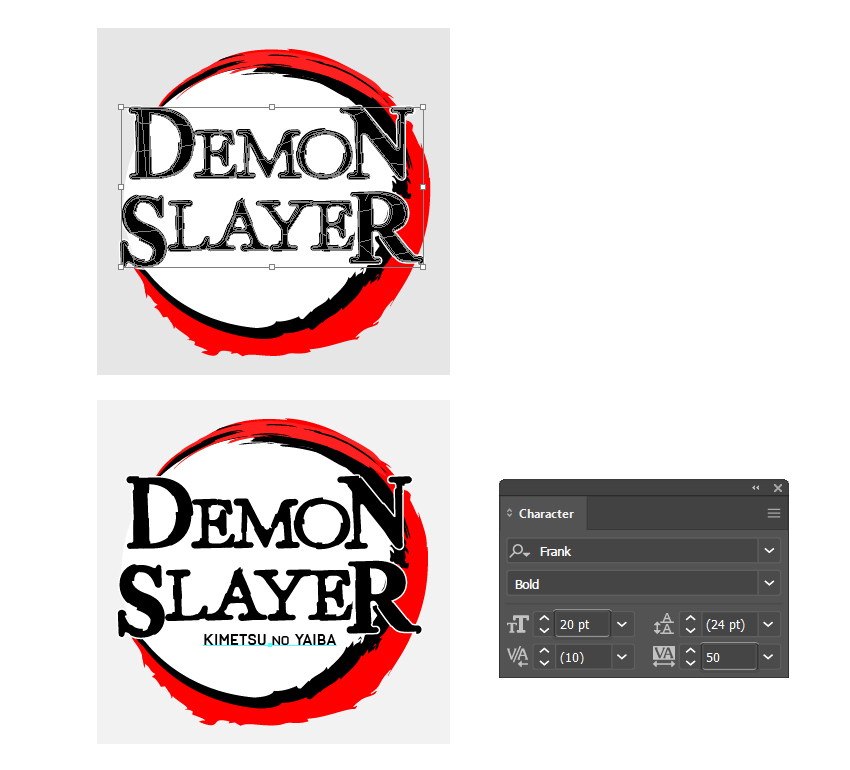
First, position the Demon Slayer text that you made in the first part of the tutorial over the background. Next, use the Type Tool (T) to write KIMETSU NO YAIBA using the Frank Bold font, size of 20 pt. Still using the Type Tool (T), select only the NO letters and reduce the font size to 17 pt. Also, choose a value of 50 in the Set the tracking for the selected characters field in order to add more space between the letters.
These are the two Demon Slayer fonts that appear on the original logo.
Fandom fact: KIMETSU NO YAIBA means “Blade of Demon Destruction”.


Congratulations! You’re Done!
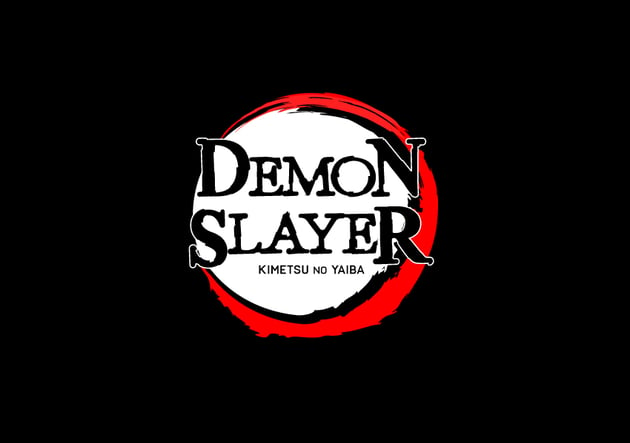
Here is how your Demon Slayer logo should look. We have a white version and a black version. You can also save it as a Demon Slayer logo PNG with transparency and use it on any other colored background that you want.
I hope you’ve enjoyed this tutorial and will apply these techniques to create other unique grunge logos in your future projects.
Feel free to adjust the final logo and make it your own. You can find some great sources of inspiration at Envato Elements, with interesting solutions to improve any logo, from other cool fonts to textures.




Popular Grunge Fonts From Envato Elements
Envato Elements is an excellent resource for logos and grunge or decorative fonts. Here’s a short list of some of the most popular fonts that you can find.
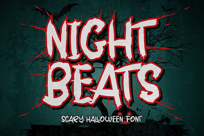
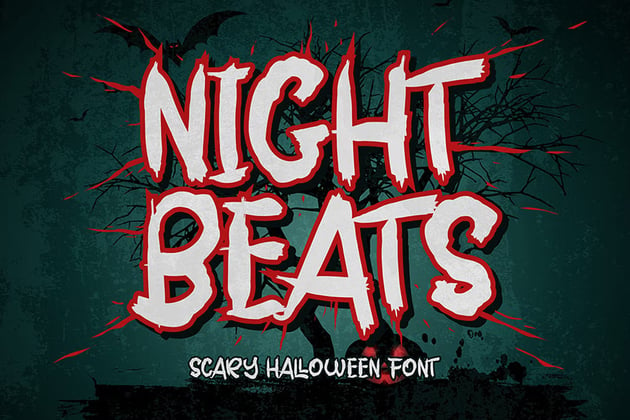
Night Beats (OTF, TTF, WOFF, WOFF2)
Here’s a font that could successfully work in this Demon Slayer vector logo too. It’s a strong brush font with a scary look. Give it a go!

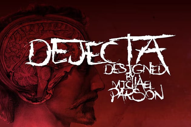
Dejecta (OTF)
You will definitely create an original logo or any design with this rough and ragged font. Include it in your projects as the main attraction.


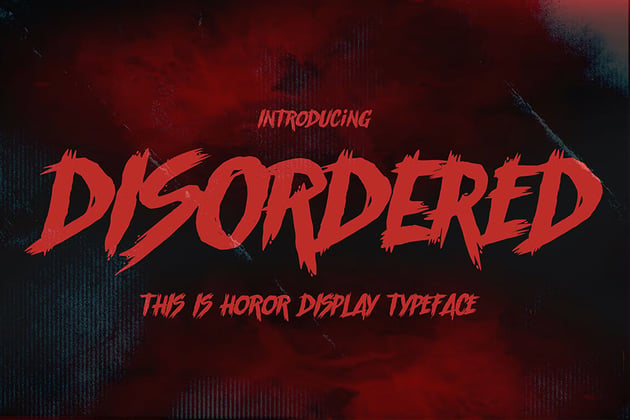
Disordered (OTF, TTF)
Here is another rough brush font. It’s great for your next creative project such as logos, cards, poster designs, and so much more.

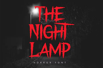
The Night Lamp (OTF, TTF, WOFF)
A font designed to give a scary look that will look perfect on your next poster, comic, or book cover design. Take your designs to the next level!


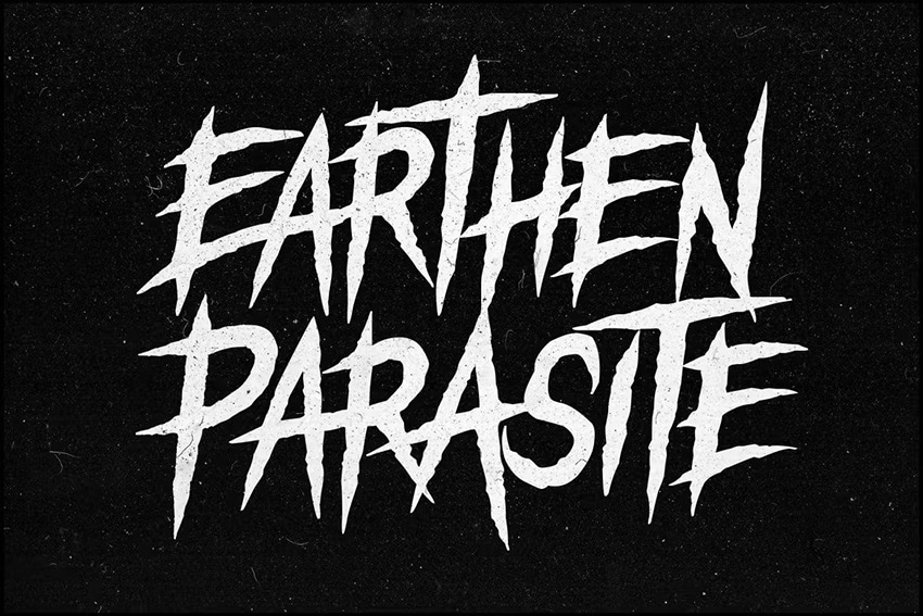
Earthen Parasite (OTF)
If you are looking for impact, drama, and chaos, then Earthen Parasite must be your choice. It will definitely impress and stir up the waters.


Want to Learn More?
We have loads of tutorials on Envato Tuts+, from beginner to intermediate level. Here’s a short but sweet list specially made for you. Take a look!