Mental models to help you mature your work and deliverables.

This article is part of the UX Translations series. It was originally written in portuguese by Camila Gaidarji via UX Collective 🇧🇷 and was translated to english with the intention of helping more designers and reaching an even wider audience. You can check the original article at the link below:
Sete modelos mentais para UX Writing
User experience areas are increasingly on the rise. Many companies say they need this professional, and many professionals are training.
I migrated from advertising to UX in 2020, so I came here to share the most important experiences in my work process.
1. UX Writing is business
Like all occupations within a company, UX Writing exists because the market has a demand and the products/services need a better experience. Not only visual, but also written.
There is a lot of talk about using user experience to change people’s lives, to be more empathetic, to change everything. But if we put our feet on the ground:
The role of the UX Writer is to know how to combine the company’s positioning and objective with the user’s need and semantics.

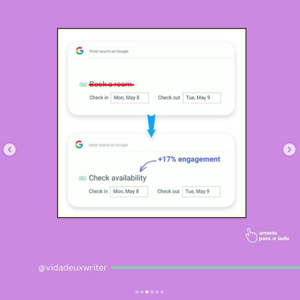
Google got 17% more engagement by changing “Book a room” to “Check availability”.
The user was probably anxious and believed that in the first version he would already be committing to the booking.
If we look at the whole process, the user didn’t even enter the site yet, nor read information about the hotel or location. The user is just searching. The phrase change makes perfect sense with the navigation flow and information architecture.
2. You won’t always write in a funny, cool or super light way
With more and more applications and products from outside Brazil delving into UX Writing, we see many fun interactions through language: Slack, Spotify, Nubank, Mailchimp and many others.
Here we put our feet on the ground: this language does not always make sense in the brand you work on. And it doesn’t even make sense to the user who will read your text.
The role of the UX Writer is to make the interaction useful and guiding, in a way that the user has no doubts about what they are doing or need to do. All of this within the brand’s tone of voice.

Now answer:
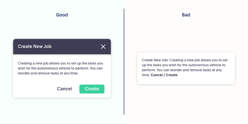
Which company would you say this communication is from?
From a government page? From a sports brand? From Apple?
Even if I don’t show the brand, some sectors don’t even cross our minds. Because tone of voice makes all the difference in UX Writing.
Communication is from Slack.
3. UX Writing is not just about reducing text or using few words
“But why did your change make the text bigger?”
- Because the user needs more instruction to perform the task.
- Because some business rule prevents a simpler explanation.
- Because a sentence solves the problem that a single word would not…
The role of the UX Writer is not just reducing text and turning everything into a button. It’s solving problems by aligning the text with the design we’re delivering to the user.
This text by Yael Ben-David talks about exactly that and also about the myth that people don’t read, when, in fact, they read everything that is useful for them to achieve their desired goal.
4. UX Writing changes UX/UI Design, yes!
We often get into the Writing box and forget the UX that is in front of our position. Looking at the experience is looking at the whole, is understanding how each layout, text and flow communicate with each other and with the user.
The UX Writer’s role is also to talk to the UX Designer and change the layout, the flow order or whatever else you need when an information/guidance that needs to be provided is not delivering what the user needs.
We don’t just look at the text, we look at how everything is interpreted in a screen.
![Good and bad form UX Writing examples. The good one shows an error message below the field that caused the error: “Oops! This doesn’t look like a valid email address. Try adding ‘@’ before the domain name. [Link to] Accepted email formats”. The bad UX Writing example shows the error message on the top of the page and doesn’t indicate visually what field is wrong. The message reads “validation fault — format does not match database. Invalid entry.”](https://cdn-images-1.medium.com/max/828/1*IUyiCsLG4TRp73b2lIpFfw.png)

More texts were necessary to better guide the user. As a consequence, we see a change in the layout and information architecture within the screen.
Design and Writing need to be aligned to work.
5. Seek language standardization
Standardization is conciseness’ synonym in UX Writing. The user needs to see patterns to correlate the brand’s tone of voice, the flow of the screens they are navigating, what action they need to execute, what happened before and what will happen after.
It is the role of the UX Writer to seek language standardization, use the same nomenclature for the same thing on all screens and at all navigation levels, offer a summary screen and a guidance feedback.

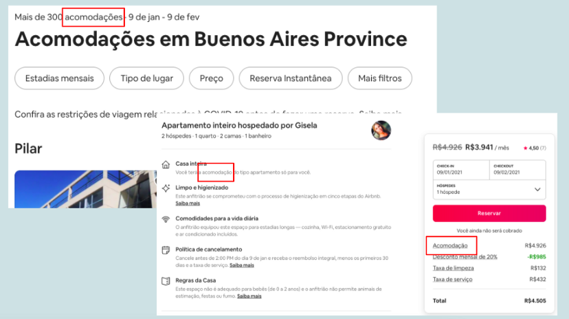
On the Airbnb website, we see the word accommodation (“acomodações” in Portuguese) being used at three different moments, which delivers conciseness, standardization and identification of what is being referred to at any given moment. This has everything to do with a company’s Language Guide. Ludmila Rocha wrote about the process of creating a guide she helped create:
Como começamos a estruturar UX Writing na Conta Azul com um guia de redação
And Rogerio Menale wrote about the construction of Loggi’s glossary:
Construindo o Glossário da Loggi
6. Text only becomes UX Writing when it finds the user
Without user research, UX writing would be nothing. It would actually be copywriting or web writing. While your text is on the screen just for your team, it is nothing more than a simple text, an alternative solution.
It is the role of the UX Writer to understand, in user tests, if those words and phrases are making sense, being interpreted in the right way by the user; only then the text becomes UX Writing.
I talked more about this in Design 2021, take a look:
UX Writing: o desafio constante de aprender a se comunicar – Camila Gaidarji | Design 2021
7. Oxygenate knowledge
UX is an area of technology that is updated all the time: there are always new tools, new concepts, new research. It is important to be aware of what is happening in the world, in my country and in my city within my area of expertise.
Some things I’m always on the lookout for:
⠀
Brazilian content
- UX Collective 🇧🇷 →
- Ladies That UX 🇧🇷 →
- UX Writing Brasil →
- iFood Tech →
- Loggi Design →
- UX para Minas Pretas (Community for black women) →
The routine of a UX Writer is being increasingly explored and detailed. I hope my seven mental models can help you too.
Follow me on LinkedIn for more content!
Seven mental models for UX Writing was originally published in UX Collective on Medium, where people are continuing the conversation by highlighting and responding to this story.