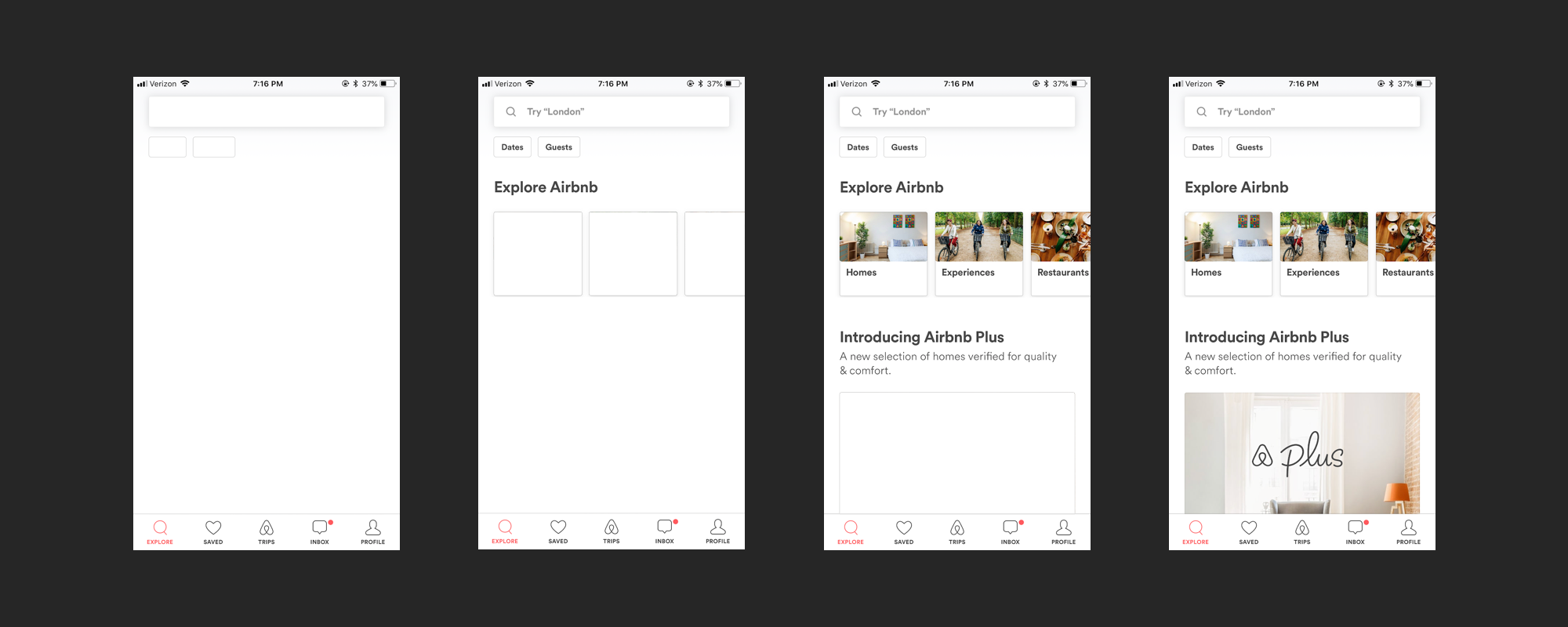
When I started off in design, I sucked.
I was obsessed with copying pieces of the trending Dribbble shots, but oblivious to how all the pieces worked together. If you could see the harsh drop shadows and unnecessary flourish I added to things, you would gasp in horror.
Though I was no product design prodigy, I figured out how to quickly hack together the skills I needed. And now I want to share one of those lessons with you. Whether or not you’re a designer, this exercise will help sharpen your product sense and improve your eye for design.
Don’t just use apps, study them
You develop your design eye by thinking as if you were the designer of a product. Open an app you use often and resist the urge to start scrolling through content. Instead, I want you to actively focus on the screen in front of you. Here are some things to keep in mind:
Hierarchy
How does the design guide your focus? What information is highlighted? How does color and text treatment signal the importance of certain elements?
Content
What specific wording was chosen for this experience? What content is visible and more interestingly, what content isn’t? How is spacing used to frame the content?
Intent
Why would someone open this app? What problem does it solve? How could the design help to solve that problem even better?
Audience
Who are the people using this product? How might their use cases be different from yours? How does the design serve these use cases?
