Sweetgreen seems to have its mind in the right place when it comes to embracing present and future technologies to offer an amazing UX.
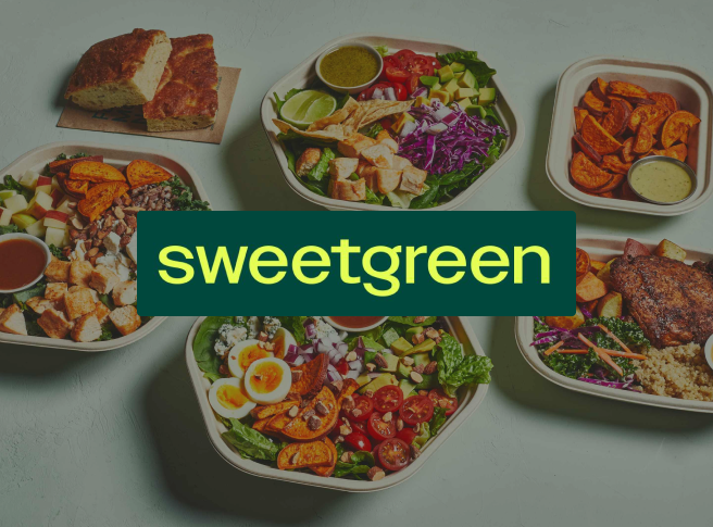
Sweetgreen has come a long way since opening its first Washington, D.C. salad bar in 2007.
15 years have passed, and they are now on track to reach over 200 stores, raised around $0.5bn, and are positioned as a Millennial culture powerhouse: beyond a salad bar, it is a lifestyle brand associated with healthy and sustainable food, design, and technology.
Positioning themselves as tech-driven is a core part of their strategy: at the most recent mandatory release as a public company, the word “Digital” is mentioned 104 times, compared to Chipotle’s 18. Financially, 68% of their revenue came through Digital Channels.
As a designer and Sweetgreen customer, seeing how they are betting on bits and atoms to make healthy eating ubiquitous made me curious. Let’s see how they are using technology to provide a better User Experience and “rewrite the future of food”.
A forward-thinking food platform
On a Medium post entitled “Why a Salad Company has a Tech Team”, they explained how they see technology: “We’ve always acted more like a tech company than a food one. Like many tech companies, we want to disrupt”.
And it’s not just small talk.
In 2021 they acquired Spyce, a robotics startup that built fully automated restaurants near the MIT campus. More recently, Sweetgreen announced they’ll release two fully automated units throughout 2023 using Spyce’s technology.
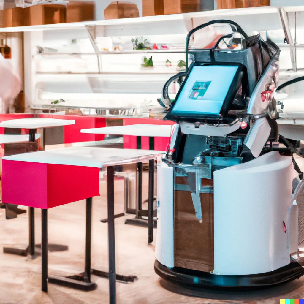
If it works, the model can solve two big variables in fast casual UX:
- Speed from ordering to eating;
- Consistency of meals, making sure taste and portion sizes are standardized throughout different stores or from order to order.
Taking care of those points would open up space for staff members to focus on hospitality and support, which would be the icing on the cake for a better user experience.
But let’s take a step back.
They currently have over 500 outpost locations taking orders exclusively through mobile, which will likely be the main interface between users and the company as the years pass. Before having a robotic kitchen, it’s important to nail the experience around such available and already relevant technologies.
And they’ve done it masterfully.
Five years ago, Sweetgreen partnered with Gin Lane and Olo, two of the best design agencies in the world, to build the first version of their native mobile app. More recently, they’ve fine-tuned their brand and online presence with Collins before becoming a publicly traded company.
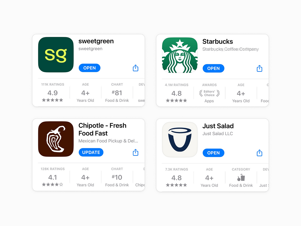
We’re still some time away from robots fully running the show, but it’s already possible to see the returns of that relentless focus on tech: Sweetgreen’s app on the App Store is one of the best-rated between competitors such as Chipotle, Just Salad, Cava or even Starbucks.
Best-in-Class Mobile App
Let’s dive deep to understand what they are doing right in terms of their app’s UI.
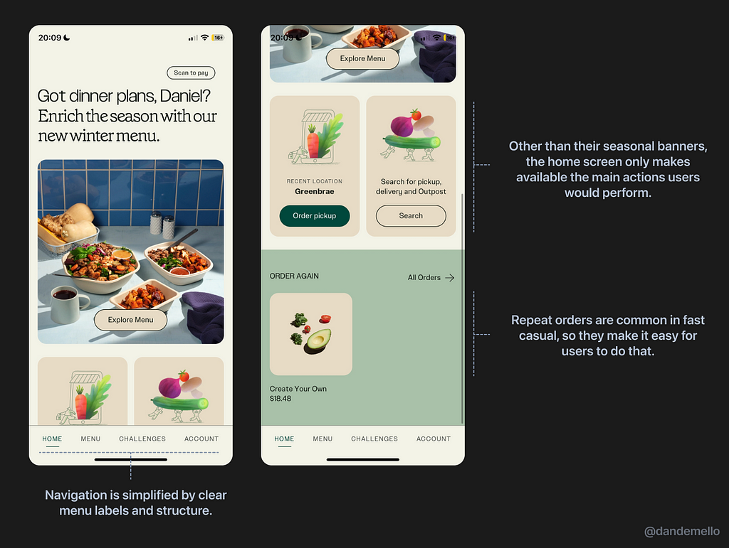
Discoverability and navigation
One of the ways to butcher an experience that combines bytes and atoms is to make an app “too much” in a way that it becomes an obstacle for the job the user wants to be done: ordering and successfully receiving their food.
For that, ease of discoverability and providing obvious next actions are key. Sweetgreen does that well by structuring the app with only four tabs and leveraging the home screen to let the user easily perform likely next actions, such as reordering.
The app’s illustrations are also discrete, with the only bright and colorful sections being either drawn ingredients or meal imagery. Such contrast have the function of calling attention to the drawn or pictured meals, which should speak to users at a biological level (likely causing hunger).
Another nice detail is how they barely use any Icons throughout the app. It’s an interesting choice because Icons have more “meaning per pixel” than words have and therefore take more of a user’s attention. Leaving them out enhances the contrast between the selected images and illustrations and the rest of the elements chosen on the app.
Seamless ordering experience
We’ve seen how users can easily start that process through the home screen, but the next steps on the checkout funnel are also well thought through.
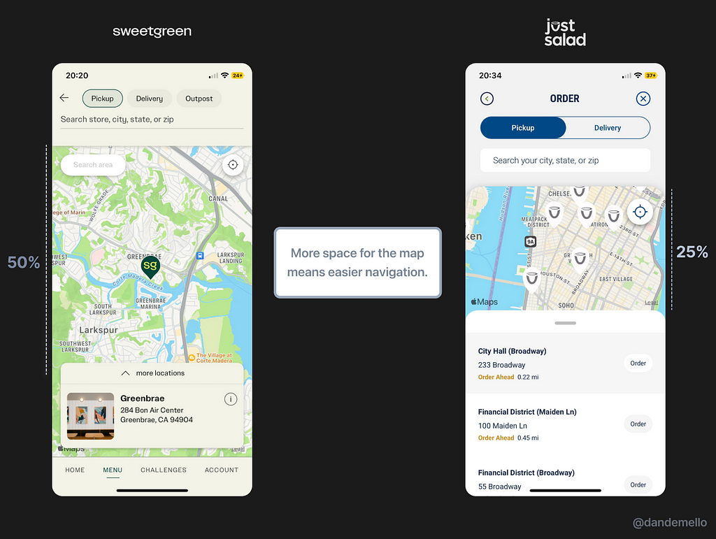
On steps such as the order location, they achieve a nice balance between making the map available for interaction and showing information about units around you.
If we compare their design with Just Salad’s, a competitor chain, Sweetgreen uses 50% of the screen to let you navigate, whereas Just Salad uses over 25%. The ability to navigate is especially important if units that are close to each other, such as the map from Just Salad shows.
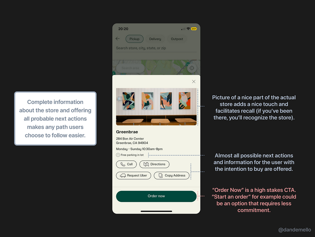
A pleasant surprise also happens when you expand on any individual store: complete information about the chosen store and basically all possible next actions the user might take are available, even the possibility to request an Uber.
On a not-as-positive note, the “Order now” button doesn’t actually bring you to finish an order. Instead, it lets you start building your meal. Choosing a CTA with lesser stakes might ease the feeling of commitment involved in clicking that button.
Intuitive customization
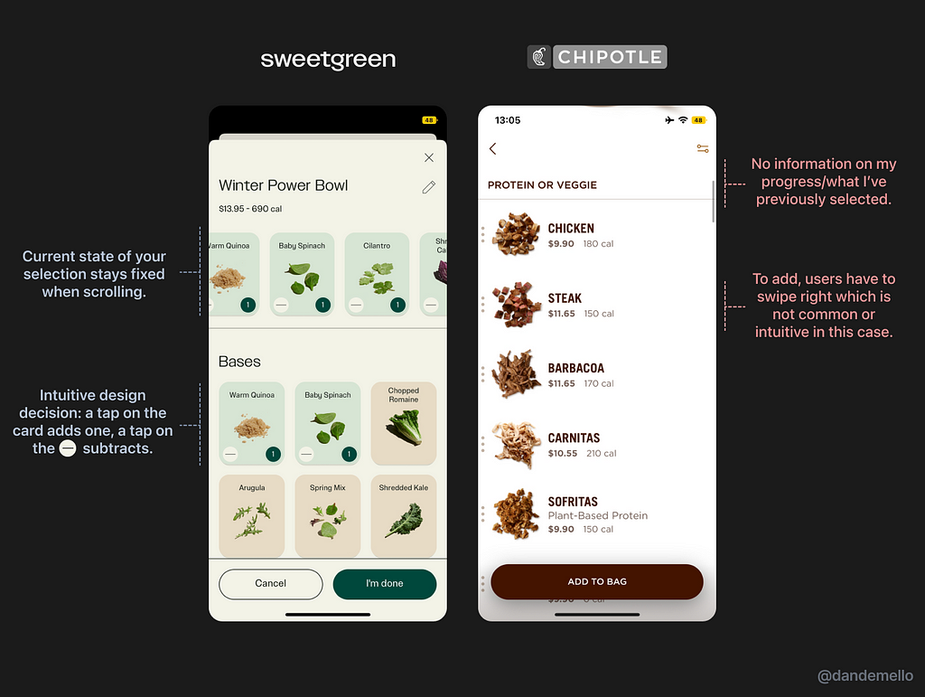
One of the big advantages I find in ordering online is the fact that is easier to customize meals on mobile compared to explaining the changes at the store when music is playing, and servers are wearing masks.
Sweetgreen makes this benefit even easier with good design: The screen that lets you add or subtract ingredients is intuitive and makes you always feel in control by showing what you’ve currently selected. Chipotle, as comparison, chooses differently and ends up with a poorer result.
That’s especially important considering how on both chains there are over 50 ingredients to choose from.
I also find the choice of showing the total cost and calories on top is better compared to choosing to show on each row: in the end, users are interested in what will be the total outcome of their whole meal instead of just on an item-by-item basis.
Incentives and improvement strategy
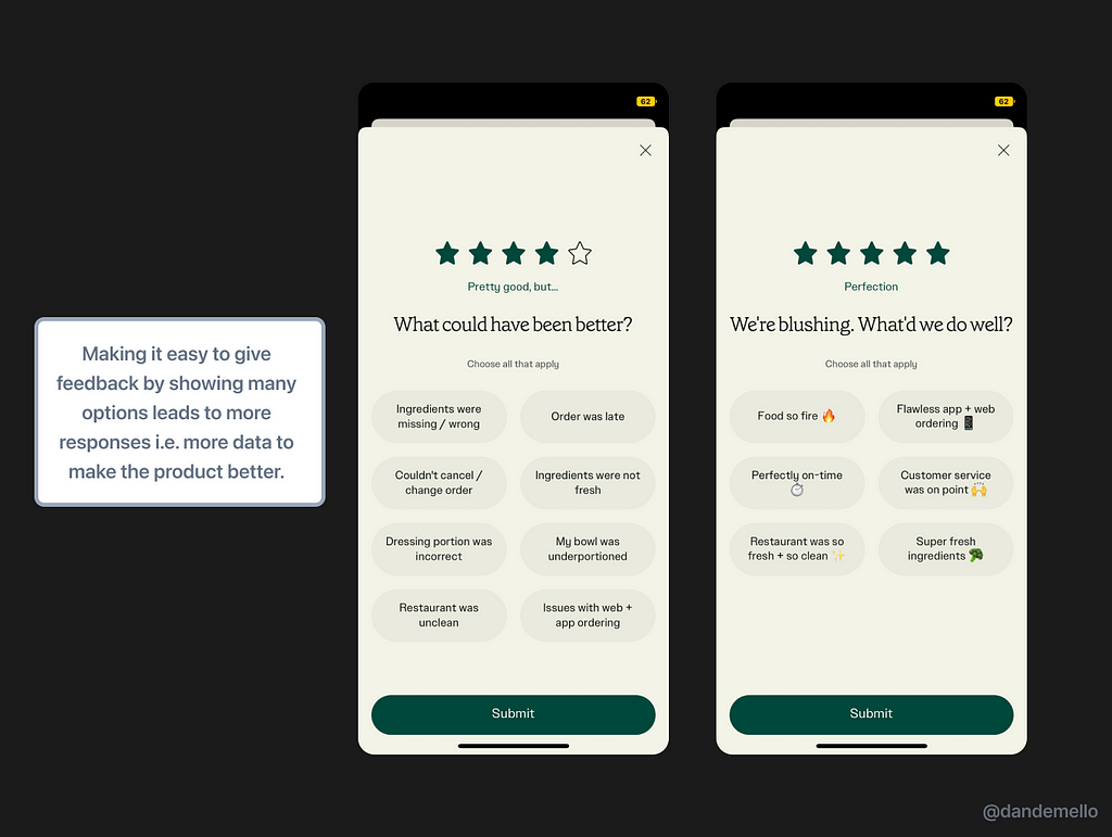
Familiarizing users with their app has many benefits, a straightforward being one that an extra customer might mean extra feedback they get on how to make their digital experience better.
To push users to order they’ve been rolling out incentives such as meals that can only be ordered on mobile. On the feedback end, after every order they’ve made it easy to provide feedback — it only takes two clicks. As behavioral scientist Richard Thaler says, “if you want to get somebody to do something, make it easy”.
That gives them the opportunity to create a flywheel effect in a true tech-company fashion.
Conclusion
The road ahead is not easy: the company’s stock has been down 60% for the last 12 months due to investors' worries about profitability.
While it’s true that they are currently not efficient as Chipotle or as prevalent as Starbucks, Sweetgreen seems to have their minds on the right place when it comes to embracing present and future technologies to offer an amazing experience for customers.
Only the future will tell how effective this strategy will be.
If you liked this, I post similar content on my Twitter.
Thanks for reading!
![]()
The UX of Sweetgreen was originally published in UX Collective on Medium, where people are continuing the conversation by highlighting and responding to this story.