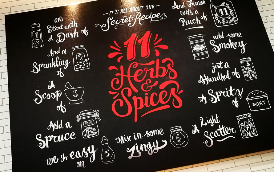
Often, when crafting meal plan graphics, we tend to overlook the fact that our designs need to do more than just convey information – they should feel appealing, trigger emotions, and even stimulate the sense of taste magically.
So, let’s explore the recipe for a killer meal plan design.
The ingredients? A canny use of color theory, typography finesse, and sharp layout strategies that foster understanding with ease.
Just roll up your sleeves – it’s simpler than you think.
Color Theory: Stirring up the Appetite
Most food establishments utilize a specific set of colors in their branding. That notion has roots in color theory – an essential principle in the realm of design that holds the key to an effective meal plan design.
Experts agree that red is the color that stirs appetites, but we’re testing new flavors this year.
Let’s grab our brushes and create a meal plan that will make eyes widen and stomachs rumble in anticipation. We’ll begin with the color of the year for 2024 – according to Sherwin Williams and Benjamin Moore – Blue.
A touch of this tranquil hue on your meal plans could evoke feelings of safety and trust, drawing your audience to discover meal recipes from Green Chef with more interest and gusto.
Fun fact: Blue is said to suppress appetite, making it a color-du-jour for health-focused meal plans. However, be prudent with this hue. Too much may tip the appetite balance in the opposite direction.
Typography Tricks: Clarity and Engagement on the Menu
Kinetic typography is making significant waves. This graphical greatness injects life into static letters by utilizing motion and animation, adding more than just depth and context – it brings personality to your meal plans.

Another intriguing trend gracing our digital presence is the use of 3D type, specifically “bubble text.” Sprinkling designs with a playful and joyful vibe, bubble text invites more eyes and, inevitably, more engagement.
Picture this: Alluring 3D fonts dazzling your audience with meal names like “Zesty Lemon Tilapia” or “Tex-Mex Style Quinoa Bowl” – now that’s enticing!
Layout Strategies: Plating your Meal Plan Design
Here are some 2024 layout strategies that will help transform your dish (meal plan design) into a visual cuisine:
- Embracing Patterns: Patterns are in vogue. Experiment with checkerboard, block prints, or organic shapes, adding a subtle buzz, and especially handy when trying to highlight distinct sections in the layout of your meal plan.
- Eco-friendly Packaging: With the growing consciousness about climate change, designs are becoming greener. While this trend overtly manifests in physical packaging, it also influences digital design.
- Minimalistic Graphic Real-estate: Chris Wilson of STCKMN proposes a design challenge worth considering – creating distinct, stand-out graphics with increasingly limited space. This encourages ingenuity, demanding an efficient and effective use of your layout space when showcasing meal recipes, nutrition facts, etc.
- Surreal Landscapes: Danielle LaRoy from Goodside Studio predicts an upcoming trend favoring opulent, richly detailed worldscapes. This surreal tendency can be tempered with experimental and ornate typography, balanced with a sharp brand voice. For meal plans, think imaginatively – a lush, vegetable garden backdrop, perhaps for vegetarian meal plans?
- Kinetic Typography: Fast becoming the show-stopper of the design world, kinetic typography can elevate your designs. Animating your textual elements will not only create an engaging visual journey but also allow information to be consumed smoothly.
Visualize your layout like a well-plated dish – easy on the eyes and aligned with the flavors you aim to highlight.
Applying Design Principles: Whisk, Mix, and Serve Your Meal Plan Design
Now that we’ve stirred up some design knowledge, let’s scramble it into actionable exercises:
- Imaginary Client: Imagine that a personal Chef has approached you to design their meal plans. Sketch the branding, typography, color palette and incorporate specific trends. This hands-on approach puts principles into practice and tunes your design skills.
- Drawing and Sketching: Draw out meal plans, focusing on the layout strategy. Play with arrangements, patterns, and spaces. Dab a bit of blue on that plate to make it special.
- Join a Group: Engaging with a community of designers can be a goldmine of learning, feedback, and inspiration. Websites such as Behance, Graphic Design Junction, Dribble, or local meet-up groups can provide such opportunities.
- Read Books: Design books provide a depth of knowledge unmatched by most online content. From color theory to typography techniques, these literary gems can add weight to your design muscle.
With these exercises at your disposal, you’re geared to venture into the world of exciting, engaging and effective meal plan designs.
Conclusion: From Concept to Cuisine – Your Meal Plan Design Journey
Whether you’re dabbling with patterns, experimenting with kinetic typography, or exploring eco-friendliness, continuous learning and application of these design principles will enhance your skills.
Savor this design recipe – whip it up, add your spin, and let your meal plan designs be a feast for the eyes that ignites the spark of healthy lifestyles.
(Visited 14 times, 2 visits today)
