The confusing design of Cybertruck’s doors.
The concept of the “Norman door” is a well-known and widely recognized principle among designers. Named after design guru Don Norman, it describes any door that proves confusing or difficult to use, highlighting a common design flaw. In this article, we will discuss the application of the Norman door concept to the unique case of Tesla’s Cybertruck, which notably lacks traditional door handles.
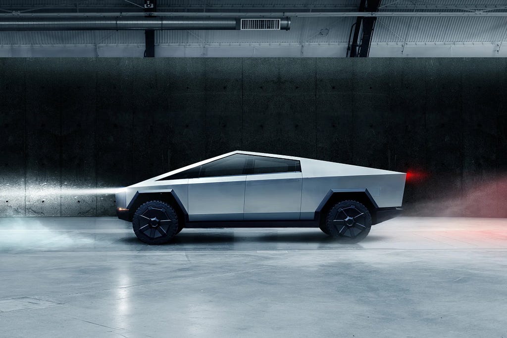
The release of Tesla’s groundbreaking Cybertruck was meant to be a celebration of innovation, but an unusual problem has stolen the spotlight — the confusing design of its doors. Social media is buzzing with criticism about the impracticality of the door-opening mechanism, prompting a closer examination of the design flaws and usability concerns plaguing the Cybertruck.
“Cybertruck doors: apparently very complicated! As Elon Musk hands off the first production Cybertrucks to owners, he’s had to show almost every single one of them how to open the passenger door.”
https://medium.com/media/aef6522f76b87a5ed1e6dcbd270c799a/href
Let’s start with the beginning: Principles of design
In his renowned work, “The Design of Everyday Things,” Don Norman presents the concept of human-centered design (HCD), where the focus is on prioritizing human needs, capabilities, and behavior in the design process.
Light readings to get into the UX mindset
Norman highlights the fundamental principle that machines and their designers must fully understand human interaction for design to be successful. This human-centric approach forms the cornerstone of creating products that not only meet technical requirements but also resonate seamlessly with the users they are intended for.
“It is the duty of machines and those who design them to understand people.” — Don Norman
By exploring the fundamental design principles through human interactions with everyday things, the book covers the six principal fundamental psychological concepts: affordances, signifiers, constraints, mappings, feedback, and the conceptual model of the system. For our focus today, we zoom in on “Signifiers.”
Signifiers play a pivotal role in design, communicating where actions should take place and providing users with meaningful clues to understand a product or service.
Good design requires, among other things, good communication of the purpose, structure, and operation of the device to the people who use it. That is the role of the signifier.
Signifiers can be deliberate and intentional, such as the sign push on a door, but they may also be accidental and unintentional, such as our use of the visible trail made by previous people walking through a field or over a snow-covered terrain to determine the best path.
Norman doors
“Norman door” is a term coined after Don Norman to describe any door that confounds users with its complexity. If a door requires guesswork to push or pull, it fails the usability test.
https://medium.com/media/7136b7352dd4df9a9d526f4799678290/href
The door’s interaction should be immediately evident, offering only a few reasonable options. While there’s room for innovative door-opening approaches, designers often dub this process as “reinventing the wheel.” While creativity holds merit, usability consistently takes precedence.
Creativity is cool, but usability wins every time.
Unquestionably, a new door introducing a significant departure from established design heuristics — common rules and usability norms — would defy convention. While occasional variations on the fundamental concepts are acceptable, a design that consistently falls short in heuristics assessments becomes inherently perplexing.
In generalizing this concept, any product causing user confusion, proving challenging to use, or functioning counterintuitively qualifies as a type of Norman door. This is synonymous with the broader term — bad design. A Norman door is, in essence, synonymous with a poor user experience (UX).
No Door Handle, No Problem? Examining the Cybertruck’s Choice
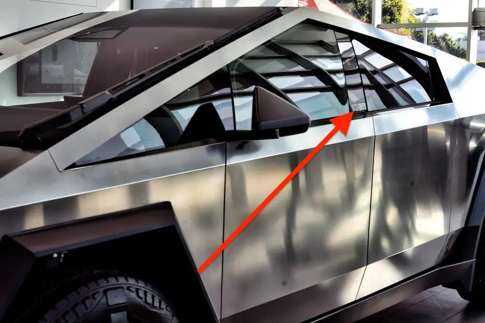
Let’s talk about one of the distinctive design features of the Tesla Cybertruck — the absence of traditional door handles.
During the much-anticipated delivery event, the futuristic truck’s lack of conventional handles became apparent, prompting CEO Elon Musk to personally assist new owners in accessing their vehicles. Instead of a standard door handle, the Cybertruck features a discreet button along the window edge on the B-pillar. Pressing this button initiates a 2-inch door pop, allowing users to then pull it open.
Recall the earlier quote, “If you have to guess whether to push or pull, the door fails.” Now, consider what if neither option works. In such cases, this design certainly falls short.
This raises concerns about its usability, prompting an exploration of design principles like signifiers. The ease with which users can identify how to open the door is crucial, especially considering the diverse range of individuals who may use the Cybertruck — kids, teenagers, adults, and the elderly. Questions arise about the need to consistently assist passengers in accessing the vehicle.
Beyond user demographics, the Cybertruck’s usability faces challenges in varying weather conditions. From sunny days to muddy terrains, rainy weather, and icy conditions, the ability to safely and easily open the doors is essential. Considerations extend to practicality — can the button be easily located when the car is dirty?
Marques Brownlee’s video, which scrutinizes the Cybertruck’s functionality, highlights potential challenges, particularly in icy conditions. This underscores a crucial aspect of good design — thoroughly considering constraints and operating conditions during the product development phase. Testing in context becomes imperative, ensuring the product’s adaptability to real-world scenarios.
Creativity is cool, but usability wins every time.
As a conclusion of this article, I wish to remind you that design isn’t just about making things look good; it’s about how users interact with them.
Standards exist to guide us, ensuring users can operate products safely. While reinventing the wheel is an option, it comes with tests and challenges. The key is remembering that users are at the center of design. A good product ensures safety and brings joy to its users.
So, as we navigate the evolving world of design, let’s keep in mind that users are the true compass. Design should not just impress but make their experience seamless, safe, and enjoyable.
![]()
Norman Doors: how do we still get this wrong? was originally published in UX Collective on Medium, where people are continuing the conversation by highlighting and responding to this story.