Want to know more? Come with me to meet some design mistakes in the galaxy of e-commerce far, far away.
1. The petrol station approach – main navigation issue
Finding the toilet in a petrol station’s cafeteria can be stressful.You enter the main door and find yourself in an open space. While figuring out if the toilet is on the right/left of the cashier or downstairs, you have more directions to go. The newsstand calls you to pick a magazine, and the coffee machine tempts you with its aromas.
When researching e-commerce sites, we might have a similar feeling.Many follow the petrol station approach, without having a good reason for that. They give you a single entrance in the main navigation and expect you to find the relevant product category in the crowded drop-down menu.
For instance, for home furnishing you have “All products” in the main navigation to reach Furniture, Textiles, or Lighting. But this entrance can be called “Shop”, “Categories” or “Products”.
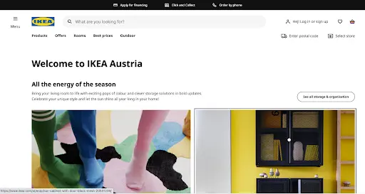
They forget that buying a certain product type might be a very conscious process. If you come to look for furniture, you don’t want to get disturbed by textiles. You want easy access to that main category from the main navigation, not having to scan through a whole drop-down menu. If that access is encumbered, the beginning of your journey becomes frustrating, which can negatively form the overall impression of your experience.
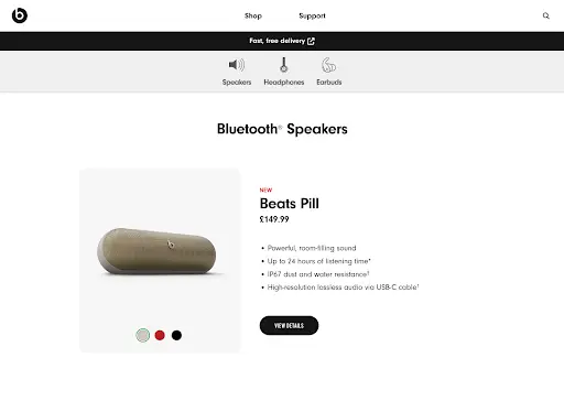
Tip to Nav bar: give direct access to the first-level product categories by displaying them in the main navigation bar (see below).
2. The jacket vs. earbuds dilemma – display types issue
Think of the last time you searched for a jacket on an e-commerce site. What did you do? You probably went to the relevant product category and set some filters (size, brand) to narrow down the palette of the available jackets. Then, you started scanning the images of the displayed results.And what does the process look like when searching for an electric gadget, for example, an earbud?
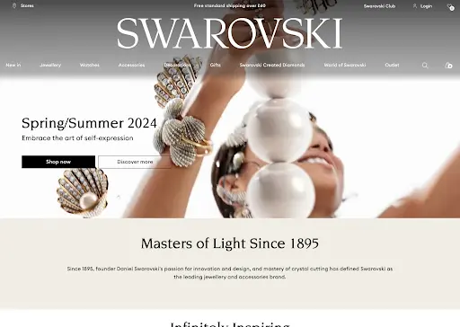
Buying a jacket and an earbud has a main difference.The first is more of a visually oriented decision, where the image plays a vital role in guiding your actions on a site. You will keep scrolling if you don’t like what you see on the card thumbnail. Besides the image, you need only a few attributes on the product card (brand, price, etc.).
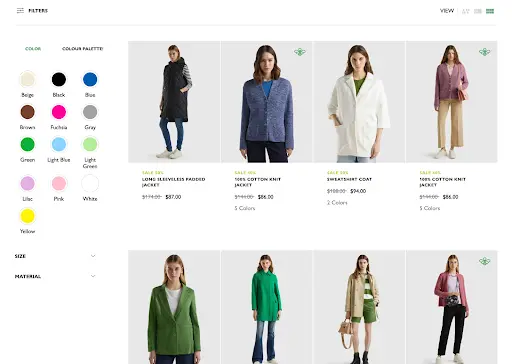
Why is this factor important from a UX perspective? Because it determines which display type to pick for the product cards. Here, a grid view display is a good choice, because it emphasizes the thumbnail while limiting the displayable written content (see below).
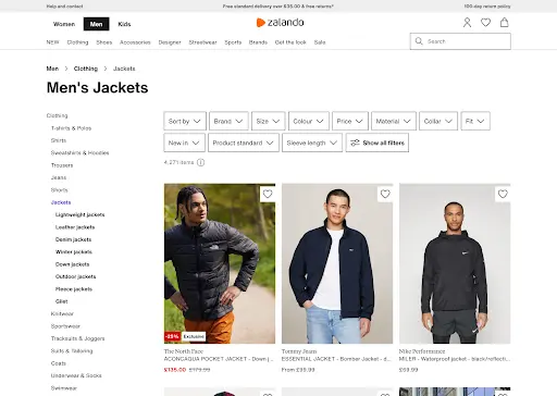
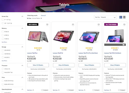
In comparison, buying an earbud is more of a data-oriented decision. The image becomes supportive because the technical attributes are more important. You want to be able to compare the specs of different earbuds just by checking their product cards. Therefore, the detailed list view is a better choice than a grid view since the card can contain more written content (see below).
Many e-commerce sites fail to consider this. Consequently, they use a detailed list view for visually driven products, thus disrupting the browsing experience with unnecessary content overload. Or they use a grid view with non-expandable cards for products requiring more attributes to be displayed, hence blocking people from easily comparing them.
Tip to Layout: consider using a grid view layout for the cards of products that require visually oriented decision-making (e.g., clothes, furniture). In contrast, for the products that require data-oriented decisions, consider using a detailed list view, or as an alternative, a grid view with expandable product cards that give access to more details with the approach of progressive disclosure (see below).
3. Numbers that matter – filtering issue
Let’s put jackets in a different scenario. Imagine visiting a small clothing store and having this conversation with the shop assistant:
-“Hi, I am here for a jacket in “XL” size.”
“No problem, we have 5 in that size.”
“And what about brown?”
“We have 10.”
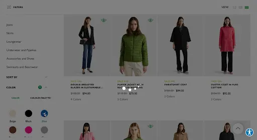
This answer is likely to confuse you. However, such logical contradictions often occur on e-commerce sites. When a filter (for example the “size”) gets selected, they don’t update the number of matches for the other filtering values (for example, the “color”). So you are given static numbers that contradict each other, thus creating uncertainty.
E-commerce sites often avoid causing such a negative experience simply by not displaying the number of matches for the filtering values. Smart? Definitely. User-friendly? Not really. When buying clothes, we might have a primary option, but we tend to opt for an alternative if there aren’t enough options.
Maybe I want a brown jacket, but a nice black one would also be fine. To decide if I should broaden the scope at the beginning of the search, I need to know how many products match my primary option. If only a few, I will probably select both colors (brown and black) when opening the filter bar.
But what happens if I don’t have the number of matches? It’s like taking potshots: I don’t know how many results to expect. If the number of products in the preferred color is not satisfying, I will be disappointed. To understand the range of my choices, I will need to play around with the color filter (see below).
It causes frustration that could have been avoided by displaying the number of matches, thus properly managing the user expectations. As if it was not bad enough, many sites do a full-page reload when selecting a filtering option.
In practice, it means a disturbing tiny break that even multiplies with the application of more filters. And if you think about the jacket example, it’s easy to get to the point when you need to apply more filters:you might need a certain size, a preferred color, a favorite brand, and a price range. Voilá, 5 full page reloads one after the other.
Tip to filtering: show the number of matches for each filtering option, and live update the numbers as filters are applied or deselected. Also, when selecting a filtering option, update the product list without a full page reload.
4. The world of thieves – Expectation management issue
When a thief is about to rob a car, they compare the reward with the risk. Is the reward a laptop, a lightsabre, or an empty bag? Depending on the result of the risk-reward assessment, the thief decides whether to take the risk.
Similarly, we all do our risk-reward assessments when using digital interfaces. Imagine a food supplement site offering an online test to get specific recommendations based on your health needs and objectives. Here, the personalized recommendation is your reward. But what about your risk? If you come to the test without going precisely through the homepage where the test is described, you will face the screen below.
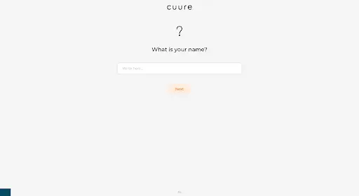
It says nothing about your risk, such as the time to fill in the test for the recommendations that might mismatch with your expectations. Companies tend not to give people the information they need to complete the risk-reward assessment. These companies might believe communicating the required time can deter people from the test. But not communicating sufficient information on a website can also be counterproductive, since nowadays protecting time and personal data is a top priority for most internet users.
Tip to expectation management: give users the data they need for the risk-reward assessments.
5. The unwanted labyrinth – User ratings
We don’t want web apps to be a labyrinth to escape from. We don’t interact with them for the “joy” of navigation, but to get our job done.
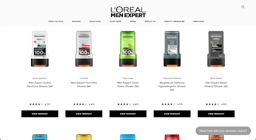
How does it relate to ratings? When making purchasing decisions, we heavily rely on others’ judgments and experiences, so we actively seek user reviews (average score and number of ratings). What if on the product card, we see a low rating average with a large number of reviews? For example, 1 star from 1000 reviews. We probably keep scrolling without visiting the page of the undervalued product. But what if we don’t get this information on the product card? Or what if we get only the average score without the number of ratings? (see below).
We need to navigate to the product page to paint a picture of the product quality based on others’ experience. If the reviews are unavailable or dissatisfying, we need to navigate back to the product list to find something worth buying. Like it or not, it will be like escaping from a labyrinth.
Tip to ratings: include the user ratings average and the number of ratings on the product cards.
6. The fuzzy ending – Order confirmation page issue
UXers know that people judge an experience largely based on how they felt at its peak and end, rather than the total sum or average of every moment of the experience (this is the peak-end rule). In this case, order confirmation as the closing step of the purchasing journey should be a well-polished, pleasant part.
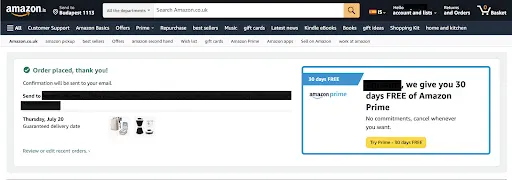
When researching how to make the best out of the order confirmation page, we concluded that it’s the part where many fail. They often miss properly answering a basic question: “What to do next?” Some say the order was complete, but don’t assure the user about sending a formal confirmation email. This generates many questions related to the next step. Should I wait for another confirmation? Should I keep the window open? Should I take a screenshot? Some sites inform the customers about the fact that email confirmation is going to be sent, but they don’t say more (see below).
This raises questions too. When to expect the email confirmation? For how long to wait? Where to turn if I don’t get it?
Not giving proper attention to the last step has a big impact on the overall journey. The headache it caused will be memorable, no matter how shiny the UI and how smooth the whole experience was.
Tip to the order confirmation page: in the step of order confirmation, inform the users about when to expect an e-mail confirmation, where to double-check, and who to turn to if they don’t find it.
Summary
Be careful when collecting inspiration to (re)design a B2C e-commerce website, because from a usability perspective, applying some current patterns may be a trap. Wisely consider your decisions when it comes to main navigation, card display type, filters, the required amount of content, user ratings, and order confirmation page.
May skepticism be with you!
Searching for the right UX agency?
UX studio works with rising startups and established tech giants worldwide.
Should you want to improve the design and performance of your digital product, message us to book a consultation with us. We will walk you through our design processes and suggest the next steps!
Our experts would be happy to assist with the UX strategy, product and user research, UX/UI design, etc.