Negative space logos are a unique and compelling design technique that uses the empty spaces within and around a logo to create a secondary image or visual effect. This approach not only adds depth and complexity to the design but also engages the viewer, encouraging them to look closer and discover hidden meanings. These logos are a testament to the power of simplicity and creativity in graphic design.
The Magic of Negative Space
The appeal of negative space logos lies in their ability to communicate multiple ideas within a single image. By skillfully manipulating the space around and within a logo, designers can create logos that are both visually appealing and conceptually rich. This technique often results in a logo that is memorable, as it invites the viewer to engage with it on a deeper level. The clever use of negative space can transform a simple design into a powerful visual story.
35+ Clever Negative Space Logos That Will Inspire You
Explore a curated collection of 35+ clever negative space logos that exemplify the brilliance of minimalist design. These logos go beyond mere aesthetics, utilizing negative space to craft hidden symbols and messages. Each design serves as a masterclass in creativity, proving that simplicity can be both powerful and profound.
A / Letter by Kakha Kakhadzen
Gable Negative Space Logo by Sava Stoic
Orca Space Logo by Vlad Szirka
A Letter Logo by Biswajit bain
Oak negative space logo by Taufikrizkyy
D in negative space by Lelevien
WIP Logo by Kakha Kakhadzen
X Logo Negative Space by Muhammad Aslam
Negative Space Bird Logo by Atik | Logo & Brand Identity Designer
Combination Mark Space Logo by Shamsuddin Ahmed
Rocket Negative Space People by R A H A J O E
360 Negative space Logo by Jishan – Branding Agency
U Negative Space Logo by HQ Shakib
Bird Mark Negative Space by Dhruw CK
Negative Space Logo Design by Logo Family JR
H Logo by Mahamud hasan Tamim
Focus Negative Space Logo by Sabrina Alam
Minimal Negative Space by Param
Pawxy Space Logo by Alex Tass, logo designer
Thought Mobile Negative Space by g????? ??????
Negative Space Logo by wa.onegraphic
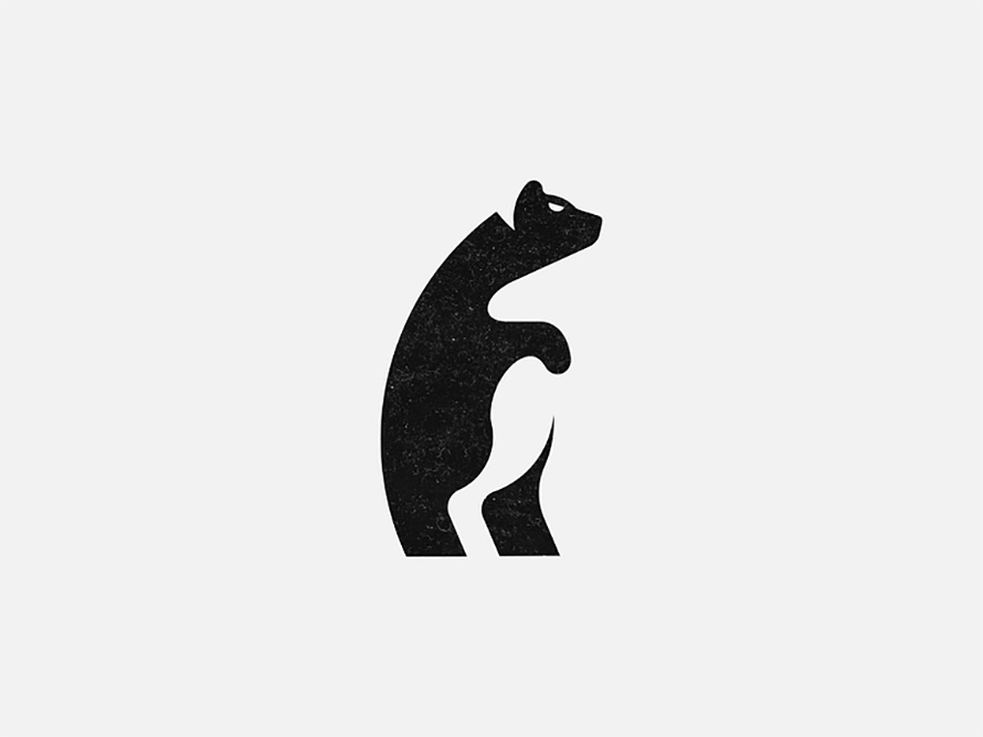
Negative Space Bear by designbyhelios
FM Negative Space Monogram by Frank Marklund
H11 Negative Space Logo by Leo for smart by design™
T+N Negative Space Monogram by Aiste
Leaf Bunny Negative Space by artsigma
Fashion Negative Space Logo by Arnadi
Negative Space Logo Collection by Aiste for smart by design™
Negative Space Studies by Christopher Thomas
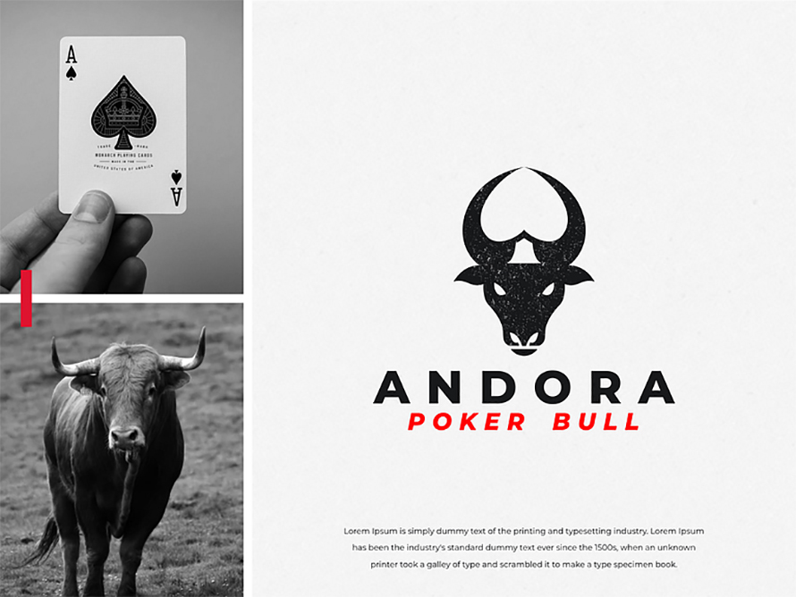
Bull Poker Negative Space Logo by Jenggot Merah
Negative Space Apple by James Viola
Fuzion Space Logo by Kakha Kakhadzen
Earthly Space Logo by Deividas Bielskis
Why Negative Space Logos Stand Out
One of the main reasons negative space logos stand out is their ability to convey dual meanings. This duality can make a brand’s identity more dynamic and versatile. For instance, a logo might incorporate a hidden symbol or message within the negative space, which adds an element of surprise and delight for those who notice it. This not only makes the logo more engaging but also helps it stand out in a crowded marketplace.
Moreover, negative space logos are often associated with minimalism, a design trend that has gained popularity in recent years. Minimalist logos are clean, simple, and uncluttered, making them easy to recognize and remember. The use of negative space allows designers to strip away unnecessary details while still creating a logo that is rich in meaning.
Check this: Branding and Visual Identity Design: A Guide to Inspiration and Creation
Best Examples of Negative Space Logos
To truly appreciate the creativity and ingenuity behind negative space logos, let’s take a look at some iconic examples that have made a lasting impact:
- FedEx: The FedEx logo is a classic example of negative space design. The hidden arrow between the “E” and the “x” symbolizes speed and precision, qualities that are central to the brand’s identity.
- NBC: The NBC logo features a peacock in the negative space created by the multicolored feathers. This symbolizes the network’s colorful programming and its forward-looking approach.
- Tour de France: The Tour de France logo cleverly uses negative space to create a cyclist within the lettering, emphasizing the event’s focus on cycling.
- Pittsburgh Zoo & PPG Aquarium: This logo uses the negative space between a tree to reveal the silhouettes of a gorilla and a lion, highlighting the zoo’s connection to wildlife.
- Hope for African Children Initiative: The logo uses negative space to depict both Africa and a child’s face, representing the organization’s mission to help children in Africa.
These examples demonstrate how negative space logos can convey complex ideas in a simple and elegant manner. By using negative space effectively, these logos become more than just symbols; they become powerful storytelling tools.
The Design Process Behind Negative Space Logos
Creating a successful negative space logo requires a deep understanding of both the brand and the principles of design. The process often begins with extensive research into the brand’s values, goals, and target audience. This research informs the design process, helping the designer identify the key elements that should be incorporated into the logo.
Once the research phase is complete, the designer begins sketching out ideas, experimenting with different shapes, and exploring how negative space can be used to convey the desired message. This phase often involves a lot of trial and error, as the designer works to find the perfect balance between the positive and negative elements of the design.
After the initial concepts are developed, the designer refines the chosen design, making adjustments to ensure that the negative space is both functional and aesthetically pleasing. The final result is a logo that is not only visually striking but also rich in meaning.
Conclusion
Negative space logos are a powerful tool in the world of graphic design. They challenge conventional design norms by using the empty spaces in a logo to create something truly unique and memorable. Whether it’s the hidden arrow in the FedEx logo or the cyclist in the Tour de France logo, these designs prove that less can indeed be more. By mastering the art of negative space, designers can create logos that are not only visually appealing but also deeply meaningful. These 35+ clever examples are sure to inspire anyone looking to explore the potential of negative space in their own designs.
(Visited 145 times, 132 visits today)

