5 lesser-known spacing tips for product designers
Your BAE might not give you space but after reading this article you will definitely give your UI objects some well-deserved space :p
When we start out as designers, spacing is often the most neglected aspect of the design process. Various objects are spaced based on what we, at that point, believe looks good. Well, I went through the same drill and a couple of years later, I see that it isn’t that complex. So doesn’t matter if you are a novice or a pro, apply the tips below at your work and see the difference it makes for yourself.
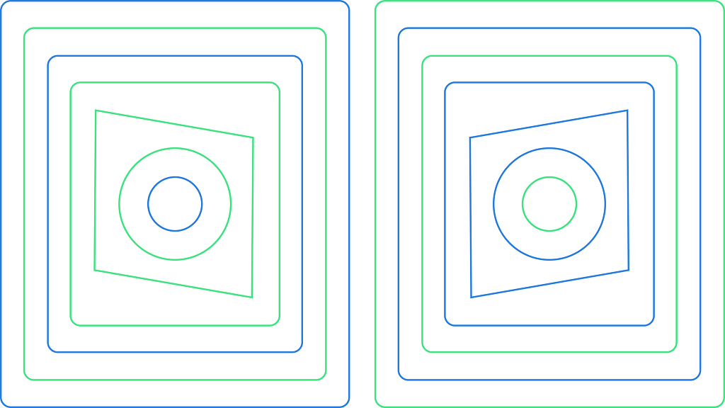
1. Stick to multiples of 4
When spacing various objects in your UI, space them by multiples of 4. You ask why? Because it is easy to remember, reduce the number of choices you need to make, and there is a visually noticeable difference with each jump in size. Also, as a side effect, your designs look coherent without any additional effort.
Start off by using 4. Does 4 look too close? Bump it up to 8. Still too close? Bump it up to 12 and so on.
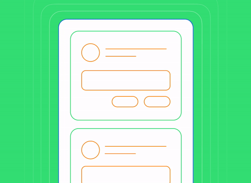
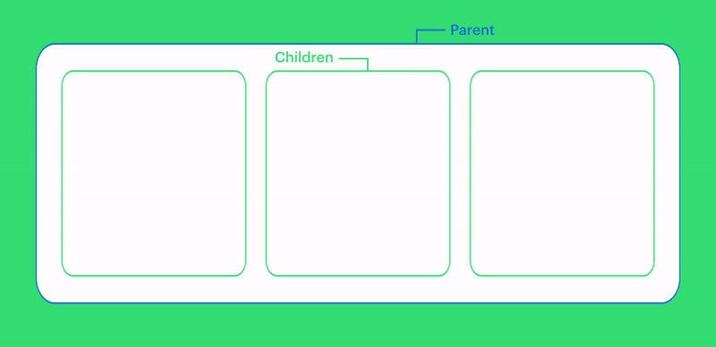
2. Make parent padding the same or more than the padding between children
This should be obvious considering the gestalt principle ie: related objects should be closer to each other.
3. Optical alignment is sometimes better than geometric alignment
All design software is really good at geometrically aligning objects. But in certain cases, geometrical alignment can cause optical imbalances, which the human eyes pick up instantly. In those cases, eyeball it and adjust the spacing between objects. It is more commonly seen among shapes whose visual weight isn’t equally spread out. For e.g. polygon, star and other irregular shapes.

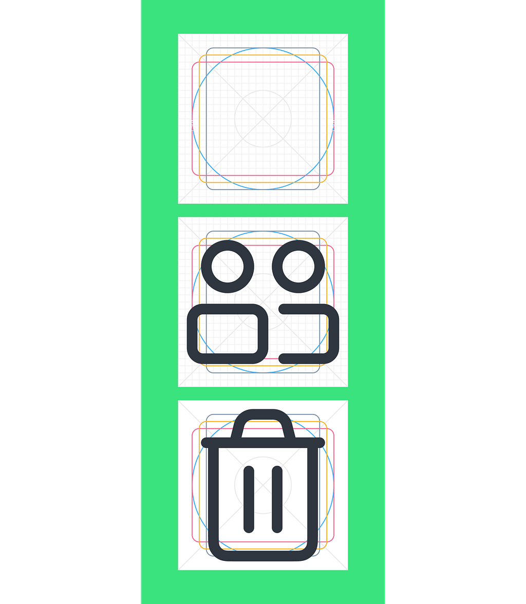
4. Use keylines to create your icons
Talking about optical alignment, have you ever felt that a circular icon looks smaller than a square icon although they are the same dimensions? Well, keylines will help you with that and also help maintain a consistent visual proportion for all the icons in a set. Here is a keyline template on Figma to get you started.
5. Define the target area for intractable components
The target area is the clickable or touchable area on an interface. It refers to the area of a UI element that is responsive to user input, such as an icon, button, or link. The material design guidelines recommend a minimum target area of 48×48 on mobile for a comfortable touch experience. On desktop, this can be made smaller e.g. 40×40.
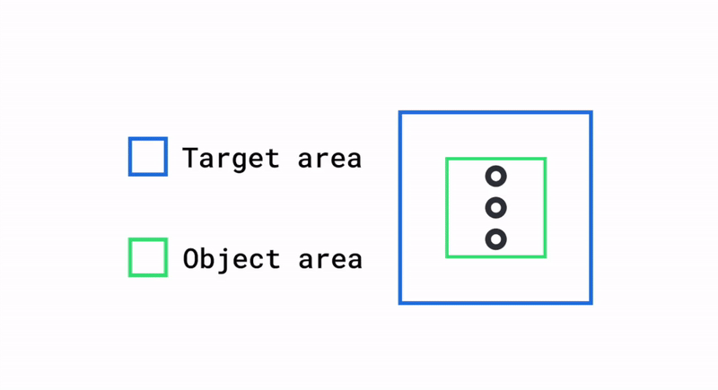
Later on, if you want to add in a hover or a tapped state, the target area can used to do that without the need for any rework.

🦄 BONUS: How to improve your sense of spacing?
Screenshot your favourite app. Paste it onto a Figma frame. Reduce opacity by 50%, lock the layer. Now trace on top and recreate the screen as it is. Do this for a couple of weeks, and you will see an immense improvement in your sense of spacing and overall UI aesthetics.
Additional reading
- Optical Effects in User Interfaces by Slava Shestopalov 🇺🇦
- Check out the Target area documentation on Google’s material design
🙋🏽♂️ Let’s be friends! Connect with me on Twitter and LinkedIn. Also check out my free resources on Figma.
5 lesser-known tips on spacing for product designers was originally published in UX Collective on Medium, where people are continuing the conversation by highlighting and responding to this story.