In the past, I’ve shown you how to create different tabbed interfaces. Today, we’ll build another responsive JavaScript tab component where the clickable tabs will appear as a stepper component.
If you aren’t familiar with stepper components, their primary goal is to improve the user experience by organizing large logical content blocks into smaller sequential steps. A widespread use case of such a component is the creation of a multi-step checkout in eCommerce sites.
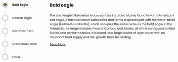
Our Tab Component
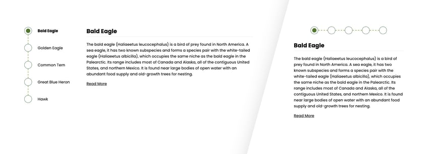
Here’s what we’re going to create—resize your browser to see how the tab layout changes:

We won’t focus so much on accessibility in this tutorial, so exploring how to make this component more accessible would be a valid next step.
1. Begin with the page markup
Inside a container, we’ll place two lists that include the tabs and their associated content (panels).
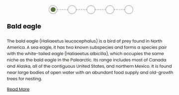
By default, the first tab will be active.
Here’s the required markup:
1 |
<div class="grid"> |
2 |
<ul class="tab-list"> |
3 |
<li class="active"> |
4 |
<a href=""> |
5 |
<span class="dot"></span> |
6 |
<span>...</span> |
7 |
</a>
|
8 |
</li>
|
9 |
<!-- more items here -->
|
10 |
</ul>
|
11 |
<ul class="tab-panels"> |
12 |
<li class="active">...</li> |
13 |
<!-- more items here -->
|
14 |
</ul>
|
15 |
</div>
|
2. Add the CSS
Let’s concentrate on the main styles—you can see all of them by clicking on the CSS tab of the demo project.
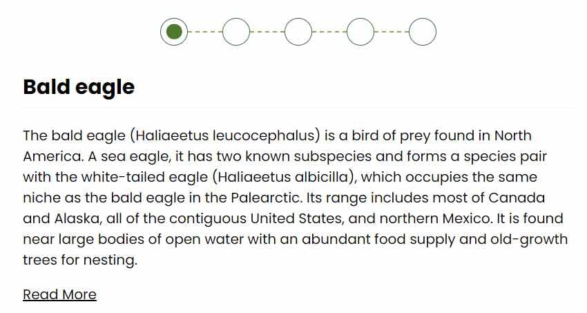
On large screens (>700px), the tab component will be like this:
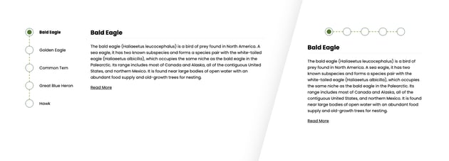
On smaller ones, it’ll look like this:
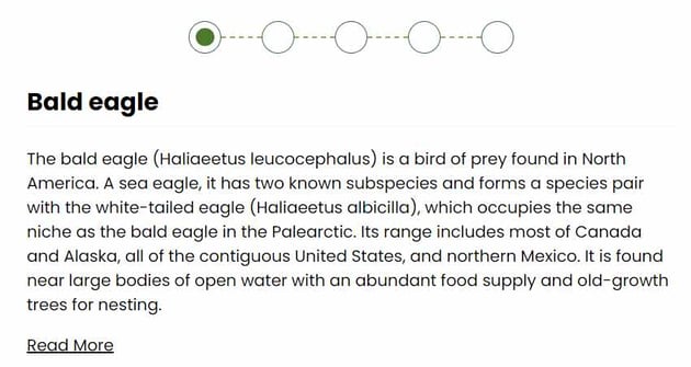
Notice how the stepper switches between horizontal and vertical orientation depending on the screen size.
Also, consider that all tab panels will be stacked and moved away 100% to the left; at any time, only the one with the active class will appear and sit in its initial position.
Here’s a part of the required styles:
1 |
/*CUSTOM VARIABLES HERE*/
|
2 |
|
3 |
.grid { |
4 |
display: grid; |
5 |
grid-template-columns: auto auto; |
6 |
gap: 70px; |
7 |
max-width: 1000px; |
8 |
padding: 0 20px; |
9 |
margin: 0 auto; |
10 |
}
|
11 |
|
12 |
.tab-list li { |
13 |
display: flex; |
14 |
}
|
15 |
|
16 |
.tab-list li:not(:last-child) { |
17 |
margin-bottom: 40px; |
18 |
}
|
19 |
|
20 |
.tab-list a { |
21 |
display: inline-flex; |
22 |
align-items: center; |
23 |
gap: 24px; |
24 |
text-decoration: none; |
25 |
}
|
26 |
|
27 |
.tab-list a .dot { |
28 |
position: relative; |
29 |
display: inline-block; |
30 |
width: 32px; |
31 |
height: 32px; |
32 |
border-radius: 50%; |
33 |
border: 1px solid var(--stepper-outline-color); |
34 |
}
|
35 |
|
36 |
.tab-list li a .dot::before, |
37 |
.tab-list li:not(:last-child) a .dot::after { |
38 |
content: ""; |
39 |
position: absolute; |
40 |
left: 50%; |
41 |
}
|
42 |
|
43 |
.tab-list li a .dot::before { |
44 |
top: 50%; |
45 |
transform: translate(-50%, -50%) scale(0); |
46 |
width: 18px; |
47 |
height: 18px; |
48 |
border-radius: 50%; |
49 |
background: var(--stepper-active-color); |
50 |
transition: transform 0.3s; |
51 |
}
|
52 |
|
53 |
.tab-list li:not(:last-child) a .dot::after { |
54 |
top: calc(100% + 1px); |
55 |
transform: translateX(-50%); |
56 |
height: 40px; |
57 |
border-left: 2px dashed var(--stepper-connector-color); |
58 |
}
|
59 |
|
60 |
.tab-list li.active a { |
61 |
font-weight: bold; |
62 |
}
|
63 |
|
64 |
.tab-list li.active a .dot::before { |
65 |
transform: translate(-50%, -50%) scale(1); |
66 |
}
|
67 |
|
68 |
.tab-panels { |
69 |
display: grid; |
70 |
overflow: hidden; |
71 |
}
|
72 |
|
73 |
.tab-panels > li { |
74 |
grid-area: 1/1; |
75 |
opacity: 0; |
76 |
transform: translateX(-100%); |
77 |
transition: opacity 0.35s ease-in-out, transform 0.7s ease-in-out; |
78 |
}
|
79 |
|
80 |
.tab-panels > li.active { |
81 |
opacity: 1; |
82 |
transform: none; |
83 |
}
|
84 |
|
85 |
@media (max-width: 700px) { |
86 |
.grid { |
87 |
grid-template-columns: 1fr; |
88 |
gap: 30px; |
89 |
}
|
90 |
|
91 |
.tab-list { |
92 |
display: flex; |
93 |
justify-content: center; |
94 |
}
|
95 |
|
96 |
.tab-list li:not(:last-child) { |
97 |
margin: 0 40px 0 0; |
98 |
}
|
99 |
|
100 |
.tab-list li a span:last-child { |
101 |
display: none; |
102 |
}
|
103 |
|
104 |
.tab-list a { |
105 |
gap: 0; |
106 |
}
|
107 |
|
108 |
.tab-list li:not(:last-child) a .dot::after { |
109 |
top: 50%; |
110 |
left: calc(100% + 1px); |
111 |
transform: translateY(-50%); |
112 |
width: 40px; |
113 |
height: auto; |
114 |
border-bottom: 2px dashed var(--stepper-connector-color); |
115 |
border-left: 0; |
116 |
}
|
117 |
}
|
3. Add the JavaScript
Each time we click on a tab link, we’ll remove the active class from the currently active tab and panel. Then, we’ll put that class in the tab and panel associated with that link.
Here’s the required JavaScript:
1 |
const tabList = document.querySelector(".tab-list"); |
2 |
const tabItems = tabList.querySelectorAll("li"); |
3 |
const tabLinks = tabList.querySelectorAll("a"); |
4 |
const tabPanelsList = document.querySelector(".tab-panels"); |
5 |
const tabPanels = tabPanelsList.querySelectorAll("li"); |
6 |
const ACTIVE_CLASS = "active"; |
7 |
|
8 |
for (const tabLink of tabLinks) { |
9 |
tabLink.addEventListener("click", function (e) { |
10 |
e.preventDefault(); |
11 |
tabList.querySelector(`li.${ACTIVE_CLASS}`).classList.remove(ACTIVE_CLASS); |
12 |
tabPanelsList
|
13 |
.querySelector(`li.${ACTIVE_CLASS}`) |
14 |
.classList.remove(ACTIVE_CLASS); |
15 |
|
16 |
const parent = tabLink.parentElement; |
17 |
let parentIndex = Array.from(tabItems).indexOf(parent); |
18 |
parent.classList.add(ACTIVE_CLASS); |
19 |
tabPanelsList
|
20 |
.querySelector(`li:nth-child(${++parentIndex})`) |
21 |
.classList.add(ACTIVE_CLASS); |
22 |
});
|
23 |
}
|
Add keyboard support
Although our component isn’t optimized for accessibility, let’s add support for keyboard navigation.
On small screens, each time the left (←) or right (→) arrow keys are pressed, we’ll grab the currently active tab. From there, we’ll check to see which arrow is clicked. If that’s the right arrow, we’ll set the next active tab as the one that immediately follows the current active tab. If there isn’t such a tab, the next tab becomes the first one. Similarly, if the left arrow is clicked, we’ll set the next tab as the one that immediately precedes the currently active tab. If there isn’t such a tab, the next tab becomes the last one.
We’ll follow the same process with the up (↑) and down (↓) keys on large screens.
Here’s the relevant JavaScript code:
1 |
...
|
2 |
|
3 |
tabList.addEventListener("keyup", function (e) { |
4 |
const activeTabListItem = tabList.querySelector(`li.${ACTIVE_CLASS}`); |
5 |
|
6 |
if ( |
7 |
e.key === "ArrowUp" || |
8 |
e.key === "ArrowDown" || |
9 |
e.key === "ArrowLeft" || |
10 |
e.key === "ArrowRight" |
11 |
) { |
12 |
if ( |
13 |
(mqSm.matches && (e.key === "ArrowUp" || e.key === "ArrowDown")) || |
14 |
(mqLg.matches && (e.key === "ArrowLeft" || e.key === "ArrowRight")) |
15 |
) { |
16 |
return; |
17 |
}
|
18 |
|
19 |
if (e.key === "ArrowUp" || e.key === "ArrowLeft") { |
20 |
const prevActiveTabListItem = activeTabListItem.previousElementSibling |
21 |
? activeTabListItem.previousElementSibling |
22 |
: lastTabListItem; |
23 |
prevActiveTabListItem.querySelector("a").click(); |
24 |
} else { |
25 |
const nextActiveTabListItem = activeTabListItem.nextElementSibling |
26 |
? activeTabListItem.nextElementSibling |
27 |
: firstTabListItem; |
28 |
nextActiveTabListItem.querySelector("a").click(); |
29 |
}
|
30 |
}
|
31 |
});
|
Conclusion
Congrats, folks! We built this beautiful and unique responsive JavaScript tab component without writing much code. From there, you can use it as it is and make it more accessible by checking the code of a similar component like Bootstrap’s tabs.
Alternatively, you can isolate the tab list layout that looks like a stepper component and use it as you wish by adding functionality for navigation arrows, etc.
Before closing, let’s recall what we created today:
As always, thanks a lot for reading!