Learn how to create a hand lettering poster step by step in Adobe Illustrator. Inspired by Dr. Sally Ride, the first American woman in space, this design highlights her famous quote:
“The stars don’t look bigger, but they do look brighter.”
We’ll walk through each step to transform your sketch into a digital masterpiece, using Illustrator’s powerful tools to achieve a polished and eye-catching design.
Whether you’re just starting out or looking to refine your skills, this tutorial will guide you through the process of creating a unique and captivating artwork with a galaxy style. So grab your tablet and get ready for this creative journey!
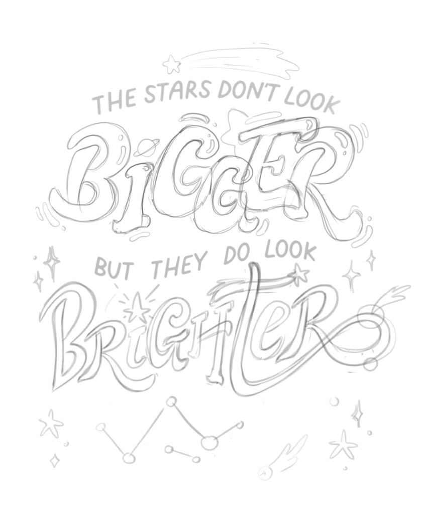
Once you’re satisfied with your sketch, scan it or save it as an image file and import it into Adobe Illustrator by selecting File > Place (Shift-Control-P) and choosing your sketch file.
You can also Right-click > Save Image As… to save the sketch that I’ve created for this tutorial and use it in your project.
Step 2
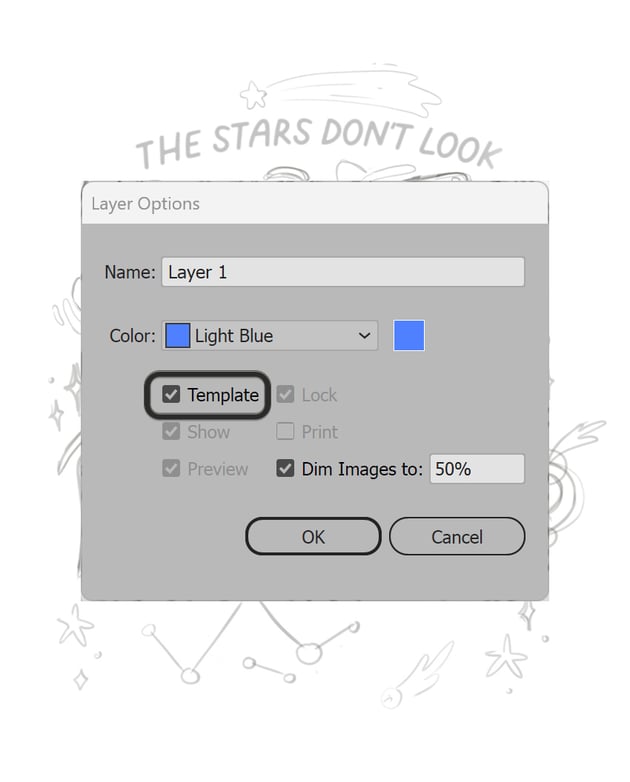
To make tracing easier, convert your sketch layer into a template. Open the Layers panel (Window > Layers), locate the layer containing your sketch, and double-click it. In the Layer Options dialog, check the box for Template and reduce the Dim Images to option to about 50%.
The size of my canvas is 1080 x 1350 px since this will be the size of our final artwork. You can adjust it by using the Artboard (Shift-O) and setting the desired dimensions in the control panel on top.


Step 1
Select the Pen Tool (P) from the toolbar and begin tracing the first letter of the word “Bigger”. Click to create anchor points along the edges of your sketch, and drag to adjust the curve handles for smooth, precise lines.
If you’d like to get more comfortable using the Pen Tool (P) in Illustrator, I’d suggest this amazing tutorial that guides you through all the things you need to know when using this powerful tool!
Step 2
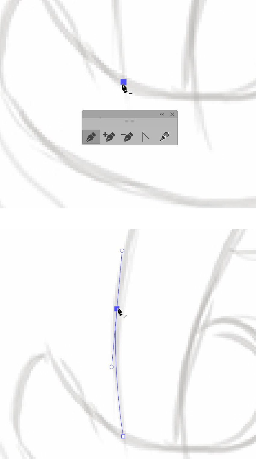
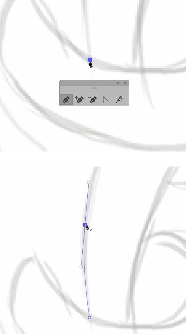
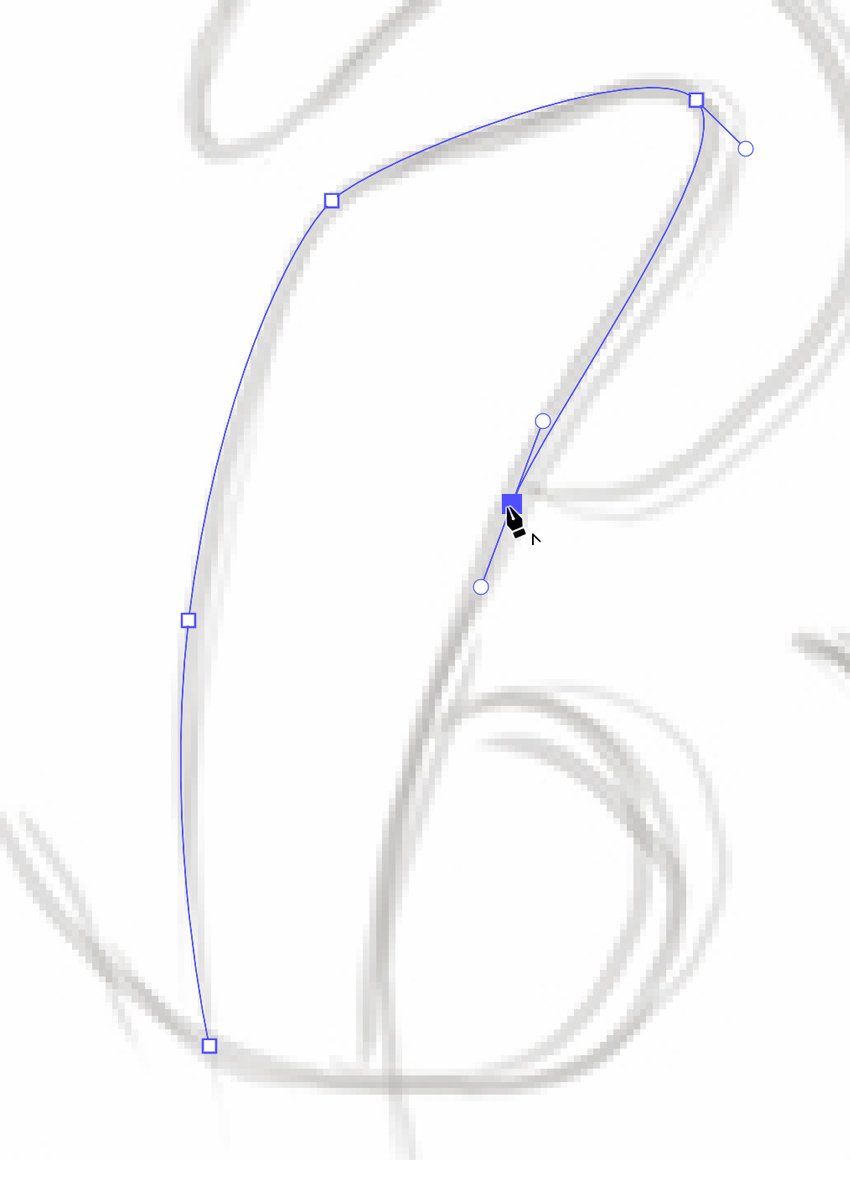
Continue using the Pen Tool to trace the letter “B”. Zoom in (Control-plus) for more accuracy when tracing detailed areas. Follow the contours of the sketch closely. Note that you can create separate shapes for each part of the letter, which will make them easier to edit individually.
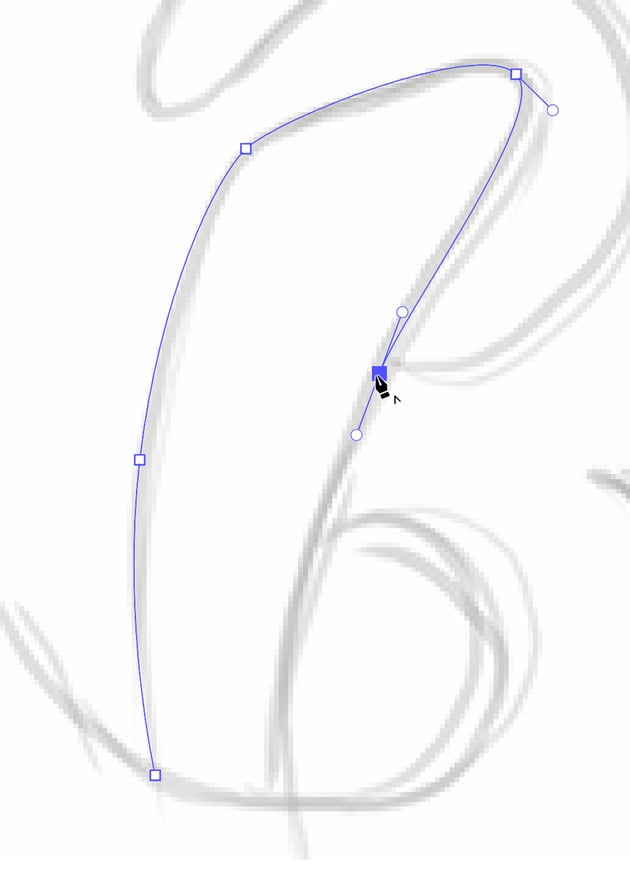
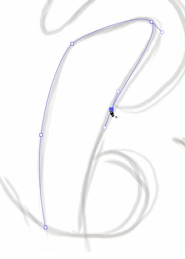
Step 3
After you’ve traced all the parts of the letter, switch to the Direct Selection Tool (A). Click on individual anchor points to reveal their handles. Hold Alt to move each handle separately, and adjust these handles to refine the curves and lines of your letter. This tool is essential for smoothing out any rough or awkward edges.
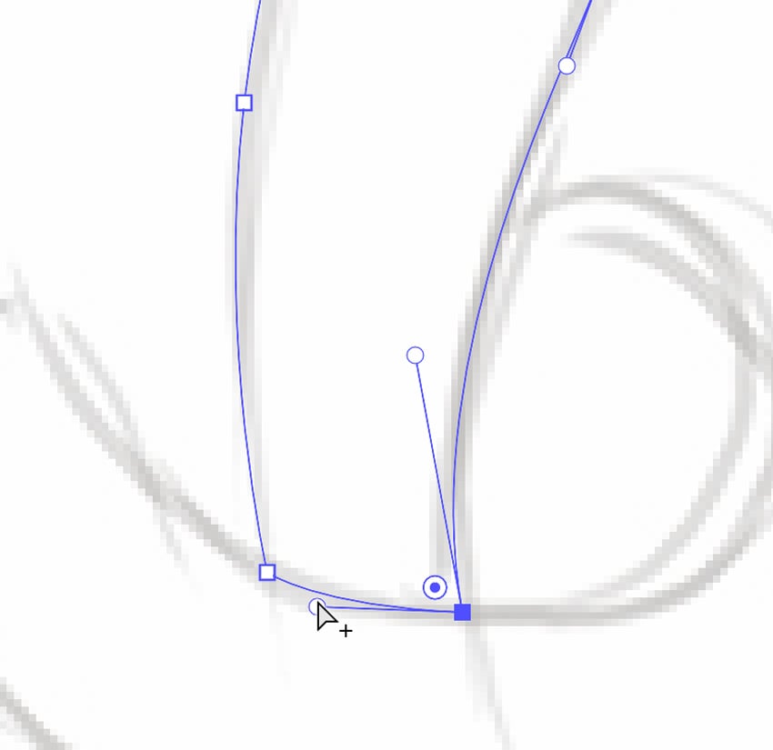
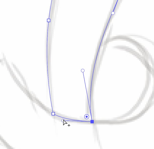
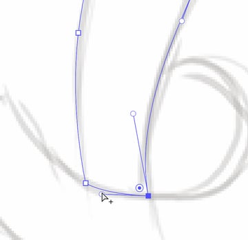
Step 4
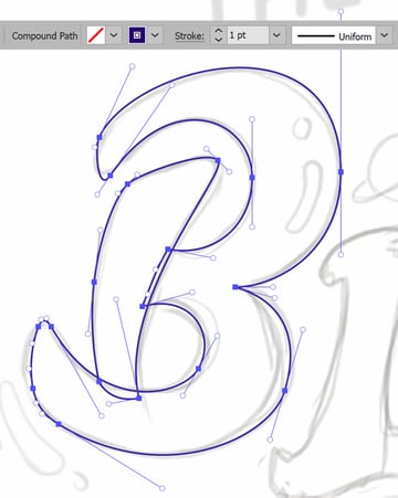
Select all the elements of the letter you’ve traced by holding down Shift and clicking each one with the Selection Tool (V). Then, apply a Stroke by going to the Stroke panel (Window > Stroke). Set the Stroke Weight to 1 pt for visibility, and adjust as needed. Notice how I’ve split the letter “B” into two parts when tracing for more convenience.
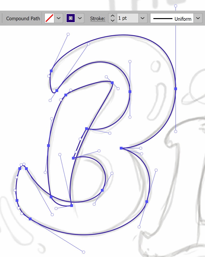

Step 5
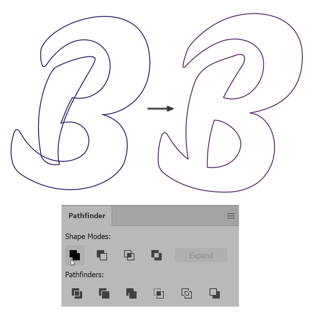
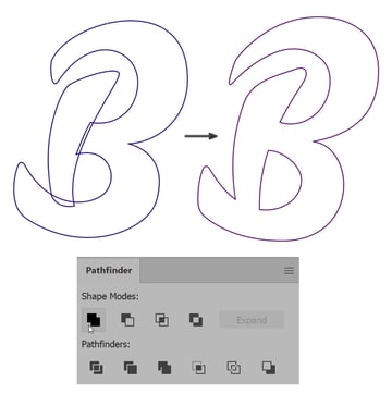
If your letter “B” has multiple parts too, use the Pathfinder panel (Window > Pathfinder) to merge them into a single shape. Select the relevant parts of the “B”, and then click the Unite button in the Pathfinder panel.
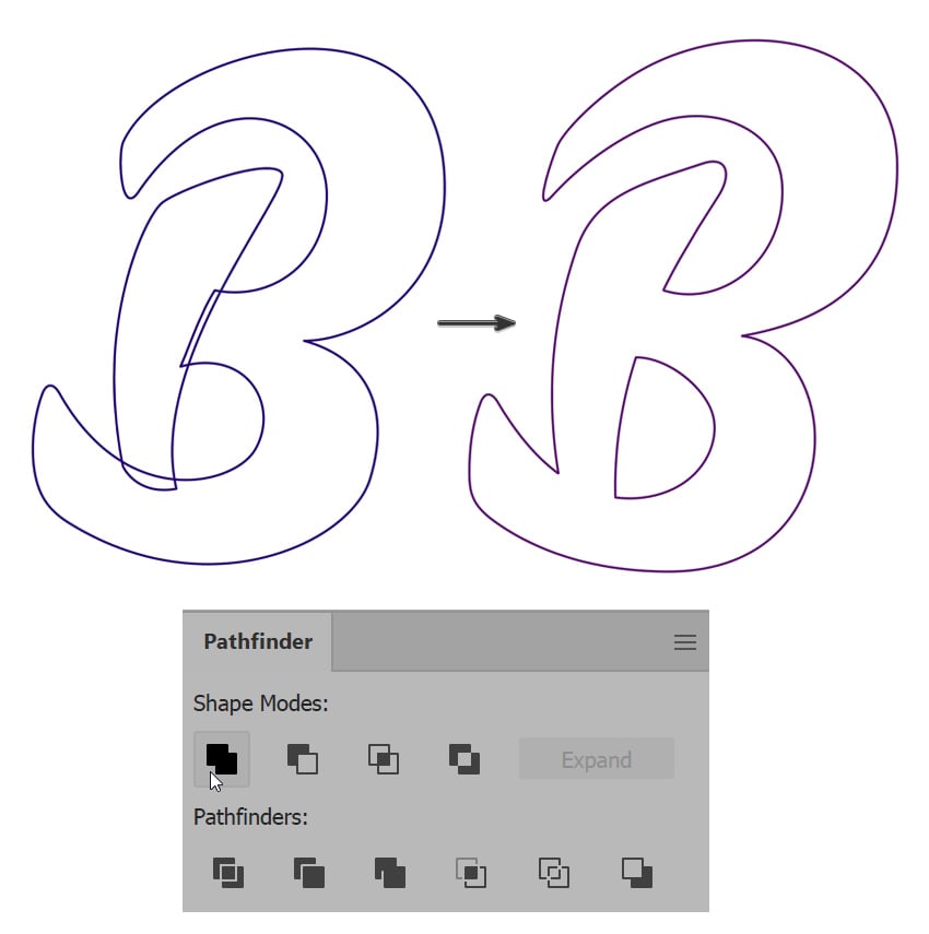
Step 6
The Pen Tool is great for precise tracing and designing, but for this poster I’d like to achieve more fluid, organic lines, which can add character to our lettering.
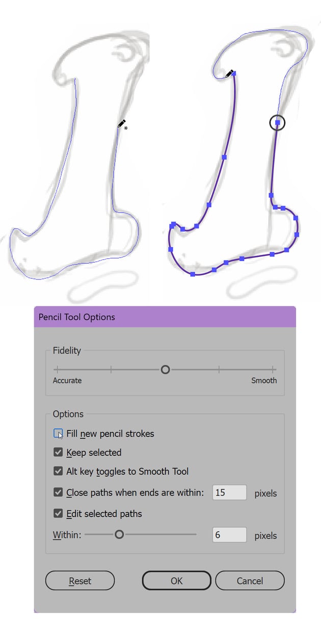
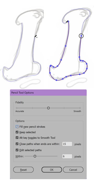
To do so, let’s switch to Illustrator’s Pencil Tool (N) for freehand tracing. First of all, we’ll adjust the tool’s settings by double-clicking the Pencil Tool icon in the Tools panel. Set the Fidelity depending on whether you want it to be smoother (i.e. fewer points) or more precise (i.e. more points). Deactivate Fill new pencil strokes to create the shapes with no fill, and check Keep selected to be able to edit the line instantly.
You don’t have to trace the entire letter in one line. For some elements, that can be quite challenging. You can start the line and stop at any moment. While your line is selected, you can continue from any point in any direction, and the line will connect automatically.
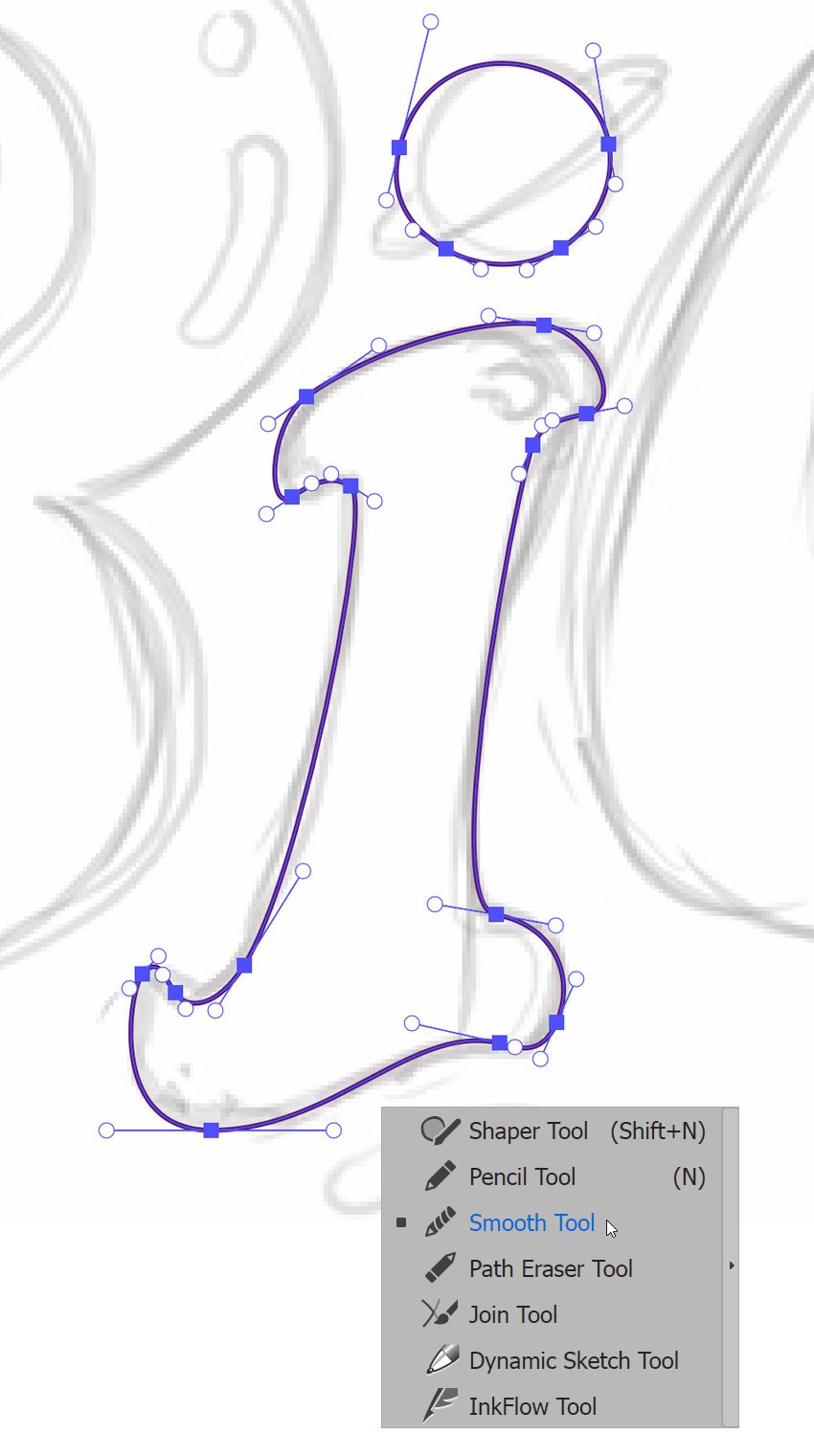
Draw the letter “I”, following your sketch.

Step 7
After drawing the letter “I”, you might notice it has too many anchor points. To smooth the shape, select it and choose the Smooth Tool, which is located in the same drop-down menu as the Pencil Tool in Illustrator. Click and drag the tool along the path to reduce the number of anchor points and create a cleaner, smoother shape.


Step 8
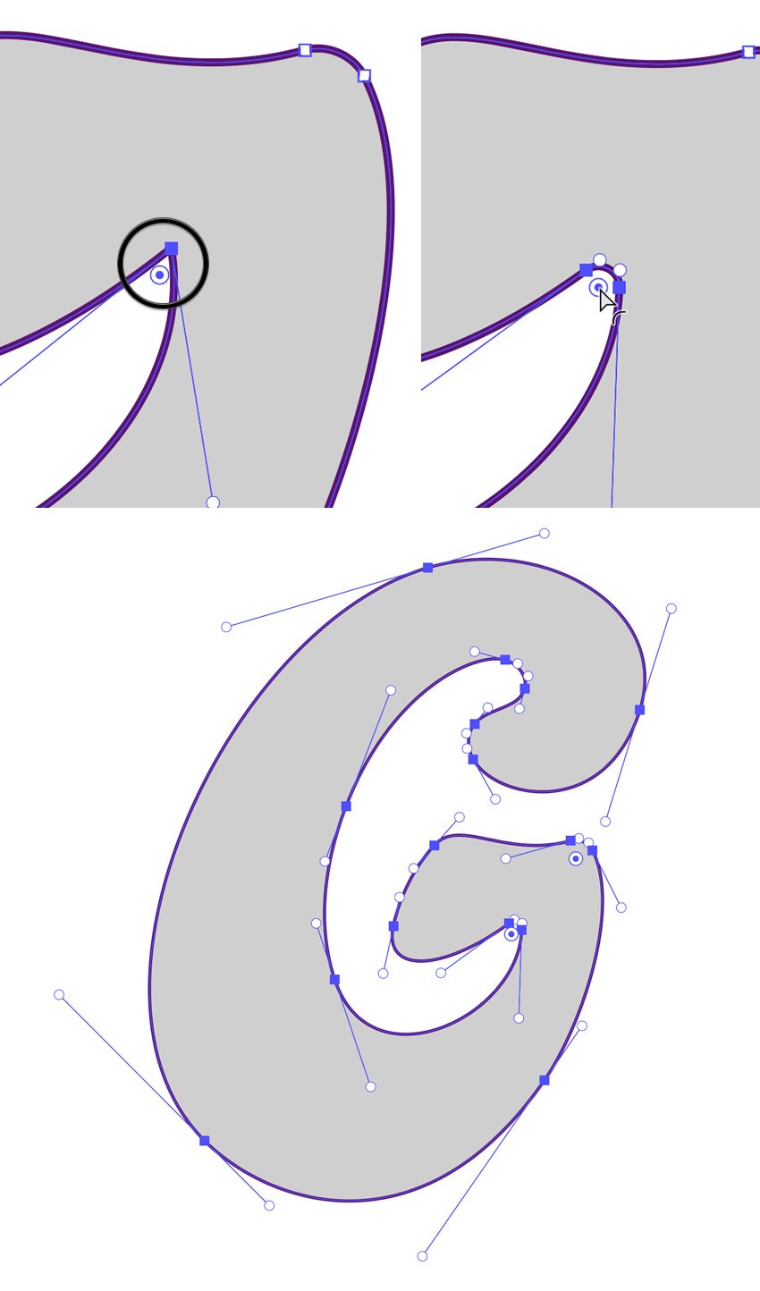
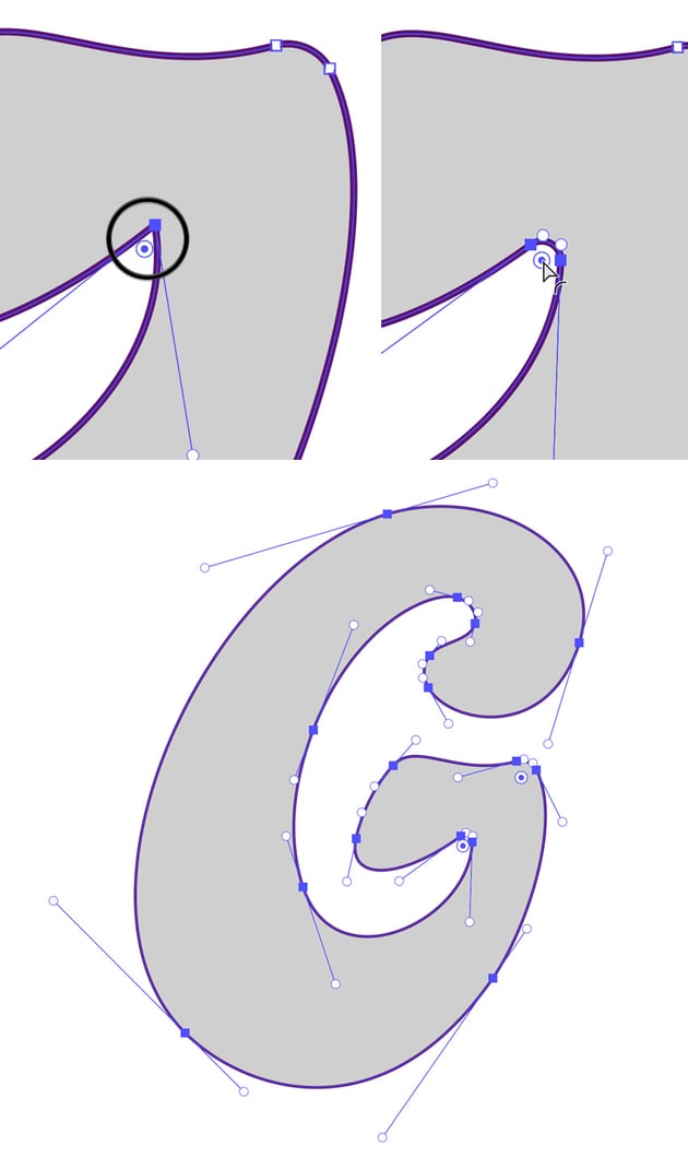
Proceed with the next letter “G” using the tool of your choice. Remember to use the sketch as a guide. When you’re happy with the letter “G”, select it with the Direct Selection Tool (A) and locate any sharp corners. With the letter selected, drag the Round Corners handles to soften the corners, giving the “G” a smoother, more polished look. You can also adjust the roundness value manually from the Live Corners widget in the control panel at the top of the screen.

Step 9
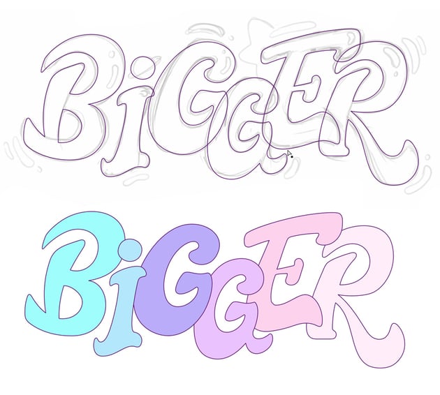
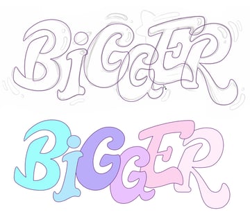
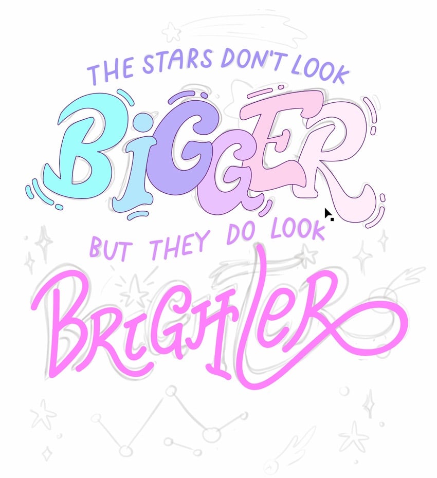
Finish up the letters of the word “Bigger” and apply placeholder colors to each letter to better organize your composition. This way, it’s easier to see which letters are overlapping and which one goes on top of which.
You can assign the colors manually by selecting random ones in the Color panel, or you can use the default ones from the Swatches panel. To do so, select a letter, open the Swatches panel (Window > Swatches), and click on a color swatch. Repeat this for each letter to help you visualize the overall design and make adjustments easily.

Step 10
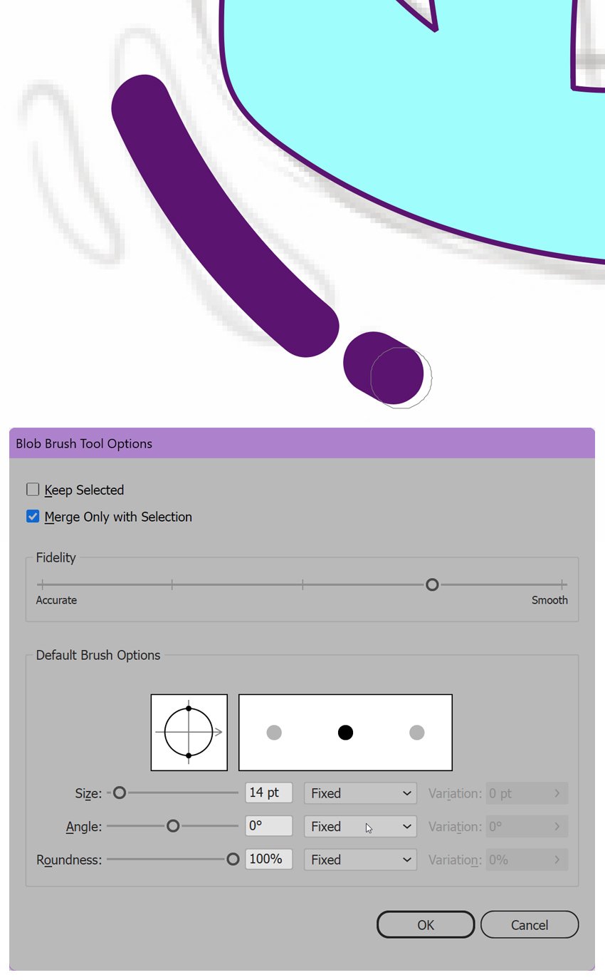
Let’s move on to the next element of our design and create some flying splashes around the letters of the word “Bigger”. Select the Blob Brush Tool (Shift-B) and draw short, dynamic strokes around the letters to create a sense of movement and energy. The Blob Brush in Illustrator creates filled shapes rather than paths, which is ideal for adding these bold, illustrative elements.
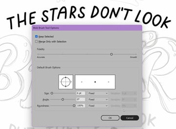
You can also adjust the settings of the Blob Brush Tool, like any other tool, by double-clicking its icon. Set the Fidelity of your brush closer to Smooth, and set the Size to 14 pt.
Deselect the Keep Selected box, and keep the Merge Only with Selection option checked. This one is important as it keeps unselected shapes separate, and anything you draw above will be a new shape. This gives you more freedom in editing and cleaning up the elements you create.


Step 11
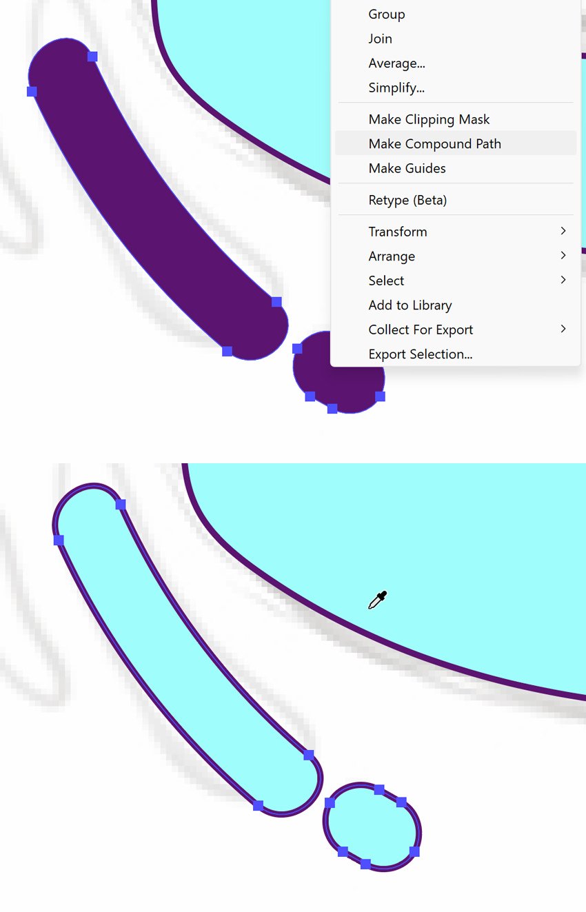
To unify the strokes you just created, select them all and go to Object > Compound Path > Make (Control-8) or Right-click > Make Compound Path. With the compound path selected, use the Eyedropper Tool (I) to sample the stroke and fill settings from the corresponding letter in your design. This ensures consistency across the artwork and will make it easier to edit your design later on.


Step 12
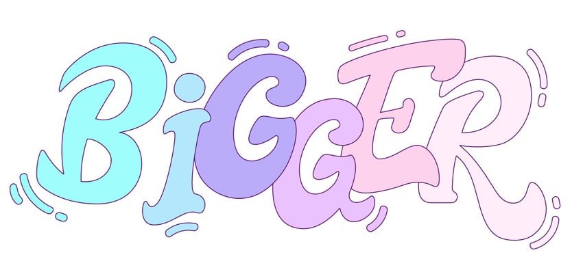
Continue adding splashes to each letter and refining the word “Bigger”. Use the Direct Selection Tool (A) to adjust anchor points and handles, ensuring each letter is smooth and cohesive.
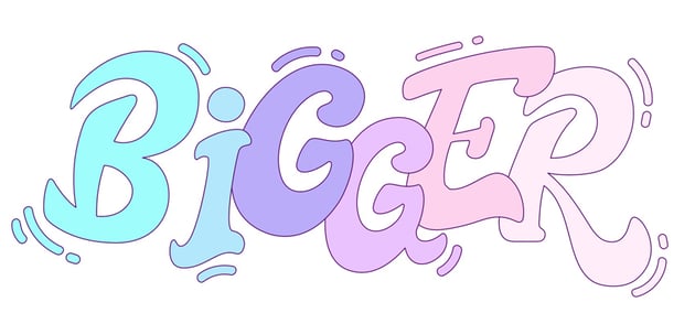

3. How to trace the letters using the Blob Brush in Illustrator
Step 1
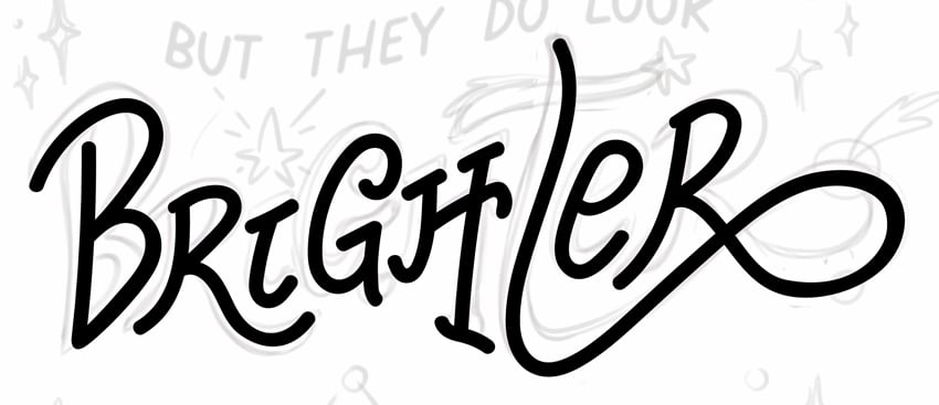
Let’s move on to the next element of our poster and trace the word “Brighter”. I see this one created in a more elegant handwritten style. Let’s keep using the Blob Brush Tool (Shift-B) to trace the letter “B”. The Blob Brush allows for thinner, more expressive strokes, making it perfect for this part of the design. You can vary the thickness of the stroke in the Blob Brush options window by double-clicking the tool. I set it to around 14 pt, the same as I had for the splashes, to make the design consistent.

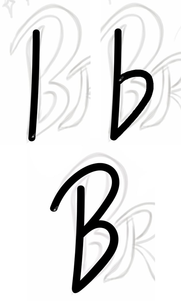
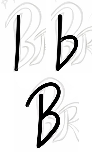
Step 2
Continue with the Blob Brush Tool to trace the letter “R” in “Brighter”. Try to keep your strokes the same width and style for all the letters, maintaining a cohesive look throughout the word. Start with the stem of the “R” and then add the bowl (the rounded part), and finish up by drawing the exit stroke. Note how the curvature of the stem arcs to repeat the curvature of the letter “B”, making the design more harmonious.


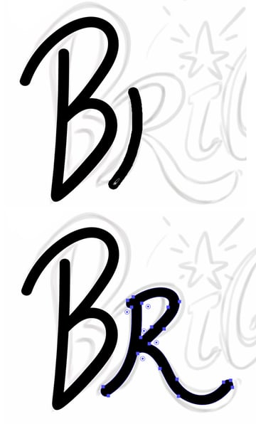
Step 3
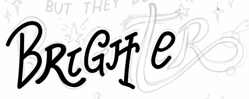
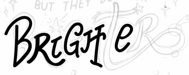
Using the Blob Brush Tool, trace all the remaining letters of the word “Brighter,” except for “T” and “R”. This will prepare you for connecting these letters in the next step.
Step 4
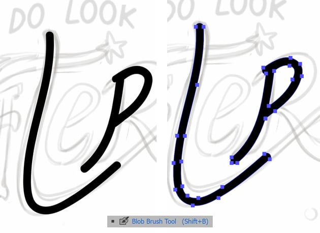
Trace the letters “T” and “R” with the Blob Brush Tool, except for the part where they merge together. Once they’re traced, use the Selection Tool (V) to select both letters. This will allow us to connect them seamlessly thanks to the option Merge only with Selection that we enabled earlier in the Blob Brush options.

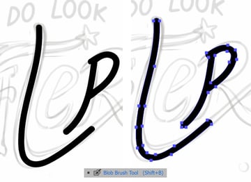
Step 5
With both “T” and “R” selected, use the Blob Brush Tool (Shift-B) to draw a connecting stroke between the letters. This technique creates a smooth transition, giving the word “Brighter” a more fluid, hand-drawn appearance. Make sure that there are no unwanted anchor points in the place where the letters connect. Use the Delete Anchor Point Tool (-) to remove the points you don’t need.
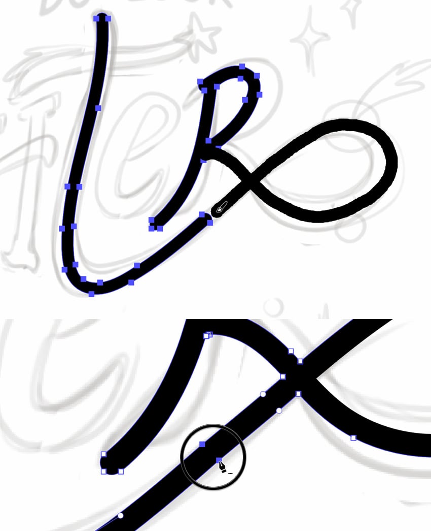
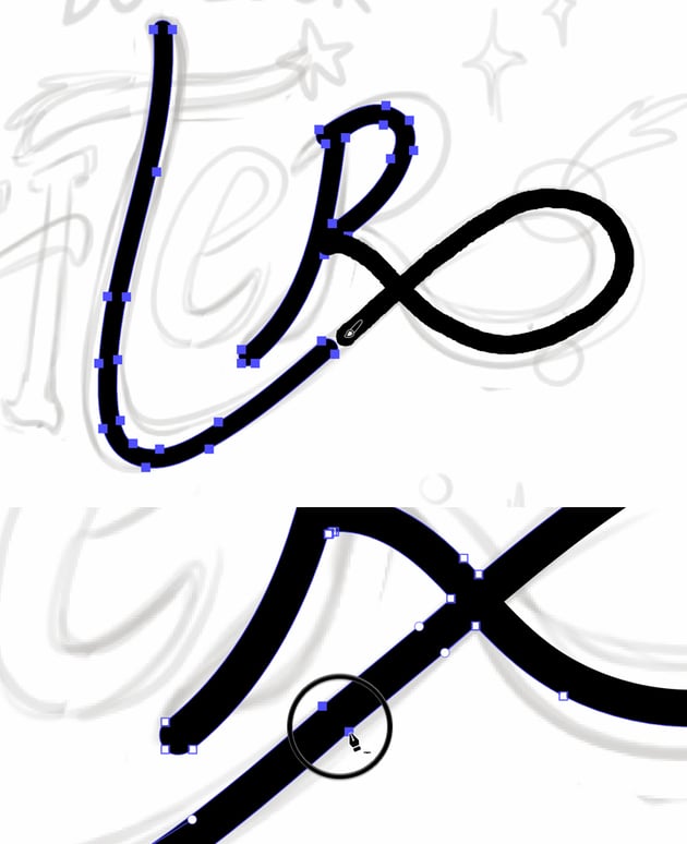
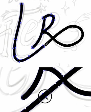
Step 6
Complete the word “Brighter” by refining any connections and ensuring all the letters flow together smoothly. Use the Direct Selection Tool (A) to make final adjustments, fixing any rough edges. There is still no dot above the letter “I” and no cross stroke on the letter “T”, but those will be special elements that we’ll work on in the next steps.

Step 1
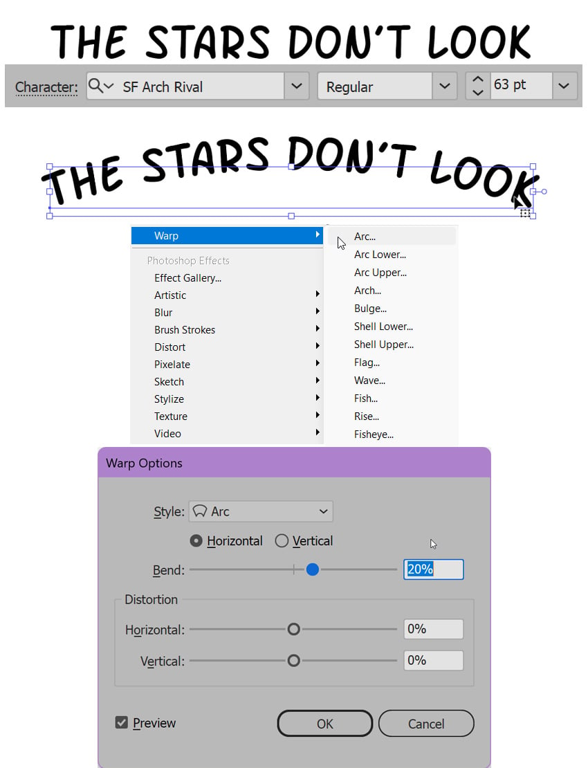
Next, we’ll work on the phrase “Stars don’t look” in our composition. When creating this element, we have two options: we can either use our own handwriting to craft a custom lettering style, or we can choose an actual font that complements the design.
If you prefer to work with a font, head straight to Envato to explore its collection of script and handwritten fonts. Browse through to find one that suits your vision, whether you want to use it as a starting point for your lettering or as the final design element. For example, the following fonts could match our design perfectly:
You can find more fonts in a similar style by typing “comic fonts” in the search bar.
Step 2
Select the Type Tool (T) and type out the phrase: “Stars don’t look”. With the text selected, go to Effect > Warp > Arc and adjust the Bend slider to about 20% to create a gentle curve in the text. This effect adds a dynamic touch to the typography.
Once you’re happy with the result, go to Object > Expand Appearance to apply the effect, turning the text into curves.

Step 3
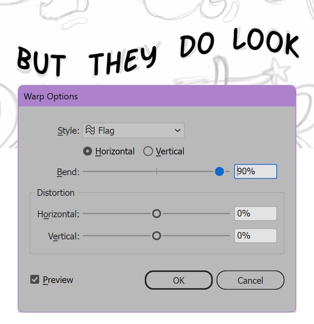
Continue with the Type Tool (T) to add the phrase: “But they do look”. For additional curvature, apply the Flag Warp function by going to Effect > Warp > Flag. Experiment with the Bend slider to achieve the desired effect. I’ve set it to 90%, making sure the size of the text coincides with the sketch.

Step 4
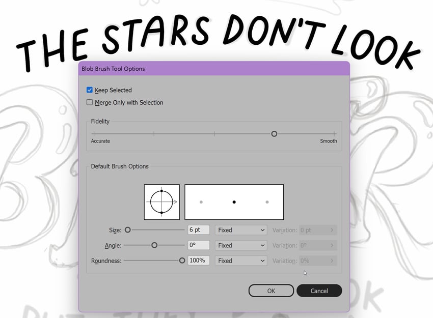
The second option that we can use to achieve a more organic and handwritten look in the final design is to trace the letters of the sketch manually (the same way as we did for the word “Brighter”). Select the Blob Brush Tool (Shift-B) and trace over the elements of your lettering, using the initial sketch as a guide. For these two phrases, we’re using a thinner brush of 6 pt to add variety.
Step 5
Select each text element and apply placeholder colors of your choice, either from the Color panel (Window > Color) or from the Swatches panel. This step helps us keep the composition organized and visually balanced.


5. How to create background elements
Step 1
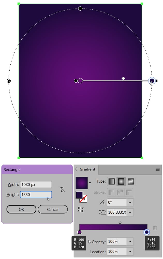
Let’s create a dark background for our poster by selecting the Rectangle Tool (M) and drawing a 1080 x 1350 px shape that covers the entire artboard. With the rectangle selected, open the Gradient panel (Window > Gradient) and choose Radial Gradient. Set the gradient to transition from a deep violet (R:30, G:10, B:60) at the edges to a lighter violet (R:100, G:15, B:120) in the center, mimicking a galaxy effect. Use Illustrator’s Gradient Tool (G) to adjust the position of the gradient slider if needed.


Step 2
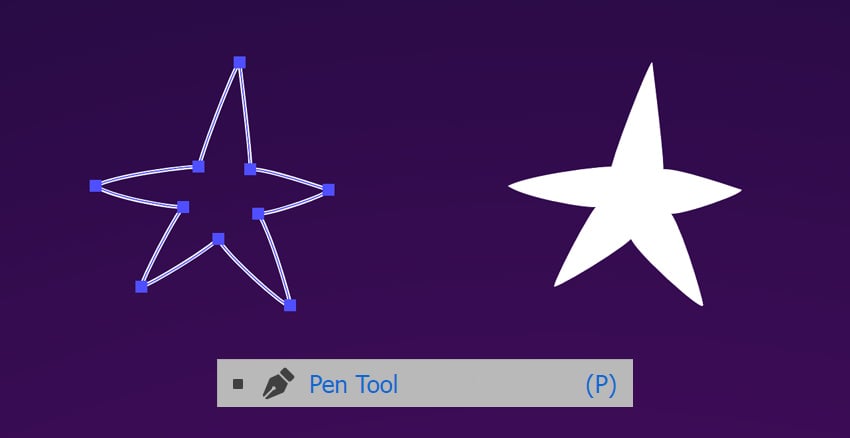
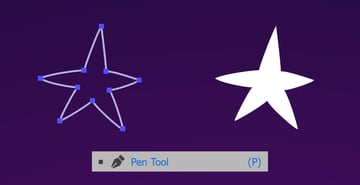
Select the Pen Tool (P) and draw a simple star shape. Click to place anchor points, and close the shape by clicking back on the first anchor point. Fill it with white. This star will be one of the repeating elements in our galactic theme.
We can also use the Star Tool, which is located in the same drop-down menu as the Rectangle Tool (M), but for this design I prefer a more stylized, cartoony look, which is easier to achieve by drawing it by hand and adjusting the shape with the Direct Selection Tool (A).

Step 3
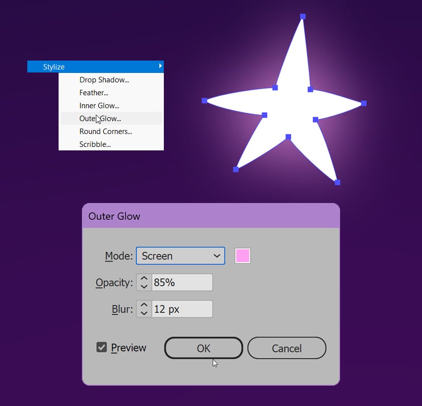
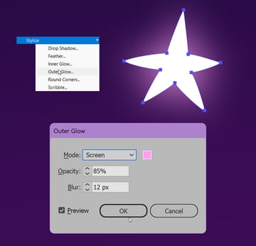
With the star shape selected, let’s apply an Outer Glow effect. Go to Effect > Stylize > Outer Glow. In the dialog box that appears, adjust the settings to give the star a bright, glowing aura by setting the color to bright pink, Mode to Screen, Opacity to 85%, and Blur to about 12 px. This effect will make the star stand out more vividly against the background, adding to the celestial theme of our poster.

Step 4
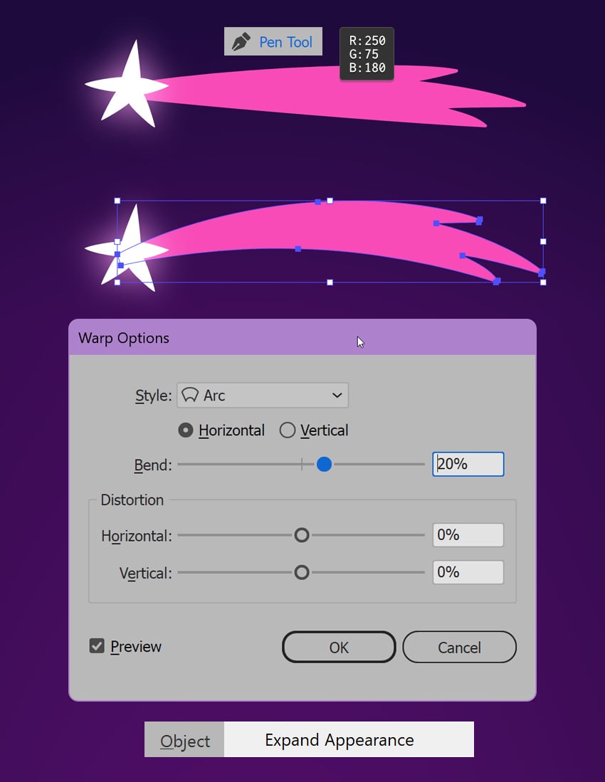
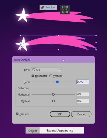
To add a sense of motion to our design, let’s create a star trail. Start by selecting the Pen Tool (P) and drawing a smooth, stylized path behind the star. Fill it with bright magenta (R:250, G:75, B:180).
Once the trail is in place, go to Effect > Warp > Arc. In the dialog box, set the Bend slider to 20% to curve the trail, giving it a dynamic, flowing appearance. This effect will make the star appear as if it’s streaking across the sky, adding energy and movement to our composition. Don’t forget to Object > Expand Appearance once you’re happy with the shape.

Step 5
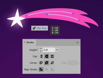
Add additional details, such as thinner strokes along the trail, using the Pen Tool (P). Adjust the line Weight in the Stroke panel (Window > Stroke) by setting it to 3 pt, and set the Cap to Round Cap. This will help fill out the composition and add depth to the individual elements.


Step 6
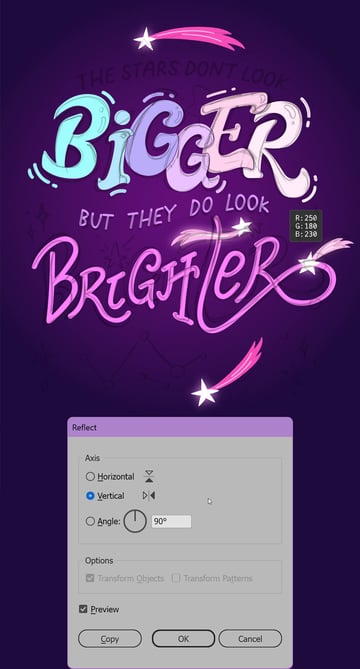
To make our poster more detailed, let’s use the Reflect Tool to create mirrored copies of the star and its trail. Select both elements with the Selection Tool (V), and then double-click the Reflect Tool. In the dialog box, select the Vertical axis and press Copy to create a mirrored copy. Repeat the same step, but this time flip it over the Horizontal axis to add some variety.
Use the Direct Selection Tool (A) to edit the shape of the star trail above the letter “T” to make it more wavy. Another way we could do this is by using Effect > Warp > Flag, which we used earlier to bend the text.
We can also play with the colors of some of the trails. Set it to lighter pink (R:250, G:180, B:230), and don’t forget to adjust the color of the strokes by setting it to white. Varying the color, size, and placement of the mirrored stars not only makes our composition more dynamic and layered but also highlights the celestial theme of the poster.


Step 7
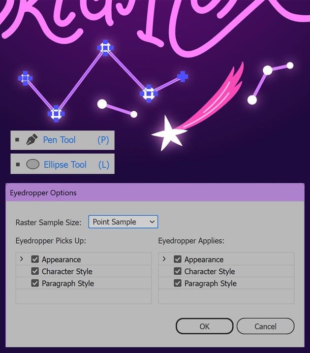
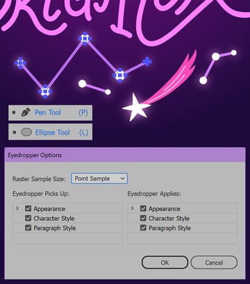
Let’s add more space-themed elements to our poster, such as constellations. Grab the Pen Tool (P) and make a zig-zag line with a pink stroke of about 7 pt. Next, use the Ellipse Tool (L) and hold down Shift to add circles of different sizes at each point of the zig-zag.
To make the circles shiny, use the Eyedropper Tool (I) to pick the Appearance from the glowing stars that we made earlier. You can check the options of the Eyedropper by double-clicking its icon in the Tools panel. The Appearance box should be checked in both columns.

Step 8
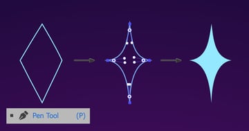
Next, we’ll create a four-pointed star using the Pen Tool (P) to make it look more hand-drawn and organic. Click on the artboard to place the first anchor point, and then move to the next position and click again to create a straight line. Continue clicking to create four anchor points in a diamond or rhombus shape, forming the outline of the star.
Once your four-pointed star is complete, use the Direct Selection Tool (A) to adjust the position of the anchor handles by moving those closer together and towards the center of the shape, ensuring the star is symmetrical and balanced. Fill the star with a bright blue color (R:150, G:230, B:250). This simple geometric star adds a sharp, dynamic touch to our design.


Step 9
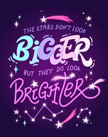
To add to the cosmic feel of our poster, let’s scatter more stars and sparks around the central part of the composition. Use Control-C (or Command-C on Mac) to Copy and Control-V (or Command-V on Mac) to Paste the created elements.
Remember to vary the size, position and color of each element to make our design look more dynamic and lively.
Use the Ellipse Tool (L) to add circles that resemble tiny stars. Use the Eyedropper Tool (I) to keep the colors and the appearance of the elements consistent.


Step 10
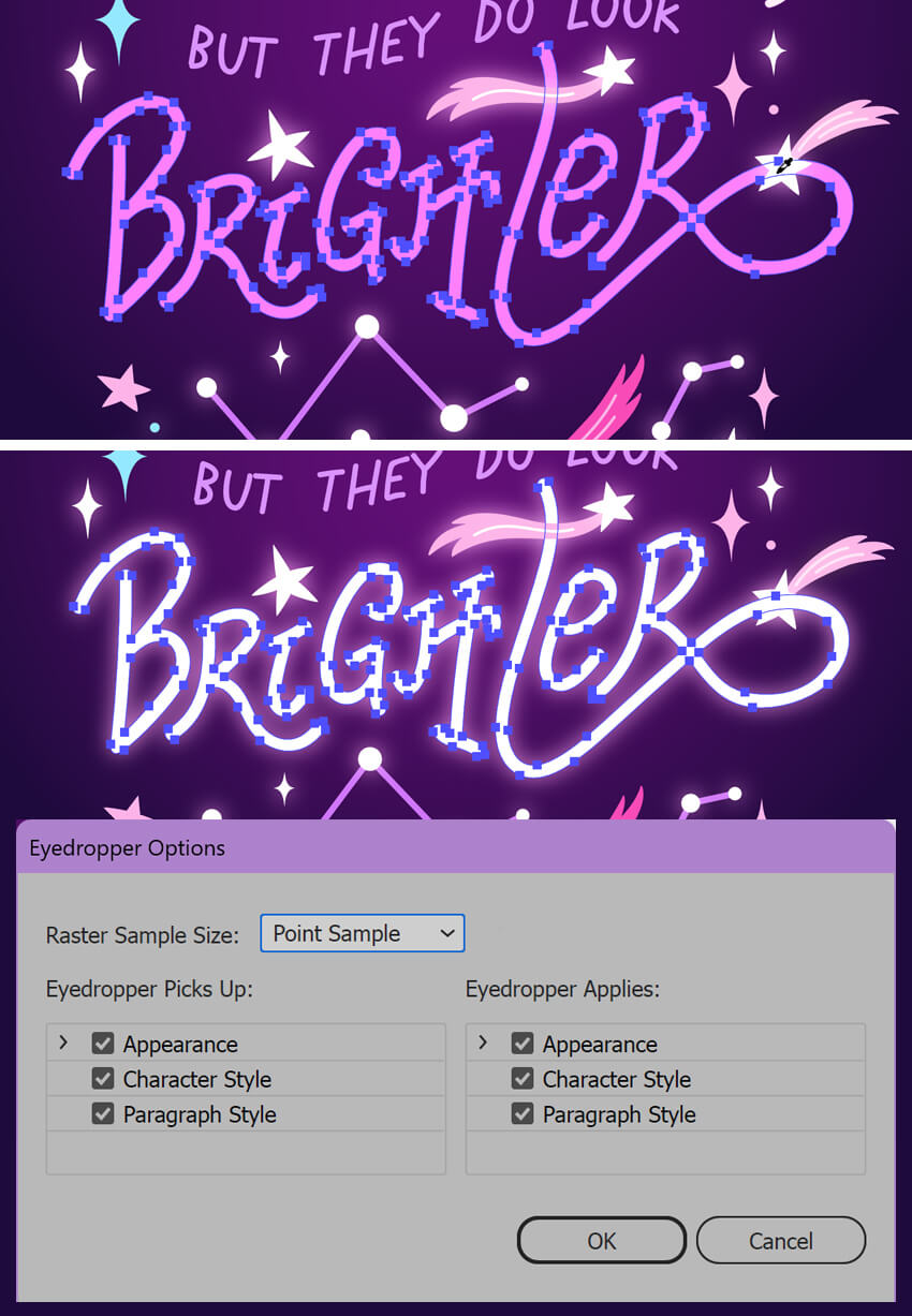
The word “Brighter” is one of the key elements of our composition, so let’s make it truly shine! Select the Eyedropper Tool (I) and click on one of the glowing stars to sample and apply its style. This glow gives the word a luminous appearance that matches the star elements, tying the design together.


6. How to create a galactic gradient in Illustrator
Step 1
Let’s replace the placeholder colors of the word “Bigger” with something vivid and give it galactic vibes!
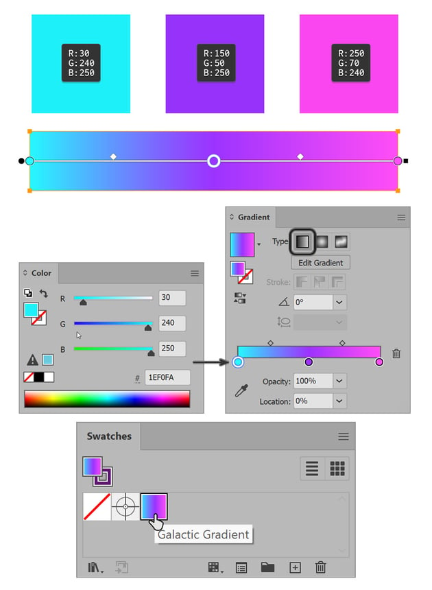
Open the Gradient panel (Window > Gradient) and create a new gradient by selecting the Gradient Slider and adding three color stops. Click on each stop to choose vivid colors, and drag and drop each color from the Color panel. For this poster, I’ve picked the following colors:
- bright cyan (R:30, G:240, B:250),
- violet (R:150, G:50, B:250),
- vivid magenta (R:250, G:70, B:240).
Once you’re satisfied with the gradient, drag it from the Gradient panel to the Swatches panel to save it for later use.


Step 2
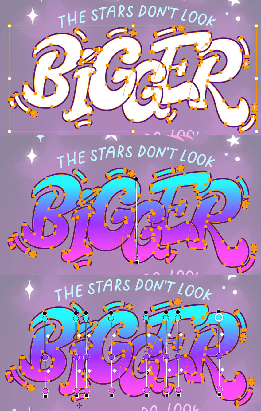
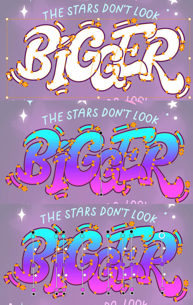
Select each letter of the word “Bigger” using the Selection Tool (V), holding Shift to select multiple objects. Once all letters are selected, group them by pressing Control-G (or Command-G on Mac). With the group selected, apply the previously saved gradient from the Swatches panel.
Take the Gradient Tool (G) and click and drag it from the top to the bottom of the word to apply the gradient to all the letters at once. This gives the entire word a cohesive, colorful appearance, making it stand out in the design.
When all the elements are selected, you can still adjust the position of the gradient of each letter separately.
Step 3
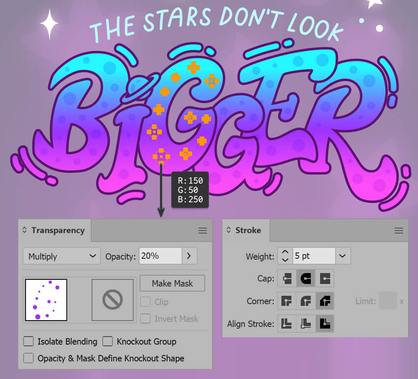
To create a subtle texture, let’s draw small circles using the Ellipse Tool (L) and arrange them into a pattern over the letters of the word “Bigger”. Select the pattern on each letter and Group it (Control-G or Command-G on Mac).
Apply a violet color (R:150, G:50, B:250) to the circles and go to the Transparency panel (Window > Transparency). Change the Blending Mode to Multiply. This will darken the pattern slightly and allow the gradient beneath to show through, creating a layered effect.
Let’s make the outline of the letters thicker to separate them from each other. Set the Stroke Weight to 5 pt and Align Stroke to Outside.


Step 4
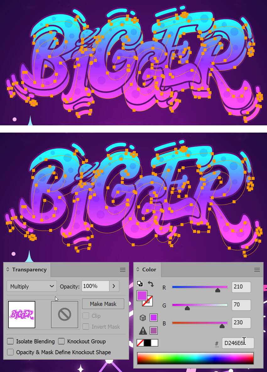
We can make the word “Bigger” stand out even more by adding a drop shadow to it. Select the word group and press Control-C (Command-C) to Copy it, and then press Control-B (Command-B) to Paste in Back behind the original. With the duplicated word still selected, nudge it down slightly using the arrow keys while holding Shift.
Apply purple (R:210, G:70, B:230) to the shadow, and switch the Blending Mode to Multiply.
This will create a shadow effect, giving the text more depth and making it pop from the background.


Step 5
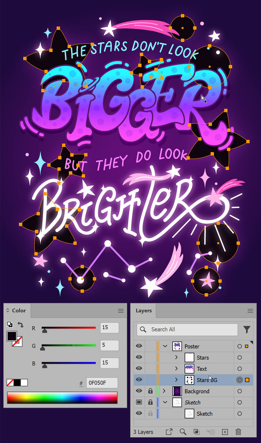
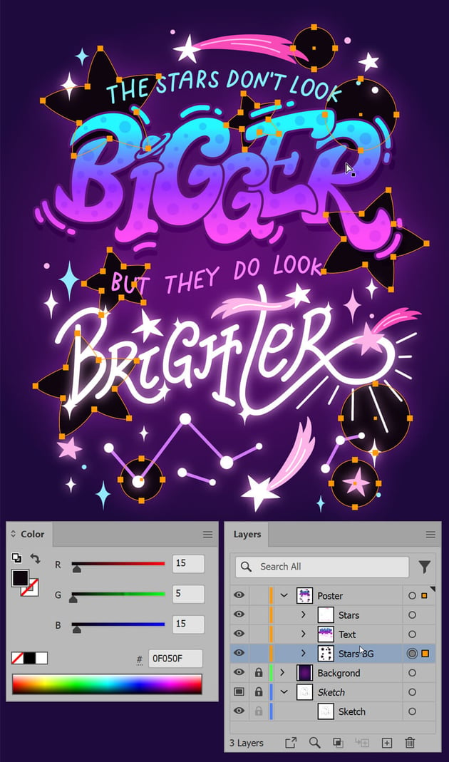
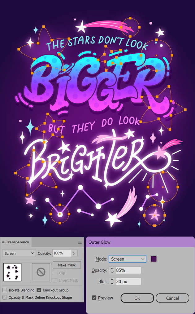
Let’s add some more elements to the background to make the composition more balanced. Duplicate some of the stars that we made before, and make them much bigger. Add circles using the Ellipse Tool (L), and fill the new elements with a very dark purple (R:15, G:5, B:15). Once all the shapes are in place, Group (Control-B or Command-B) them.
Select the group and open the Layers panel (Window > Layers). Drag the group to the very bottom of the layer stack, just above the background shape. This positioning will make the stars and circles blend naturally with the background, adding subtle details without distracting from the main elements of the design.

Step 6
Select the stars and circles you’ve just added, and go to the Transparency panel. Change the Blending Mode to Screen. This will lighten the elements, allowing them to interact softly with the background. Then, apply an Outer Glow effect by going to Effect > Stylize > Outer Glow. Adjust the settings by setting the color to dark purple, Opacity to 85%, and Blur to 30 px to create a soft, luminous glow around the stars and circles, enhancing their ethereal appearance.


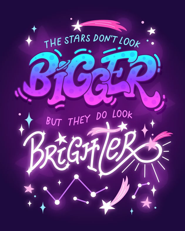
That’s how to create a galaxy-themed hand-lettering poster in Adobe Illustrator
Take a moment to review your work. Zoom out and make any final adjustments to the placement, color, or effects as needed. For example, I’ve added smaller white sparkles to the word “Brighter” to make it shine even more. Once you’re satisfied, save your work and export the final design.
Congratulations! You’ve completed your galaxy-themed hand lettering poster. In this Adobe Illustrator lettering tutorial, you’ve learned how to design letters in Illustrator and how to combine hand-drawn elements with digital techniques to create a stunning, layered design. Whether you’re planning to print and display your poster or share it online, you’ve developed a piece that showcases your creativity and skills in vector art. Keep experimenting with different styles and effects in Illustrator, and continue to refine your techniques. The possibilities are endless, and every new project is an opportunity to grow as a designer!


Want to learn more about how to create hand lettering designs and explore other lettering tips? Check out some more tutorials in the hand lettering and typography series below.