In this next article of our Advanced Color Theory series, we’ll discover the science behind “ghost images” and how after-image and successive contrast affect your designs.
This article explores physiological and psychological reasons for these intriguing visual effects, based on how our eyes and brain process color and value. Learn how these phenomena not only explain common visual experiences but also offer practical insights for designers, from crafting color harmonies to enhancing visual interest in limited palettes and sequential media.
After-image is an interesting phenomenon resulting from the physiology of our eyes and the way our brains handle visual signals. It’s also a key component in understanding concepts like simultaneous contrast, successive contrast, and complementary color pairings.
1. Physiology and psychology: What do cones do in the eye?
We talked about what cones do in the eye and how the different types of cones are sensitive to different colors in the first article on advanced color theory. There are three types of cone cells in the eyes: one group sensitive to long wavelengths, one sensitive to medium wavelengths, and one sensitive to short wavelengths. These photoreceptors are organic structures, though, and can quickly become fatigued after prolonged stimulation.
Our visual system would be pretty ineffective if we could only differentiate color for 30 seconds or so. Instead, the brain looks at the relative activity across all three types of cones and compares them. As the cones become fatigued, they are less sensitive.
The brain is essentially compensating for the decreased sensitivity when it compares the input from the fatigued cones to the other cone types. Once the stimulus is removed, we continue to see the opposite color. This is an after-image.
2. Color after-image
2.1 Color
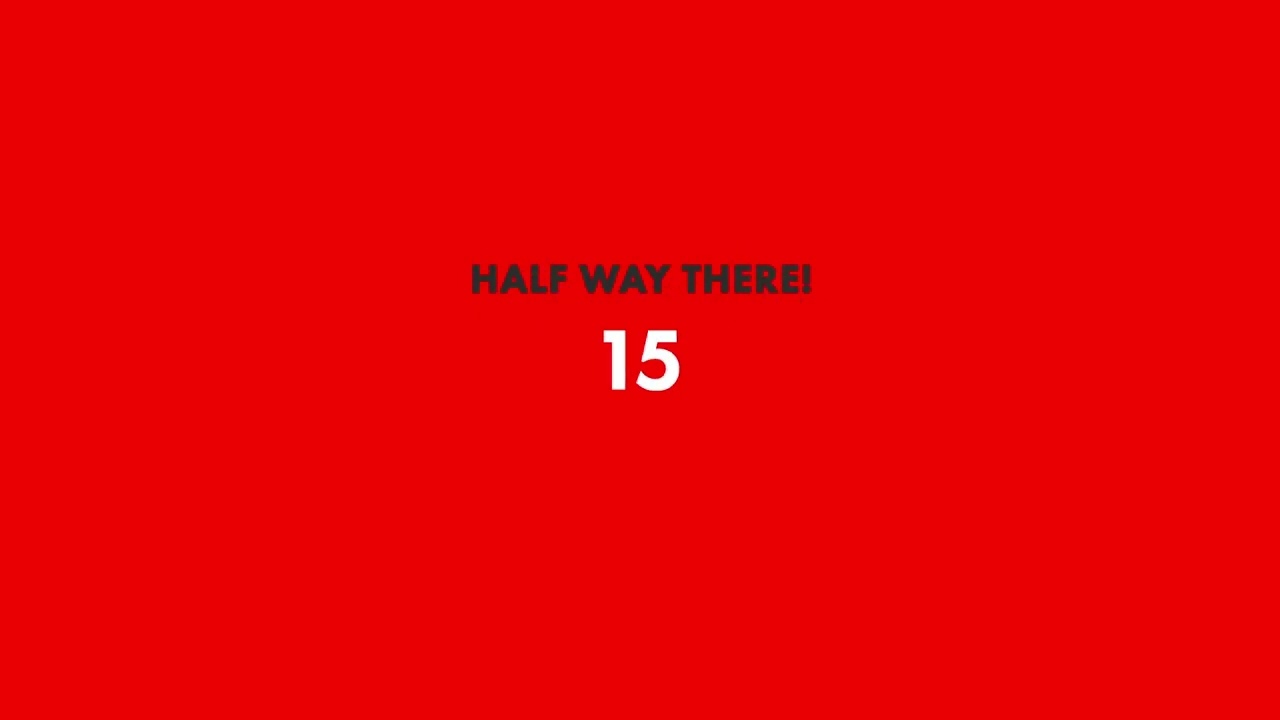
The following video demonstrates color after-image. Keep looking at the countdown timer in the center color field to fatigue your color receptors. Once the timer ends, the color will be replaced with a white field, and you should see the opposite color.

3. Successive contrast
3.1 After-image and value
We don’t see colors in isolation, and the effect gets more complex when multiple colors and overall lightness and darkness are involved. In the last example, you probably noticed that the edges of the color after-image were somewhat indistinct and blurry. We tend to use value or the overall lightness and darkness of an image to understand shape and form.


Rod cells in the eye are sensitive to a wide range of wavelengths. The rods are responsible for identifying value. They do not differentiate between different wavelengths to identify color, but they can become fatigued just like the cone cells in the eyes. Like color, we also perceive value based on relative activity across all of the rod cells that are stimulated. Even though the value after-image isn’t as readily apparent in isolation, we can still see the effect in successive contrast.
3.2 Experiencing successive contrast
In this example, you’ll see a color negative. Again, keep staring at the center until the timer runs out, and the image will be replaced with a black and white version of the same image.
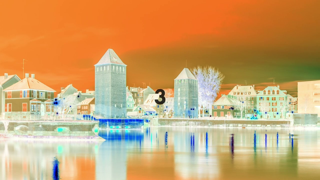
If you look away, the color image disappears, but when you look back, it returns. Value, or the lightness and darkness of an image, helps us perceive shape and form. The fact that the color disappears and the overall after-image becomes harder to perceive when we look away shows that we perceive color and value somewhat separately.
3.3 Successive contrast and after-image
Successive contrast is effectively a result of after-image. As we build up fatigue in both the rods and cones, it affects how we perceive color in images that we view in succession. Since the effect requires that the value of the images viewed in succession match, it’s usually difficult to notice the effect.
When we specifically view images that have the same shapes and forms but different colors, though, we can see that the effect substantially changes the way the images look.


4. Putting it to use
After-image and successive contrast are interesting effects to be aware of, but how do we, as designers, put them to use?
4.1 After-image and color harmonies
Using cone cell fatigue is a quick way to identify complementary pairs and build complementary color harmonies that are specific to a given color.
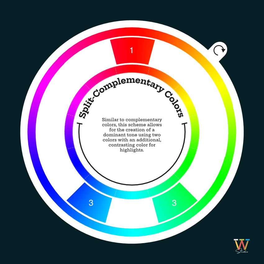
No matter what system you’re using, you can quickly and accurately find a complementary color by simply looking at the base color for an extended period of time and then looking at a white surface. For instance, we can look at this image for about 20 seconds or so and identify an exact complementary color, and then we can build a split complementary harmony from that information.


The Munsell color system employed this effect specifically to design a better subtractive color wheel. Munsell color charts arranged hues around the color wheel based on their after-image so that mixing hues would fully cancel them out, resulting in a chromatic grey.
This wasn’t possible with the red, yellow, and blue color wheel since red and green are not a true complementary pair.
4.2 Limited color palettes


Color printing is expensive, and it is always ideal to use fewer colors if possible, particularly when printing with specific Pantone colors. Using successive contrast effectively can help you add visual interest without adding more colors.
4.3 Time-based, sequential, and interactive media
Although it’s rare for scenes to last long enough to build up fatigue, it is still possible to induce successive contrast by using repeated cuts to the same scene or UI elements that will be on screen for an extended period.
This may be something you prefer to avoid or something that you choose to emphasize. In any case, it’s useful to be aware of the buildup of fatigue and how it will affect subsequent scenes.
5. Conclusion
Understanding after-images and successive contrast not only deepens our comprehension of visual perception but also opens up new possibilities for creative expression in design.
By leveraging the natural fatigue of cone and rod cells, designers can craft more dynamic color harmonies, enhance visual interest with limited color palettes, and even influence how audiences perceive sequential and interactive media.
These phenomena remind us that our perception of color and value is fluid, shaped by both physiological and psychological factors, and that this fluidity can be a powerful tool in the hands of a skilled designer.
If you’re interested in color theory, here are a few articles you can check out, and don’t forget to go to Envato for a complete library of graphic resources.