In the previous post we learned all about block style variations and how they’re used in the brand new WordPress 5.0 editor to switch between predefined styles easily.
We’ll take things a little further in this post by providing more examples to give you a solid base for implementing block style variations in your own projects. Specifically, we’ll create our own block from scratch to demonstrate how to add multiple style variations directly in the block definition itself. I’ll also show you how to set which block style is used as the default is also covered.
Then we’ll look at extending our block by adding further block style variations (BSVs for short) via a separate plugin. You’d typically want to do this if you needed to extend block styles but didn’t have access to the block’s source code.
The same approach will be used again but this time via a child theme. You might want to do this to provide extra style variations for core blocks to match your own theme styles.
Just as important as registering new styles is how to unregister them too. And there’s a dedicated function we’ll use for doing just this.
All the code for this tutorial is available for download our GitHub repo to the right, so you don’t have to type in the code manually if you just want to follow along.
Registering a BSV Inside a Block
If you have access to a block’s source code then you can manage block style variations directly inside registerBlockType(). Let’s take a closer look.
Firstly, we’ll need to spin up a new block. It doesn’t really matter what the block does as we just need something to add our custom block style variations too. Probably the easiest way to do this is to use the create-guten-block utility which creates a new plugin and adds a sample block ready for customization. And it does this all from a single terminal command!
If you’ve not used this handy utility before then you can take a look at the project repository for more information. Also, here’s a dedicated tutorial to get you up to speed if required.
Inside your local WordPress plugin folder open a command line window and enter:
npx create-guten-block bsv-plugin
I’ve used bsv-plugin here for the name but you can use anything you like. After a couple of minutes when installation is complete enter:
cd bsv-plugin
npm start
We can now edit the source code for our newly created block and create-guten-block will automatically compile the source code for us after every change. Nice.
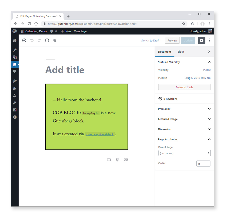
Go ahead and activate the plugin inside the WordPress admin and add an instance of your new block to the editor by creating a new page or editing an existing one.
Remove Editor-Only Styles
Before we go any further though we just need to alter the way CSS is enqueued by default.
The custom block create-guten-block just created for us includes two style sheets. One is enqueued on the editor and the other is enqueued on the editor and frontend. We don’t need the editor-only styles for this tutorial so in .bsv-pluginsrcinit.php comment out or delete the call to wp_enqueue_style() in bsv_plugin_cgb_editor_assets().
Staying in init.php for a moment we also need to comment out the dependency array for wp_enqueue_style() in bsv_plugin_cgb_block_assets() as for some reason this currently prevents the styles from being enqueued properly. I’m using create-guten-block v1.11.0 in this tutorial so you may or may not have the same issue depending on the version you’re using.
The bsv_plugin_cgb_block_assets() function should now look like this:
function bsv_plugin_cgb_block_assets() {
    // Styles.
    wp_enqueue_style(
        'bsv_plugin-cgb-style-css', // Handle.
        plugins_url( 'dist/blocks.style.build.css', dirname( __FILE__ ) ) // Block style CSS.
        //array( 'wp-blocks' ) // Dependency to include the CSS after it.
        // filemtime( plugin_dir_path( __DIR__ ) . 'dist/blocks.style.build.css' ) // Version: filemtime — Gets file modification time.
    );

} // End function bsv_plugin_cgb_block_assets().
Now when you load the page you’ll see the block styles that are applied in the editor and on the front end which is what we want.

Register Block Style Variations
We’re all set up now to add in our custom CSS which we’ll do shorty. First though we need to register our block style variations.
Open up .bsv-pluginsrcblockblock.js and add the following to the registerBlockType functions configuration object (e.g. directly beneath the keywords property will do here).
styles: [
    {
        name: "style1",
        label: __("Style 1"),
        isDefault: true
    },
    {
        name: "style2",
        label: __("Style 2")
    },
    {
        name: "style3",
        label: __("Style 3")
    }
],
This registers three new style variations for our custom block. Notice how the block style variation named style1 has the isDefault property set to true. This simply selects the Style 1 block style variation when you open the block options in the editor. It doesn’t actually set any CSS classes for the block as you might think.
This was a bit of a sticking point for me when I first started working with block style variations and was a source of much confusion. Hopefully in the future the isDefault property will also trigger the CSS class to be added to the block’s wrapper which I think is more intuitive.
Refresh the editor page and open the style variation options by clicking the icon to the top left of the block to see the three block style variations we just defined.

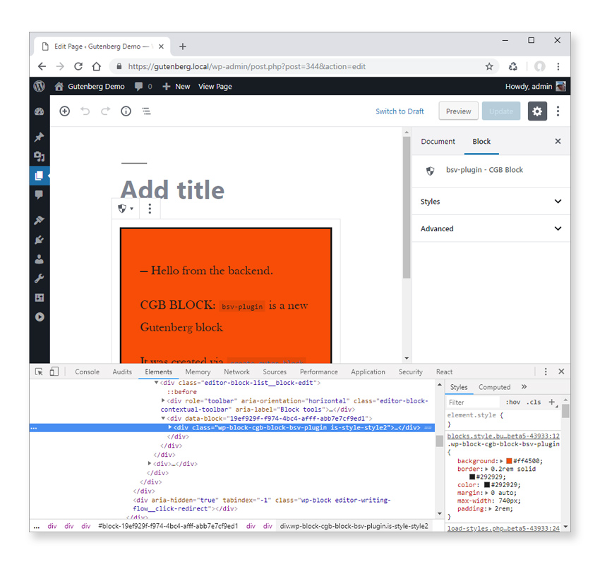
Notice how the Style 1 block style variation is selected by default which is the one we specified in the styles property above. Selecting any one of the three block style variations results in different CSS classes being added to the block’s wrapper. For example selecting the Style 2 adds the is-style-style2 class.
Nothing currently happens when each block style variation is selected so let’s add some basic styles to fix this. In .bsv-pluginsrcblockstyle.scss add the following after the existing styles:
.wp-block-cgb-block-bsv-plugin.is-style-style2 {
    background: pink;
}

.wp-block-cgb-block-bsv-plugin.is-style-style3 {
    background: purple;
    color: white;
}
Only custom styles for Style 2 and Style 3 block style variations are being added here so that the default block styles are still applied even when no block style variation is specifically clicked.
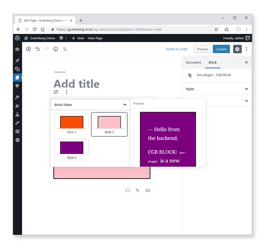
As you can see our block style variations are now available with the styles applied. I really like the way that you can see a preview of each style variation as you hover it, and without having to select it first too!
Registering a BSV Via a Plugin
If you want to add style variations to a block that you don’t have source code access for, then you can use registerBlockStyle(). This function enables you to define additional style variations for core blocks and 3rd party blocks, outside of registerBlockType().
Let’s test this out by adding a couple of our own style variations to the core button block. This block comes with three style variations already defined: Rounded, Outline, and Squared.

We’ll add two further style variations of our own: Pill Shaped, and Uppercase.
Before we do that though we need a plugin to store our custom code in. I won’t be covering this in depth as the focus of this tutorial is block style variations rather than plugin development. If you’re having any issues following along then you can just download the finished plugin via the GitHub link to the right.
Create a new bsv folder inside your local WordPress .wp-contentplugins folder and add three files:
In bsv.php add the following code:
<?php
/*
Plugin Name: Block Style Variations
Version: 0.1
Description: Demonstrates how to add block style variations to an existing block.
Author: David Gwyer
Author URI: https://www.wpgoplugins.com
*/

// editor scripts
function bsv_editor($hook) {
    wp_enqueue_script( 'bsv_js', plugins_url( 'bsv.js', __FILE__ ) );
}
add_action('enqueue_block_editor_assets', 'bsv_editor');

// frontend and editor scripts
function bsv_frontend_editor($hook) {
    wp_enqueue_style( 'bsv_css', plugins_url( 'bsv.css', __FILE__ ) );
}
add_action('enqueue_block_assets', 'bsv_frontend_editor');
In bsv.js add the front-end code:
jQuery(document).ready(function($) {
  wp.blocks.registerBlockStyle("core/button", {
    name: "upper-case",
    label: "Upper Case"
  });

  wp.blocks.registerBlockStyle("core/button", {
    name: "pill",
    label: "Pill Shaped"
  });
});
And in bsv.css add the styles themselves:
.wp-block-button.is-style-upper-case {
  text-transform: uppercase;
}

.wp-block-button.is-style-pill .wp-block-button__link {
  border-radius: 30px !important;
}
Activate the plugin and insert a new instance of the button block in the editor. You should now see the two new block style variations available!

Understanding the BSV Plugin Code
Let’s review what we’ve just done. In bsv.php the JavaScript file was enqueued via the enqueue_block_editor_assets hook so it loads only on the admin editor. However, we want the CSS to load on the editor and front-end so we use the enqueue_block_assets hook for this.
The styles are pretty self explanatory but notice how we’ve targeted block instances with specific block style variation classes. This gives us a clean way to separate out our CSS for different block style variations.
The important thing to take notice of here are the two registerBlockStyle() calls. This function lives in the global wp.blocks object so we need to explicitly include the prefix wherever that function is used.
registerBlockStyle() takes two arguments. The first is the name of the block you want to add the style variation to, and the second is a configuration object. This is exactly the same object we came across earlier when we added block style variations directly to a block definition via the styles property.
One thing to note here though is if you add isDefault: true for a block style variation via registerBlockStyle() it will be ignored if a default style variation has already been set. Just something to watch out for if (like me) you were expecting it to override the default style variation.
According to the documentation you can also unregister a block style variation with unregisterBlockStyle(). Usage is very similar to registerBlockStyle() but you only need to specify the block name and style variation name.
So, for example, to unregister the Outline style variation from the button block you can use:
wp.blocks.unregisterBlockStyle("core/button", "outline");
However, there seems to be a bit of an issue with this right now. It works if you enter the above line of code in the console window but it doesn’t always appear to work when used from a plugin. Hopefully these issues will be addressed soon.
Registering a BSV Via a Theme
For our final example let’s add another style variation to the core button block to add an option to render buttons with a gradient background color rather than just a flat color.
We’ll implement this new style variation via a child theme this time as I think it will be a common use case to provide alternative styles for blocks that match in with your own theme. (The theme is also included in the downloadable file for this tutorial if you don’t want to create it manually.)
I’m using Twenty Nineteen as the parent theme as it’s included with WordPress 5.0 but you can base it off any parent theme you want.
Create a new twentynineteen-child folder inside your local WordPress .wp-contentthemes folder and add four files:
- style.css
- functions.php
- tnc_bsv.js
- tnc_bsv.css
We won’t be adding any specific child theme styles to style.css but we need to include it so the theme is recognized by WordPress.
In style.css add:
/*
 Theme Name:   Twenty Nineteen Child
 Author:       David Gwyer
 Author URI:   https://wpgoplugins.com/
 Template:     twentynineteen
 Version:      0.1
 License:      GNU General Public License v2 or later
 License URI:  http://www.gnu.org/licenses/gpl-2.0.html
*/
The JavaScript and CSS files are enqueued via functions.php so add the following code to this file:
<?php

// tnc = twenty nineteen child

// Include parent theme styles
function tnc_enqueue_parent_theme_styles() {
    wp_enqueue_style( 'parent-theme-styles', get_template_directory_uri() . '/style.css' );
}
add_action( 'wp_enqueue_scripts', 'tnc_enqueue_parent_theme_styles' );

function tnc_add_styles() {
    wp_enqueue_style( 'tnc-bsv-css', get_stylesheet_directory_uri() . '/tnc_bsv.css' );
}
add_action('enqueue_block_assets', 'tnc_add_styles');

function tnc_add_scripts() {
    wp_enqueue_script(
        'tnc-bsv-js',
        get_stylesheet_directory_uri() . '/tnc_bsv.js'
    );
}
add_action( 'enqueue_block_editor_assets', 'tnc_add_scripts' );
In tnc_bsv.js add the code to register our block style variation:
jQuery(document).ready(function($) {
  wp.blocks.registerBlockStyle("core/button", {
    name: "gradient",
    label: "Gradient"
  });
});
Finally the CSS for our block style variation is added to tnc_bsv.css:
.wp-block-button.is-style-gradient .wp-block-button__link {
  background: linear-gradient(
    to bottom,
    #6db3f2 0%,
    #54a3ee 50%,
    #3690f0 51%,
    #1e69de 100%
  ) !important;
}

.wp-block-button.is-style-gradient .wp-block-button__link:hover {
  opacity: 0.9;
  cursor: pointer;
}
The code is pretty much the same as the plugin we created in the last example to add two new block style variations. All we’re doing here is adding another one but via a child theme this time.
Activate the theme and then add a button block to the editor to see our new creation.

You may have noticed that I’ve wrapped the JavaScript code inside a jQuery statement:
jQuery(document).ready(function($) {
    // ...
});
This isn’t actually strictly necessary. During testing the code seemed to work fine without the jQuery wrapper. However, there aren’t any official guidelines as yet on how to add JavaScript code that interacts with the new editor API. In the meantime it might be advisable to keep using the jQuery wrapper method above but the choice is up to you.
Download the Code
As already mentioned, the code is available to download via GitHub link to the right of the page.
This repo contains the theme and two plugins we developed in this tutorial. When you’ve downloaded the contents you’ll see three folders. Add the twentynineteen-child folder to your .wp-contentthemes theme folder and the other two plugin folders to your .wp-contentplugins plugin folder.
Activate both plugins and the theme to make the block style variations available in the new WordPress editor.
Conclusion
Thanks for joining me in this tutorial! I hope you’ve now got more of an idea what block style variations are all about. Let me know in the comments what ideas you might have for using them in your own projects.
I’m sure this is going to be a heavily used feature of the new editor by plugin developers and theme developers alike. In particular for theme developers it gives you a lot of scope for customizing block styles to match your theme styles.