CSS for UI Designer Or bye bye, 12-column grid layout Most designers are familiar with responsive design, a column-based layout approach with fixed breakpoints to cover all screen sizes. However, we can move beyond the rigid structure with modern CSS layouts, crafting flexible and dynamic designs that seamlessly adjust to different screen sizes. Designers and developers having different… Continue reading Why UI designers should understand Flexbox and CSS Grid
Tag: Breakpoints
5 Simple Responsive Blunders (And How To Avoid Them)

Nearly 49% of all the web traffic worldwide originates from mobile devices (excluding tablets). If you don’t design mobile-friendly websites, you’ll likely lose out on this massive chunk of your target audience. Additionally if you wish to improve your SEO, you can’t afford to ignore smartphones; Google gives priority to mobiles with mobile-first indexing. All… Continue reading 5 Simple Responsive Blunders (And How To Avoid Them)
How to Customize Bootstrap’s Sass Files With Grunt
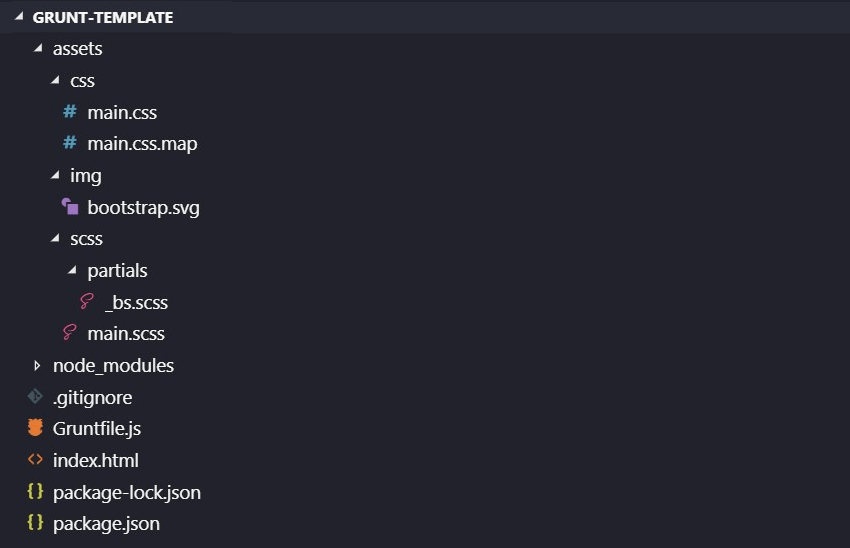
Today, we’ll learn how to customize Bootstrap 4’s Sass files with Grunt. Instead of Grunt, we could just as easily use another task runner like Gulp, webpack, or npm scripts. Regardless of the build tool the process of customizing Bootstrap’s source Sass files will be the same. Note: This tutorial assumes you have some familiarity with Bootstrap 4, Sass, and build tools.… Continue reading How to Customize Bootstrap’s Sass Files With Grunt
Creating Useful Breakpoints in Responsive Layouts

In our modern technological era you can find devices with any screen size that all have access to the Internet. This means bored people around the world can visit their favorite websites from a laundry basket full of different screen dimensions. If this were Pee-wee’s Playhouse I’d say the word of the day is: breakpoint!… Continue reading Creating Useful Breakpoints in Responsive Layouts