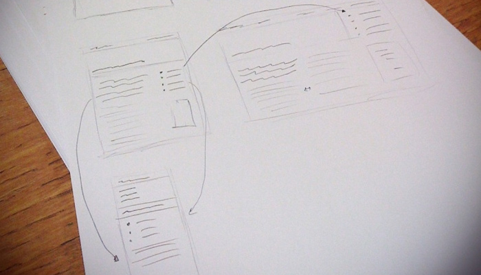
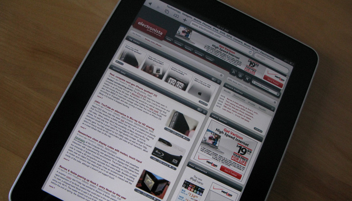
In our modern technological era you can find devices with any screen size that all have access to the Internet. This means bored people around the world can visit their favorite websites from a laundry basket full of different screen dimensions. If this were Pee-wee’s Playhouse I’d say the word of the day is: breakpoint!
The process of responsive design creates distinct layout styles that change based on a device’s screen resolution. When a layout shifts into a smaller or larger display style it’s often called a new breakpoint. Choosing when to create a new breakpoint is quite an arduous task since the threshold and number of breakpoints can change dramatically from project-to-project.
In this post I want to outline a couple ideas for creating responsive breakpoints in web design. The end goal is to create a usable website experience that fits naturally onto any device. While this is easier said than done you’d be surprised how much can be learned by just building a site and fixing mistakes as you go along.
Common Devices
First I’d like to point out that most breakpoints are dependent on the website layout, not the device width or resolution. But understanding which devices are commonly used for Internet browsing will help you get to know the audience a little better. Keep in mind we’re primarily interested in the device width because it’s the limiting factor since height can be theoretically infinite.
We can safely assume that desktop monitors and some laptops will present the largest resolutions. A website probably shouldn’t expand as wide as possible because this could turn into 1920px or 2560px for higher-end displays. Determine a reliable maximum width and use that as a stopping point.
For smaller devices the widths rarely drop below 300px. It doesn’t make sense to create minimum thresholds because a device could drop below this limit. Instead just make sure the lowest breakpoint is still readable at 320px on smartphones. If you’re really nitpicky just write a quick list of common devices and their screen resolutions. Later you can double-check which breakpoint is active for each device.
Analyze Page Elements
Deciding when to actually create a breakpoint is going to result from either a breakdown of the layout or a tight squeeze in content. Being resolution-independent helps you focus directly on the content of a page. How large is the navigation menu? Can it stay at full-width by reducing margins between links?
The first step is to build a prototype for the layout with all the important pieces. By resizing down to smaller resolutions you’ll quickly recognize which elements break first. Take note of these natural points of conflict whether they result in a navbar, sidebar, page header, or anything else. If there are multiple elements breaking down you can make a single breakpoint to handle all of them together.
Also consider things like grid content for eCommerce pages. A 4-column grid eventually breaks down into 3 columns and ultimately a 1-col grid. The sizes, spacing, and distance between grid items is completely dependent on the layout. So take note of each important page section because they require certain limits within each breakpoint.
Crafty Solutions
Once you know the exact position when elements break down you’ve got something to start with – but it’s only half of the problem. How do you actually break down in a graceful and concise manner? Obviously it differs based on the page element(s) in question but most of the techniques boil down to reducing space and making items smaller.
For page content you’ll need to recognize when to resize text so it fits better. This can include paragraphs along with list items, headers, captions, pretty much everything meant to be read. Super small devices might perform better with larger text and line spacing – or perhaps you’d rather keep the same text size but increase the margin between paragraphs.
Each solution will be different so it’s quite helpful to brainstorm ideas quickly. When it comes to extraneous page sections like the sidebar or footer you might end up hiding them completely. If the links are important then you could bump them down beneath the content area. But the page height should be a consideration and if some content isn’t necessary on mobile screens I say lose it. The CSS property display: none is very helpful for these circumstances.
Since navigation menus are necessary I’d recommend a simple solution to hide them offscreen or rearrange the links to fit into a smaller box. Most responsive websites hide links with a toggle button. Alternatively you might just place each link in one large block area at the very top of the page. Check out similar responsive layouts to see which techniques they’re using to handle navigation design.
Tools & Resources
Who actually has a stockpile of every tablet and smartphone to demo each responsive breakpoint? Well if you do I’d suggest a recycling drive but honestly there are plenty of better alternatives.
My favorite online resource is Responsive Test which displays a website inside a sliding window. As you lengthen or shorten the window pane the site will respond as if it were shrinking. You can also select from device presets like smartphones and tablets. Granted you may be able to accomplish this by shrinking the actual browser window but it wouldn’t be as precise.
Another great choice is Responsinator which displays smartphones and tablets in both portrait and landscape view. Everything is rendered on the same page so that you can double-check device widths against each other.
Lastly if you’d prefer to run some plugins try searching for related Firefox add-ons or Chrome plugins. These are two browsers that have large communities of developers releasing exotic yet fascinating plugins like Dimensions Toolkit. There is no right or wrong way to check your responsive design. Just find a method that works best for you and stick to it.
There isn’t always a detailed formulaic approach to find the necessary breakpoints. If you’re following a grid structure or building for certain devices then you’ll have a realistic idea to get started. But the most useful breakpoints will be different for each layout because they relate to content and structure. Keep these tips in mind when building your next responsive layout and see if you can push the boundaries to find your own problem solving method.


