CSS for UI Designer
Or bye bye, 12-column grid layout
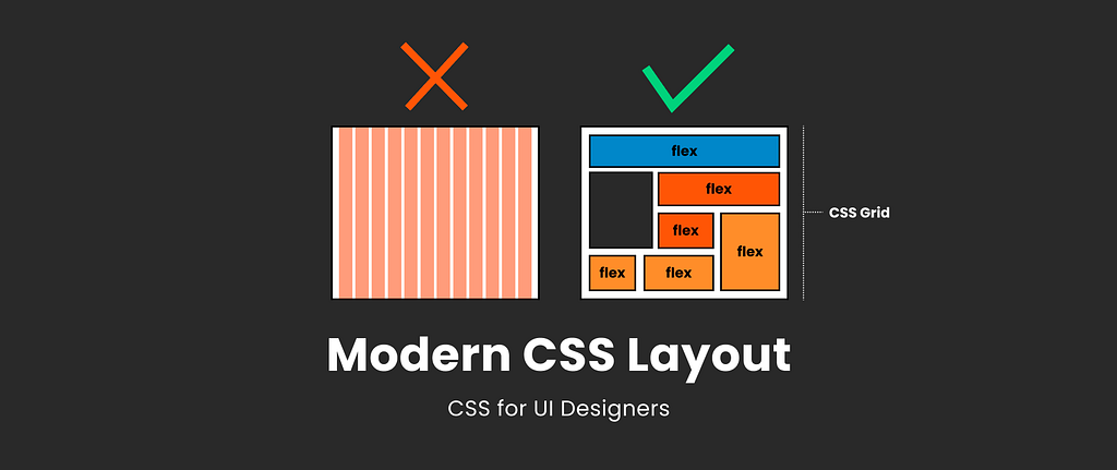
Most designers are familiar with responsive design, a column-based layout approach with fixed breakpoints to cover all screen sizes. However, we can move beyond the rigid structure with modern CSS layouts, crafting flexible and dynamic designs that seamlessly adjust to different screen sizes.
Designers and developers having different mental models when discussing layout, especially grid, leads to a lot of misunderstanding in our collaboration.
This article is not about a perfect handoff (I still doubt if such a thing should exist) but much more about understanding each other’s tools and their limitations to find common ground for conversation and collaboration.
I want to tell you a little bit about:
- Responsive Column-Based Design vs. Modern CSS Layout
- Understanding CSS Flexbox as a Designer
- Understanding CSS Grid as a Designer
- Breakpoints: Do We Still Need Them?
This is a written outtake from my full class “Modern CSS Layout for UI Designer: How to deal with this in Figma”
Traditional column-based design with frameworks
Let’s first understand where we’re coming from. As a UI designer, you’re likely more familiar with the classic column grid setup, which consists of columns, gutters, and margins where you place your elements. This grid serves as the foundation of your design, providing a structured framework.
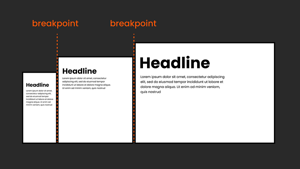
Understanding Breakpoints in Classic Grid Layouts
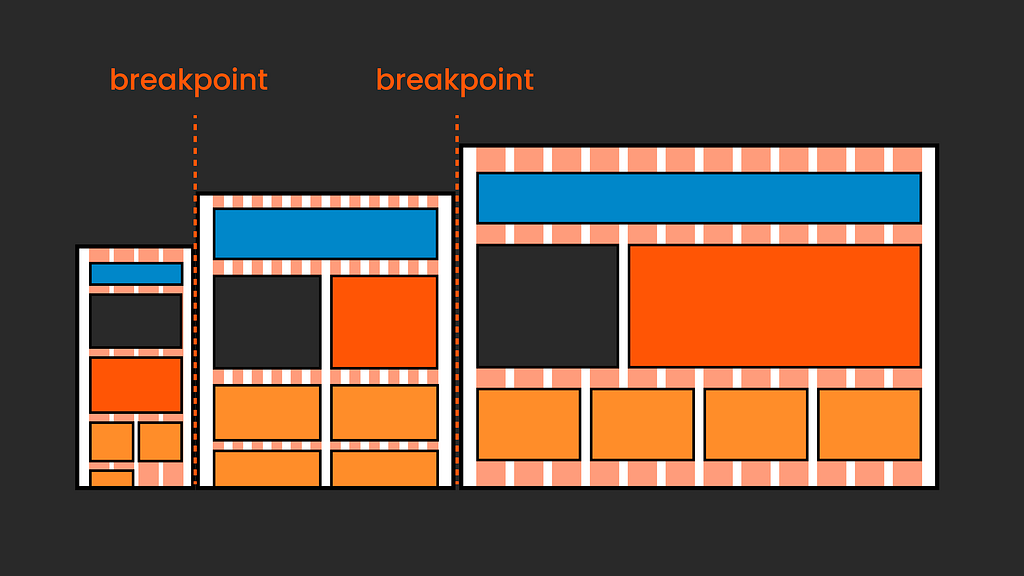
The essence of this approach to responsive design lies in its breakpoints, which are defined by CSS media queries and are crucial for adapting the layout to various screen sizes. The website’s structure dynamically adjusts at these predefined points: elements may rearrange, a compact navigation menu could expand, or text sizes might be altered to improve readability. This flexibility ensures that the design remains functional and aesthetically pleasing across devices.
Frameworks
In implementing these designs, CSS frameworks like Bootstrap or Foundation are popular choices, and you might have also heard of Tailwind. They provide pre-designed components and grid systems that simplify the process of creating responsive web layouts.

While these frameworks used to be essential for creating responsive designs a few years back, today we can still use them but don’t really need to, thanks to modern CSS layout techniques
📍 Sidenote: These days, many frameworks use Flexbox and/or CSS Grid under the hood, becoming increasingly flexible than the original rigid column-based layouts.
So in short: In a traditional responsive column-based setup, design changes for various screen sizes are implemented by reacting to a set of fixed breakpoints. In other words, it involves looking outward and adjusting to external factors like changing viewport size.
Modern CSS Layout
Modern CSS layouts with Flexbox and CSS Grid can adopt a more inward-focused approach, sometimes called intrinsic design. This means that our designs adapt not only to the viewport size but also to the content itself and the space available.
So, rather than placing items into a static grid defined by the viewport, this intrinsic approach gives us more control over how content behaves with changing space. It combines fixed and flexible elements, offering ample space for fine-tuning, such as defining minimum and maximum sizes and more.
This concept might take time to be intuitive for designers because it involves gaining a basic understanding of CSS. So, let’s do just that!
📍Tip: I highly recommend all of Jen Simmons free videos on her channel Layout Land about this topic; they are very well explained!
What Tools Are We Using?
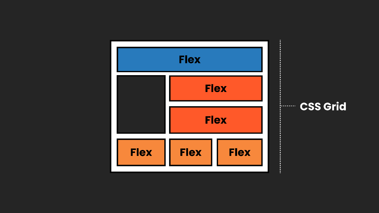
Our main CSS tools here are Flexbox and CSS Grid. They can be used individually or combined. We can use them to set up components as well as overall layouts.
Our main CSS Layout tools are Flexbox and CSS Grid. They can be used individually or combined we can use them to setup components as well as overall layouts.
📍Tip : Also, keep your eyes open for container queries, the latest addition to the CSS layout family. I wrote an article about what they are and how to plan for them in Figma.
Understanding CSS Flexbox as a Designer
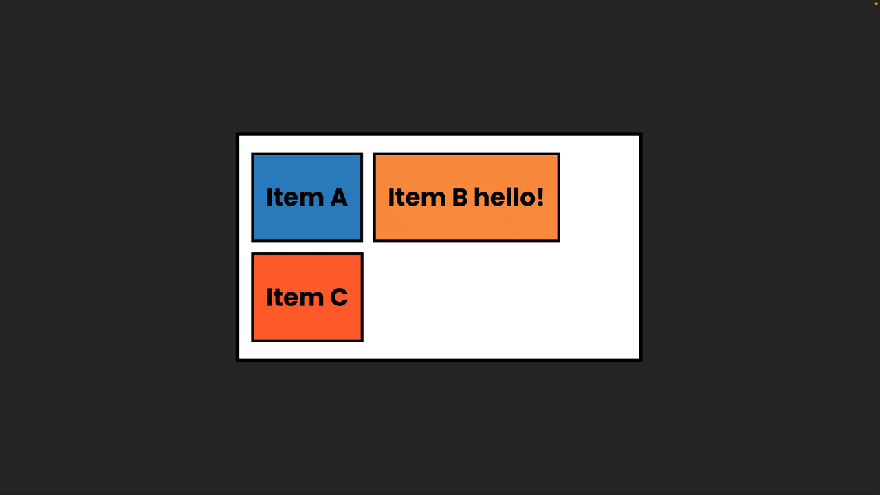
With Flexbox (CSS Flexible Box Layout is the official name), we can neatly stack elements in a sequence and control their alignment while also precisely adjusting their behaviour and size to fit the available space and respect changing content. We can use Flexbox to set up our components and entire groups or pages, it's all about nesting.
CSS Flexbox works with two main elements: the parent container and its child elements.
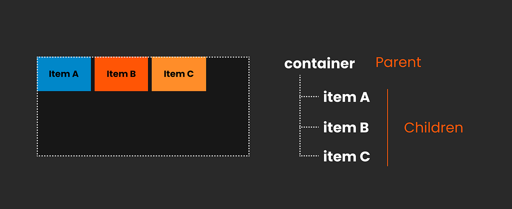
Parent Container (Flex Container)
This is the outer wrapper where you apply display: flex;. This declaration turns the container into a flex container and its direct children into flex items. Within the flex container, you can control the direction of the flex items (row or column), how they wrap, and how they're justified (aligned along the main axis) or aligned (along the cross axis). In other words, the parent controls the overall rules, so the same rules are set for all children.
Here is a Codepen for you to play with the real thing:
https://medium.com/media/cc91f793ba57019a4d666d8a81b43aa2/href
Child Elements (Flex Items):
These are the elements inside the flex container, the direct children. While they still follow the overall rules of the parent, they have some individual freedom. We can control their growth (how they expand to fill the container), their shrinkage (how they reduce in size when there’s not enough space), and their basis (their default size before growing or shrinking). There are also some more advanced settings, like aligning individual items differently from the rest.
Here is a Codepen for you to play with the real thing:
https://medium.com/media/8d131fc89040eaec335d3f55f20736e4/href
📍Tip: You can find my full CSS Codepen collection with very simplified examples to all concepts here:
Nesting Flexbox
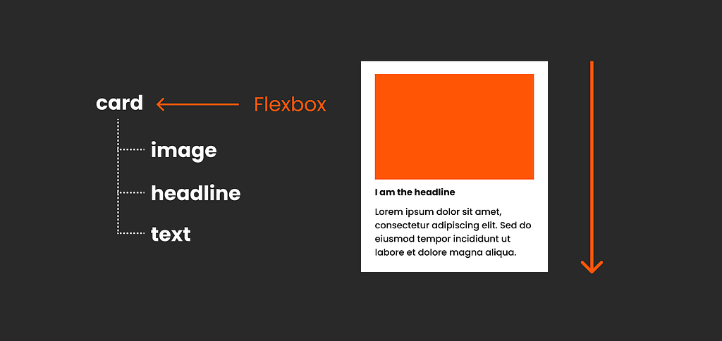
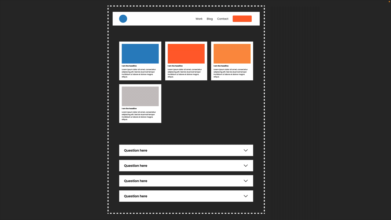
So with simple setups like this card, you can see below that it is just a simple flexbox; the card is the parent, and inside, we have three children, image, headline and text, all going in one direction, same distances between them, easy.
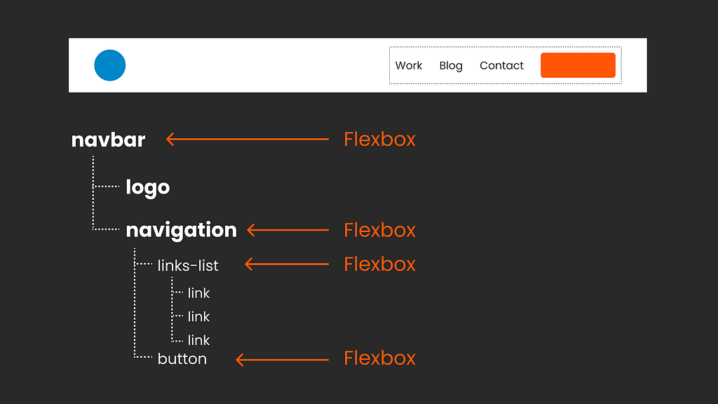
But for more complex designs, like this navigation below with different elements grouped together, varying distances, directions, and behaviours, we need to nest flexboxes. So each nested flexbox is the child of its direct parent getting the general position from above (e.g., the navigation of the navbar) but also dictates new rules to its direct children…just like in any family really.
Is Figma auto layout Flexbox?
Does this sound familiar? It’s exactly like using auto layout in Figma or flex layout in Penpot because both fundamentally reflect Flexbox. The direct correlation becomes apparent when you explore the dev mode or use the inspect tool. To delve deeper into this subject, I’ve created a free video that explores how auto layout in Figma corresponds to Flexbox, including areas where we encounter limitations.
https://medium.com/media/65d8c8bbf76256ac2d5864c4c43b2a87/href
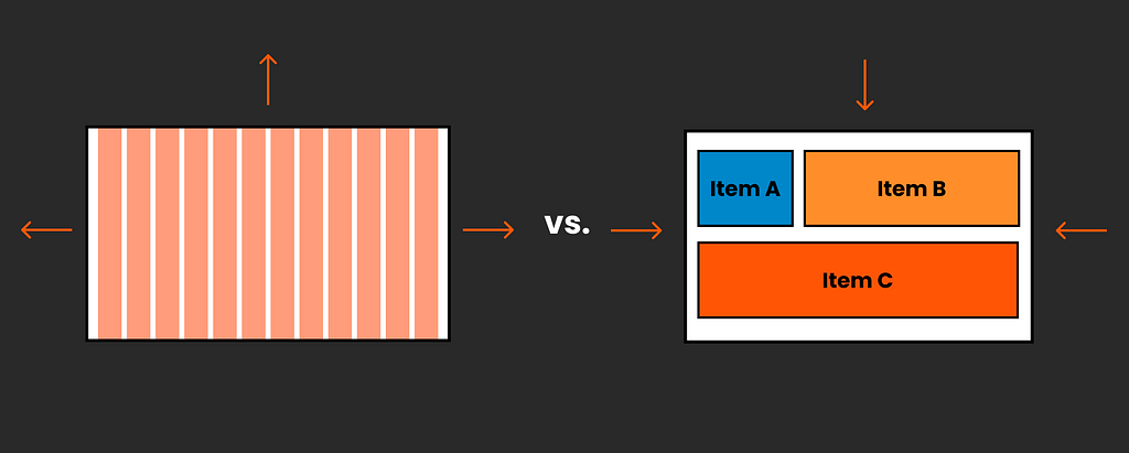
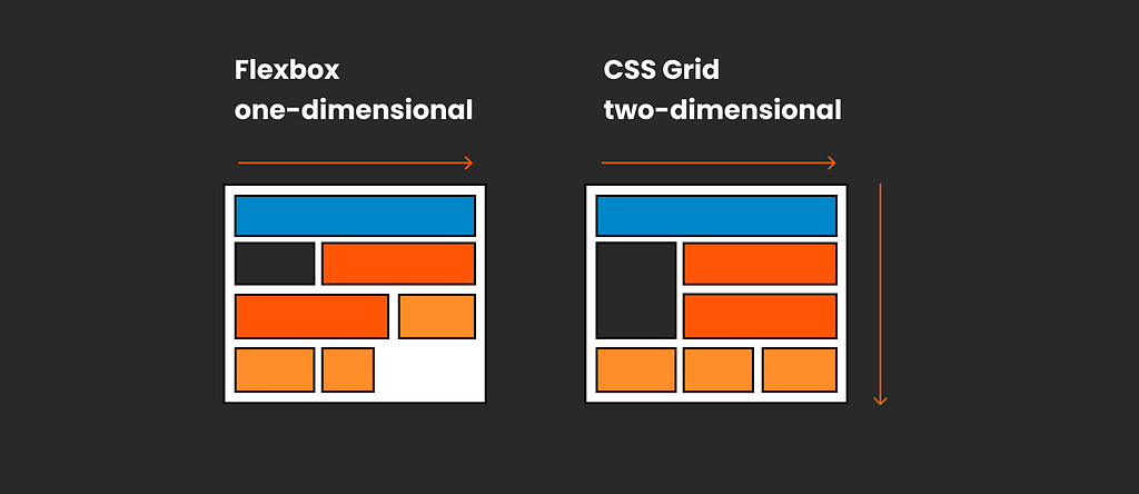
One-dimensional vs. two-dimensional layouts
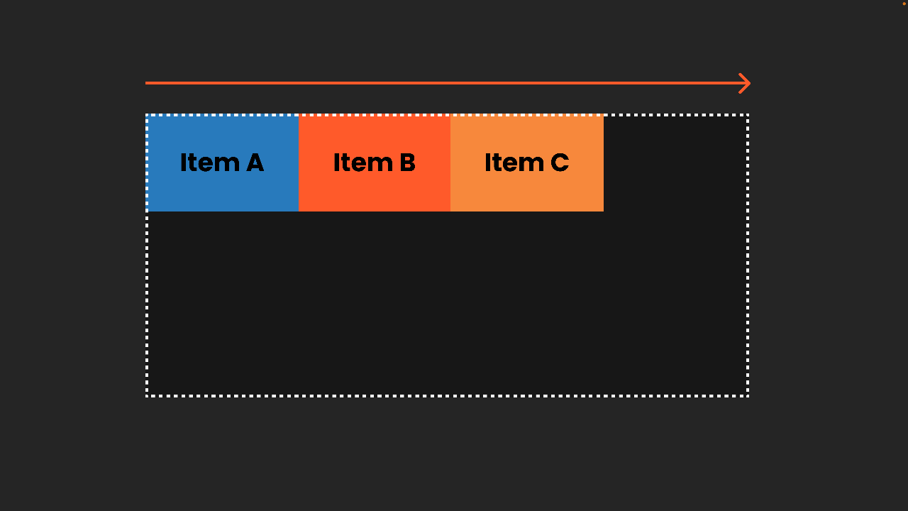
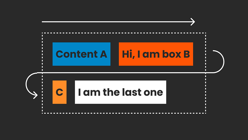
It is important to understand that Flexbox is a one-dimensional design approach, placing each item in a line.
That is absolutely fine in many cases, but it does not give you the control of a grid layout with rows and columns. If you want grid-like control of your design, you would need a two-dimensional layout approach like CSS Grid.
There is no right or wrong; it depends on what you are trying to build. They work wonderfully together.
CSS Grid Layout
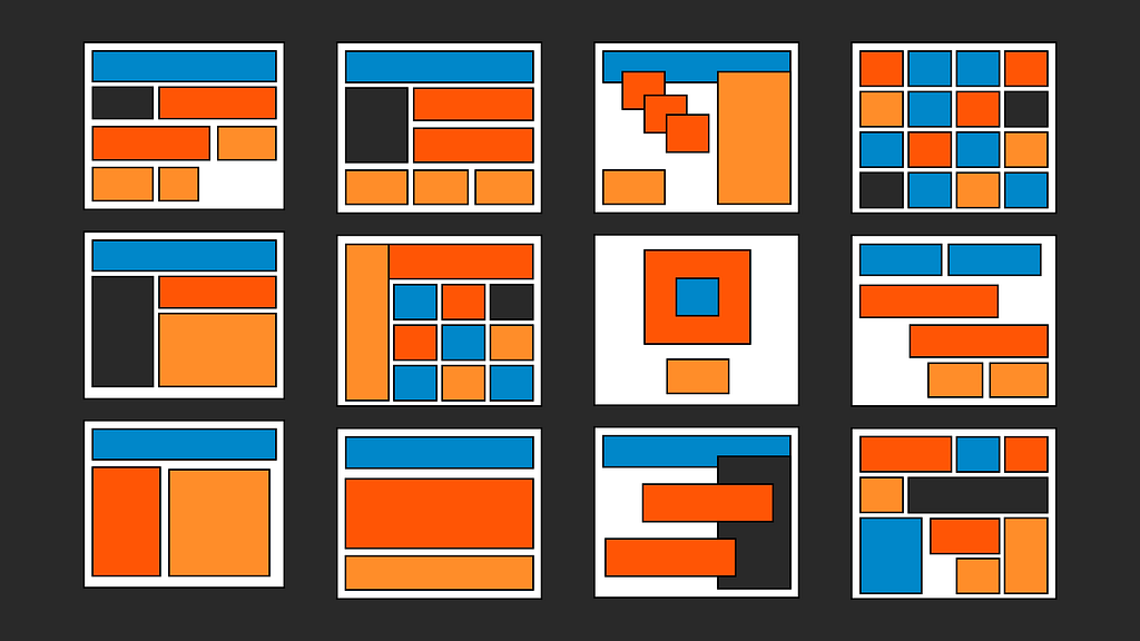
I love CSS grid; it’s amazing, and you could potentially build anything with it. Yes, really anything — overlap, subgrids aligning, or even without defining anything, it magically creates everything for you. It’s nuts. However, that can also be very overwhelming, and 90% of the time, we are not creating super fancy arty layouts (but you absolutely can!!!). The great thing about CSS grid is that we can create the simplest of layout structures, such as a classic column grid, and open up our layouts with more flexibility for structuring composition and sizing all the way into creative designs that go beyond the standard grid perception. CSS Grid will be there for you.
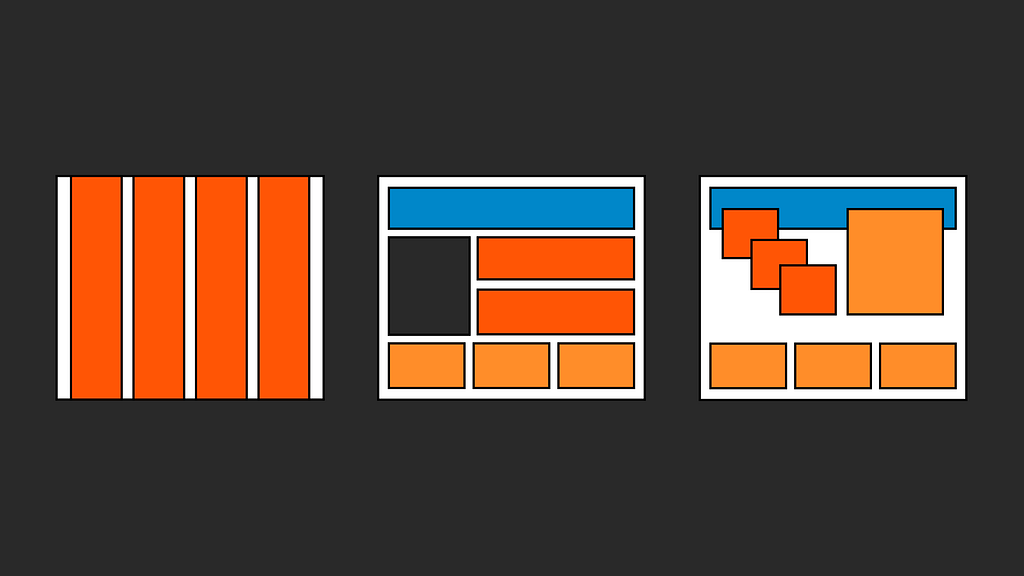
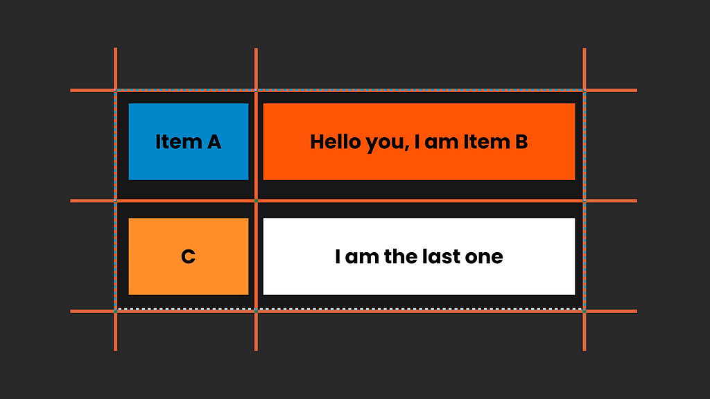
If we imagine Flexbox as beads on a string, either in a horizontal or vertical line. Then CSS Grid is like taking the beads and placing them into a bento box, where we can freely arrange them in any row or column. And it’s like one of those cool bento boxes where you can move the dividers and join the compartments. It would even automatically extend.
If Flexbox is beads on a string, then CSS grid is like a super flexible bento box you can put the beads in.
Let’s go bit by bit and understand the CSS Grid structure a bit better:
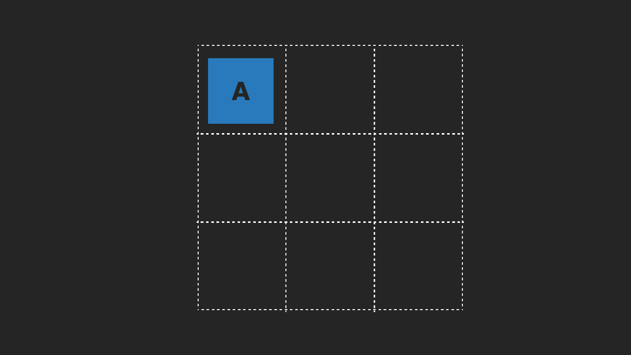
Thinking in Gridlines, Not Columns
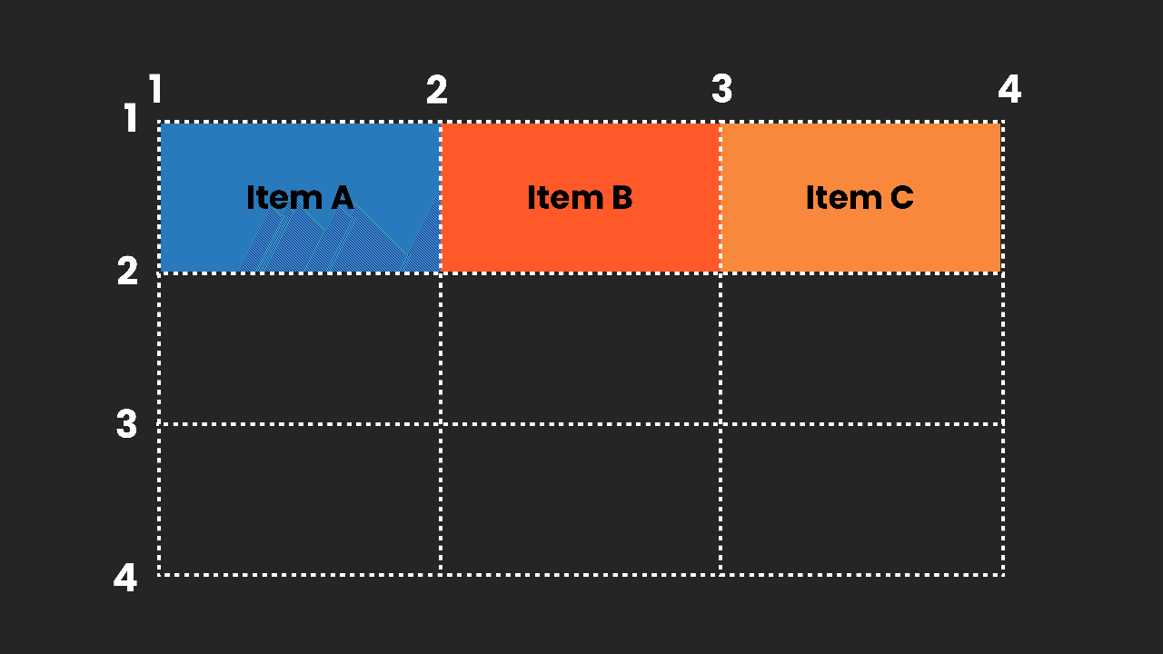
As UI designers, we usually think of a layout grid as a container with columns, and then we place our items on or across these columns. But with CSS Grid, it’s a bit different. We still have a container, but the grid itself is made of lines that create grid cells. Grid items are placed in sequence by default, following their HTML order. However, we can control their exact horizontal and vertical placement with CSS Grid's coordinate-like lines.
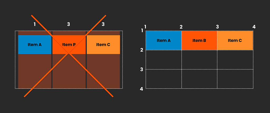
This allows us to create grid areas, allowing for effects like overlaps and more complex layout structures. Additionally, we can, of course, add margins to the container and gaps between rows.
Here is a Codepen; try to play with the positioning if you want to understand this better I have a detailed article about CSS grids explaining positioning in more detail.
https://medium.com/media/6ce72d15bb162a331f69f78401753fb5/href
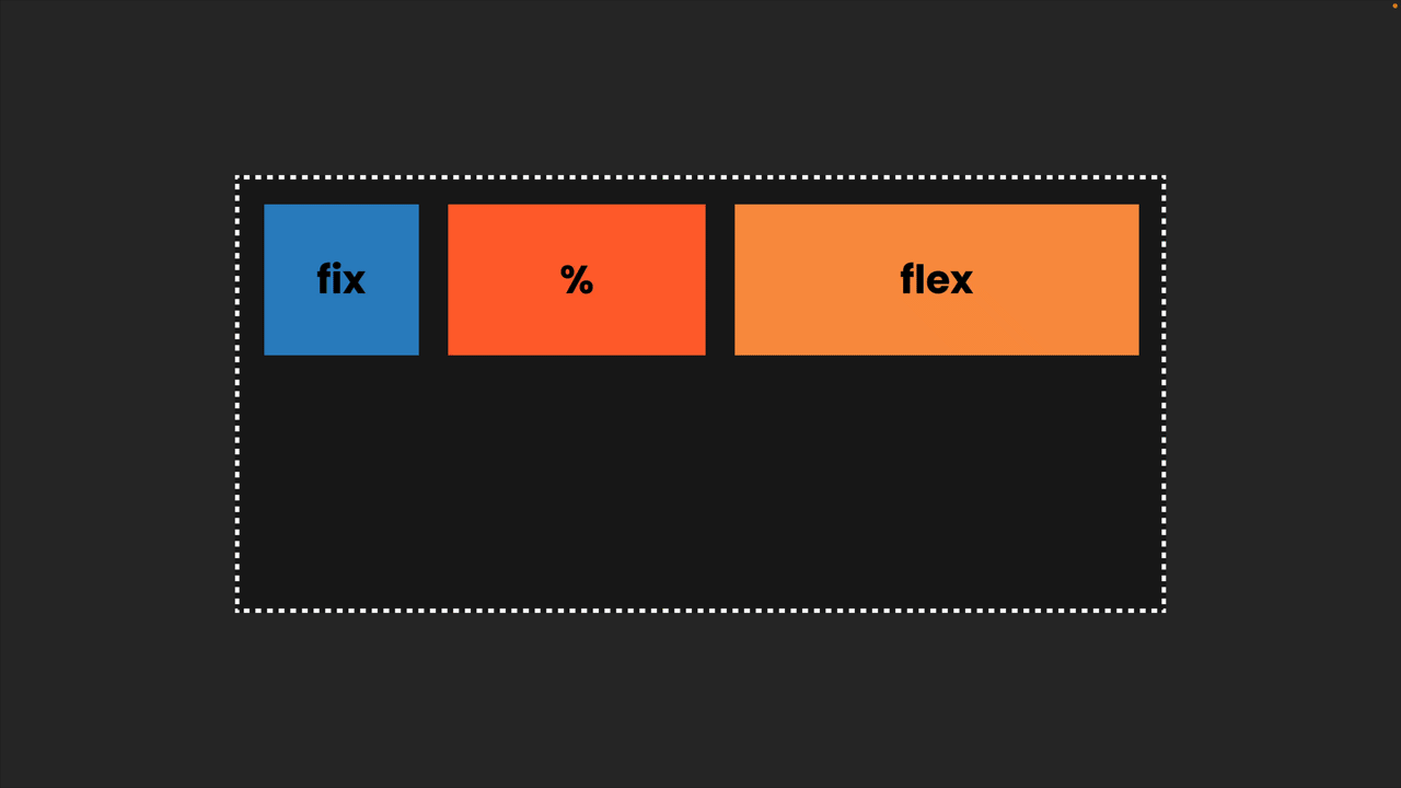
FR or Fractional Units
Our columns and our grid cells don’t all need to be the same size; we can customize them as we like. This includes fixed sizes or using ‘fr units,’ which are fractional units that divide the available space.
By using fr units, we can distribute the rest of the available space evenly or adjust proportions — for example, 2 fr for one cell and 1 fr for another.
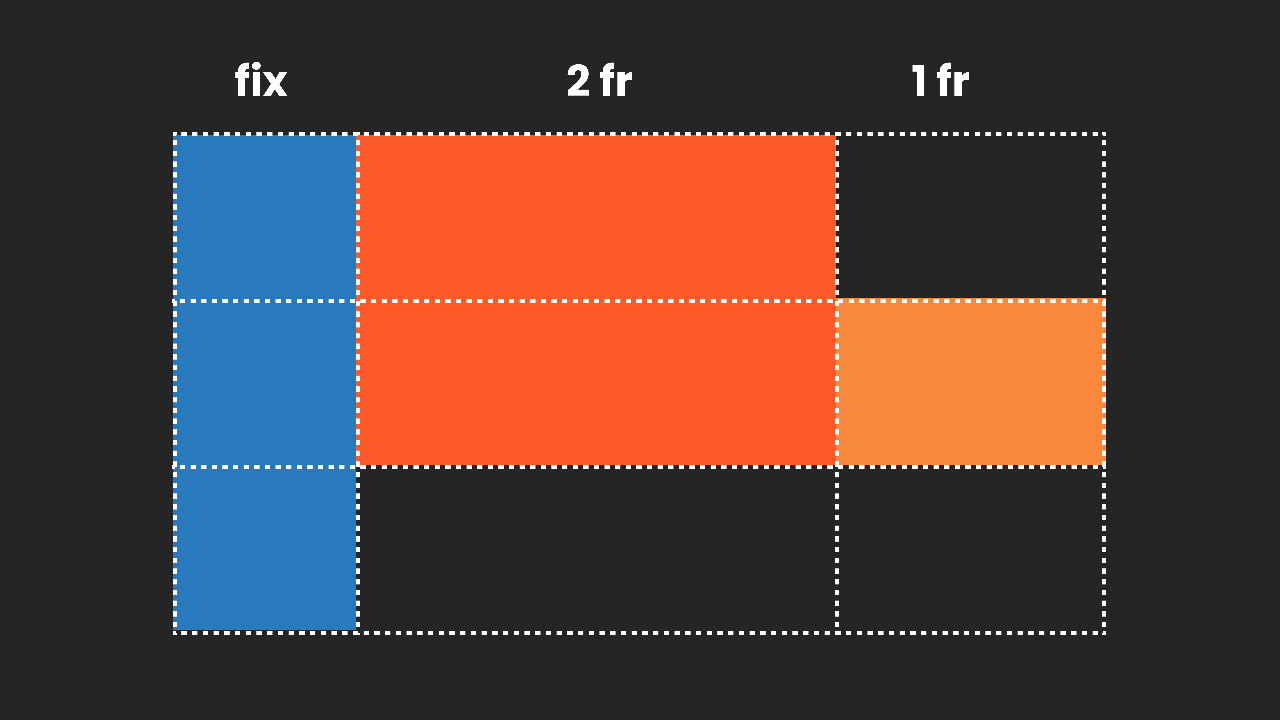
Everything adjusts nicely when the size changes: our fixed elements maintain their size, while the fr units redistribute the remaining space accordingly.
Here is a little Codepen where you can play with the different units in CSS:
https://medium.com/media/75b9a91e64f163426b673d21784649fc/href
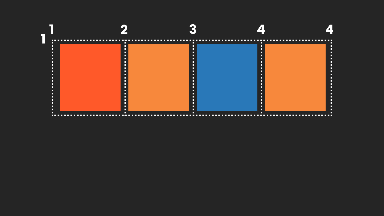
Explicit vs. Implicit Grids
Up to now, I’ve been discussing the explicit grid, where we, as designers, clearly define the rows and columns. However, CSS Grid also functions when we don’t define every cell; the browser automatically generates a grid based on the content. This is referred to as an implicit grid, and it’s particularly useful when dealing with dynamic or unknown content, such as a list of blog posts or products that change over time.
The explicit approach comes much more naturally to us as UI designers, while the implicit approach is something we primarily witness in action within the browser. Therefore, we need to think outside of our UI software and collaborate as designers and developers.
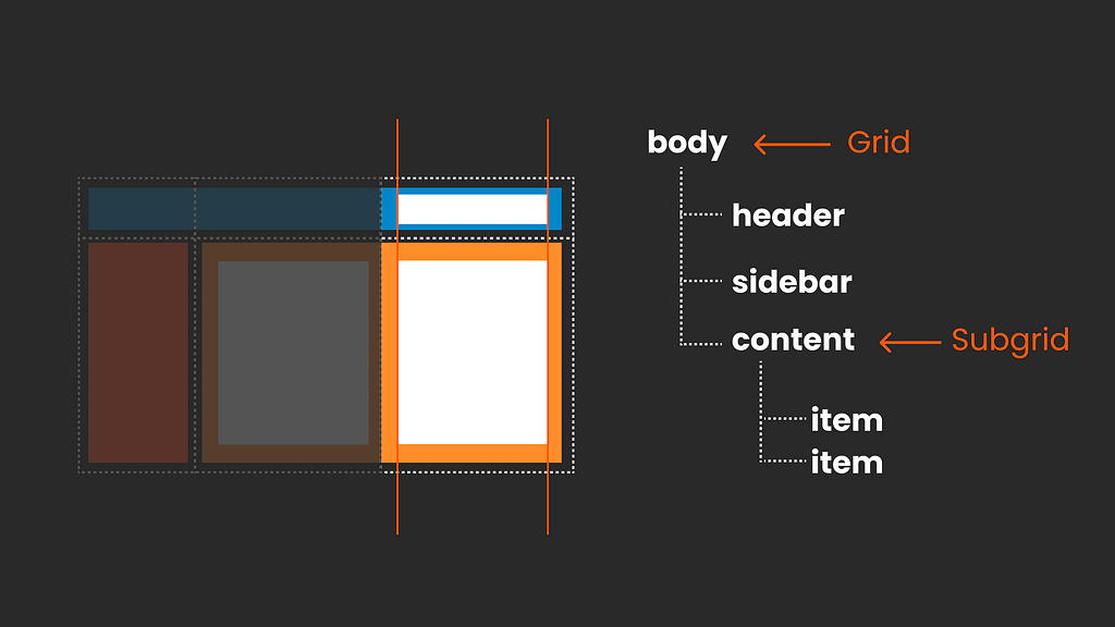
Nesting
CSS Grids can also be nested. For example, if you have an overarching layout with a header, a sidebar, and a content area and wish to structure that content further, you can easily nest another CSS Grid inside it. Depending on your requirements, this nested grid can be either implicit or explicit.
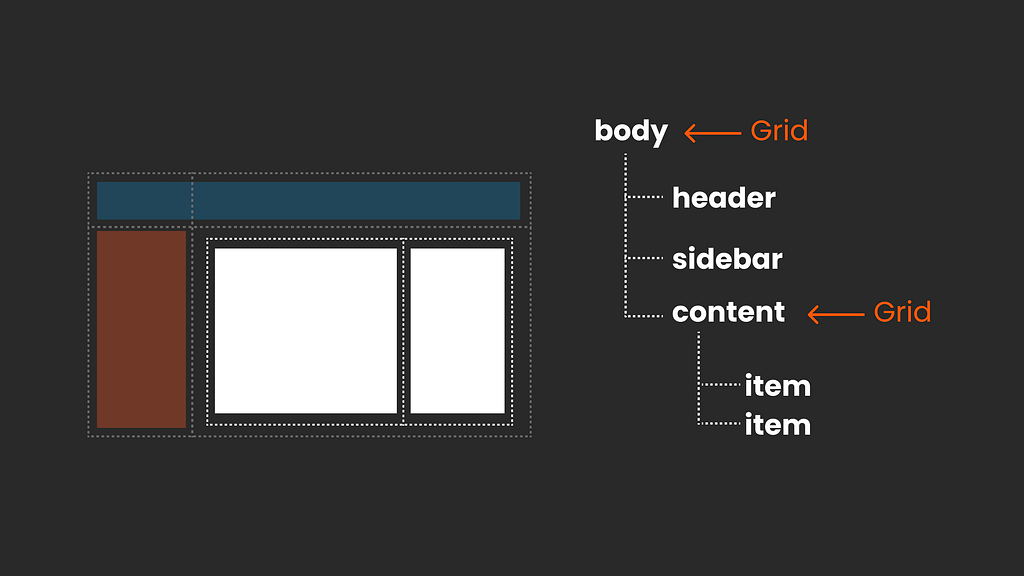
To achieve a perfectly aligned design, CSS Grid’s subgrid feature allows you to create a consistent grid structure across your entire layout.
The World Is Your Oyster
We’ve covered the CSS Grid basics, but there’s even more power in its alignments, justifications, and the way you can combine and nest its elements. So, have fun delving deeper into its intricacies. Additionally, I highly recommend this article for further reading: Gridless.design
But I Just Want a Simple Grid!
While CSS Grid opens up endless possibilities, it’s crucial to stay focused and keep things as simple as possible to create maintainable and scalable products, which is what we need in most cases. Hence, in many projects, you might want to stick to just a basic column grid that everyone agrees on, and that is absolutely fine! We can use the simplest of setups with CSS Grid. However, when creativity calls, you now know where to go.
Does Figma Have CSS Grid Features?
Figma does offer a grid feature, but it is limited to standard columns. While we do have auto layout, which translates to Flexbox, currently, Figma lacks a feature representing CSS Grid, which I personally find quite frustrating despite my immense appreciation for Figma. You can check out my class about how to deal with this in Figma.
You might also want to explore a new rising star on the horizon, Penpot, a free UI design software that offers both Flex Layout and CSS Grid features (set to be released shortly). You can find a sneak preview here, and it’s quite impressive (and it's free!).
Do I Need to Choose Between CSS Grid and Flexbox?
Its not about one or the other, Flexbox and CSS Grid are both part of the CSS family and work in great harmony.
It is not about one or the other, Flexbox and CSS Grid are both part of the CSS family and work together in great harmony.
Most of the time, components will be set up using Flexbox, while CSS Grid will control the overall layout. However, it’s entirely possible to use Flexbox for an entire page if needed. You can mix and match; sometimes, both approaches work well, while other times, one may be the superior solution. In fact, you might even find that components are set up using CSS Grid (I personally love this approach) and/or Flexbox these days, anything goes. There’s no right or wrong choice; they complement each other seamlessly, depending on whether a one or two-dimensional layout works better for your specific case.
As a UI designer, you can leave the nitty-gritty decisions to your front-end developers. Your focus is on understanding why certain choices are made and designing with the potential and constraints of modern CSS in mind. Remember, what you envision in Figma might not always translate directly to the browser. You’re not doing anything wrong; it’s simply part of the creative process. Collaboration between design and development is key!
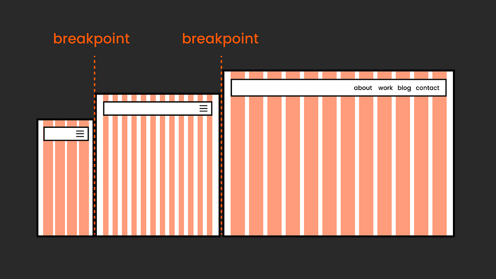
Are Breakpoints Still Necessary? A Closer Look
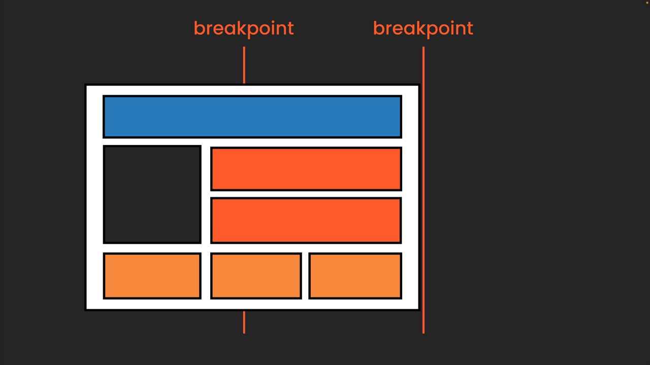
In traditional column-based design
The “old” way, with our responsive grid with set columns, involved fixed breakpoints where our design would, well, break into a new version. At these breakpoints, the grid layout itself can change, ranging from different amounts of columns to changing gutter or margin. We can also rearrange how our items sit in the grid or show and hide specific ones. Additionally, we can choose to display different versions, like a burger menu changing to a links menu, and the text size might vary across these breakpoints.
This more rigid responsive layout approach often uses a framework, and there is typically accompanying documentation that provides essential information. For instance, with a framework like Bootstrap, the documentation will include details about the number of columns, gutter width, and breakpoints. So, this makes it really easy for us as UI designers to just mirror in tools like Figma or Penpot.
Modern CSS & Breakpoints
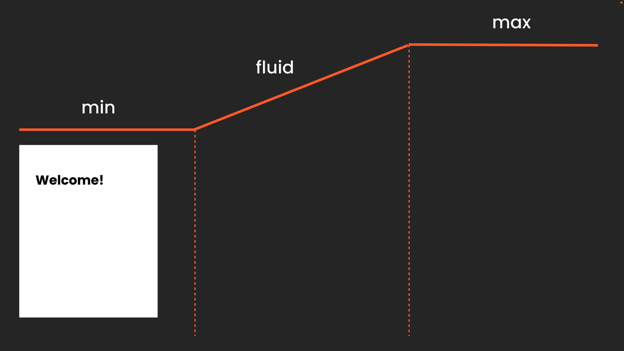
With modern CSS layouts, our design approach can become more intuitive, allowing designs to adapt fluidly without the constant need for breakpoints. This means the layout can automatically reorganize itself effectively a lot of the time.
However, there will still be occasions when you might find it necessary to use breakpoints. Instead of relying on a set of fixed breakpoints (though you still can, and I’ll discuss this shortly), you can examine your design and determine the breakpoints with much greater flexibility.
So you might want to add breakpoints in Modern CSS layout for:
Changing the layout
Even though Modern CSS does a really good job by itself, you might want to set breakpoints for more “radical” layout changes, such as changing the grid setup, showing or hiding elements, or distributing them differently from their natural flow.
Changing component layout
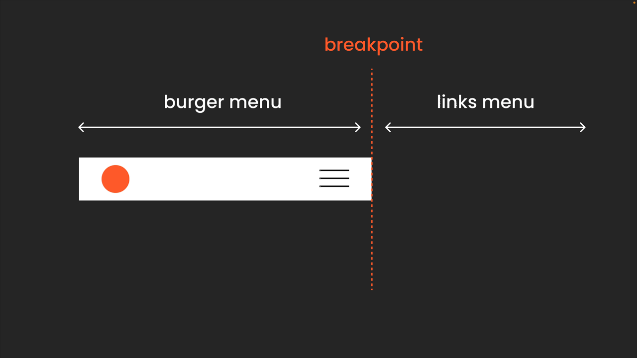
One example might be a navigation change from a burger menu to a links menu. This way, we can find the sweet spot where we want to set the breakpoint.
📍Tip: This could also be solved very elegantly with container query.
Changing typography
Typography is a more complex area. To keep it short, theoretically, we can just set individual breakpoints here as well, but it usually makes more sense to revert to a fixed set of breakpoints for your typescale. This approach streamlines the process, ensuring that our typography remains consistent and legible across different screen sizes a clear system. I am very interested to hear if you are having other approaches here!
Other approaches with CSS Clamp:
In addition to breakpoints, we can also utilize the clamp() function in CSS to enable our typography to scale fluidly within a specified range, ensuring its responsiveness. This method allows text size to adjust between a minimum and maximum, considering the general viewport width independently of breakpoints.
However, using clamp() requires close collaboration with the development team, as performance and accessibility issues need to be considered, and more testing is needed. So, it's a great tool to understand, but it needs to fit your specific setup and project.
Finding Balance: Between Design Freedom and Structure
One challenge I faced was bringing some order to the vast array of possibilities and freedom that comes with CSS Layout. I discovered it’s crucial to first sit down and carefully consider the project and its scope.
a) Arty Design for One-off Projects or Sections
Are we creating a one-off, super fancy, arty page? Then, you’ll probably want to leverage the full magic of CSS layout. Jen Simmons's amazing creative examples showcase what you can achieve with modern CSS layouts. You might forego traditional breakpoints entirely, letting the browser dictate the layout, or meticulously consider each breakpoint for every item.
Keep in mind, this approach might not apply to your entire website; it could be just for the homepage or hero section where you’re aiming for this graphic design to come alive.
In this case, I would set up some fixed screens in Figma or Penpot as a graphic representation. Then, it takes a very skilled front-end developer (and a proper budget!) to work closely together. The focus is on jumping into the browser early; planning any behaviour too extensively in Figma won’t make much sense.
b) Balancing Flexibility and Structure in Scalable Designs and Design Systems
Flexibility is key to a scalable product, but so is structure. While modern CSS layouts allow for a more fluid design by letting the browser dictate the flow, creating a scalable design often requires setting clearer rules to keep things manageable. Think of this as placing some magic within a structured box—not to make the design dull but to provide a solid foundation.
Brad Frost's article on how to handle grid in a design system by creating grid components is absolutely fantastic. I truly believe this is something we can work beautifully with, as this approach of using set layout patterns works just as well in Figma (with some limitations due to the lack of CSS Grid) or Penpot as it does in CSS. I personally would also opt for some fixed breakpoints for the overall layout and typography to keep life simple. The important part is that we can still easily break out from this system whenever needed.
I have a detailed course on how I deal with this in Figma. Also, make sure to sign up for my newsletter, so I can keep you updated on further articles. I am currently exploring more ideas around this topic.
It’s Not About Making Coding Decisions as Designers
Let me be really clear: this article is not about designers needing to code. The decision on how this is implemented in CSS is, and should not be, made by the designer and will always lie with the front-end developer, the expert in this field! So, it’s not about providing a code solution in design at all. But if we design with an understanding of the capabilities and limitations of CSS, then we can have a much better and more understanding collaboration and, most importantly, conversation with development… and it’s quite fun to play with it!
The expertise on how this is implemented in CSS will always lie with the front-end developer. It’s not about providing a code solution in design; it’s about designing with an understanding of the capabilities and limitations of CSS to enable better collaboration and, most importantly, meaningful conversations.
Anything else? Yes, container queries!
As mentioned, but I cannot stress this enough: keep your eyes open for container queries; also, as a UI Designer, I am the latest addition to the CSS layout family. I wrote an article about what they are and how to plan for them in Figma.
Like this article?
This is article a written outtake from my full class “Modern CSS Layout for UI Designer: How to deal with this in Figma”
I’m always eager to hear your opinions and welcome you to point out anything I might have missed or should consider.
Remember to subscribe to my articles here on Medium and follow me on moonlearning.io, Twitter, or LinkedIn where I teach and talk about UI Design, Figma + Code.
Why UI designers should understand Flexbox and CSS Grid was originally published in UX Collective on Medium, where people are continuing the conversation by highlighting and responding to this story.