Summary:
A few relevant, high-quality visuals placed next to associated text can boost users’ comprehension of your content and its memorability.
When implemented strategically, visuals can enhance users’ ability to understand and remember products. Here are seven best practices for memorable visuals.
#1 Choose or Create Relevant Visuals
Visuals exist alongside other content, and users leverage this content to interpret them. Our eyetracking research shows that users focus more on images that strengthen text content. Designers should choose imagery that promotes the key message that users should take away. They should think of images and text as two different channels that they can use to convey their message and strengthen it.
Irrelevant visuals are a missed opportunity and they may decrease the memorability of your message.
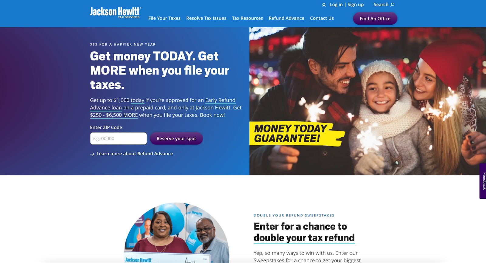
For example, the image on JacksonHewitt.com shows a family dressed in winter clothing enjoying sparklers. This image is not relevant to the tax-service text content and, as a result, fails to strengthen the content and the memorability of the service.
#2: Avoid Stock Photos
Stock photos are often generic and not specific to your content. Other sites, products, or competitors may use the same image. Not only are users likely to overlook photos they have seen previously, but they are also less likely to remember them.
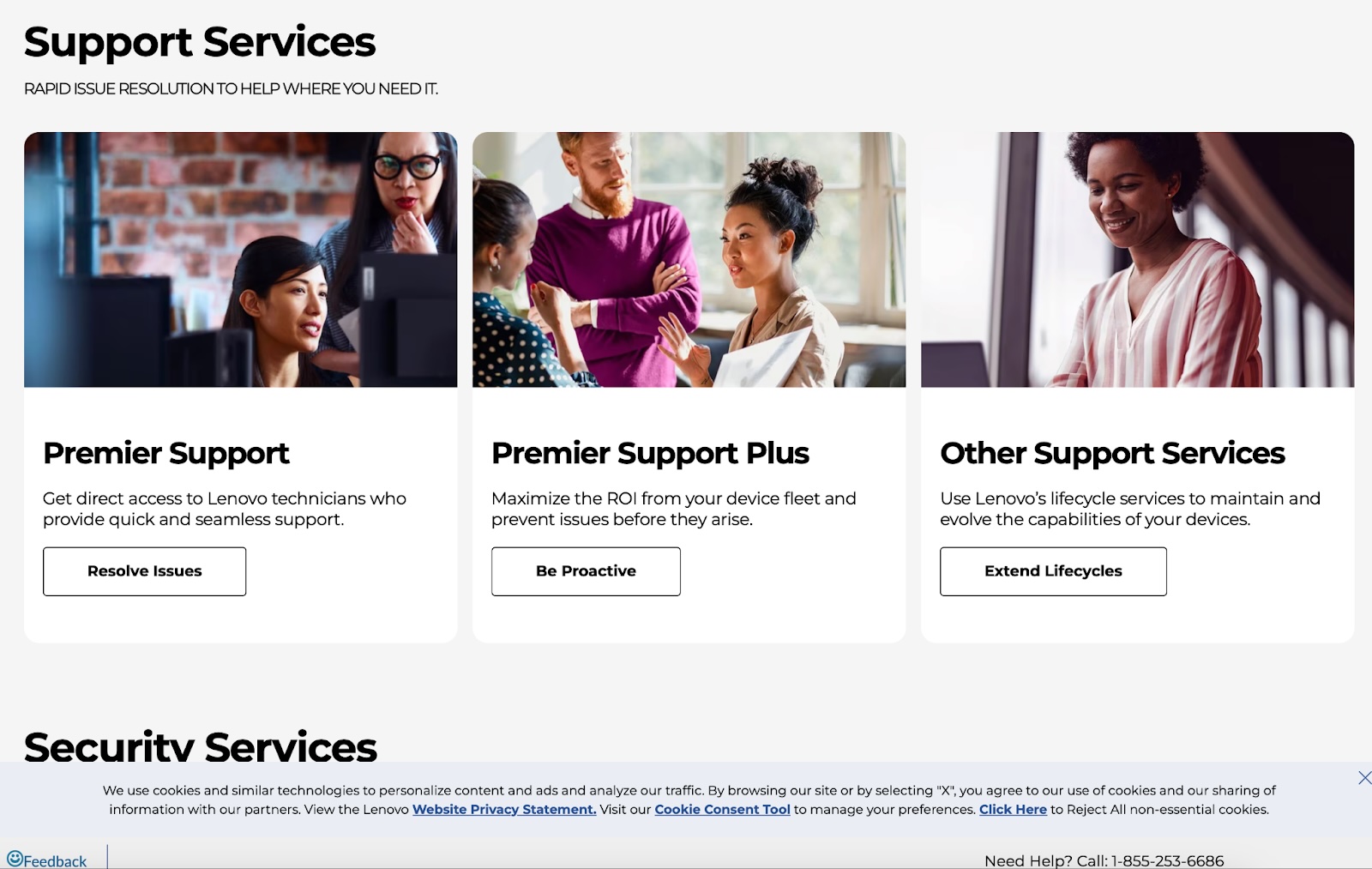
For example, the Lenovo Support Services product categories were represented by stock images that were not specific to Lenovo or to the navigational categories. These images were not memorable.
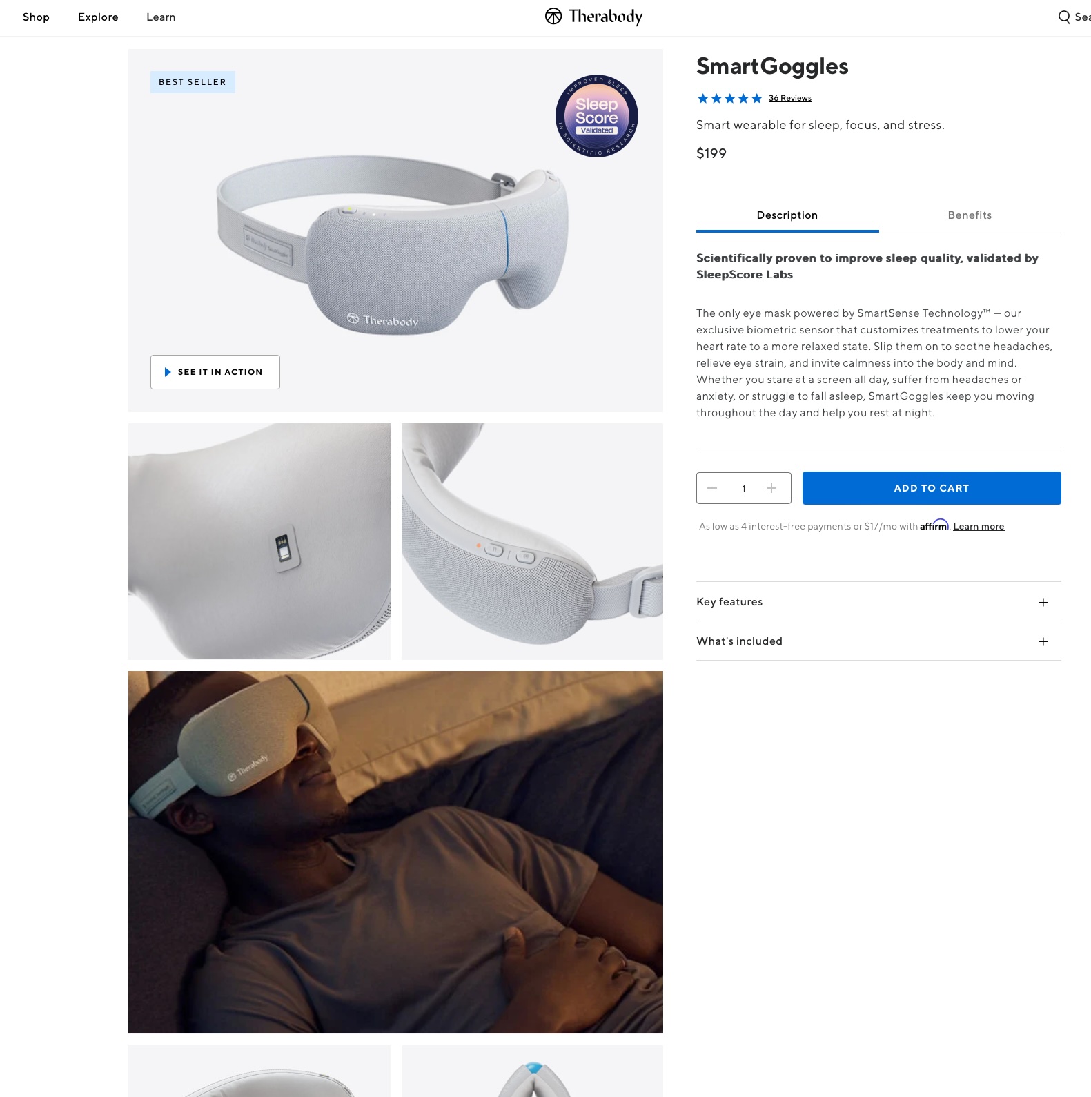
Businesses that sell physical products can easily avoid stock photos by featuring their product in their photography. Meanwhile, SaaS businesses can avoid stock photos by featuring clear screenshots of their software — which is what customers often want to see!
#3: Display Products in a Realistic Context
To boost the memorability of your product and product visuals, show the product in the context in which it would realistically be used. These types of visuals will support users’ comprehension of the product and help them to remember it.
Consider including the following in your product imagery:
- The environment: Show where and when the product is used (i.e., location, time of day, socially or alone). These elements can help communicate the product’s purpose.
- The target audience: Show who will benefit from using this product.
#4: Place Visuals Close to Relevant Text
In addition to choosing relevant imagery, designers should strategically place images near related text content to facilitate comprehension and memorability. Additionally, if your site is responsive, ensure that the proximity of text and associated visuals is preserved across all screen sizes.
On Cigna’s website, an image of a senior with a birthday cake accompanied the text Turning 65? The image placement supported comprehension of the content.
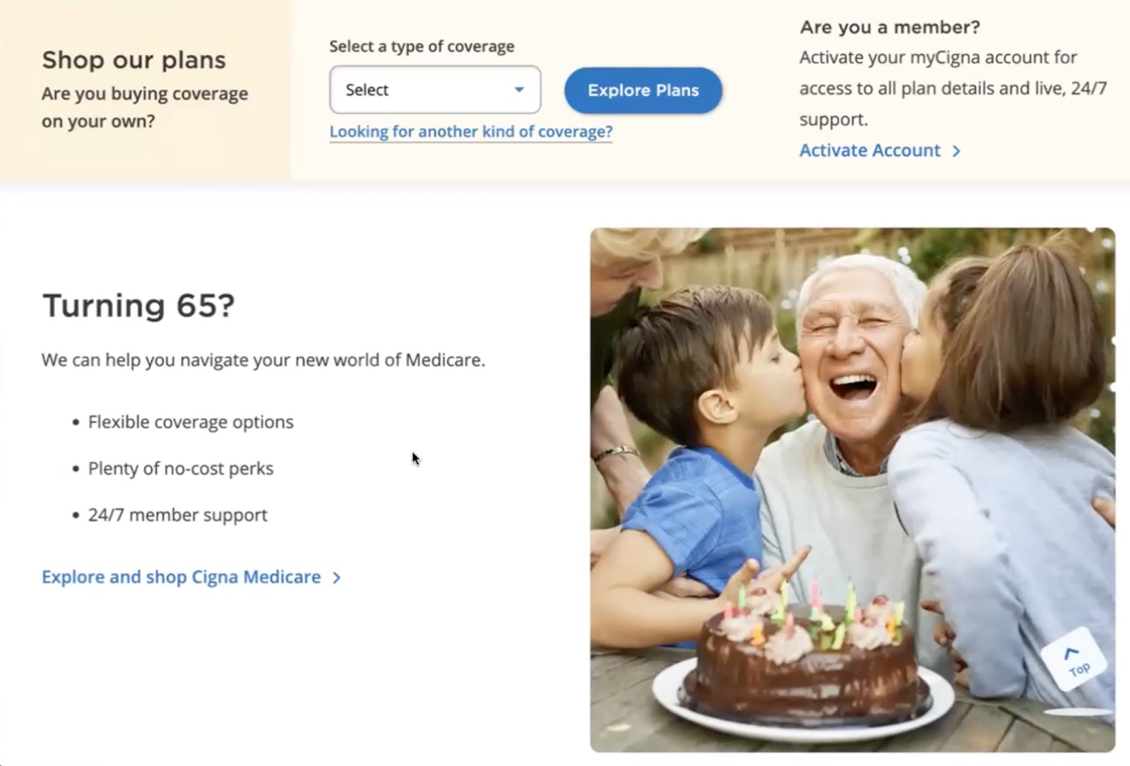
However, on Cigna.com’s mobile design, the visual was far away from the text Turning 65? As a result, usability-test participants incorrectly assumed the image went with the dental-care content and were confused.

#5: Avoid Too Much Imagery
Too many visuals can be distracting and cause each of them to be less impactful. Instead, choose a few solid visuals that communicate the key takeaways on each page.
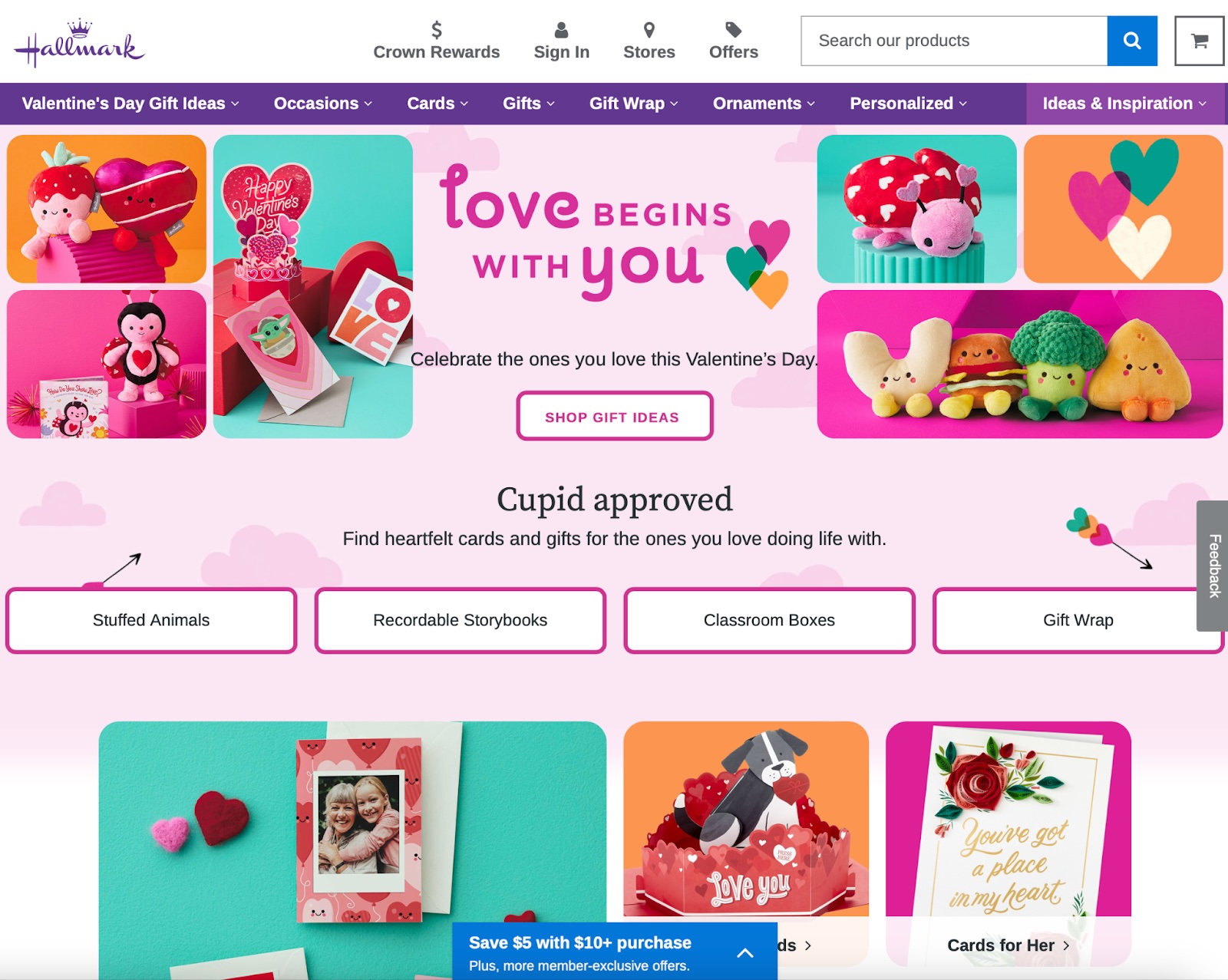
Hallmark’s homepage features ten similar visuals above the fold. The number of images weakens the page’s visual hierarchy. The eye is overwhelmed and unsure of where to focus. In this case, less is more.
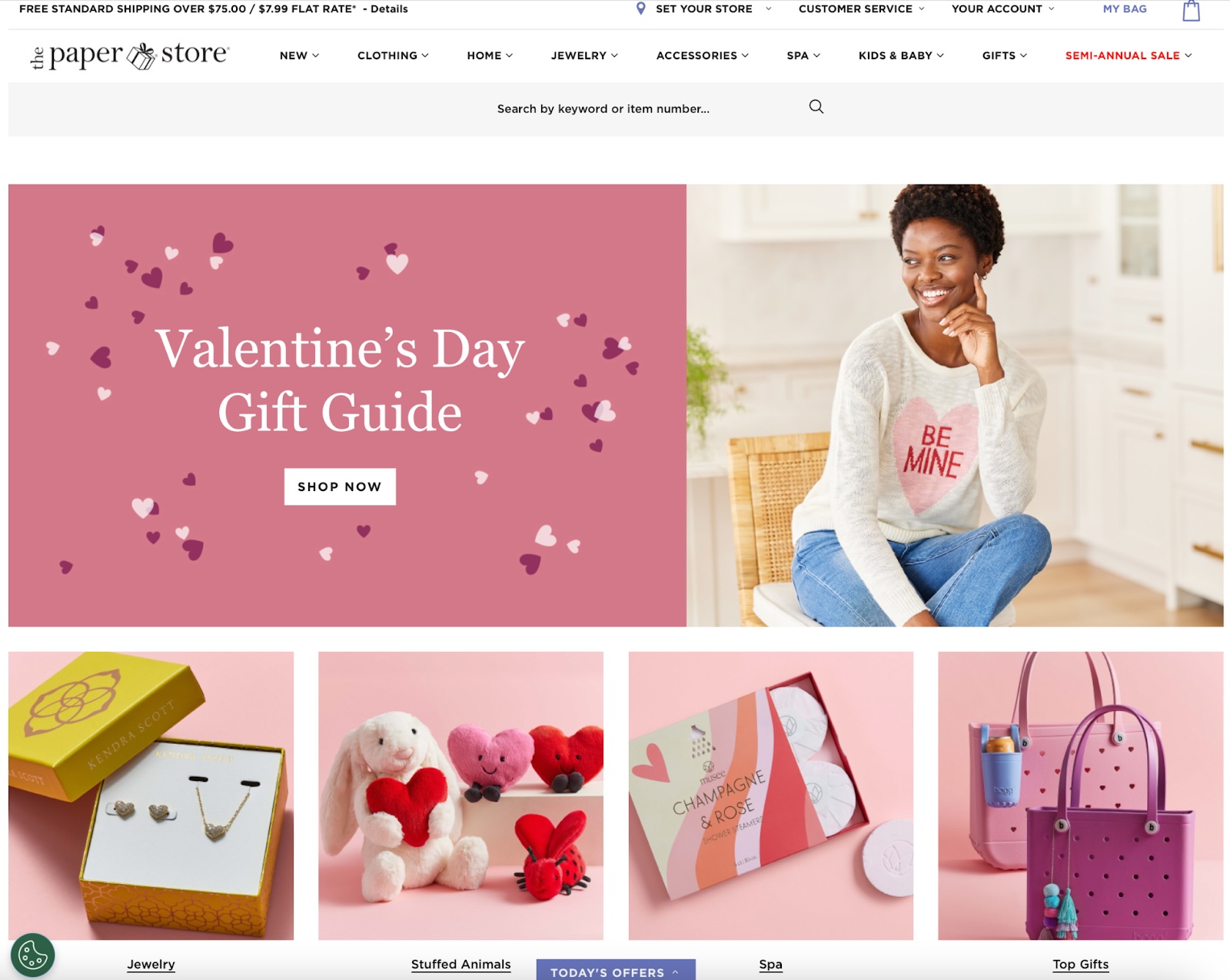
The Paper Store struck the proper balance with five distinct visuals representing unique product categories. The page had a clear visual hierarchy.
#6 Choose High-Resolution Photographs
Low-resolution images appear blurry and can lack important details; as a result, they are often harder to comprehend and remember.
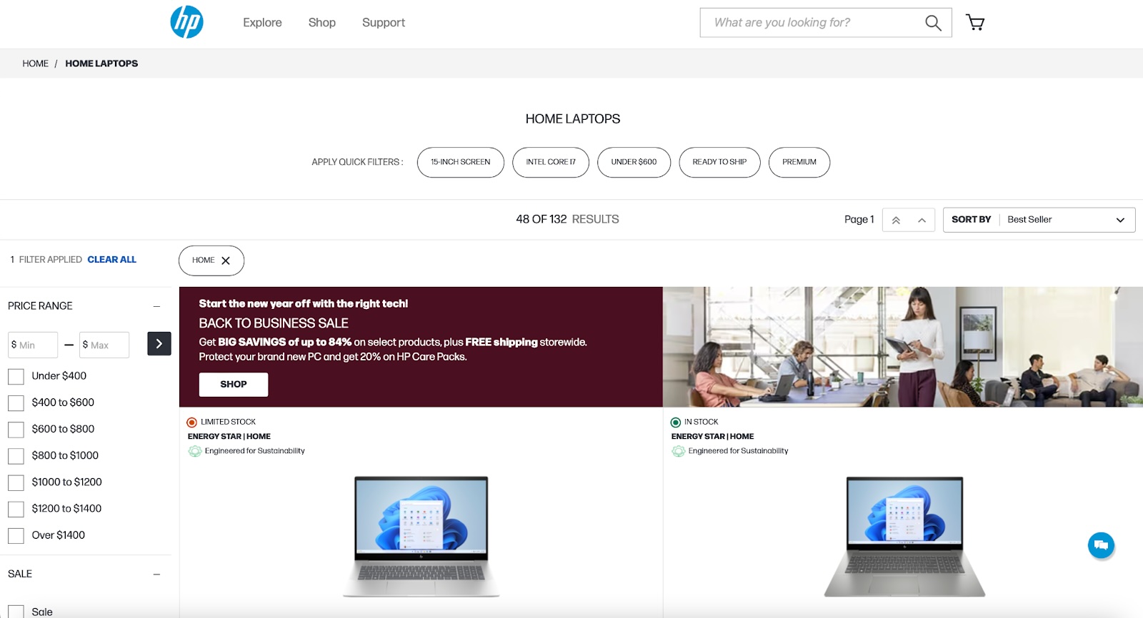
The Hewlett-Packard Laptops page featured a blurry image of office employees. The image was too low-resolution to tell whether the laptops featured in the image were HP Laptops or if this was a stock image.
#7 Consider How Visuals Could Be Interpreted Across Cultures
Imagery can “translate” differently from one culture to another. Sometimes, localized visuals resonate better with people and are more successful at achieving the intended effect.
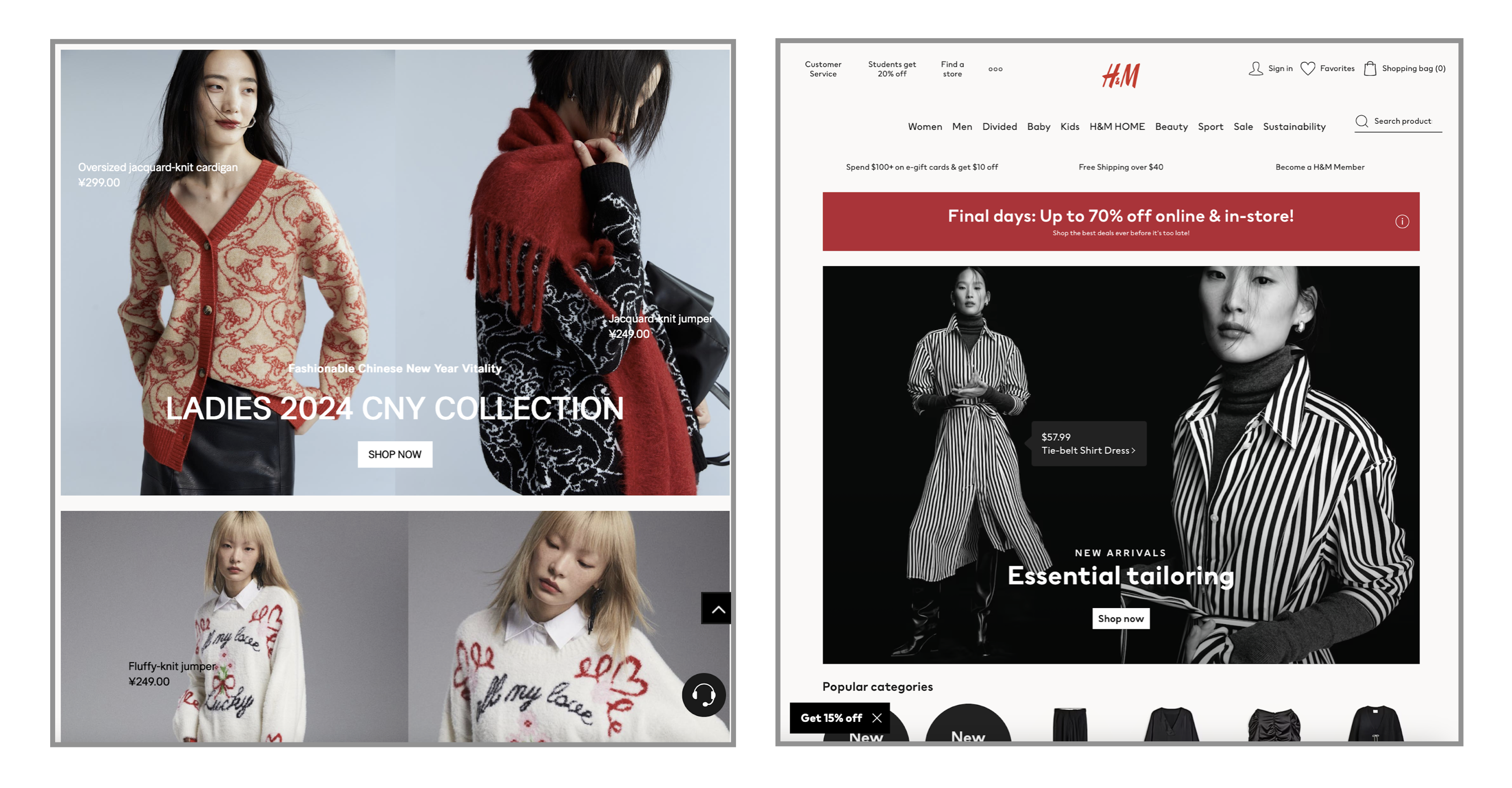
For example, during the month of January, the Chinese version of the H&M website featured photographs of clothing suited to celebrating Chinese New Year. These visuals were more culturally relevant among users in China.
Test Your Visuals
Qualitative usability testing is the best method to determine if your visuals are understood. Follow these best practices when testing your visuals:
- Show the visual in the design: Visuals do not exist in a vacuum. They accompany and complement other content in your design. Where possible, test visuals within the design or accompanied by the surrounding text or microcopy.
- Write tasks that encourage users to naturally discover the visual. Avoid telling users where to go or what to do. Instead, ask them to complete a realistic task requiring them to navigate to the page including the visual. If users seem to notice the visual and don’t explicitly mention it, you can ask the followup question What did you learn from this page?
- Watch whether users notice the visual. In your analysis, pay close attention to whether users noticed the visual, even if they don’t mention it. For example, they might pause near the visual or decrease their scrolling pace. Evaluate whether their impressions or takeaways from the page suggest they gained information from the visual.
- Be aware of the query effect. Practitioners sometimes mistakenly ask users about visuals outright. Avoid doing this because you risk forcing the user to make up an opinion to answer your question when, in reality, they don’t have one. Instead, ask a nonleading, follow-up question like What do you think about this product after exploring this page? and note whether they naturally mention the visual.
The following three methods can help you learn about the memorability of your visuals. They are often performed as remote, unmoderated studies.
- 5-second test: In this test, you present your visual to the user for 5 seconds (or another short period of time), then hide it. When the visual disappears, you can ask the user to describe what they saw and what they think the visual communicated or contained. The short time limit will help you understand whether the participant could correctly assign a label to the visual. To gather more first impressions, ask What stuck out to you, if anything?
- Open word-choice test: This test is like a 5-second test but without the time limit. Participants are presented with a visual and asked to describe it (either verbally or in a written format). The lack of a time limit allows researchers to collect as many associations and labels as possible. Analyze whether the words and descriptions generated by the participants are consistent and accurate. Variation in how participants interpreted the visual might suggest that the image is not concrete and familiar enough.
- A/B testing: If you have a live product and enough traffic on your site, you can compare two live versions of your design, altering only a visual between versions. With this type of test, you’ll know whether one visual significantly impacted the metric you are measuring (typically, conversions). Since this is a quantitative method, you’ll learn whether one visual works better but not why.
Conclusion
Well-chosen, high-quality imagery can supplement text and strengthen the comprehensibility and memorability of your content. However, in order to function as an effective aid, visuals must be relevant and specific to your particular context, be accompanied by explanatory text, and not overwhelm users. Consider testing your images to ensure that they work for you rather than simply wasting screen real estate.