That’s a big part of the reason so many designers are stripping down menus to more minimal styles. (Plus, it can create a cleaner, more sleek overall design.)
Here’s what’s trending in design this month – and it is all about navigation.
1. Pop-Out Navigation
There’s an obvious connection to mobile-friendliness here – website designs that use pop-out navigation for all screen resolutions and device sizes.
This is something that we probably wouldn’t have recommended a few years ago, but users have become increasingly comfortable with this navigation style because of how popular it has become on mobile device sizes.
The commonality in this navigation element is often a hamburger-style menu. The icon is often in the top right corner, with a logo in the left corner. This preferred user pattern keeps the location of the full menu familiar for users, although you’ll notice alternative placements for some websites. (Do these give you any pause?)
What happens when the navigation pops out can take on a wide range of forms and design styles. Here are three different ways to try it:
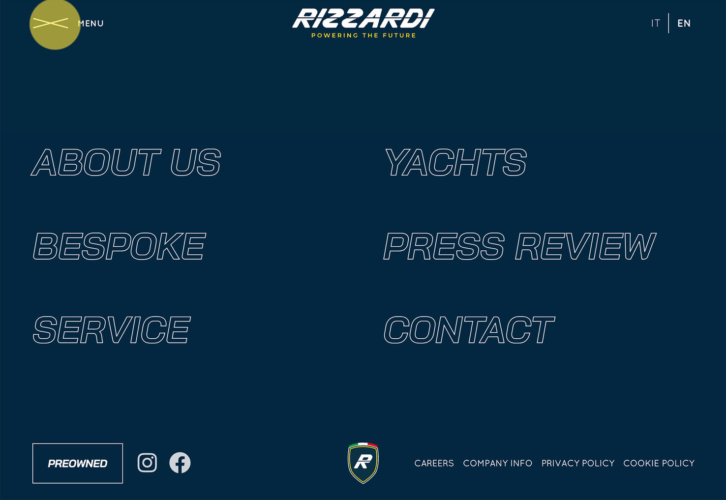
Rizzardi Yachts exemplifies the most popular use of a full pop-out navigation style, other than the location of the hamburger icon (which is on the left side here). The menu opens to a full-screen list of options with branding at the top and interesting hover animations to encourage clicks. They also add all of the common footer information at the bottom of the pop-out screen, including social icons and website policies.
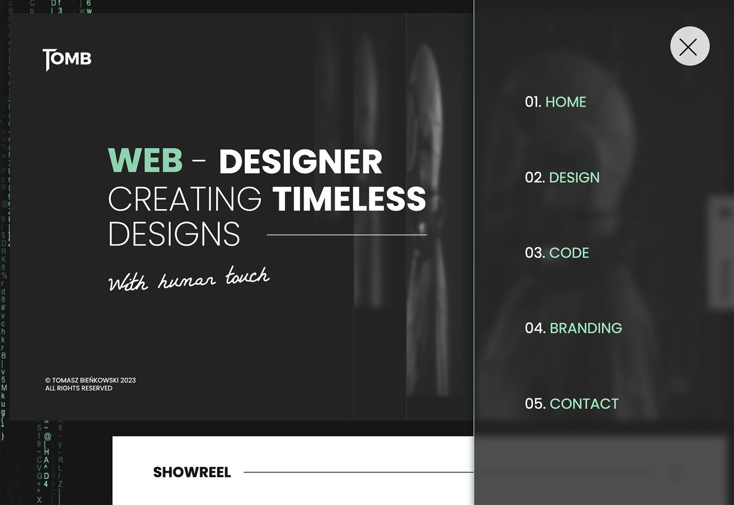
TomB uses a partial screen pop-out navigation element on the desktop version that mimics the size of the mobile nav. This works well for menu items with short names and ensures that the main part of the site and branding remain visible at all times. You don’t have to worry about users not knowing how to close the nav element, which can sometimes happen with full-screen overlays.
Made by Field breaks all of the “rules.” The navigation is hidden inside a circle in the top right part of the screen. It then expands to a full-screen menu but doesn’t have any branding and is a bit cluttered with an über-minimal design. What might be most interesting is the hover styles. Hover over items on the left side, and a background image appears. Hover on the items on the right, and they just have a slight animation with no background changes.
2. Minimal Menus
While minimal menus are a design element in the examples above, here they take on a whole new level. Not only are they minimal in look, but many of these sites are completely limiting the number of options available, creating a distinct user journey.
This design style for navigation works best on small sites without a lot of options or paths for visitors to take or sites where every page is essentially designed as navigation to the next step.
The trick to this type of navigation is setting clear expectations for the user. Is it clear what they are supposed to do next? How do they interact with the design?
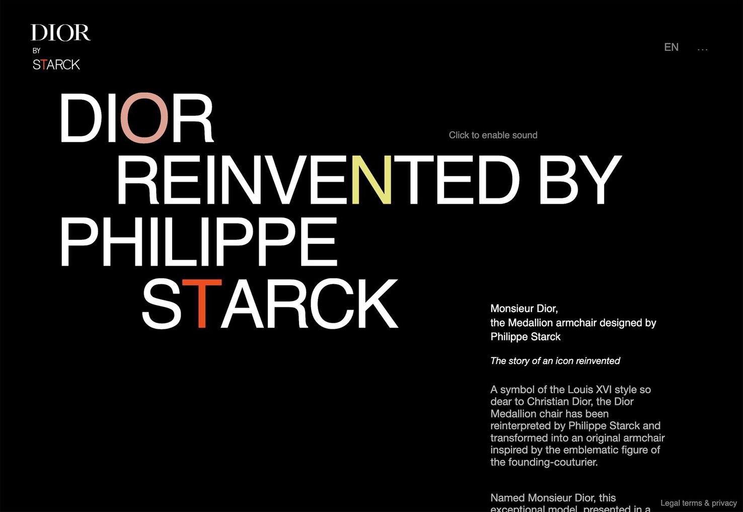
Dior by Starck is a one-page, long scrolling site. That’s part of the reason the minimal menu – it’s simply a logo, language, and sound selector – is enough. Having a long text block that’s partially obscured by the scroll makes it obvious to the user that there’s more below the scroll, and encourages the next steps of interaction.
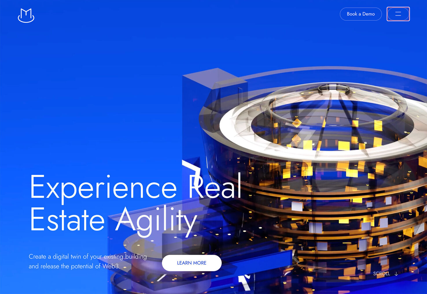
Magma uses a style that’s a lot like what we saw from TomB in the first set of examples, but there’s a little more to the menu with the primary call to action next to the hamburger icon. The navigation design is actually telling users the most important thing to do here is click that button to “Book a Demo,” but if that’s not for you, there are additional menu choices.
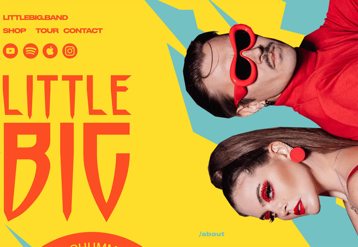
Little Big has a minimal menu tucked into the top left corner of the homepage. There are a few buttons, but the site design really only has three options for pages other than home. The remaining four buttons take users off-site, but to highly relevant channels for a music group so that people can listen to or stream their songs.
3. Encroaching Elements
This website navigation design trend might be the most difficult to pull off, with other design elements occupying part of the space dedicated to navigation. Here, you’ll find more traditional menu items across the top of the page, but other design elements encroach into the space.
This is a visually stunning option that marries modern design elements with high functionality due to a commonly accepted user pattern.
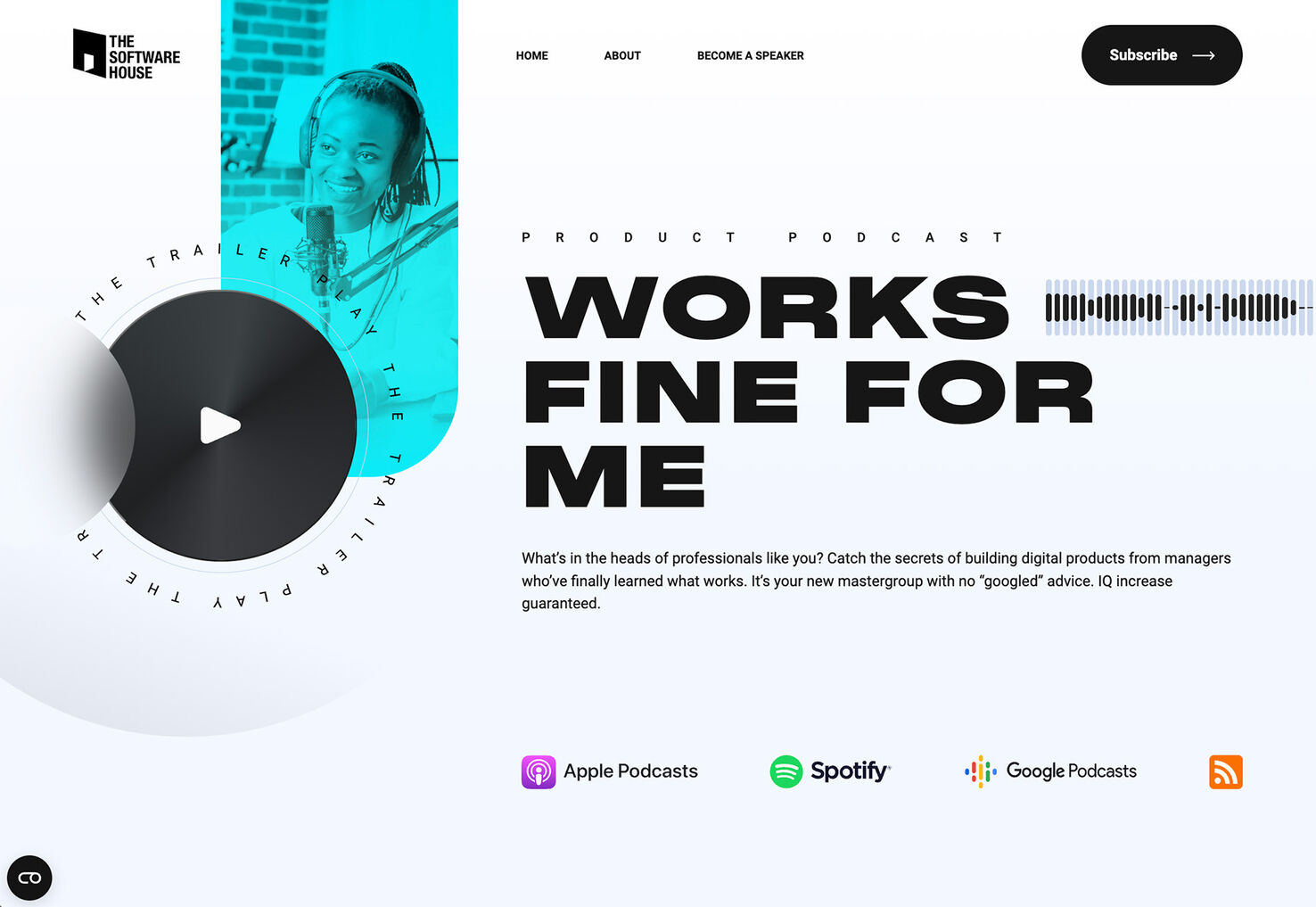
The Works Fine for Me podcast design has a typical top-line navigation structure with a logo, links, and a CTA button but the blue-green photo container drops down through the menu. It helps draw your eye to the navigation and creates visual flow across the screen.
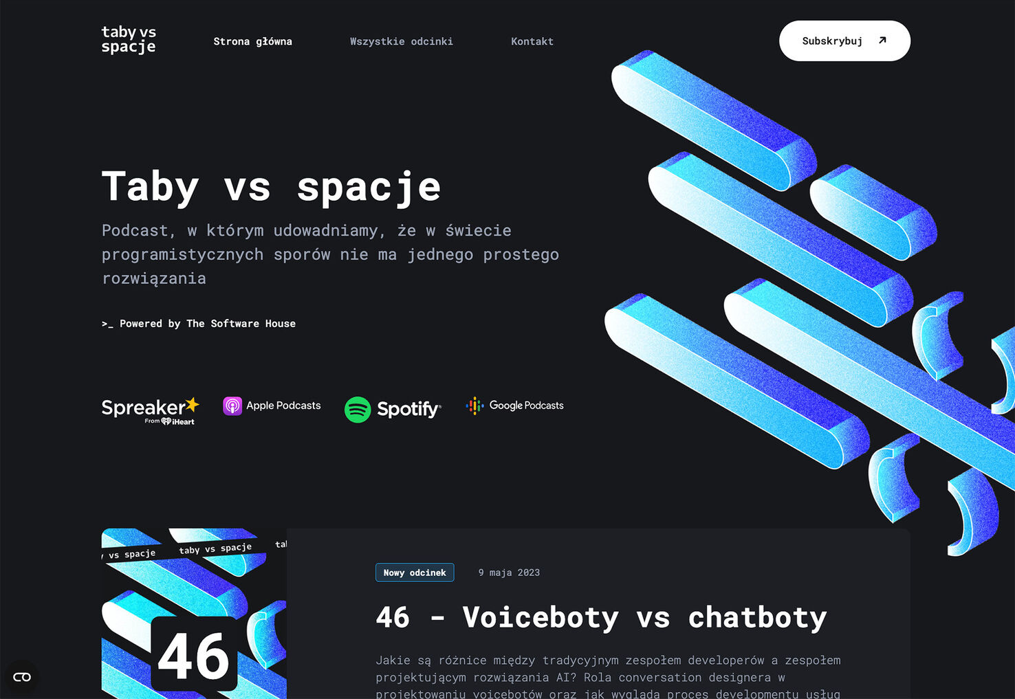
Taby vs Spacje, also a podcast website, uses a similar pattern, but instead of the encroaching element coming from above, it sneaks into the navigation from below. The shape element is placed between navigation text links and a button and actually collapses at smaller screen sizes to maintain readability for all of the elements.
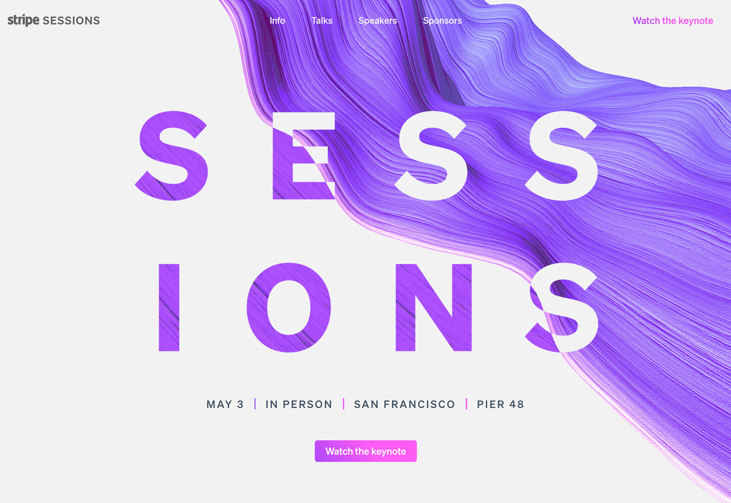
Stripe Sessions has an animated element that rests behind the middle menu items with a logo on the left side and CTA on the right. Colorful animation leads the eye to the navigation elements in the center of the screen, but the whitespace surrounding the edge elements makes them almost more of a focal point. What part of the menu actually catches your attention first?
Conclusion
And some months, we notice trends within trends.
Are these navigation and menu design trends something you can see yourself using? What’s most relevant for the projects you are working on right now? We hope you found something useful and functional to help keep your projects looking modern and fresh here.