The hunt to find more use cases for local variables.
At this point in 2023, almost all UX UI designers who use Figma should know about one of Figma’s biggest features of this year, local variables.
Something I have continued to struggle with since its initial launch this past summer is how to actually apply them in my day to day work.
The demos presented at 2023’s Config as well as office hours with ‘Figmates’ throughout the later half of this year were more straightforward and uncomplicated. Reverting between light mode and dark mode? That’s easy. Adding a live count to a stepper component? Yes, I got it.
These demos made me THINK I had a grasp of how to use the variables, but once I opened Figma to apply them, I couldn’t think of many use cases for my needs and reverted back to the way I know best. AKA, I just continued using the standard Figma styles or manually inputting numbers into frame specs.
Within my current job, I support building and maintaining my company’s Design System for SaaS products, so the application of variables for color modes was a giveaway from the initial Figma demos. My Design System does not include multiple brands, but if we did, the use of brand-theming would also be a great use case for variables to support.
After applying the new color variables to the Design System’s UI components and deprecating the original ‘Dark theme’ file that stored the dark theme versions of the UI components , I thought, “Well, what now?”.
Since those initial Figma demos and office hours only scratched the surface of how the variables could be applied, it’s been up to the Figma users to figure out how we can work it into our processes.
After exploring the new minimum and maximum constraints that can be placed on frames, it hit me that I could use a number variable for those values. Same with margins, paddings, and gutters.
I had found a new use case for me and my Design System. Breakpoints!
Below are the steps I followed to create the number variables for the breakpoints, and apply them to foundational grids and appropriate UI components in the Design System.
Step 0: Have breakpoints established and aligned on with stakeholders.
How breakpoints are established is dependent on your Design System scenario:
- If you work on a Design System, breakpoints are probably already defined (maybe…fingers crossed) and ready to be inserted into the variables collection.
- If you adopt a privately-owned or company-owned Design System, I would reach out to your Design System liaison to work with them on getting a breakpoint variables collection added to the library you use.
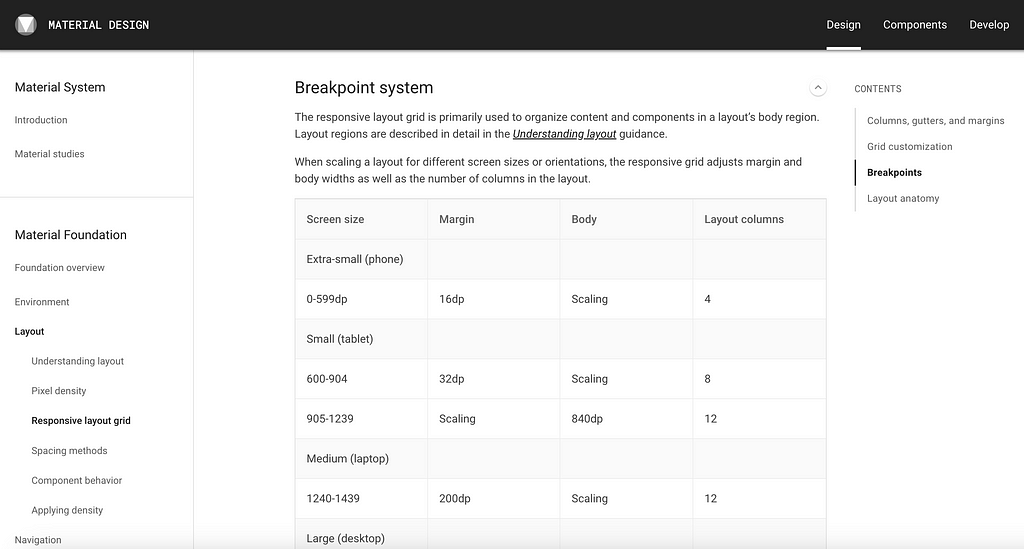
- If you adopt an open-sourced Design System, they should provide guidance on breakpoints within the documentation, and can be inserted into your file’s local variables. For example, here in a link to Google Material’s documentation on breakpoints.
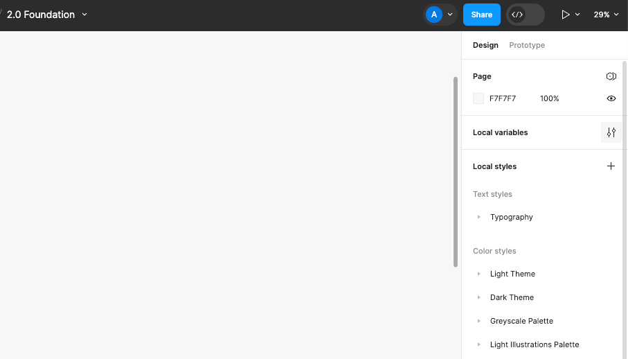
Step 1: Create a new local variables collection to store breakpoint specs.
Open the file that stores the variables that will wire to your designs. This could be a Design System file, such as a ‘Foundation’ file, or it could be localized to a single file you’re using.
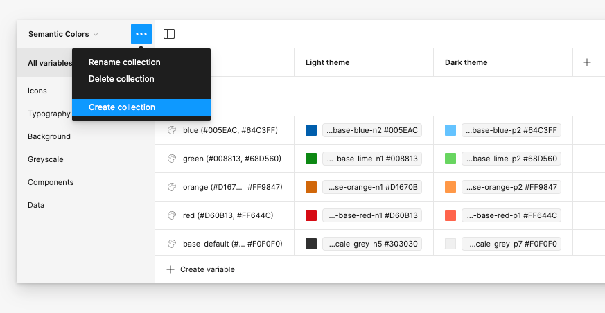
To open local variables, click the ‘Local variables’ icon button.’
To create a new collection, click on the meatball menu on the top-left of the variables popup, then click ‘Create collection’ from the options.
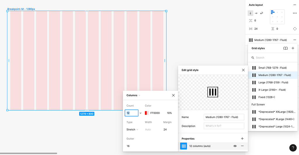
Step 2: Name the collection modes to correlate with the breakpoint sizes.
To add a mode to the collection, click the ‘+’ icon button near the top-right of the variables popup. Note that the left-most mode is the ‘default’ mode.
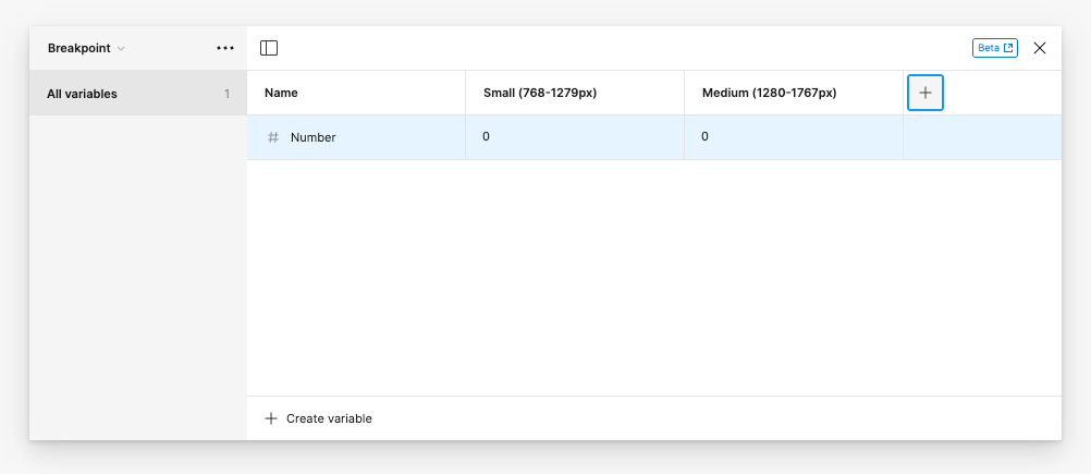
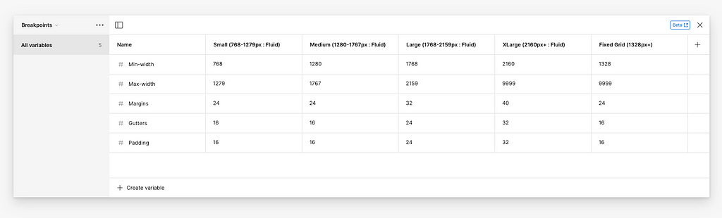
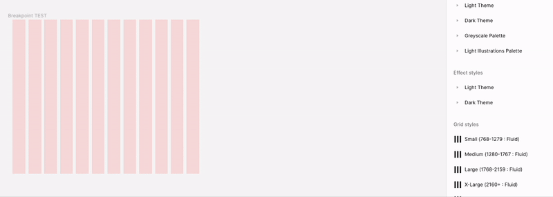
For my Design System, we offer five sizes for web responsive grids, which include four sizes for fluid resizing and one size at a fixed size. The size modes are as follows:
- Small: 768–1279px (Fluid)
- Medium: 1280–1767px (Fluid)
- Large: 1768–2159px (Fluid)
- XLarge: 2160px+ (Fluid)
- Fixed: 1328px+
The breakpoint sizes you include should adhere to your Design System or product guidelines.
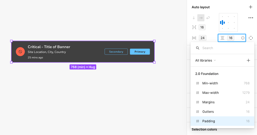
Step 3: Add number variables & corresponding values.
To create a variable for the Breakpoint collection, click the ‘Create variable’ button at the bottom-left and select ‘Number’.
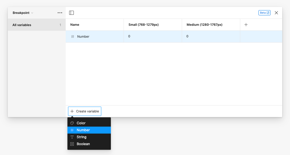
Add and name variables according to your needs, but as recommendation, I added the following variables for the collection:
- Min-width
- Max-width
- Margins
- Padding
- Gutters
For each mode or breakpoint size-range, insert the corresponding value per variable.
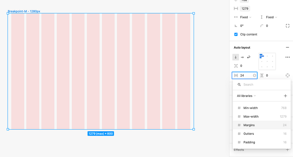
Step 4: Add breakpoint variables to grids
This step is more Design System specific or if you want to add the variables to a frame size representing a certain viewport.
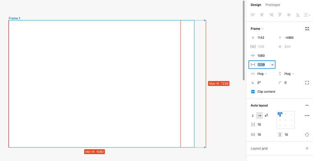
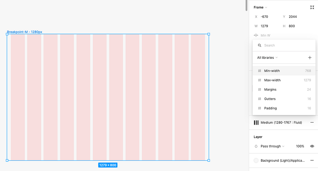
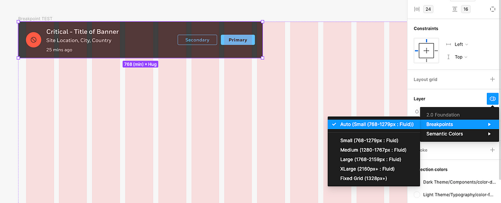
I. Add variables for the min and max widths of the frame.
Click on the frame housing the grid, go to the Design panel to find the input field for the frame width, and click ‘Add min width’.
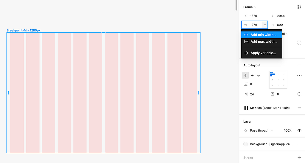
Click on the dropdown arrow on the right of the Min width input field and select ‘Apply variable’ at the bottom of the menu.
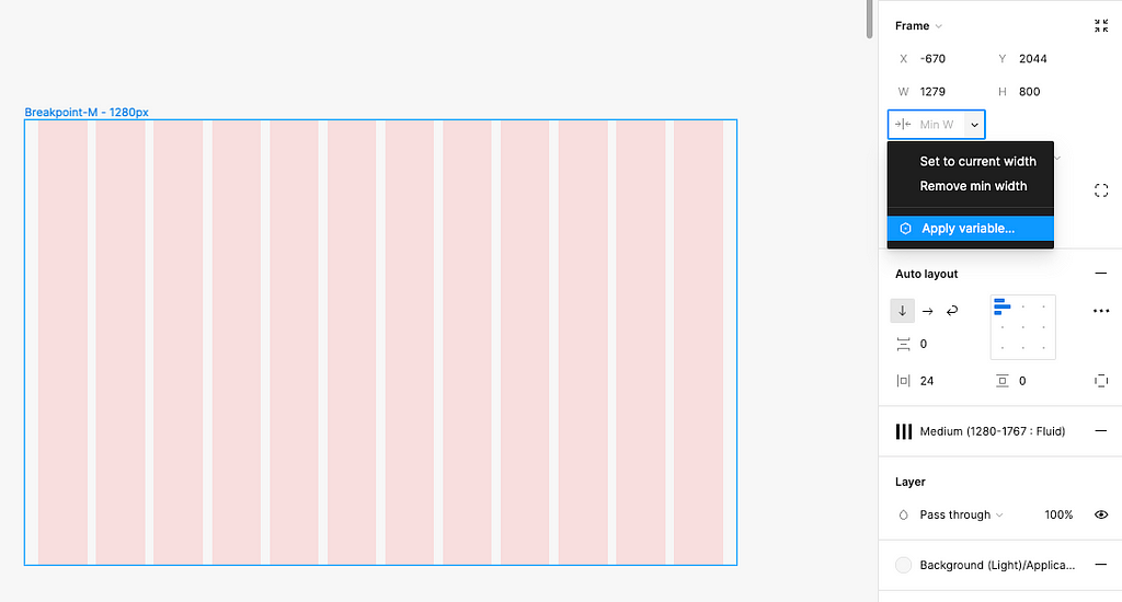
Find and click on the Min-width variable to apply it.
❗️Note: The default variable values, which are from the left-most mode within the collection, will appear within this initial list. As of now, you have to tell Figma you are using a variable in order to apply a mode associated with that variable. So in this case, I have to apply the Small breakpoint variable by default, then define the mode to be the Medium breakpoint.
Repeat the above process for the maximum width on the grid’s frame.
II. Add a variable for the margin of the frame.
Go to the auto layout section of the Design panel, and select the variable diamond icon on the right side of the input for the horizontal padding. Then, select the Margin variable.
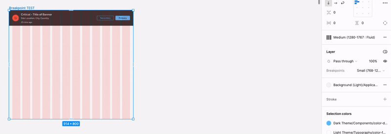
III. Define the mode of the frame.
Select the parent frame and go the ‘Layer’ section in the Design panel. Click on the variables stacked-diamond icon on the right of the section title.
Select the Breakpoint collection and pick which mode the frame should be in. In this case, the frame needed to adopt the Medium breakpoint.
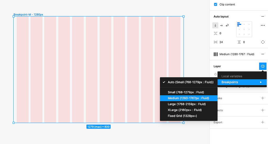
❗️Note: Again, you cannot select the mode you want the frame to have BEFORE applying at least one variable to the frame. Figma will not recognize you want to use that variable collection unless it’s being called to the frame. It’s backwards and not intuitive, so hopefully Figma will fix this in a future update.
Step 5: Apply variables to appropriate UI components
This step is similar to Step 4, but is showing a different application of variables for breakpoints.
❗️Note: Breakpoint variables should only be applied to UI components that are full-bleed on the application, such as a system banner or the global header.
I. Add variables for the min and max widths of the component.
For greater guidance on how to complete this, see Step 4, section I above.
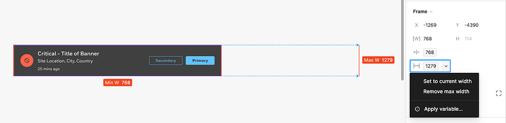
You can tell if a value is calling a variable by looking at the visual treatment given to variables. Variables are displayed using a tag-like bounding box.
II. Add variables for the margin, padding, and gap (gutter) of the component.
For greater guidance on how to complete this, see Step 4, section II above.
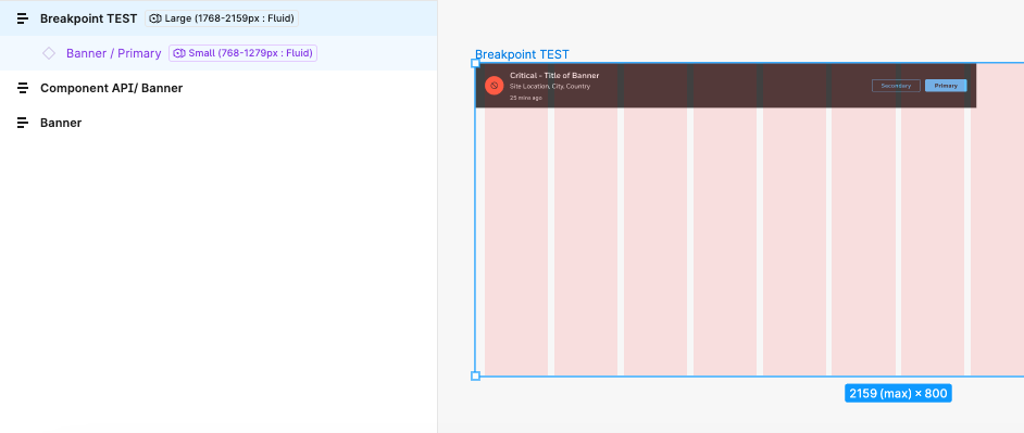
III. Test the UI component in a grid or a viewport example.
Make sure the UI component’s mode is set to ‘Auto’, then insert the component to the grid or frame to be tested in.
❗️Note: If a mode is defined within child layers of a parent frame, defining the mode at the parent level will not override the mode defined at the child level. So only define the mode at the top-layer and leave the remaining layers on auto.
Swap between modes at the parent frame layer to trial the breakpoints automatically adjusting to the mode being called.
❗️Note: A quick way to see if a child layers has a mode defined is if there a variable tag on the right of the layer in the layers panel. This should be avoided to ensure there are no conflicts between the parent and child layers.
Conclusion
As I’m trying to hunt for more applications of using variables, they are proving to be extremely powerful and help reduce the need to create so many screens that must be mocked up for dev hand-offs or general designer critique sessions.
I hope this helped you discover a new use case for applying variables into your design process.
Happy variable creating!
For some more…
If you have yet to begin using color variables, especially in a Design System setting, and need help getting started, please check out the below article going step-by-step in how to migrate your colors to use variables.
Article link: Migrating from color styles to local variables in Figma.
Using Figma variables for breakpoints was originally published in UX Collective on Medium, where people are continuing the conversation by highlighting and responding to this story.