Can we defend pursuing beauty when communicating science or innovation?
When creating visuals to explain complex ideas, cutting edge innovations or new scientific research we often focus on the images’ ability to carry information. But data visualization, infographics or even schematics have a hidden power we rarely discuss: beauty.
Obviously not all images are beautiful. As designer Alberto Cairo writes “Beauty is not a thing, or a property of objects, but a measure of the emotional experience of awe, wonder, pleasure, or mere surprise that those objects may unleash.” Beauty is an experience.
So can we defend pursuing beauty when communicating science or innovation?
Beauty gets our attention
Curiosity is the greatest source of motivation. It is usually triggered by creating an information deficit or by promising to teach the audience something new. In both cases the audience expects an answer, at best to learn something interesting, and at least to have their curiosity satisfied.
But beauty triggers curiosity differently. It draws us in the content not with a promise of knowledge but with a promise of visual satisfaction. We feel touched by the work before getting to the knowledge. Beauty makes it easier for us to look deeper, to wander around the content, to gather knowledge while already being satisfied. Beauty makes the learning process pleasant for our brains.
Accurat, the italian design agency specialized in data visualization, pursues beauty as one of its main design principles:
“Beauty is not a frill. We know how to engage and motivate people to dig deeper and take time to explore the intricacies of a visual data analysis. We deploy our rigorous methods to achieve the ideal balance between familiar visual motifs and unexpected aesthetics, a powerful combination that leverages studies on perception to trigger curiosity and interest, and creates indelible images in the minds of users.”
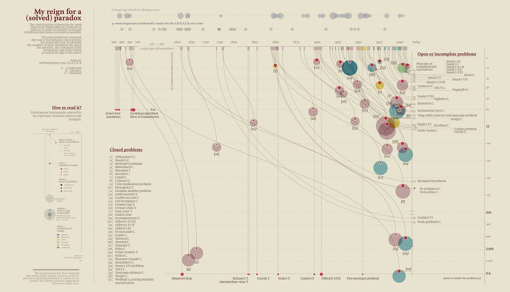
Their series of visualizations for the newspaper La Lettura leverages beauty as a way to get people’s attention on very specific topics. For example the visualization above explores the 80 most important mathematical problems in history. That visualization makes me want to know more about it. In the words of Giorgia Lupi (cofounder of Accurat): ‘I like the idea of making people say “Oh that’s beautiful! I want to know what this is about!”’
Beauty triggers emotions
Beauty is fundamentally an emotional experience. Emotions have the power to create deep connections with the audience. They help viewers relate to the subject matter on a personal level. A great example of beauty creating emotional connection with abstract ideas can be found in The beauty of mathematics video. The video shows 3 levels of abstraction, each with their own visual language. The beauty of the video lies in the connection between the 3 scenes. Going from one level of abstraction to the other allows us to understand each of them, it connects our vision of reality to the maths and physics behind it. Watching it, we feel touched by having such an understanding of our world.
https://medium.com/media/3b9f94e3e77b059c983f7f0aa9208407/href
There is something very satisfying for our brains in the fusion of an emotional experience and a rational experience. Emotional and rational experiences both play a fundamental role in our cognition and our decision making process. As neuroscientists Antonio Damasio writes “emotion is integral to the process of reasoning”. In other words: through emotions, facts resonate within us.
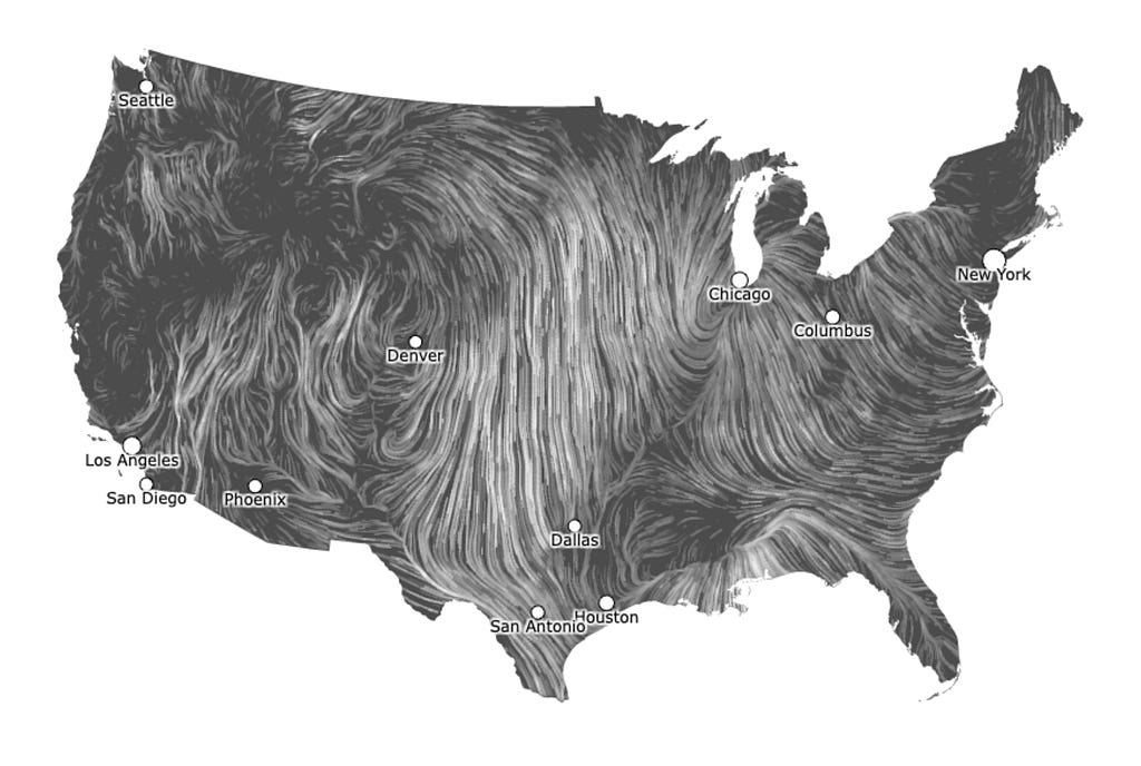
Wind Map by Fernanda Viégas and Martin Wattenberg is a great example of a beautiful data visualization. It represents wind patterns — a very large dataset at the scale of the United States — in an instinctive way. Using only black and white, the visualization makes us feel the wind. It connects with us on an emotional level while delivering precise and complex data. I really like Eli Holder’s words about this visualization:
“Data can be texture. Data isn’t limited to profound insights or crisp takeaways. It can also work in the background to create visual interest or give a more diffuse sense of which way the breeze is blowing.”
Beauty creates a satisfaction that lies as much in the movement of the fine white lines as in the feeling of understanding a complex system at a glance.
Beauty creates cultural significance
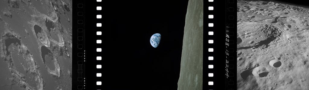
The story behind NASA’s famous Earthrise photo is quite interesting. It was taken during the Apollo 8 mission, the first to travel around the moon. The crew was equipped with cameras to take photos of the lunar surface. They took about 900 photos, most of them showing in details the grey craters of the moon. During the fourth lunar revolution, astronaut Bill Anders noticed, through a foggy window, the earth rising behind the moon. He was struck by the beauty of the scene. He reached to the camera and asked for a color film. His colleague Frank Borman replied: “hey don’t take that, it’s not scheduled”. The photo was not part of the plan. Without Anders’ intuition and photography skills, that photo would not exist.
Back on earth, the photo circulated widely. The 900 photos of the lunar surface were certainly valuable to scientists, but the one truly beautiful image struck the public around the globe, igniting a global movement of environmental awareness. Looking at the photo today makes us reflect on our planet, on our home, on ourselves. As the science historian Lorraine Daston writes: “It’s an uncomfortable emotion. You don’t have wonder. Wonder has you.”
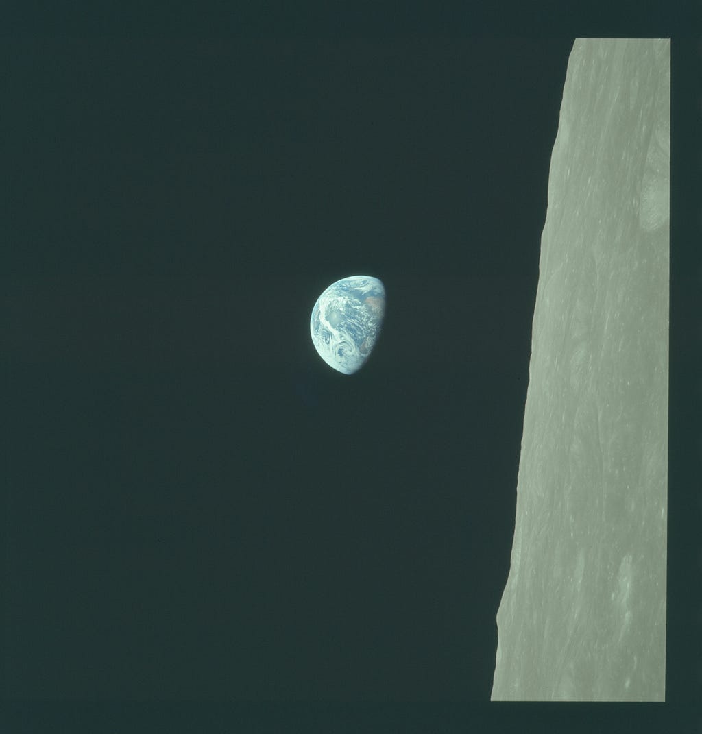
This photo gets our attention, it tells us everything there is to know about our planet, it provokes emotions, but maybe more importantly, it creates a collective moment of reflection at a global scale. This is a third function of beauty in communicating complex ideas: beauty has the power to create culturally significant objects. Objects that resonates in us at the individual scale and at a collective scale. Objects that transcend their context to create profound cultural significance.
As designers creating images to communicate complex ideas, we rationalize our processes, we bring objectivity to our craft, we want our clients to think that our decisions are based on reasoning. However, we should also defend our intuitions, our subjectivity. We should also defend pursuing beauty as it is one of our most powerful tools.
This text is an attempt to put words on my practice as a designer helping researchers to communicate science and cutting edge innovations. You can see more about my work here: https://www.louischarron.io/
Sources
Data Visualization in Society. Edited by Martin Engebretsen and Helen Kennedy, Amsterdam University Press (2020)
https://www.aup.nl/en/book/9789048543137/data-visualization-in-society
Data visualisation: A handbook for data driven design. Kirk, A. (2016)
https://book.visualisingdata.com/
Finding the plot in science storytelling in hopes of enhancing science communication. Susana Martinez-Conde and Stephen L. Macknik (2017) https://www.pnas.org/doi/10.1073/pnas.1711790114
Read the room. Effect & Affect, Eli Holder (2024)
https://www.effaff.com/read-the-room-ensemble-effect/
Seeing Science, How photography reveals the universe. Marvin Heiferman (2019)
https://aperture.org/books/seeing-science-how-photography-reveals-the-universe/
The photography behind Earthrise. Phil Edwards (2024)
https://youtu.be/B7KR1nCA4Js?si=0cXA-pMwm5xbBS3J
Mercury, Gemini and Apollo Digital Image Archive
https://tothemoon.ser.asu.edu/
![]()
The power of beauty in communicating complex ideas was originally published in UX Collective on Medium, where people are continuing the conversation by highlighting and responding to this story.