Let’s roll back the years with this 80s cover art! Learn how to design a real 80s VHS cover in Adobe InDesign. This vibrant 80s cover art captures the bold, nostalgic aesthetic of the era. We’ll achieve an authentic retro look that feels like something that came straight out of a classic video store shelf.… Continue reading How to create an 80s VHS cover
Tag: White
How to skew text in Illustrator
In the following tutorial, you will use Adobe Illustrator to design a poster which includes experimental typographic techniques. Skewing text is an essential tool to learn that can add dimension and experimentation to your designs. Let’s get started! If you’re short on time, be sure to check out Envato for cool text effects for your… Continue reading How to skew text in Illustrator
How to design an anti-design poster
The anti-design movement, as the name implies, is a style that ignores all rules proposed by traditional graphic design. Many artistic movements are considered anti-design, like Dada and De Stijl, due to their strong opinions on politics, society, and art. While some of these anti-design styles are rooted almost 100 years ago, this is a… Continue reading How to design an anti-design poster
How to Create Leo the Lion Artwork in Photoshop
Today, we will learn how to create a modern Leo the Lion constellation poster design in Photoshop! We will create a more contemporary Leo the Lion artwork by adding trendy neon colors and gold leaf textures. Let’s get started! What You’ll Learn in This Photoshop Tutorial How to create a Leo the Lion constellation… Continue reading How to Create Leo the Lion Artwork in Photoshop
Simple and Clean Business Cards For Your Brand: A Guide to Timeless Design
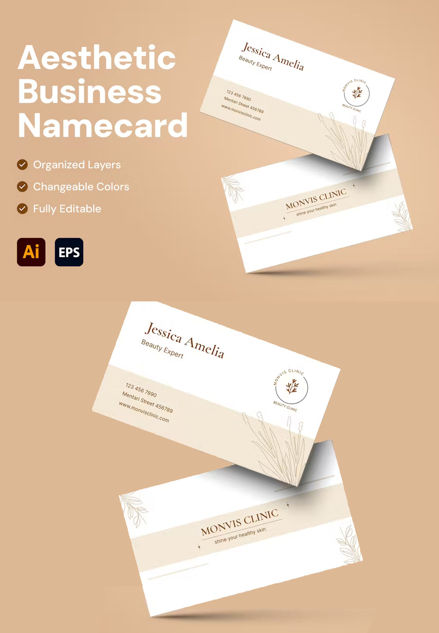
0 Shares In today’s digital age, clean business cards might seem like a relic of the past. However, a well-designed card remains a powerful networking tool. It’s a tangible representation of your brand, a physical object someone can hold onto and reference later. But in a world bombarded with flashy marketing, how do you create… Continue reading Simple and Clean Business Cards For Your Brand: A Guide to Timeless Design
How to Create Tim Burton Inspired Art in Photoshop
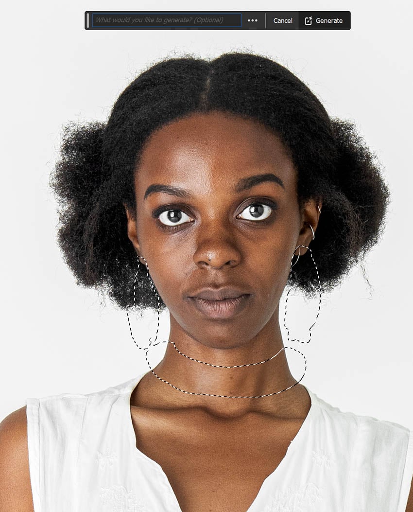
Today, we’ll be creating our very own Tim Burton photo filter! We’ll cover what makes Tim Burton’s art so recognizable. Then, we’ll recreate this iconic style using some smart liquifying techniques and simple image compositing. Let’s get started! What You’ll Need Find more resources on Envato Elements. What Is Tim Burton’s Art Style? Tim Burton’s… Continue reading How to Create Tim Burton Inspired Art in Photoshop
How to Create an 80s Punk Flyer
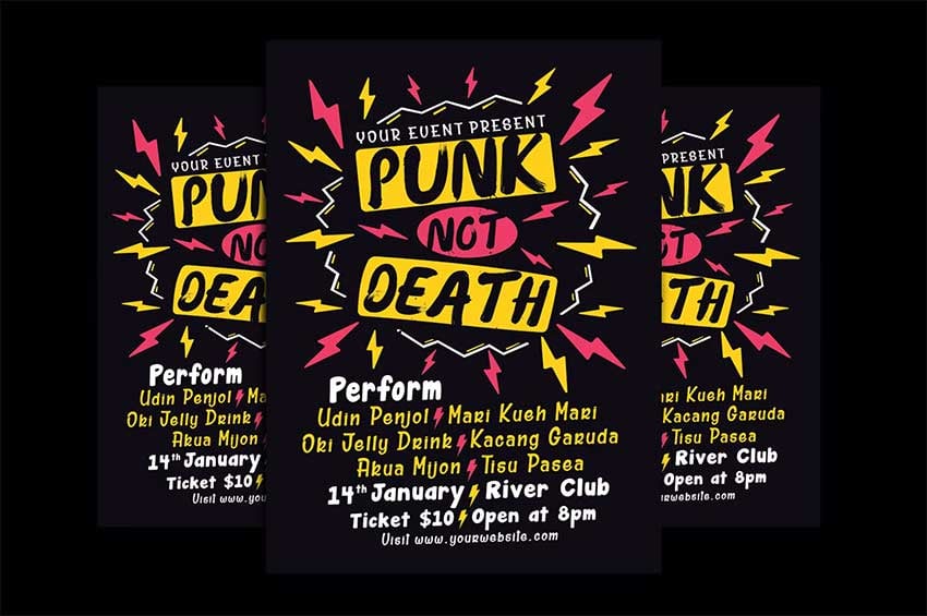
In this tutorial, you’ll learn how to create an authentic 80s punk flyer with a ragged, rough, and messy look. If you’ve been wondering how punk influenced graphic design, the answer is that it broke many rules that came from classic and minimalist styles, and punk culture has had a big impact in other areas… Continue reading How to Create an 80s Punk Flyer
3 Essential Design Trends, July 2021
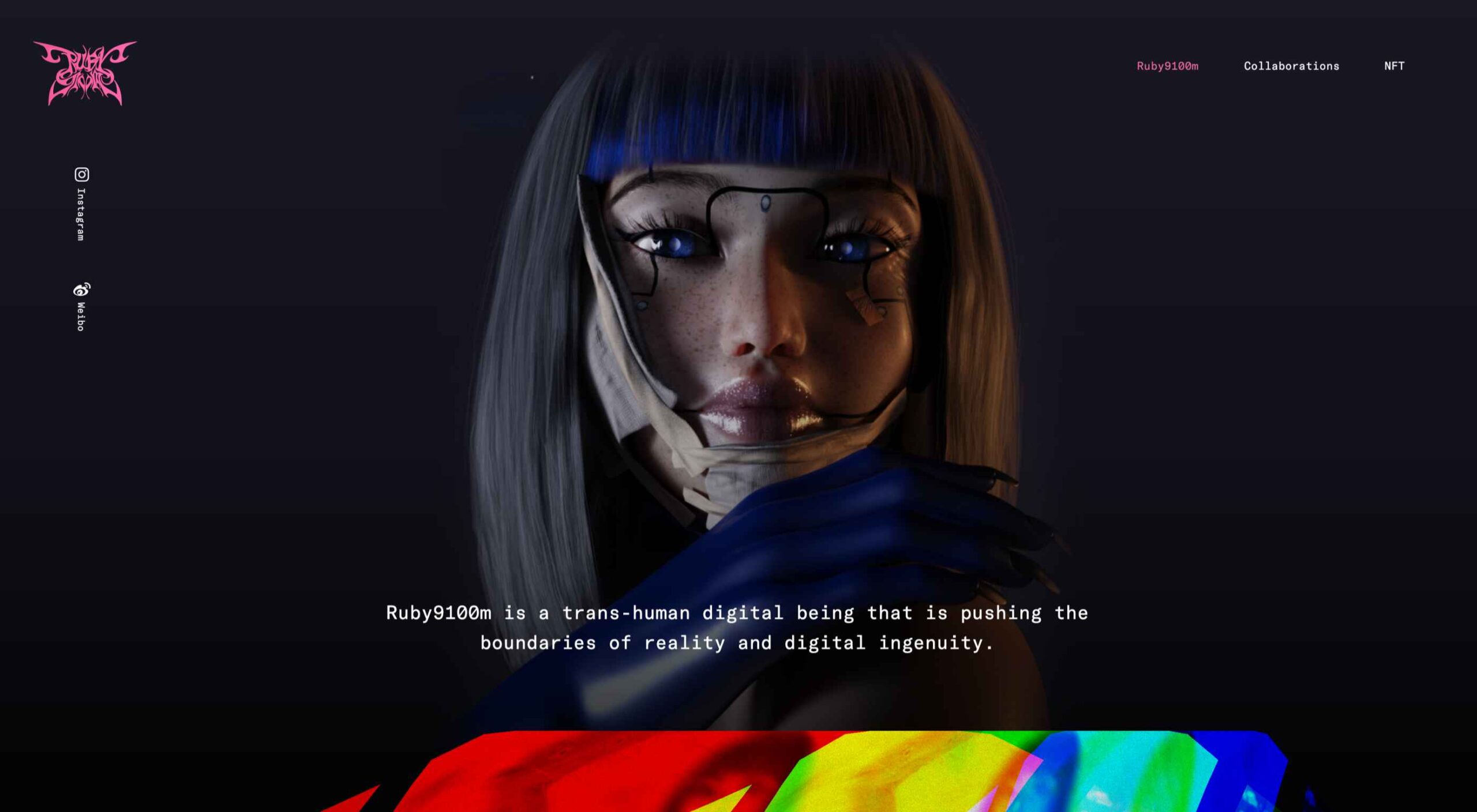
This month, you will either love or hate the featured design trends. The common theme among them is a strong design element that can create distinct emotional connections. They range from interesting monotone color choices to brutalist examples to AI-inspired faces and design elements. Here’s what’s trending in design this month. 1. Interesting Monotone Color… Continue reading 3 Essential Design Trends, July 2021
20 Best New Websites, January 2021
Here we are into a brand new year, and although we’re far from out of the woods yet, there is a feeling of renewed hope on many fronts. In this first collection of the year, we have a mix of retrospectives, brand new ventures, and business as usual. There is an eclectic mix of styles… Continue reading 20 Best New Websites, January 2021
3 Essential Design Trends, December 2020
The end of the year tends to be busy for a variety of reasons and it can limit some of the freshness we see in designs during much of the year. Regardless, there are a few trending design elements. What we are seeing right now is rooted in deep simplicity with a focus on the… Continue reading 3 Essential Design Trends, December 2020
18 Websites with Cool Patterned Backgrounds
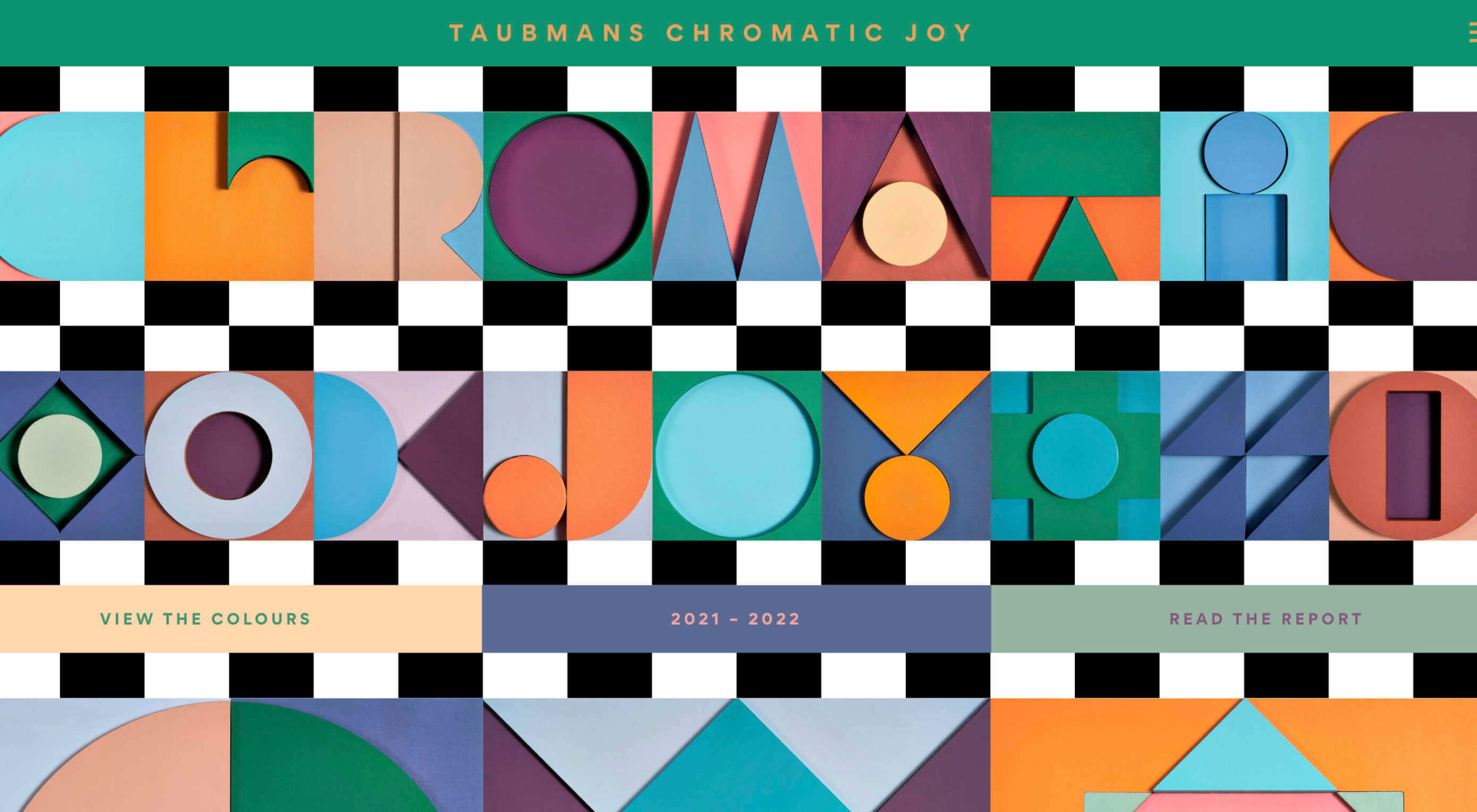
November 9, 2020 by Sangalang Kristine Website design trends change so fast, sometimes it is hard to follow. Patterned backgrounds have existed since website design started to be considered in developing webpages. These are usually basic and add style to an otherwise plain white background. Interestingly, patterned backgrounds are becoming popular again in recent years… Continue reading 18 Websites with Cool Patterned Backgrounds
Black Friday Design Elements for E-commerce Websites
November 2, 2020 by Sangalang Kristine Now that online purchases are both encouraged and preferred for Black Friday, e-commerce websites are given a new challenge of accommodating significantly more buyers. than before. There are numerous competitors on the internet, how do you make sure that the buyers notice you? The answer to this is simple… Continue reading Black Friday Design Elements for E-commerce Websites
Tips on Making Your Design Breathe: Using Space Effectively
September 24, 2020 by Clarence Design is about putting elements together to make a whole new object. This can be about product design where you design an object to be functional and better. It can also be about art or digital design where you combine images, color, and texts together to create a whole new… Continue reading Tips on Making Your Design Breathe: Using Space Effectively
How to Build an SEO Tool from Scratch
A quick Google search of the term “SEO tools” will give you a list of countless apps and software all claiming to help you get higher rankings. For SEO specialists and digital marketers, this can be both good and bad news. Good, because it’s a sign that the industry is constantly evolving. Bad, because finding… Continue reading How to Build an SEO Tool from Scratch
UI/UX 101: Break Into Secret Room of Lazy User Psychology
Admit two facts. First, you’re lazy. Second, you’re a user of something. You’re using something every day, from a coffee maker on the kitchen counter to website and mobile app interfaces. Remember how sometimes you’re really stuck while using an interface of something. Randomly clicking on every button, nav element, and link to achieve action… Continue reading UI/UX 101: Break Into Secret Room of Lazy User Psychology
5 Critical Elements You Need to Know to Build a Genuinely Cool Website
After completing 2 or 3 multi-page websites building a one-pager will take no time at all. Or so you’ve been told. The problem is, whoever told you that never tried putting together a one-pager. Or, at least one that could be bragged about. You’ll discover that cramming all the important information isn’t all that easy… Continue reading 5 Critical Elements You Need to Know to Build a Genuinely Cool Website
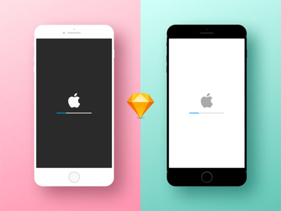
White & Jet Black iPhone 7: Free Sketch mockups
A minimal Apple iPhone 7 mockup for Sketch in two colours, White and Jet Black. Designed and released by Rifayet Uday. Download freebie
How to Design a Landing Page That Converts
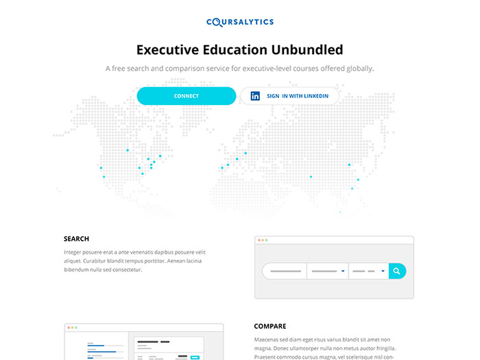
Every e-commerce website is designed to have one primary goal: to convert visitors. Conversion can range from a completed sale to registering a membership, or filling out a subscription form. Whatever it is, an effectively designed website must be able to convince users to achieve that primary goal. In light of various research and experiments,… Continue reading How to Design a Landing Page That Converts
Aol – One Of The Boldest Logo Rebranding Cases Ever
The history of Aol branding is a story of bold decisions and risky moves. It shows how much can be achieved when you have the audacity to push the boundaries of design. It also shows that extraordinary problems require extraordinary solutions. How loss of clients creates necessity for bold actions The online environment has changed… Continue reading Aol – One Of The Boldest Logo Rebranding Cases Ever
Create an Awesome Underwater Scene Depicting a Dragon and a Treasure Hunter
In this tutorial we will create an awesome underwater photo manipulation. I’ll explain some of the more complex techniques I use in the first steps to make it easy for beginners but intermediate and advanced users can also learn a thing or two.I like doing underwater scenes because there is something mysterious about the depths… Continue reading Create an Awesome Underwater Scene Depicting a Dragon and a Treasure Hunter
Designing for Apple Watch: Designing a Glance in Sketch
What You’ll Be Creating If this is the first time you are designing for a wearable device, you will notice that there are some key differences compared to designing a product for a smartphone or a desktop computer. In this quick tip, I cover some of these differences while also teaching you how to design… Continue reading Designing for Apple Watch: Designing a Glance in Sketch
50 Free & Premium HTML5 Templates for Any Taste and Budget
What should you better choose for your site – a free or a premium HTML 5 template? This is an ongoing dispute that makes millions of people hesitant on the best ready-made solution for their sites. Well, tastes differ, as much as the purpose of downloading a website template. Some need html5 templates for educational… Continue reading 50 Free & Premium HTML5 Templates for Any Taste and Budget
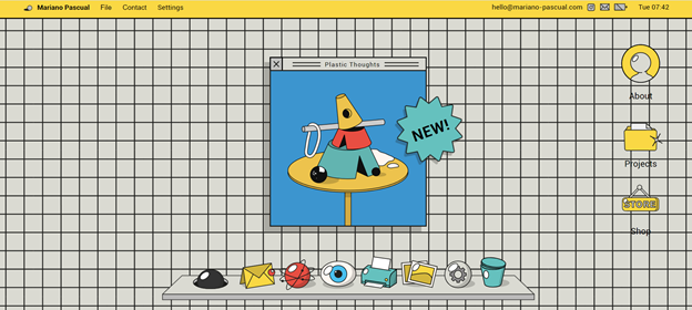
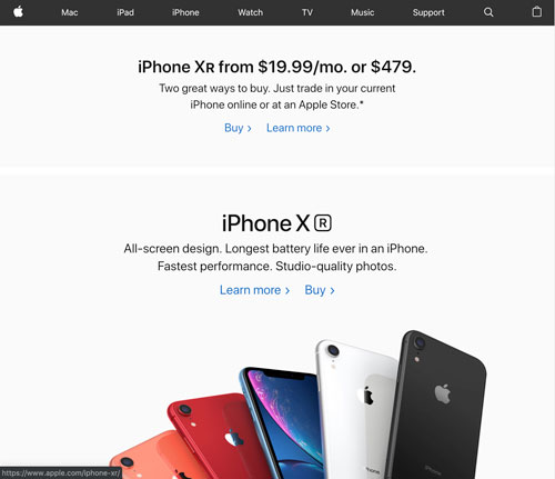
Less Is More – Minimalist And Simple Web Design
Image source: Vadim Grin[2] Exposed to lots of senseless content on the internet, we grow more sensitive to mess and distractions. We come across useless texts, we receive a pile of magazine spam, ads or business commercials, and we have serious difficulties in determining what is really worth our attention. Responsiveness Image source: Erikas Mališauskas[3]… Continue reading Less Is More – Minimalist And Simple Web Design
12 Corporate & Creative Business Card Mockups
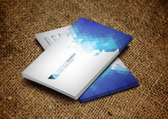
ADVERTISEMENT In this round up, we have for you 12 excellent corporate and creative business card mockups that you can use for your next client meeting or design project. These mockups are not only covering corporate professional designs but also include profession specific business card designs as well. We hope that you will like this… Continue reading 12 Corporate & Creative Business Card Mockups
