Design is about putting elements together to make a whole new object. This can be about product design where you design an object to be functional and better. It can also be about art or digital design where you combine images, color, and texts together to create a whole new design (ads, posters, artwork, etc.). In terms of artistic and/or digital design, there are times where we are so focused on fitting everything together in one area that we forget to let our design breathe. We forget that using space effectively in design is also very important.
Types of Space
Before we talk about how to use space effectively to make your designs breathe, let’s talk about the types of white spaces that we have in digital design. White space is what you call the area found between the design elements. This also includes the spaces between typography elements. The types of spaces we know are the ones categorized based on functionality and size.
Micro Space
Just like its name, micro space refers to the small spaces found between gaps of elements like letters and lines. Adding micro space in a design so cluttered helps it breathe more easily. In paragraphs, adding space makes the words much easier to read. Spaces are so important in design that even just adding a little bit makes the overall look of a design much better.
 Image Credit: gurafiku.tumblr.com
 Image Credit:
 Macro Space
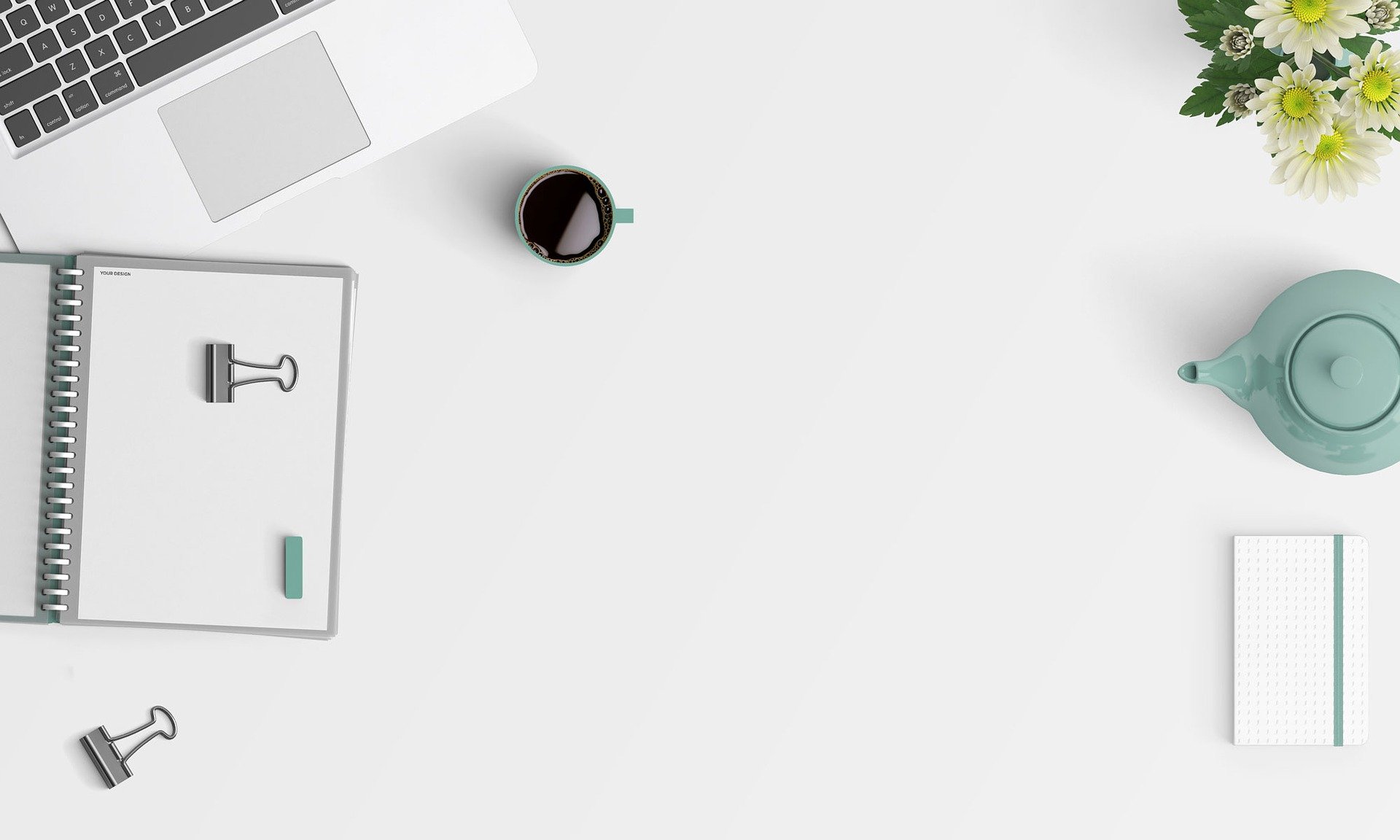
The opposite of micro space, macro space is what you call large areas of spaces in a design. These are usually found between texts and graphics. Margins and paddings are also macro spaces. Basically, if there’s no clutter, there is macro space. Minimalist designs are a great example of using macro space.
Active White Space
An active white space is what we call the space that is obviously put there. We are aware (consciously) of the white space in the design. This is because the active white space plays a part in the structure of the whole design. They also help in emphasizing certain elements – like images or logos – depending on the way they are positioned in the design.
Image Credit: Inspiration DE
 Image Credit:
 Passive White Space
On the other hand, a passive white space is what we call spaces that are usually unnoticeable. Usually, these are spaces that happen naturally – the spaces between lines of texts, grids, or images. Designers usually apply passive white space to arrange paragraphs, images, and to even arrange texts. Passive white space also helps in making the design easier on the eyes.
Tips on Using Space
Ismail El Azizi, a UX/UI designer released a series of images with tips on how to use space in your designs.
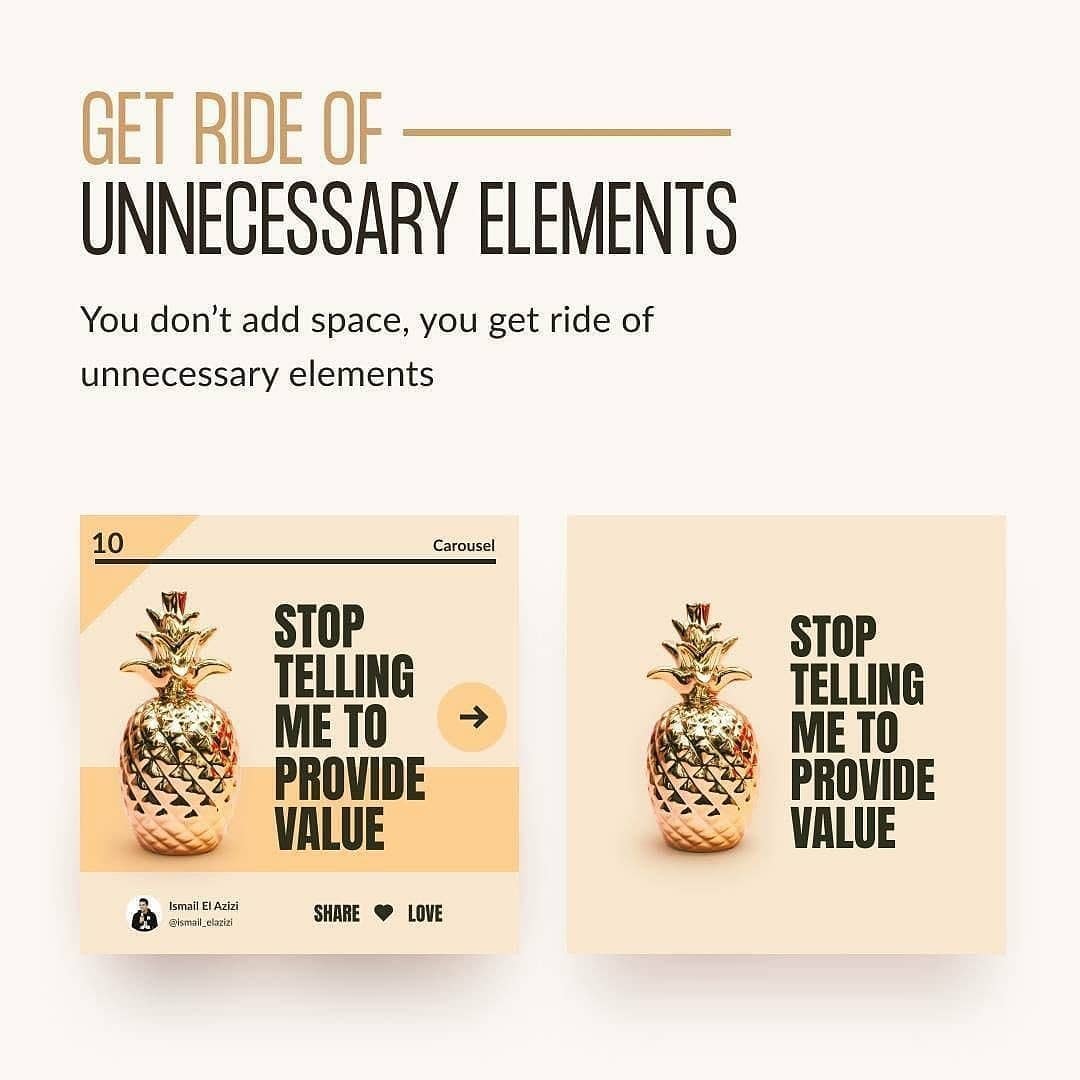
His first tip is to remove unnecessary elements in your design. If your goal is to emphasize a certain element in your design, the simplest – and probably the best – thing you do is to remove other elements surrounding it. The space that will surround the element will do a great job of directing a person’s eye to the element you want to stand out.
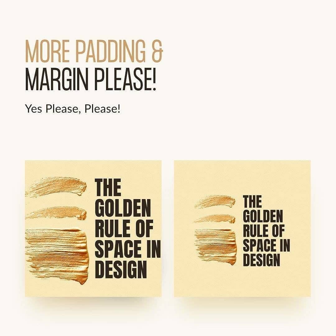
Also, never forget that margins and padding are as important as your design elements! By adding margins and paddings into your design, the design won’t feel that it’s squeezed together.
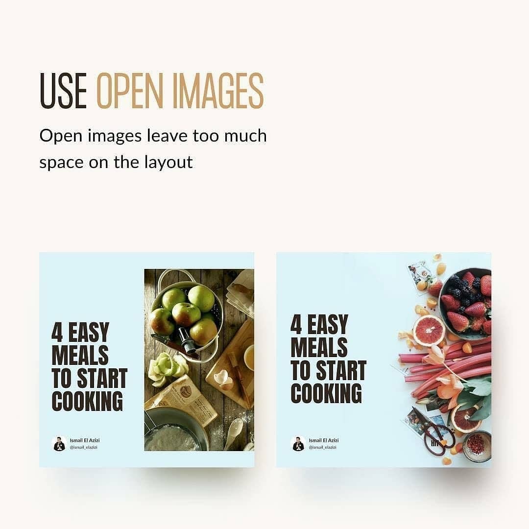
If you are able to use an image with no borders, use that as it gives you so much more space to play with.
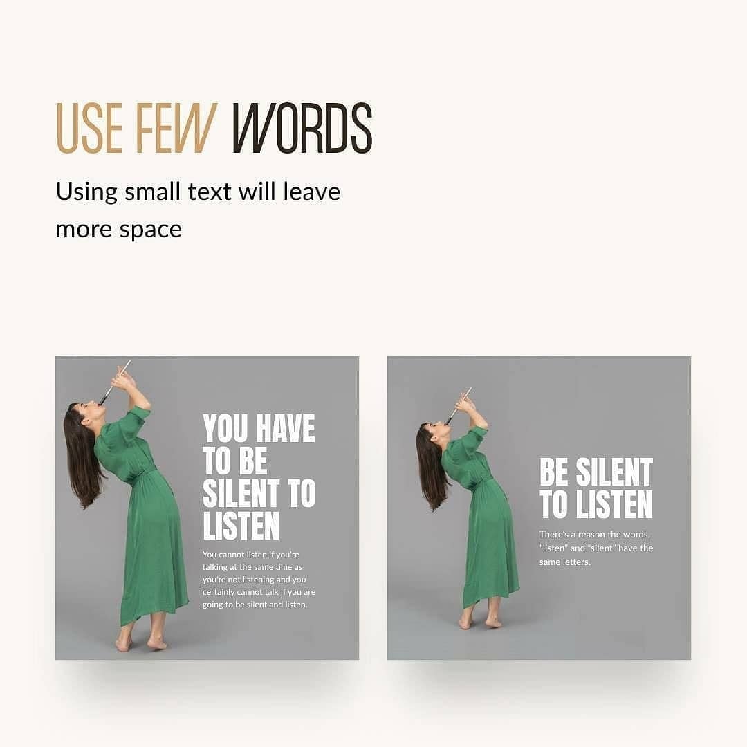
The copy you put on your design is important as well. As all copywriters know, the less words to say what you want, the better.
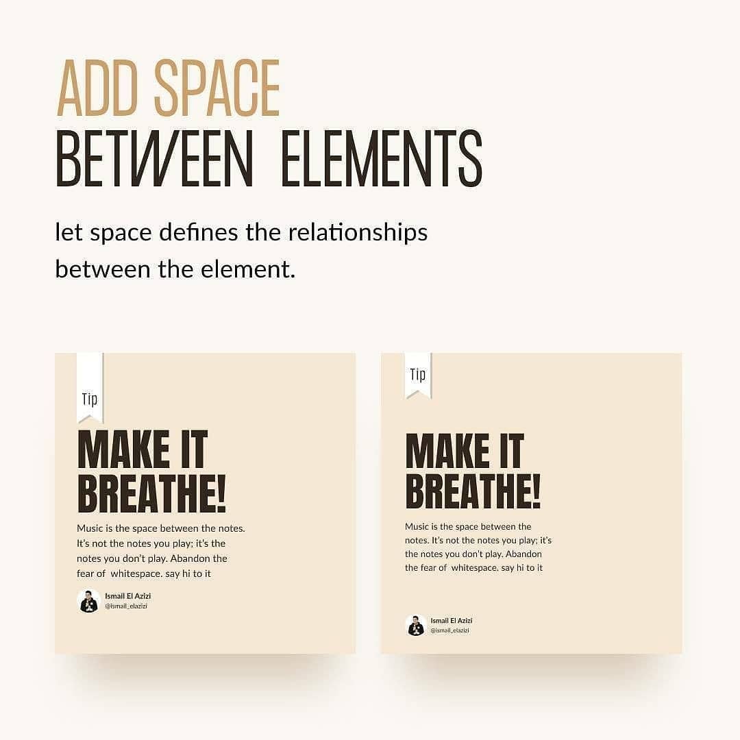
As mentioned before, always add space between elements as it makes everything easier on the eyes. There’s room to breathe, and there’s not much clutter.
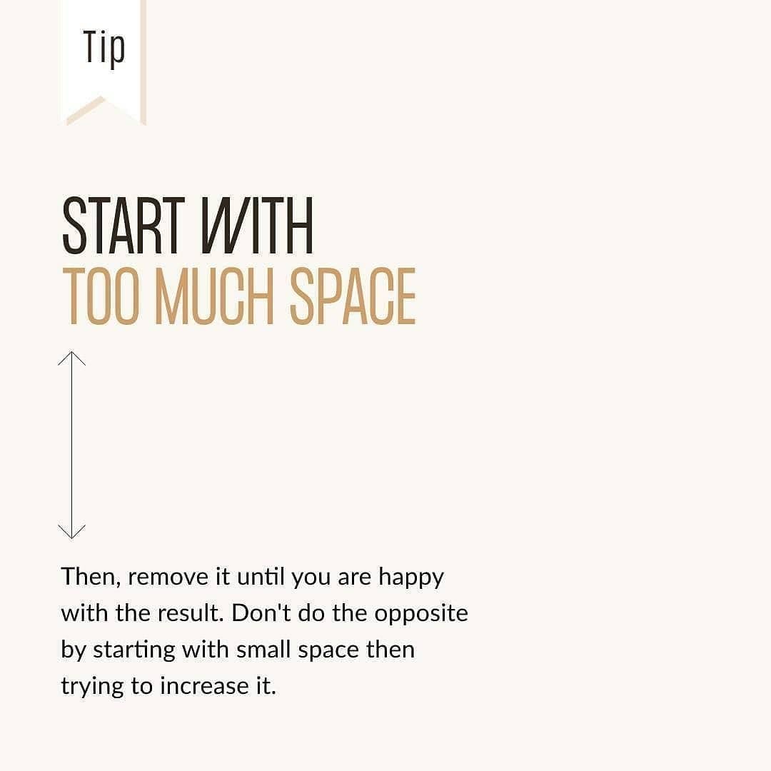
If in doubt, you can always start with too much space and reduce it from there.
How you use the space and how much you use it depends on various things – the theme of the design, a designer’s preferences, and even the current trends. However, as they say, too much of something is never a good thing. There are times when it is much better to take a step back and take a breather. There are times when a design with a lot of various elements added into it look great, but even then, a good designer will always keep in mind the spaces found in their design – no matter how big or small. A good design lets the person looking at it understand what the design is all about at a glance. If there is too much information presented to the person, they’ll end up not understanding it – making the purpose of the design useless.
You might also enjoy: