Exposed to lots of senseless content on the internet, we grow more sensitive to mess and distractions. We come across useless texts, we receive a pile of magazine spam, ads or business commercials, and we have serious difficulties in determining what is really worth our attention.
Responsiveness

Image source: Erikas Mališauskas[3]
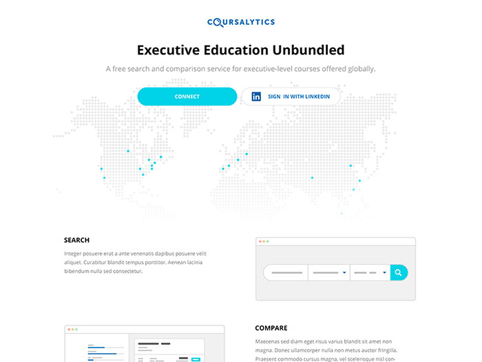
There are two essential characteristics in every well-made minimalist web design: an outstanding wireframe and an excellent grid system. If applied accurately, they can ensure mobile responsiveness even for the simplest websites.
The screens of mobile devices can always use extra-space: design components, white backgrounds and minimal contents could be the excellent solution.
Patience is also an important factor. We live in a busy world, where people are always on the rush or they are trying to secure some self-space in their tight schedules. Why not helping them with a bit of clear, factual and well-organized information? That is exactly what they expect!
Balancing
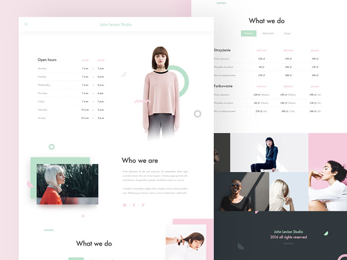
Image source: Michael Korwin[4]
Creativity is highly welcomed in web design, but that doesn’t make it unlimited. Designers should try and comply as much as possible with what their customers’ expectations.
A well-designed website is almost always based on successful examples, which managed to satisfy their customers’ needs.
Outstanding websites can show you how to create designs you would be proud of. Find out how these websites made it to the top and how they benefited, and think whether you can do the same. Take some time to develop interesting ideas and to deliver great design choices for an effective website your clients would like and enjoy.
Minimalism in web design
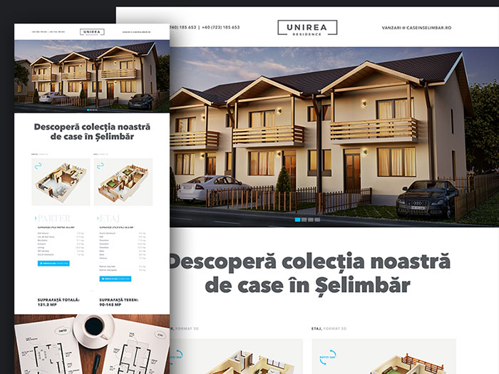
Image source: Marius Ciuchete Păun[5]
Minimalism is all about straightforwardness. You need to avoid chaos and clutter on your website, so that you would convey your message in the most efficient way. Remove all the things which are not related to the core of your website and keep it simple. Don’t let advertisement and useless banners distract users from the site and preserve your quality.
Minimalist design encompasses an excellent understanding of grids, layers, and smooth patterns. Let us suggest few tips on simplifying the content on your website:
- Reduce content. Get rid of the mess, and stick only to the content which is related to the message you’re trying to deliver.
- You don’t need more than 5 navigation pages.
- Don’t overwhelm visitors with bold and complex graphics.
- Feeds are a distraction. Remove social media and popular websites’ feeds, so that your users will not be distracted from the content you are trying to promote.
Neutrality
We are not suggesting to make a web design that lacks personality, but to create a sensible shortcut to content accessibility. Don’t forget that as a designer you want to provide content which is perceivable and has no ‘strings attached’.
White space
Image source: senyil.com[6]
Give the components on your page some ‘breathing space’. You might think there is too much information to present, but your clients will really appreciate if you keep things simple and you avoid silly ideas that will clutter your design.
Eyes need a break that will help them differ between the pages on your website. That’s exactly the purpose of whitespace. They look classy, rather than poor and you should not ‘bomb’ them with useless junk.
An overview of prototypical websites
Prototypicality is the initial mental picture your brain develops when it interacts with different categories of content. It is a kind of ‘template’ for every experience, from the people one meets to the websites he uses. For instance, when we mentioned ‘people’, 95% of you thought of somebody they recently met. Yes, people tend to associate things with the way how they imagined them before.
Prototypicality in the online world is even more diverse. People develop various, clear-cut mental images for every platform, website, blog or forum they use. Therefore, if they come across a website that lacks some of the essential parts of their mental images, they refuse it automatically and subconsciously.
Conservative approach
We are not saying that your design ought to resemble a middle-age dining chamber (unless that’s exactly what you’re trying to achieve), but it should stay modest and conservative in terms of techniques and resources.
Clean and clear design is something rare nowadays, not because of the complexity of technical resources, but also because of lack of personal efforts. Designers are expected (and required) to invest lots of time, creativity and hand-operation efforts.
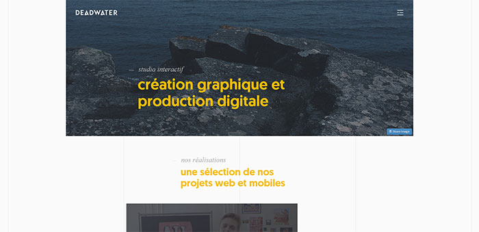
Image source: deadwater.fr[7]
Therefore, you need to balance your resources. If your purpose is to create an efficient, still minimalist web design, you should consider investing most of your resources in the initial phase of the process. The same as your kitchen, design will look chaotic and confusing, but it will lead you to the perfect result.
Proper aligning
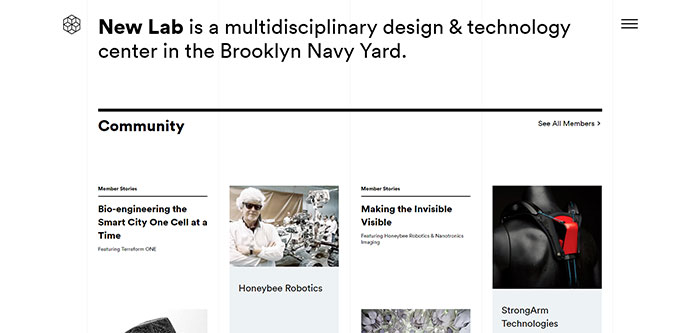
Image source: newlab.com[8]
Aligning items in a minimalist website ought to be clear and plain. It requires strict preciseness, as only a pixel or two can increase visibility and can make an object strike from the rest.
Proper alignment can be achieved with quality grids and a proper choice among the variety of interesting frameworks.
Usability is a must
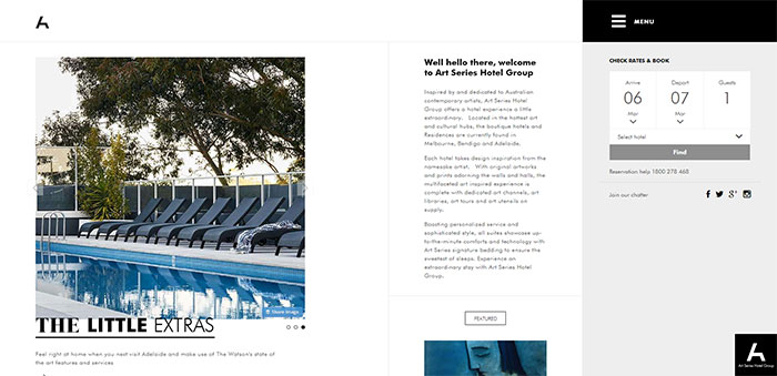
Image source: artserieshotels.com.au[9]
Between usability and design, usability always comes first. We are not saying that you should scarify good appearances in order to ensure functionality – you should find the balance between them!
A simple website which keeps users focused is a well-executed design idea which will stimulate them to use it. As we already mentioned, it is the perfect approach to convey your message and to deliver it efficiently.
The more comfortable and easier to browse your site is the funner and more interesting the experience of your users will be.
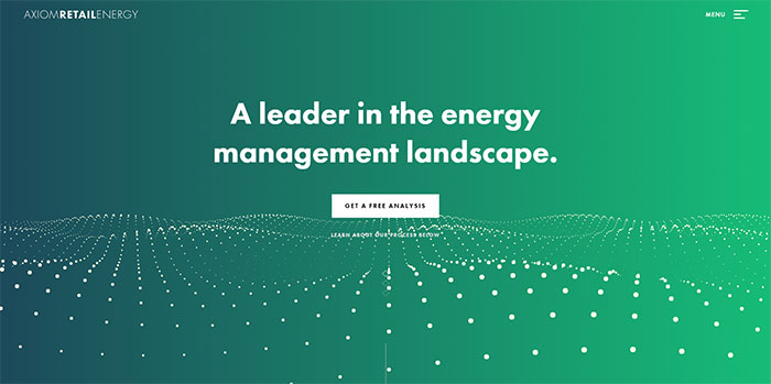
Image source: axiomretailenergy.com[10]
This counts also for the application of trendy styles and recent techniques – don’t fear to use them, but make sure you have enough space to include them and that they will not affect the functionality of your basic elements and tricks:
- Precise links that are easy to use
- An obligatory ‘Homepage’ link
- An always active ‘Back’ button
- Buttons that can close and disable pop-ups
- Clear indication of the page your user is currently on
However, be careful with minimalism in web design. You don’t want to simplify things to the extent where that can no longer be used. These are some guidelines developed on the basis of ‘empty-page’ minimalist errors. We could all learn something from them.
Navigation should be logical and intuitive
- Content should have clear titles and it should be easy to understand
- Codes should be clarified and adjusted to recent web trends and well-established standards
- Websites should be equally displayable and functional on every browser
Honesty
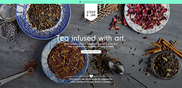
Image source: steepandjar.com[11]
Designs ought to ‘communicate’ with users in an open and honest manner. It is the only way to ensure that clients will get the right message your content is trying to deliver, and they will not misinterpret the purpose of your minimalist design.
It doesn’t take magic to do this – every element on your website should remind users of the product you’re trying to sell, or the information you’re trying to distribute.
Choose timelessness
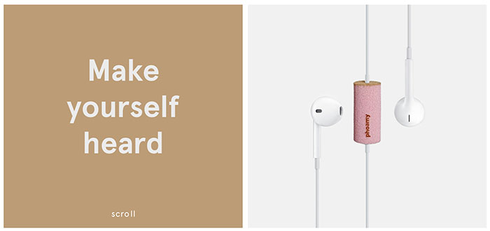
Image source: phoamy.com[12]
Do we even have to say this? Every designer dreams to make a website that will turn into an ‘evergreen’ and will never fade from user’s preferences. It is an individual approach, but there are certain designer tricks that can ensure a bit bigger longevity.
First of all, you need to recognize trends – you need to read, to follow successful websites, and to stay on track with recent developments. Secondly, you should never deviate from the basics and fundamentals of web design. The more you use them, the more stylish and classical your design will become.
Be understood
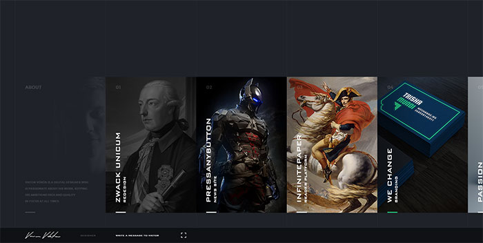
Image source: hellowiktor.com[13]
Excellent designs are visually concise and there is no need to explain them. Users perceive them as a proper choice, even without thinking about it. It is very simple-we learn to like stuff that is easy to use, right because there was no manual to teach us. That is how minimalist web designs should be-as straightforward as they possibly can!
Interestingly enough, simplicity is not that simple. It takes time and constant denial of all ‘add it’ ideas that come to your mind. Not sure how to do it? Ask yourself:
- Is it easy to use?
- Is it approachable?
- Is there any obvious clutter?
Finally, be honest to yourself. If your design is not straightforward, it means there is more mess to ‘cut out’.
Don’t forget appearance
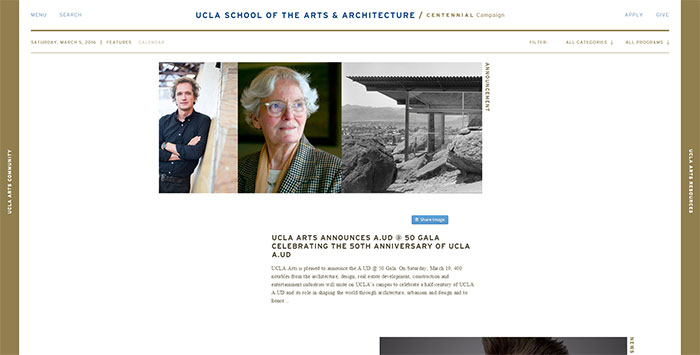
Image source: arts.ucla.edu[14]
According to Dieter Rams[15], good design must be equally beautiful as it is useful. It is because aesthetic quality is important for effectiveness and it represents an integral part of the usefulness of everyday products. The more you observe beautiful items, the more attached they become to your senses.
Even dreadful design can make their way to your attention, if you’re somehow forced to look at them every day. Before you know it, your interaction is affected and you’re about to internalize a dose from that dreadfulness. Obviously, this is a very positive thing when it comes to beautiful-looking items.