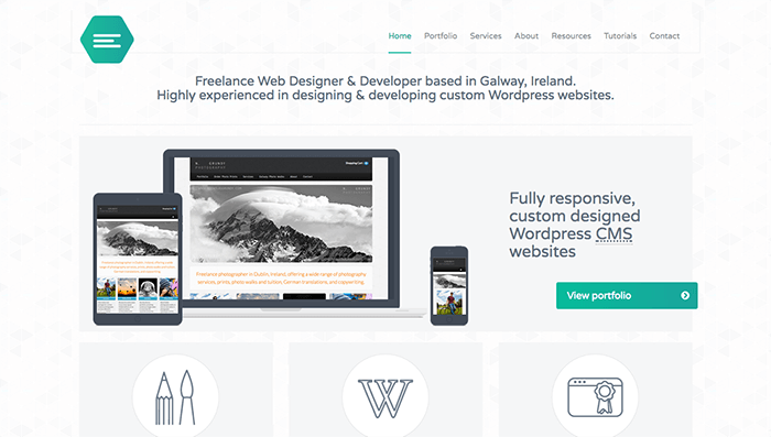
Web design has become the focal point of the online industry. Why? Entrepreneurs are now concentrating all their resources on improving their online image, reputation, and brand. That brand is defined most strongly through an official website.
Official websites are by far the most common tool used to attract new customers. A good website can change the perception of a person or brand presented there. Even with basic design principles and fundamentally simple designs, properly designed websites can be extremely persuasive when used right. People are attracted by strong, emotionally-resonant visuals. These emotional reactions drive users to make choices about engaging with your brand, increasing conversions as well as more subtle measurements like brand preference and sentiment. You can follow these basic design principles to build persuasive, effective websites for you and your clients.
Clarity
Clarity is above all the most important principle of web design. When people reach your website, they need to know exactly what your company does. People click on links because they are interested in finding the information they need or want. People stay on the website they accessed only if the platform offers clear and direct answers to their questions and needs, helping them find whatever they came for quickly and painlessly.
That’s why clarity is so crucially important to a successful website. If the website is cutting-edge, that’s even better because the visitors will get caught in the gorgeous design and the beautiful appearance of the site.
Using Clarity in Web Design
There are some basic questions that every website needs to answer, obviously and directly, from the first user visit.
- What is the name of the brand? If your logo is not legible, ensure that the name is prominently displayed under it. Remember the illegible logo for the 2012 London Olympics that everyone mocked? Don’t let that be you.
- What is the brand’s purpose? Do they sell physical good, provide consultation services, offer free programs? Never assume that your visitors already know who you are and what you do.
- How will the website help the user reach their goal? Whether they need products, services, or information, the path from their current position to their end goal should be so clear that it only requires basic visual recognition to proceed. Don’t make people hunt for the next step.
- Does the information provided sufficiently address your users’ questions?
- Is the information linked under obvious navigation keywords? We discussed this at length in other posts, but make sure your navigation text clearly describes what the user will find when they visit.
First Impression
The first impression that visitors have when they enter your website will be the key factor in determining how long they stay on your website. This is why loading times are so crucial: visitors will quickly abandon your website if the first impression is poor.
This is where visual appeal intervenes. A visually pleasant website will always attract the attention of a person. Putting elements in the right place and using the right tools to arrange information will lead to a positive or negative snap judgment. It takes less than a second for people to decide whether they are going to leave the website or not. Visual appeal and facile website navigation must go hand in hand for a smooth experience with the platform. Visual appeal is, in some cases, more important than the website’s usability.
Making a Good First Impression
Ensure that you’re presenting a clear first impression to your users. Make sure that the site loads quickly and offers relevant, useful options instantly. Do not make users sit through animations, splash screens, or videos before accessing their site. The same goes for complex scrolling-based animations, which have become extremely popular recently. As impressive as they can be, such heavy and slow animations should not be the first thing the user encounters on your site.
Informational Hierarchy
Persuading potential customers to buy one product or another is related to how elements are put together on the website. Proper application of hierarchy principles accentuates the importance of a product or service and reduce the significance of others. Keep in mind that hierarchy is not just related to the size of the elements you place, but the order too.
Employing Informational Hierarchy
The business objective will help determine what type of hierarchy to use. If you want to simply promote a product or a service that you don’t sell online, you can use hierarchies based on sizing, to prioritize what information the clients assimilate first. If you want to sell products faster or make clients preorder, make the call-to-action button stand out compared to the rest. By surfing the web, you should get a better grip on how to set hierarchies.
A properly laid-out page will use size and positioning to create a clear path through the content. These visual cues provide subconscious hints to users, gently nudging them through the content in the correct order.
Ancient concepts like appropriate titles and headings define the page’s hierarchy, but so does size and positions. For example, the left side of a website receives approximately 70 percent of viewer attention. When pressed for time, which is always, users will tend to respond to the thing that catches their attention first. Make sure your purchase action or next step catch the viewer’s attention instantly.
Conclusion
These concepts should be old ground for experienced designers. If you’re a new designer struggling to get a grasp of these concepts, or a solo entrepreneur looking to improve your website, you might benefit from a little help. If you’re overwhelmed by the task or don’t know where to start, a web design company like Lilo can help build a clear, effective website.
You might also like the following posts:
Building Effective Navigation Menus
3 Features Every CSS Navigation Menu Must Have
Microcopy Tips to Improve Your Site’s UX