
UX writers create the copy that users interact with when using software, apps, and other products. This includes button text, error messages, policy and terms documents, help text, prompts, and instructions. Good UX writing improves user experience by making your product easier and more enjoyable to use. ![]()
The best UX writers understand the ways in which people interact with websites, apps, and other software. They also understand how those interactions can vary, for example, from device to device. To create the best UX copy, you must consider how UX contributes to great UI. If you want to do the same, check out the following tips.
Replace All Caps With Title Case

All caps can come off as yelling. Surrounding text with asterisks just looks weird. It’s too easy to overuse bold print. So, how do you show emphasis without using jarring, or irritating methods? Use title case instead. That’s simply capitalizing the first letter of each word in a statement. In most cases, that is sufficient for letting users know that what they are reading is important.
Reuse Phrasing Throughout

In other forms of writing, you are encouraged to embrace variety. You use different phrases, adjectives, and other terms. This keeps your prose interesting, and your users engaged. You may even keep a thesaurus nearby so that you aren’t repeating the same things over and over again. When it comes to UX writing, all of this goes out the window. Consistency should always trump variety.
Keep in mind that much of UX writing is instructional. You are giving guidance to people who may not know what to expect, or what they should do next. So, as you define tasks and create the vocabulary you will use, make sure you are consistent. Don’t alternate between click and tap. Choose one, and stick with it. This rule applies especially when you are working on a product that will be used by people who may not be native speakers. You don’t want to add additional confusion that could make navigating even more difficult.
Stick With The Standards
In the same vein, it’s also best to stick with plain language and familiar terms. Don’t confuse people with jargon or tech-speak. Don’t attempt to make up new words and phrases. There’s a reason that you come across the same words and phrases over and over again as you interact with apps and websites. That familiarity isn’t boring. It eliminates confusion.
For example, consider the process you go through when making a purchase online. You add items to your shopping cart. When you are ready to finalize your purchase, you go to checkout, and you make your payment. The vocabulary used from site to site to describe these steps is almost 100% standard. There’s no good reason to refer to any of these things using different words
Let Users Know What is Happening Behind The Scenes

There’s nothing worse than hitting the enter key or tapping submit, only to have nothing happen. That’s especially true when the action you’ve just taken is an important one. This is why users need feedback. Every action taken by the user should correspond with a response they receive. For example:
- You Have Been Successfully Subscribed
- We Are Processing Your Request
- Your Account Will Now be Deleted
- We Have Updated Your Preferences
- Thanks For Submitting Your Order
Without this feedback, users may attempt to perform the same action over and over. They may also become frustrated enough to back out altogether. It’s even more important to provide these responses when the user is performing an action that could have unintended consequences.
Consider Various Input Options

The more you understand user intent the better. It may be impossible to predict every possible user input, but you should make an effort to try. For example, if you ask someone for their gender, a person identifying as female may enter, woman, female, or simply ‘F’. If you’re only prepared to accept ‘female’, and nothing else you create a lot of frustration and extra work. Make an effort to accept and respond appropriately to any reasonable input.
Provide Clear And Positive Feedback

What happens if the user inputs something that the system simply cannot interpret, or if you must require very specific inputs, use clear and positive feedback. Messages such as ‘invalid response’ just aren’t helpful. If you absolutely need the user to enter male or female, tell them, ‘You may enter ‘female’ or ‘male’ as your response.’
Further, when you provide instructions, frame them in a way that focuses on the positive. Avoid phrases that begin with ‘You Can’t’. Instead, tell the user what they can do. ‘You can choose email or ftp.’, not ‘Faxing isn’t available.’
Provide The Most Important Information in an F Pattern
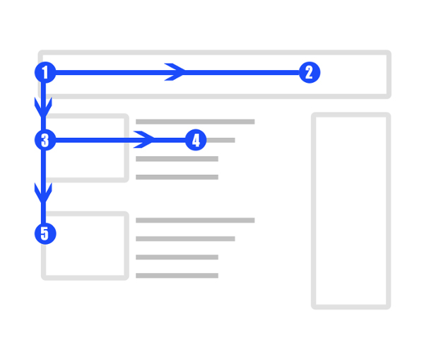
People tend to scan through screens using a bit of an F pattern. They tend to read in the following order:
- Heading
- Subheading
- First Line of Text
- Subheading…
They stop when something catches their eye. This is why it’s key to include the most pertinent information in your headings, subheadings, and the first line under each subheading.
No, you can’t squeeze in every pertinent detail. However, you should include enough information to let people know that what they are looking for is within a given section of the page. Start with the main idea in each section of the page. Then provide the details further down. This will signal to users that the information they need is in a specific place.
This is why pages that are structured in question and answer format work so well. The questions as subheadings give users an easy way to find the information they are looking for as they scan the page from top to bottom.
Keep Opposing Actions Far Away From One Another
As a UX writer, you can’t always control how the screen loads. What you can do is control the spacing and layout of your text. No user should be confused by contradicting instructions or labels that are placed too close together on the screen. Likewise, no user should inadvertently take the wrong action simply because that button was located too close to the button they intended to tap.
Space text far apart so that it reduces the likelihood of confusion or mistaps. Group like text and actions together. For example, adding an account and deleting an account do not need to exist on the same screen, right next to one another.
Use Numerals
To someone quickly scanning through a screen, the word ‘one’ can look a lot like ‘on’. The word ‘three’ looks quite a bit like ‘there’. Numbers, written out in word form tend to be obscured among other words. Copywriting standards and style guides may tell you to write out any numbers over ten. However, the rules of UI are different. Use numerals to make things clear.
Use The Word You Instead of The User
UX writing should be friendly, not intimidating. It certainly shouldn’t be robotic or cold. Don’t address the user in the third person by referring to them as ‘User’ or ‘The User’. Instead, use a second person, and address them as ‘you’. If you’re trying to save space, the implied ‘you’ works as well.
UX Writing Should be Branded as Well

UX content is just like any other content in that it gives you another opportunity to communicate with your audience in a branded voice. Don’t be afraid to make your UI more enjoyable and relatable by adding some personality to your UX content. Speak to your users in the same voice that you would elsewhere.
Marie Fincher is a content writer at Trust My Paper who is experienced with UX writing. He says, “Before I write UX content, I familiarize myself with the client’s overall branding voice. This helps me to create something that retains the intended messaging.”
Format For Readability
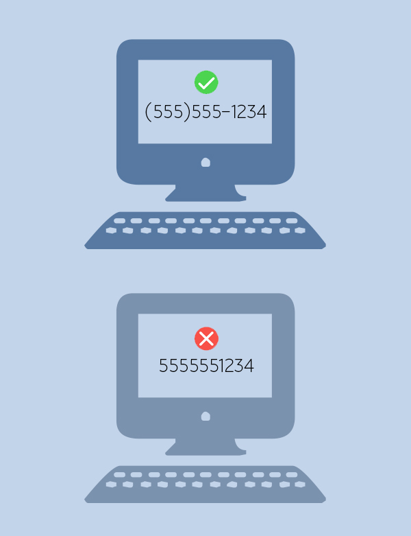
Use the proper conventions for dates, phone numbers, postal codes, and other items. Keep in mind that this can vary from location to location. Don’t be tempted to save space and effort simply by displaying numbers without any formatting. Use (555)555-1234, not 5555551234. By doing this, you make things very clear to your user, and they are able to find things easily.
Use The Shortest Simplest Messages Possible

In many cases, it is perfectly fine not to write in complete sentences. Save space on the screen, and your user’s time by minimizing the number of words you use to communicate with them. For example, ‘Delete Account?’ is sufficient. There’s no need to write ‘Are you sure you want to delete your account now?’
Use Lists
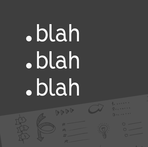
Lists are a great way to make your writing easy to read. The help users to understand and remember important points. They also break up the monotony of the page. This makes instructions easier to understand, and is less tiring on the eyes.
Final Thoughts
Good UX writing balances branded messaging with practicality. Use the tips here to write UX content that helps your users navigate your website, apps, and software while staying true to your branding.