
When you think of Sonic the Hedgehog, what comes to mind? Maybe it’s the iconic blue spikes, the red sneakers, or the way he zooms across the screen faster than you can say “chili dogs”! For over 30 years, Sonic has been one of gaming’s most recognizable characters, speeding his way into our hearts and… Continue reading Adapting Sonic: The Blue Blur’s journey to the big screen
Category: Tutorials
You learn something everyday if you pay attention
How to create an 80s cheesy photo portrait
If you’re into the 80s aesthetic, you surely remember the style of 80s graphics—the awkward photos with a family staring off into distance and giant heads floating behind them. These cringy photos used to be cool, then they became cheesy, and now our nostalgia has made them cool again. In this tutorial, I’ll show you… Continue reading How to create an 80s cheesy photo portrait
What is hyperrealism in film?

Hyperrealism is a stylistic approach that goes beyond traditional realism by being vividly detailed and immersive. It’s different from naturalism and neorealism because it exaggerates the details of life and so is supposed to feel ‘more than real’. Hyperrealism is rooted in the art movements of the 1970s and exaggerates everyday life to the point… Continue reading What is hyperrealism in film?
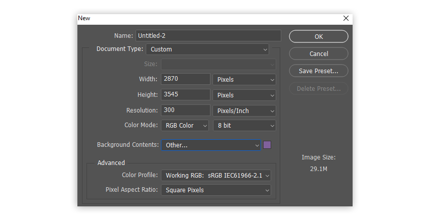
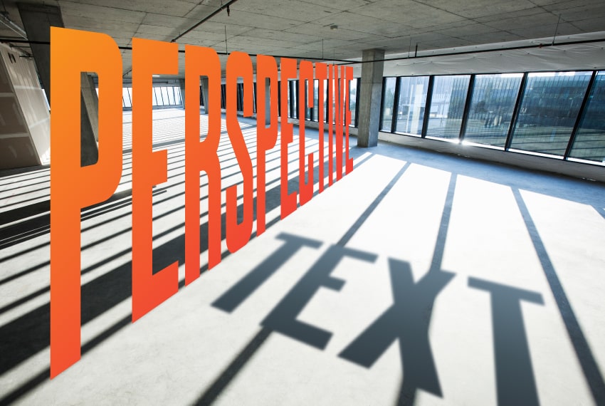
How to add perspective to text in Photoshop
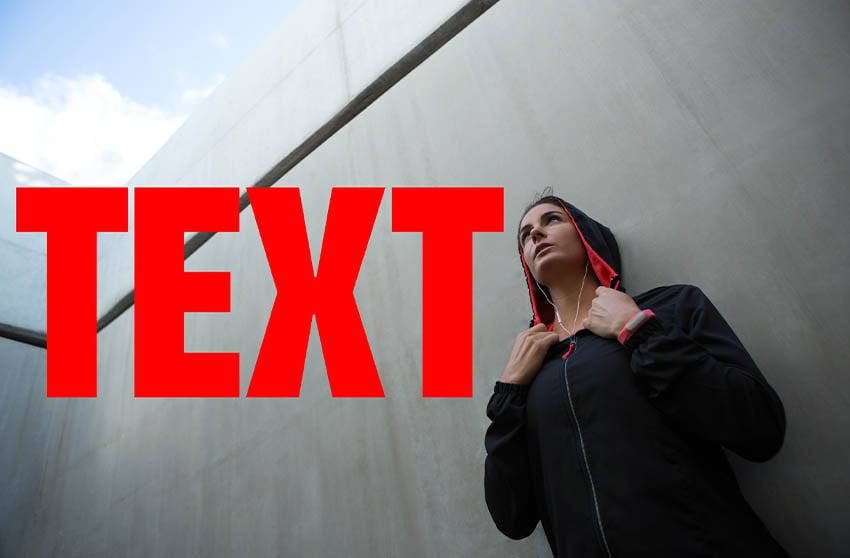
Today you’ll be learning how to edit text in Photoshop so that it appears to match the perspective of the surface it’s on. This is an incredibly useful but easy trick, and it will help you create more dynamic and interesting design. Let’s get started! What is perspective in art? Perspective is a technique for… Continue reading How to add perspective to text in Photoshop
How to create a vaporwave cityscape in Photoshop

Today, you’ll learn how to create the basics of the vaporwave aesthetic in Photoshop, without having to use AI! The key to vaporwave is being able to combine deep blues, neon pinks, and bursts of color to create a dark but vivid nostalgic scene. Let’s get started! What you’ll learn in this vaporwave tutorial … Continue reading How to create a vaporwave cityscape in Photoshop
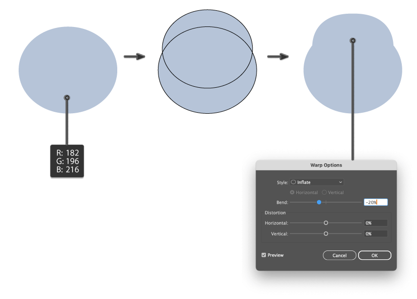
How to design a Winter themed illustration in Illustrator
Welcome to the tutorial, where we’ll create a cute winter illustration with a retro vibe, perfect for holiday graphics and seasonal projects. We’ll play with basic shapes, warp effects, the Pathfinder panel, and Adobe Illustrator’s Anchor Point Tool to craft something truly magical. So grab a warm drink, and let’s bring your winter designs to… Continue reading How to design a Winter themed illustration in Illustrator
How to build a Connect Four game in HTML, CSS, and Vanilla JavaScript
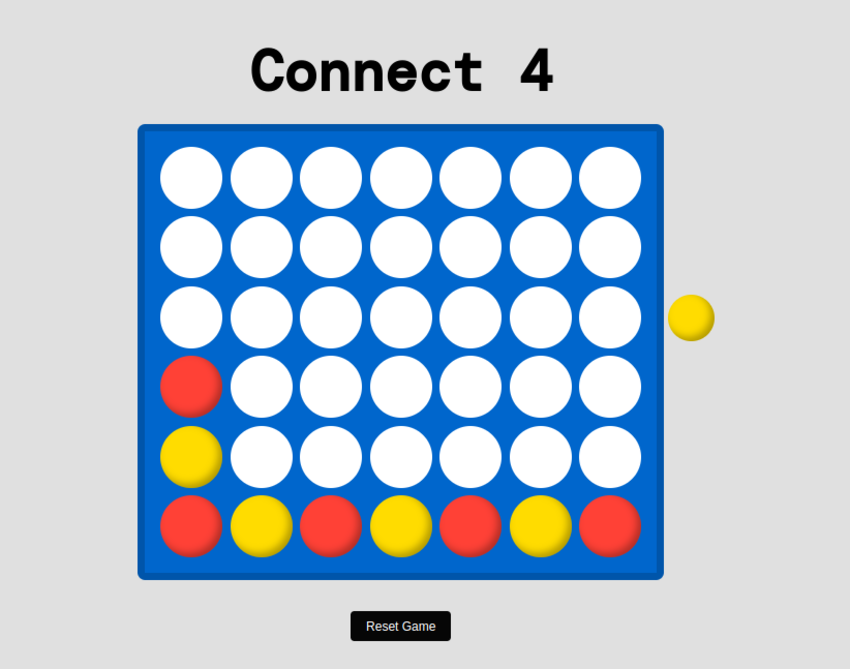
In this tutorial, we will cover how to build a fully functioning Connect Four game in HTML, CSS and Vanilla JavaScript. Here’s the demo we’ll be working towards. Click on the available slots to place whichever color is next in the queue! Begin with simple HTML markup Alright, let’s get started. In the body of… Continue reading How to build a Connect Four game in HTML, CSS, and Vanilla JavaScript
What do we mean by “non-linear storytelling” in film?
Non-linear storytelling is when the events in a narrative are presented out of order. Linear storytelling would follow a clear beginning, middle, and end, whereas non-linear storytelling reorders that (in one of a variety of ways) to create something different. It can jump between past, present, and future, or it can even look at multiple… Continue reading What do we mean by “non-linear storytelling” in film?
How to create the Squid Game logo in Adobe Illustrator
Is Squid Game the best Korean show on Netflix? We think so! Find out about the Squid Game logo aesthetic and learn how to create the grunge-style logo which represents perfectly the drama and the brutality of this popular TV series. If you don’t have the time to learn how to make the Squid Game… Continue reading How to create the Squid Game logo in Adobe Illustrator
How to draw a cow print pattern in Illustrator
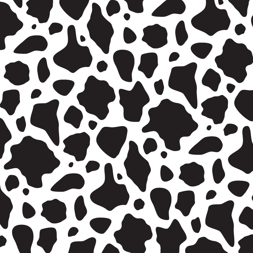
What You’ll Be Creating In the following tutorial, you will learn step by step how to make a cow print pattern in Illustrator, and then how to scale, rotate or stylize it. If you don’t have the time to learn how to draw a cow print, then Envato is the solution. This creative platform offers… Continue reading How to draw a cow print pattern in Illustrator
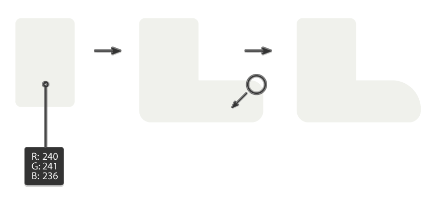
How to create abstract Y2K geometric shapes in Illustrator
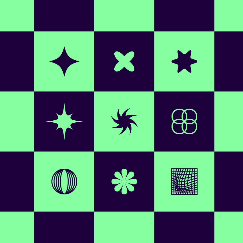
What You’ll Be Creating In the following tutorial, you’ll learn how to create a set of Y2K shapes using basic tools and effects. If you don’t have the time to build these abstract shapes from scratch, you can find plenty of alternatives at Envato. This subscription-based marketplace has thousands of Illustrator add-ons you can download… Continue reading How to create abstract Y2K geometric shapes in Illustrator
How to add perspective to text in Illustrator
What You’ll Be Creating In the following tutorial, you will learn how to use the Perspective Tools and how to do perspective drawings in Adobe Illustrator. If you don’t have the time to learn what a vanishing point is in perspective drawing and how it can help you to do perspective drawing, then Envato is… Continue reading How to add perspective to text in Illustrator
How to create photocopy and Xerox textures
Old photocopiers might have not produced copies of the highest quality, but the distorted images resulting from such copying can have a retro appeal—especially in the age of high-resolution, full-color, HDR photos. In this Photoshop tutorial, I’ll show you how to go back in time and turn your photos into low-quality copies—with a nice Xerox… Continue reading How to create photocopy and Xerox textures
What you need to know about logo rebranding

Rebranding is a strategic process to help businesses align their visuals to their messaging. A business may have new evolving goals, a different target audience, or expanding products and services. All of these can drive the need to rebrand. In this article, you can expect a guide on when to consider a rebrand, how rebranding… Continue reading What you need to know about logo rebranding
6 reasons for website downtime (+ how to resolve it)
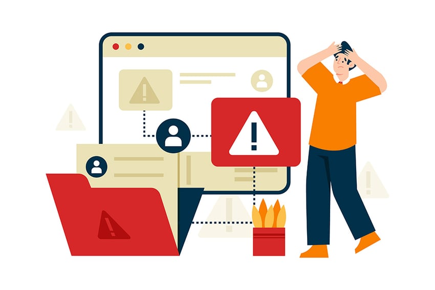
Website downtime is an extremely frustrating experience for business owners, bloggers, and other professionals across all industries. If this problem isn’t addressed quickly and efficiently, affected sites will likely experience a big drop in engagement and sales. I don’t have to tell you that this situation is far from ideal. My goal today is to… Continue reading 6 reasons for website downtime (+ how to resolve it)
How to create 3D text effects with Project Neo and Adobe Firefly
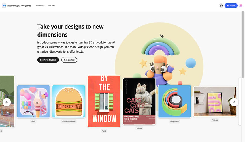
Today, we’ll explore Adobe’s new web-based design tool, Project Neo. It’s currently in beta and accessible to the public on the Adobe website. Project Neo allows users to easily create and edit volumetric designs, drawings, text, and shapes with simple turns and tweaks to create unique 3D artwork. This tool can be handy for creating… Continue reading How to create 3D text effects with Project Neo and Adobe Firefly
How to use Firefly with InDesign
In this tutorial, you will learn how to use Adobe Firefly. I’ll show you how to set up your document and give you some tips on describing the image you want so you can get the best results. We’ll also dive into some ways to change the style and add reference images for more accurate… Continue reading How to use Firefly with InDesign
How to use the Adjustment Brush tool in Photoshop
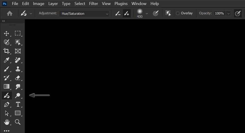
Today let’s learn about Photoshop’s Adjustment Brush tool! The Adjustment Brush is ideal for quicker edits and Photoshop adjustments like changing the color of objects or adjusting specific areas to be brighter or darker. Let’s take a closer look at how it works! 1. How to use the Adjustment Brush tool in Photoshop Step 1… Continue reading How to use the Adjustment Brush tool in Photoshop
How to use the Adjustment Brush tool in Photoshop
Today let’s learn about Photoshop’s Adjustment Brush tool! The Adjustment Brush is ideal for quicker edits and Photoshop adjustments like changing the color of objects or adjusting specific areas to be brighter or darker. Let’s take a closer look at how it works! 1. How to use the Adjustment Brush tool in Photoshop Step 1… Continue reading How to use the Adjustment Brush tool in Photoshop
Build a website page configurator with CSS & JavaScript
To build our page configurator, we’ll combine old-school CSS techniques with modern CSS features like custom properties and container queries. What We’re Building Without further ado, let’s take a look at the final project. Click the setting icon to the left of the screen to access the controls panel: 1. Begin with the panel… Continue reading Build a website page configurator with CSS & JavaScript
How to use the Remove Tool in Photoshop
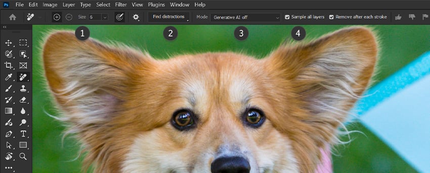
In this Photoshop tutorial, we’ll be taking an in-depth look at how to use the Remove Tool in Photoshop. Quickly remove unwanted objects, distracting details, and even people with just a couple of clicks. Let’s take a look! Step 1 The Photoshop Remove Tool is found in the left-hand toolbar, grouped in with the Spot… Continue reading How to use the Remove Tool in Photoshop
How to draw Moo Deng in Illustrator
Who is Moo Deng, you ask? Only the internet’s cutest baby hippo! And where is Moo Deng from? According to Wikipedia, Moo Deng is a baby pygmy hippopotamus born on July 10, 2024, at Khao Kheow Open Zoo in Chonburi, Thailand. Her name, meaning “bouncy pork” in Thai, was selected through a public poll. Moo… Continue reading How to draw Moo Deng in Illustrator
How to use Photoshop brushes to create negative space

In this tutorial, let’s take a look at how to create negative space in design by recreating a promotional poster from TV show The Last of Us. What you’ll need What is negative space? So what is negative space? Negative space, also called white space, is an empty area or shape around the main subject… Continue reading How to use Photoshop brushes to create negative space
Make your own URL shortener in JavaScript
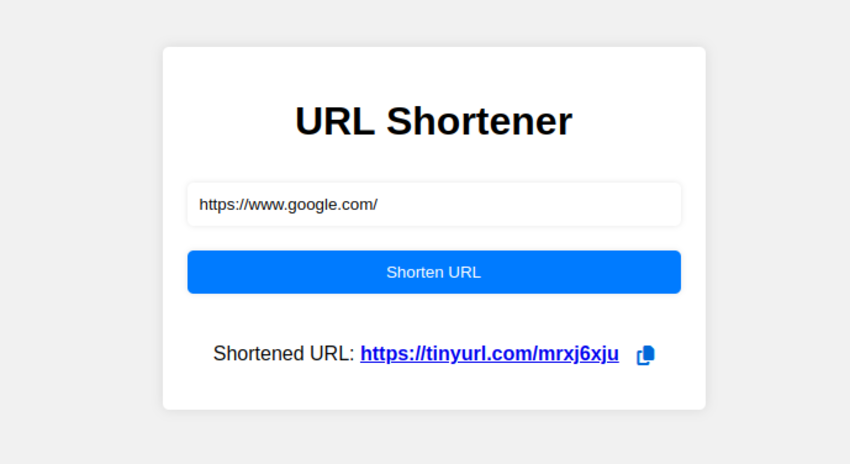
What is a URL Shortener? A URL shortener is a tool that converts Long URLs into shorter, more manageable links. Once the URL has been shortened, it redirects users to the original URL. Short URLs are easier to share on social media, emails, or any other digital platform. Additionally, many URL shorteners offer advanced features… Continue reading Make your own URL shortener in JavaScript