Rebranding is a strategic process to help businesses align their visuals to their messaging. A business may have new evolving goals, a different target audience, or expanding products and services. All of these can drive the need to rebrand.
In this article, you can expect a guide on when to consider a rebrand, how rebranding can help a business realign its visuals, and how to take essential steps like auditing the existing brand. We’ll also look at some successful and not-so-successful case studies. Let’s get started!
What is logo rebranding and when to consider it


A good logo rebranding is a strategic process that involves updating a company’s visual identity. It isn’t just about aesthetics—it’s to strategically reshape the perceptions consumers have of the brand, while ensuring that the company’s messages, values, and vision are better directed and more aligned.
When is it time to consider a logo rebranding? There are a few key instances when a logo rebrand is necessary. Let’s take a look at some key situations from the graphic design and marketing perspective.
Company’s name change
When a company changes its name, a logo rebranding is essential to directly reflect the new values, message, and identity. It’s important to create visual cohesion with the brand’s new positioning by altering the typography, color palette, and other elements, while also maintaining some level of continuity from the previous brand to help maintain consumer recognition.
Brand growth and product expansion
As companies evolve, they may expand into different product lines, offer other services, or change the market (or even refine it). The original logo brand may not accurately represent their identity anymore, and this is when a new logo may help expand or shift the brand. When the brand mission, values, or position in the market changes, a new logo rebrand can reinforce the new direction.
Competition
If a logo is too similar to a competitor’s, it can fail to stand out and can even create confusion. A logo rebrand can set a company apart from the competition. A distinct and memorable logo needs to be different from what’s standard in a specific industry. A fresh look can help strengthen a brand’s positioning and ensure consumer recognition.
Maintain relevance
Design trends evolve over time, so it’s normal for a brand to update and tweak its logo branding to look more modern. A brand designed a decade ago may look dated now. If the logo no longer appeals to consumers or it starts to communicate something different, it may be time for a logo rebrand. A fresh logo can reshape perceptions, communicate innovation, and attract new consumers.
Brand crisis
In a worst-case scenario, a brand may face a reputation crisis. Rebranding through a fresh logo can help a brand distance itself from the past. A new logo is an indicator that the company has turned the page and is trying to rebuild trust and change the public’s perception.
Risks of rebranding


A logo rebrand comes with risks from the design and marketing perspective. When a logo rebrand isn’t executed correctly, it can lead to the loss of brand recognition, distancing from customers, or even market mispositioning. Let’s take a look at some risks that can impact a logo rebrand:
Loss of brand recognition
A major 180˚ redesign can alienate existing customers who may no longer see themselves or recognize the brand. A drastic change that involves overhauling every design element may confuse customers and result in a significant drop in sales.
Modernizing a logo to fit digital media can strip down some of the personality and result in a generic rebrand. It’s necessary to preserve some of the brand’s core identity to keep it distinct from competitors.
Negative public reaction
This is one of the most common risks that comes with a logo rebrand. If a logo rebrand doesn’t resonate with customers or is perceived as unnecessary, it can lead to negative responses. Explaining the reasons behind the rebrand and involving existing customers in the process can help with the brand transition as the customers feel as if they’re part of the journey.
Costs
Rebranding can be an expensive endeavor. A good rebrand won’t be successful without a proper analysis from start to finish. It’s essential to carefully assess the goals of the brand to ensure that a logo rebrand is necessary and that the benefits are justified.
Recognizing the need for logo rebranding from a design perspective


A logo rebrand takes time, money, and effort. So it’s important to evaluate trends, set new goals, and reflect on the strengths and weaknesses of the logo and brand in general.
Evaluating an existing logo
The first logo for a brand might no longer be appropriate as trends change and a brand grows, or the logo might even have been designed for a specific application that’s no longer relevant. Trends come and go, and some logos have been designed too much for “current times”. Colors, gradients, and other effects tend to box a logo into a specific timeline.
When a company grows bigger or in a different direction and the logo doesn’t reflect its original goals anymore, then it’s time for a rebrand.
Logos are sometimes designed with a specific application in mind. In the 90s, no company could have known about the future importance of social media and its impact. During the mid-2010s, we saw a rebrand boom among higher-end brands that made their new logos work with the digital world. These applications aren’t only for print—these days we have to consider e-commerce, websites, applications, screens, etc.
Understanding goals
It’s important to understand the main goals for the rebrand. If there’s a new audience, then going back to the drawing board will be useful to create a new logo that best communicates and represents the target market. If the goal is to create a logo that works better at different scales and across different mediums, then the focus is on the visuals rather than rehashing the values of a brand. If the goal is product/service expansion, or say a different target market, an overhaul is necessary to attract the new market or include the new products/services.
Reflecting on strengths and weaknesses
Even strong brands sometimes rebrand to breathe new life into their purpose. Shifting core values, mission, and vision, a renewed commitment to sustainability, or maybe eco-friendly colors are some of the things to consider.
How to rebrand


Rebranding requires more than just creating a logo—there needs to be an understanding of the brand’s essence. So you need to evaluate what isn’t working with the current brand, analyze the competition and target market, and ultimately create a cohesive visual language.
Reevaluate the old brand and audit
Deeply analyze the brand’s history, mission, values, target market, and competition. Surveys are a great way to get insight. Understand why you need a rebrand—is it to modernize the logo? Is it a shift in company values? What are the goals?
Evaluate the strengths and weaknesses of the current brand and analyze all the elements, from color to typography, form, and effects. Is it working well in print? Is it working well in digital? Is there consistency across different platforms?
New strategy
A new strategy will be a strong point when it comes to rebranding. Create a brief that outlines the new tone and personality. For this, using archetypes will provide a framework for creating an emotionally engaging brand identity. Brand archetypes tap into universally recognized symbols and traits that evoke emotional responses.
Visually, having a plan with brand guidelines is key to implementing the new rebrand. Making sure consistency and graphic assets are used correctly will only reinforce the new personality.
Concepts and moodboards
At this stage, it’s time to get to the drawing board and use all the information you’ve collected. Generating multiple concepts and directions will help you explore different avenues of where to take a rebrand. A moodboard can help you clarify the feeling and values that you want to convey, so use this as a starting point to create concepts. It’s important to clarify that concepts are wildly different ideas, rather than iterations of the same concept. You can have multiple visual iterations for the same concept. It’s important to have multiple concepts until you narrow down which works best for the rebrand.
Tests and focus groups
A logo rebrand might seem as if it’s just a graphic design job, but involving other departments can help greatly. Involving the marketing and development teams, as well as focus groups, can give you a better idea of the design based on consumer reactions. The feedback from focus groups is invaluable and gives you the chance to make adjustments based on real-world testing.
Rebranding examples and case studies
Let’s take a look at some rebranding examples that applied different approaches and had different outcomes. Rebranding can be a powerful tool for companies, so let’s see how these companies redefined their market position and strengthened their brands.
Apple
Apple’s original logo was a detailed and traditional styled image of Isaac Newton under an apple tree. In the 1970s, the logo was replaced by the colorful rainbow-striped apple. By the end of the 90s, Apple had transitioned its logo to a more sleek version with a bite taken out of it. At this point, the brand represented simplicity, innovation, and modernity.
The new logo aligned with Apple’s values: clean, innovative, and user-friendly. The rebrand aligned with its product philosophy, going from quirky to cutting-edge, sleek, and luxurious.


Pepsi
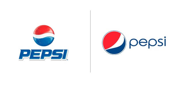
Pepsi has had many logos in the past, but in the early 2000s, the brand needed to refresh its logo to stay in competition with Coca-Cola. In 2008, Pepsi came out with a minimalist version of its iconic globe, with the white stripe curving to resemble a smile and the word “Pepsi” set in a modern font.
The minimalist changes came at a cost. The new logo had a modern look, but people didn’t think the money was worth the rebrand, and some found the design underwhelming.


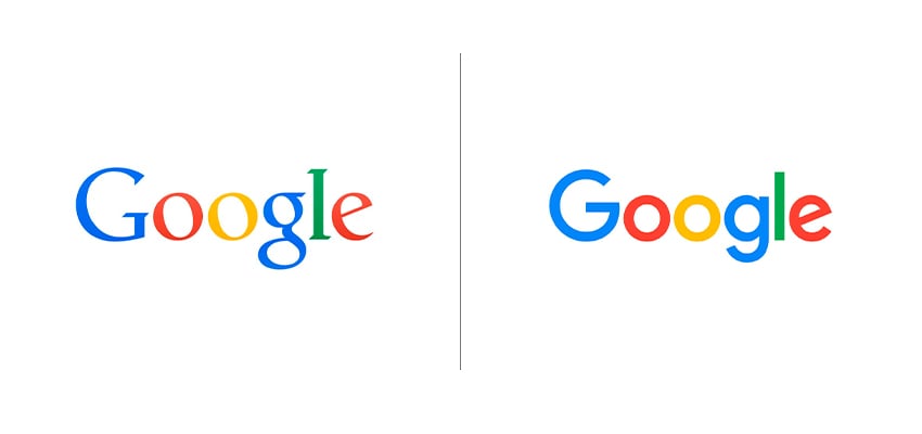
The original Google logo featured a serif font, but serifs weren’t optimal for web use in the 90s, and the logo itself wasn’t modern. Google switched to a sans-serif typeface, resulting in a flat logo that made it look more contemporary and that was easy to scale on different platforms. The colors got a small revamp by adjusting the brightness to also make the palette look modern.
Since the company is based online, it needed to work on mobile platforms, and it also matched Google’s growing ecosystem of products and services. This rebrand worked because Google didn’t stray too far from its original colors or present a wild logo—it maintained recognition as it rebranded to grow.


Airbnb
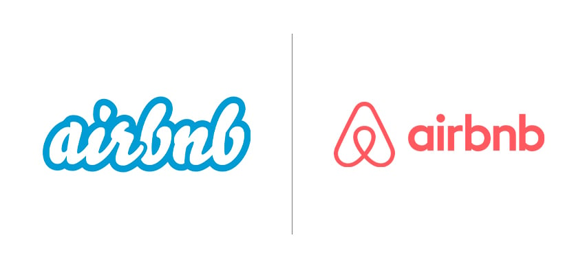
The original Airbnb logo was a wordmark that didn’t really represent the service the company provided. The new logo is an abstract symbol that represents the experiences Airbnb offers: people, places, love, and belonging. While there was some backlash when the new logo was revealed, Airbnb maintained its position, and the logo helped strengthen the company’s positioning.
The new logo created an emotional connection with Airbnb’s mission, and it’s proven to be highly versatile across different platforms.


Gap
The Gap logo we know from the 90s featured a bold serif wordmark inside a blue box. This logo stayed the same for 20 years. In 2010, Gap introduced a new logo featuring Helvetica and a small blue square. The rebrand had tons of backlash from customers to designers, and in less than a week, Gap reverted to the old logo.
There was no clear reason to change the logo. The new design lacked any type of DNA from the original logo, and in this case it was a lesson of the importance of brand equity and customer loyalty.


Final thoughts
Rebranding can be a powerful tool and a transformative process to reinforce a company’s values, vision, and connection.
Different case studies have shown how strategic changes to a brand identity can promote innovation and clarity, thus making the emotional connection with the audience even stronger. On the other hand, brands like Gap have completely missed the boat with customer expectations.
Successful rebranding requires balance, creativity, and more than anything, strategic insight. We hope that with this article, we showed you how to navigate the complex and rewarding process of rebranding.
If you liked this article, you might want to read: