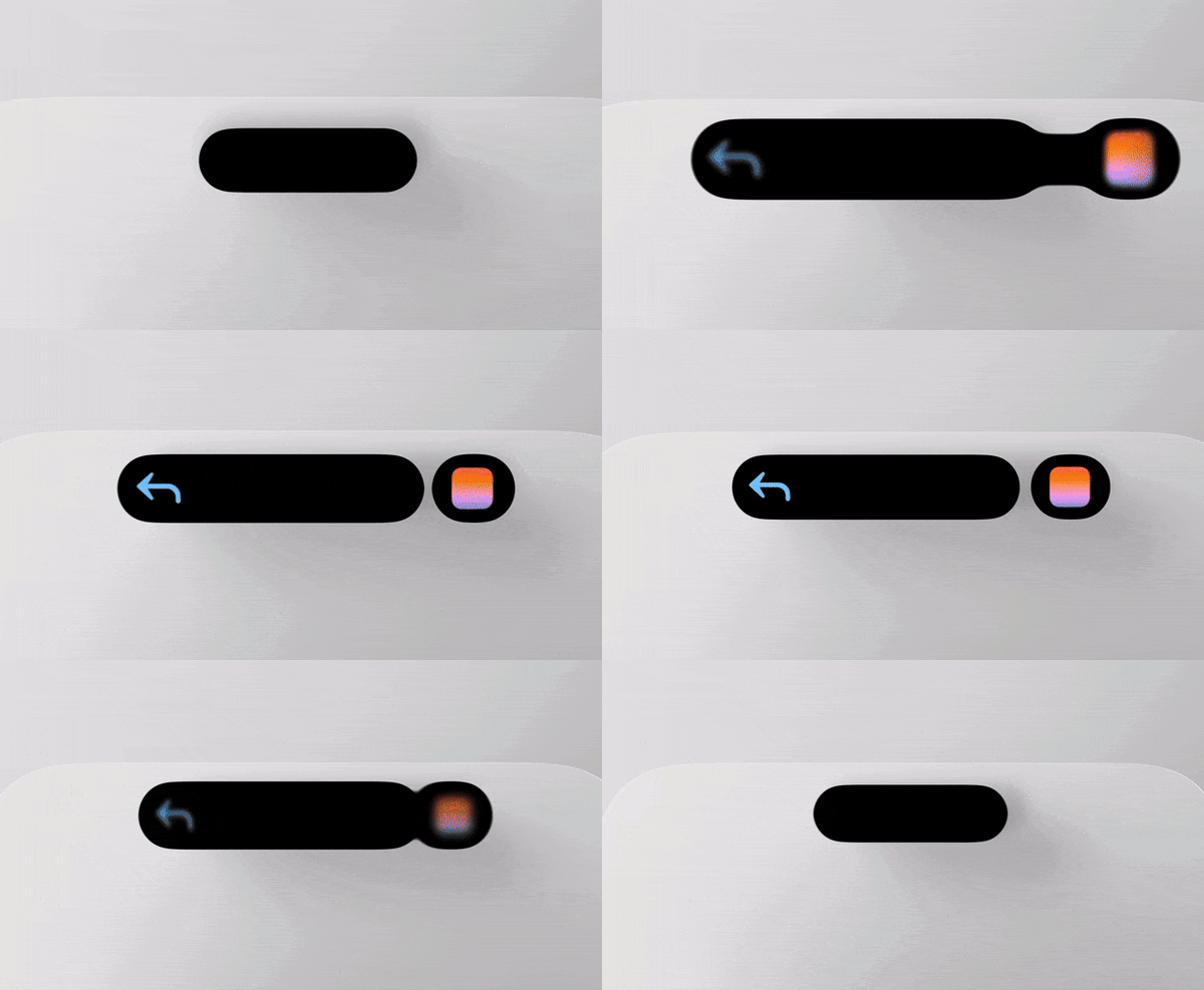
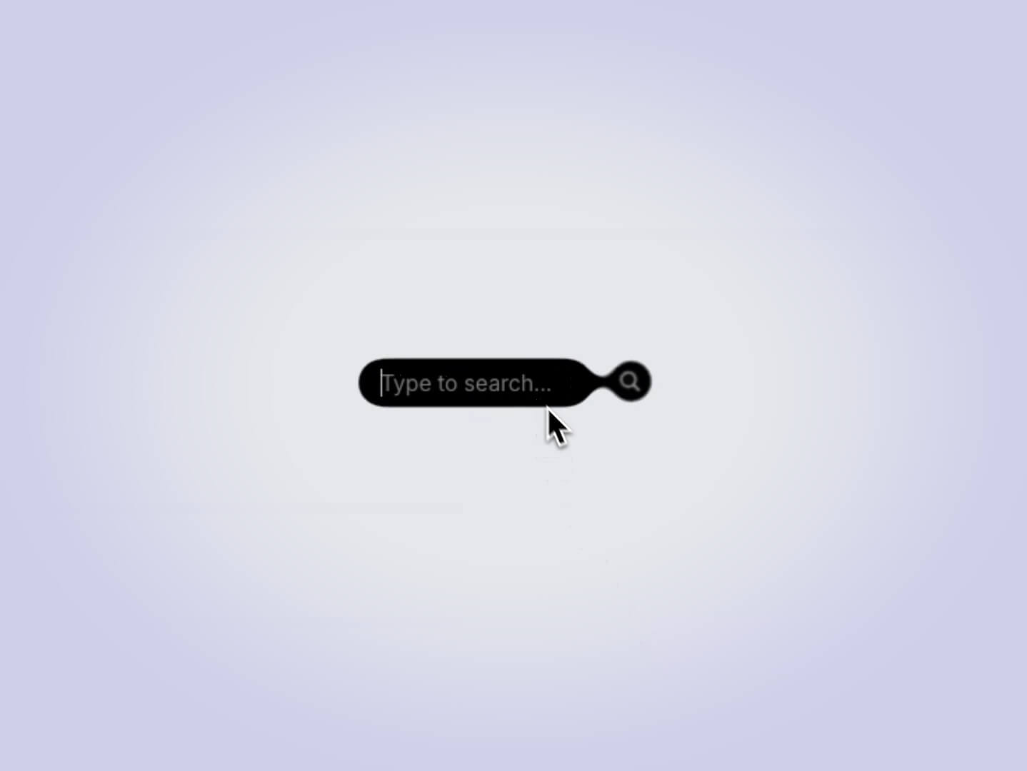
I’ve been eager to create something with the Gooey effect for a while. While many of our peers on X have been experimenting with it, I wanted to apply it to a more practical component. Recently, I stumbled upon a video showcasing dynamic island animations, which sparked my inspiration. Inspired by this, I decided to create a search bar—a small yet enjoyable interaction.

The Gooey Effect
First, we create the component for the Gooey effect from Lucas Bebber. I achieved the effect I wanted by changing the alpha channel data in the values matrix.
const GooeyFilter = () => {
  return (
    <svg aria-hidden="true">
      <defs>
        <filter id="goo-effect">
          <feGaussianBlur in="SourceGraphic" stdDeviation="5" result="blur" />
          <feColorMatrix
            in="blur"
            type="matrix"
            values="1 0 0 0 0  0 1 0 0 0  0 0 1 0 0  0 0 0 18 -15"
            result="goo"
          />
          <feComposite in="SourceGraphic" in2="goo" operator="atop" />
        </filter>
      </defs>
    </svg>
  );
};

export default GooeyFilter;

Applying the Effect
After creating the filter effect in our main component, we apply this SVG filter to the parent element through CSS.
<div className="wrapper">
   <GooeyFilter />
</div>
Framer Motion Integration
Up to this point, the process has been straightforward. Now, let’s add the crucial finishing touches with Framer Motion. With the SVG filter now active, it’s ready to be applied to our moving elements, bringing the gooey effect to life.
We will use four different states to manage the search bar:
const [state, setState] = useState({
    step: 1, // Indicates the stage of the search process 1: Initial state - 2: Search field activated
    searchData: [], // Contains the results of the search process
    searchText: "", // Stores the search text
    isLoading: false, // Used to show a loading icon when loading search results
  });
The code employs a nested structure of AnimatePresence components. The outer layer manages the collective display of all results, while the inner layer handles the individual animation of each search result.
<AnimatePresence mode="popLayout">
  <motion.div
    key="search-text-wrapper"
    className="search-results"
    role="listbox"
    aria-label="Search results"
    exit={{ scale: 0, opacity: 0 }}
    transition={{
      delay: isUnsupported ? 0.5 : 1.25,
      duration: 0.5,
    }}
  >
    <AnimatePresence mode="popLayout">
      {state.searchData.map((item, index) => (
        <motion.div
          key={item}
          whileHover={{ scale: 1.02, transition: { duration: 0.2 } }}
          variants={getResultItemVariants(index, isUnsupported)}
          initial="initial"
          animate="animate"
          exit="exit"
          transition={getResultItemTransition(index, isUnsupported)}
          className="search-result"
          role="option"
        >
          <div className="search-result-title">
            <InfoIcon index={index} />
            <motion.span
              initial={{ opacity: 0 }}
              animate={{ opacity: 1 }}
              transition={{ delay: index * 0.12 + 0.3 }}
            >
              {item}
            </motion.span>
          </div>
        </motion.div>
      ))}
    </AnimatePresence>
  </motion.div>
</AnimatePresence>;getResultItemVariants:
- exit: On exit, items move slightly upward (y: -4) unless
isUnsupportedis true, creating the illusion of merging with the search bar.
getResultItemTransition:
- duration and delay: Each item has a transition duration of 0.75 seconds and a delay calculated by its index (
index * 0.12) to achieve sequential animations. - type and bounce: A spring animation with a bounce effect (0.35) is used for smooth movement.
- filter: The filter property has easeInOut easing applied to avoid warnings in the spring calculation, as spring is not compatible with filter blur effects.
const getResultItemVariants = (index, isUnsupported) => ({
  initial: {
    y: 0,
    scale: 0.3,
    filter: isUnsupported ? "none" : "blur(10px)",
  },
  animate: {
    y: (index + 1) * 50,
    scale: 1,
    filter: "blur(0px)",
  },
  exit: {
    y: isUnsupported ? 0 : -4,
    scale: 0.8,
    color: "#000000",
  },
});

const getResultItemTransition = (index) => ({
  duration: 0.75,
  delay: index * 0.12,
  type: "spring",
  bounce: 0.35,
  exit: { duration: index * 0.1 },
  filter: { ease: "easeInOut" },
});
And that’s it! This is the result:
Safari Compatibility Challenges
We saw the isUnsupported boolean in the code. This boolean was added by necessity. WebKit has some restrictions on SVG filters. It hasn’t been fixed for a long time, although some users have submitted bug reports.
isUnsupported includes some fixes to animations for Safari.
Wrapping It Up
I hope this tutorial sparked your creativity and inspired you to try the Gooey effect in your own projects. It’s a fun and visually interesting way to add some personality to simple components. Thanks for following along—happy coding!
