In the digital age, Instagram has become a vital platform for personal branding and business growth. Yet, building a strong Instagram presence can be a daunting task. Enter InsFollowPro, an Instagram growth service designed to boost your Instagram with real followers, likes, and views. This article provides an in-depth review of InsFollowPro, exploring its features,… Continue reading InsFollowPro Review: Boost Your Instagram with Real Followers, Likes, and Views
Tag: different
How far do people trust AI? – A Research project from UX Studio
We designed quantitative research to get an overview. In this post, we will introduce our research process, and give a sneak peek at our top 3 findings. You can also check out the detailed results with all the graphs and findings. Why we ran this study UX studio is delving into the research on the… Continue reading How far do people trust AI? – A Research project from UX Studio
Feedback: The Foundation of the Designer Communication Toolset
Reality hits as soon as you cut into a piece of wood. First, you might blame the quality of the wood. After countless trials and errors, you slowly begin to realize that using a Ryoba requires practice, patience, and technique. Based on my experience and after a series of internal mentoring at UX studio, I… Continue reading Feedback: The Foundation of the Designer Communication Toolset
The Power of Checkout Campaign Management
[unable to retrieve full-text content] When it comes to checkout pages, the most frequently cited word is conversion. After all, the main criteria for a successful checkout is its efficiency in terms of successful payments. Conversion can be viewed from many angles, including technical performance and client experience. Still, there are other less obvious components… Continue reading The Power of Checkout Campaign Management
32 Creative Stationery Mockups That Will Make Your Brand Stand Out
The Power of Presentation: How creative stationery mockups elevate your corporate branding! For graphic designers working on corporate branding, a logo and color palette are just the beginning. A truly cohesive brand identity extends to all touchpoints, including the seemingly small detail of business stationery. But how do you effectively showcase your vision for letterheads,… Continue reading 32 Creative Stationery Mockups That Will Make Your Brand Stand Out
The Ultimate Collection of Best Logo Mockups
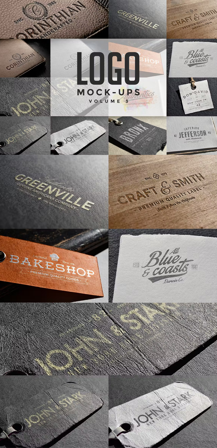
Imagine your company’s logo is like a handshake. It’s one of the first things people see, so you want it to look good! A logo mockup is like a photo booth for your logo. It shows what your logo would look like on things in the real world, like business cards, t-shirts, or websites. Your… Continue reading The Ultimate Collection of Best Logo Mockups
Visual Design: Glossary
Summary: Use this glossary to quickly clarify key terms and concepts related to visual design. Visual design requires knowledge and understanding of many jargon terms. Use this glossary as a reference as you delve into visual and user interface design. Jump to a definition in the table or review the complete glossary. Aesthetic-Usability Effect Users’… Continue reading Visual Design: Glossary
10+1 Commandments For Using Figma
As we constantly work on many projects and in-house innovations, our UX professionals are massively familiar with the golden rules of using Figma. At UX studio, we develop ourselves and help everyone at the company grow continually. We have our well-established onboarding system, in-house pieces of training, and many other ways of knowledge sharing. It… Continue reading 10+1 Commandments For Using Figma
7 Tips for Memorable and Easy-to-Understand Imagery
Summary: A few relevant, high-quality visuals placed next to associated text can boost users’ comprehension of your content and its memorability. When implemented strategically, visuals can enhance users’ ability to understand and remember products. Here are seven best practices for memorable visuals. #1 Choose or Create Relevant Visuals Visuals exist alongside other content, and users… Continue reading 7 Tips for Memorable and Easy-to-Understand Imagery
Product Idea for Reselling Used Clothes & Accessories
[unable to retrieve full-text content] Hiyya! 👋 How are you doing? While clearing up my stack on Google docs, I found two product ideas that I had written down last year but had never got the chance to polish them up for publishing. As time ticked by, dust started gathering on them (well, if digital dust… Continue reading Product Idea for Reselling Used Clothes & Accessories
The rise of Generative AI-driven design patterns
[unable to retrieve full-text content] How Generative AI advances are helping shape the future of feature design, from enhancing content interaction to more informed decision-making Order among chaos (Credit: Dall-E) The ChatGPT revolution has been unfolding for over a year now. While the specific chatbot may not represent a seismic technical shift, the profound change in… Continue reading The rise of Generative AI-driven design patterns
How to Create a Meeting Agenda Presentation
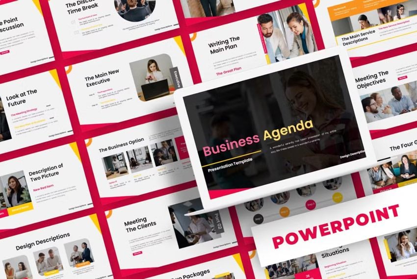
Agenda slides can be used as a plan for your presentation. They can give you the structure and help you set the tone for what your audience needs and expects. This is true for any type of agenda, whether a team meeting or a conference agenda. Business Agenda is a premium template from Envato Elements. … Continue reading How to Create a Meeting Agenda Presentation
AI UX-Design Tools Are Not Ready for Primetime: Status Update
Summary: Our research and evaluation shows that there are currently few design-specific AI tools that meaningfully enhance UX design workflows. AI tools won’t be replacing UX designers any time soon. Currently available LLM-based tools are not shortcutting steps in the design process just yet. Our Study There’s so much marketing hype around AI that it’s… Continue reading AI UX-Design Tools Are Not Ready for Primetime: Status Update
How to Tackle Prompting Challenges with AI Writing Tools
With the rise of readily available generative AI tools, it is now possible to create large bodies of text in a matter of seconds. However, crafting the right prompts to achieve the desired output can be challenging. In this article, we will examine the complexities of prompting and how AI writing tools can simplify the… Continue reading How to Tackle Prompting Challenges with AI Writing Tools
Top 10 Mistakes When Creating User Journey Maps
[unable to retrieve full-text content] Here are the top 10 common mistakes to watch out for when creating user journeys: 1. Not defining clear objectives Creating a user journey without a clear goal is like setting out on a trip without a destination. It’s crucial to know what you’re trying to understand or achieve with… Continue reading Top 10 Mistakes When Creating User Journey Maps
Why UI designers should understand Flexbox and CSS Grid
CSS for UI Designer Or bye bye, 12-column grid layout Most designers are familiar with responsive design, a column-based layout approach with fixed breakpoints to cover all screen sizes. However, we can move beyond the rigid structure with modern CSS layouts, crafting flexible and dynamic designs that seamlessly adjust to different screen sizes. Designers and developers having different… Continue reading Why UI designers should understand Flexbox and CSS Grid
Distinguishing between ARIA and native HTML attributes
As a developer, you want to create more inclusive and accessible digital experiences for your users. Great! It’s possible, however, that you might be feeling a bit confused or overwhelmed by the element attributes that can affect the usability for users of assistive technology. ARIA (or WAI-ARIA, Web Accessibility Initiative-Accessible Rich Internet Applications) defines some… Continue reading Distinguishing between ARIA and native HTML attributes
Learn How to Use SmartArt in MS Word
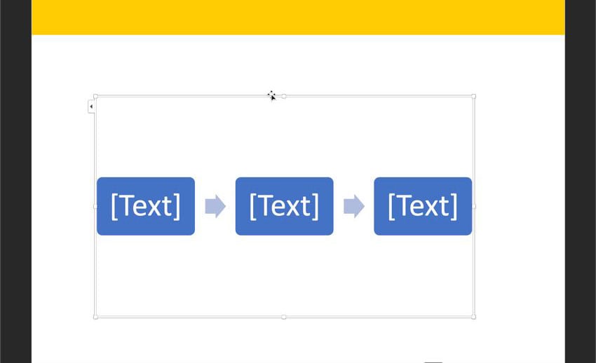
Are you looking for a way to make your Word documents more visual? Try adding SmartArt graphics for the perfect visual touch. This SmartArt graphic is waiting for text to be added. Use SmartArt in Word to communicate your idea with graphics. SmartArt comes with Microsoft Word. SmartArt can save you time when adding high-quality… Continue reading Learn How to Use SmartArt in MS Word
4 Ways You Can Test Your Design System in Figma
Consistency is key for a successful UX design system. Learn about different ways to test your design system in Figma. Keeping consistency and efficiency across design projects is essential. A good UX design system must include all the elements that make up your brand’s visual and functional identity. As you may already know, one of… Continue reading 4 Ways You Can Test Your Design System in Figma
Designing genAI-enhanced features
Elevating user experience through intelligent content enhancement and personalization. Futuristic workspace (Created with Dall-E) Chatbots serve as an accessible gateway to the realm of Generative AI features, a fact underscored by the success of ChatGPT. Their simplicity, requiring only basic instructions to engage in natural dialogues, allows them to integrate across various digital platforms seamlessly. Yet,… Continue reading Designing genAI-enhanced features
The Art of Engineering AI Prompts
AI By Louise North 3 days ago In the rapidly evolving world of artificial intelligence, the ability to communicate effectively with AI tools has become an indispensable skill. Whether you’re generating content, solving complex data problems, or creating stunning digital art, the quality of the outcomes you receive is directly influenced by the prompts you… Continue reading The Art of Engineering AI Prompts
Crafting an effective design system strategy
How to build a strategy, not a roadmap A design system is a product. A product that solves concrete tasks: ensuring consistency reducing development time and much more Most often, the main reason to create a new product is that you want it to be different from the existing ones on the market. After all, why waste time… Continue reading Crafting an effective design system strategy
Google Maps: a refreshing turn in the right direction
Finally! Google Maps gets a much-needed makeover… and we’re here for it. Sometimes, a reroute is all it takes to rediscover the joy of the journey — Google Maps’ latest update is a testament to that. What’s New Since My Last Rant A few months back, I ripped into some serious user experience flaws in Google Maps. Google Maps: about that… Continue reading Google Maps: a refreshing turn in the right direction
Good design is subjective, contextual, and intentional
Urban planners have been designing for human experiences for nearly 200 years, and UI/UX designers can learn from this. Examples of The Chicago School of Architecture | Photo Credit: Tom Seiple When I finished my graduate degree, I was lucky to find my first job in Chicago. From a very early age, I had always hoped to… Continue reading Good design is subjective, contextual, and intentional


