Consistency is key for a successful UX design system. Learn about different ways to test your design system in Figma.

Keeping consistency and efficiency across design projects is essential.
A good UX design system must include all the elements that make up your brand’s visual and functional identity.
As you may already know, one of the main purposes of a Figma design system is for everyone involved in the project to be aligned. This is where you set your design values and a clear common goal for everyone to follow.
In this tutorial, we’ll cover some actionable tips and friendly reminders to consider to develop a successful web design system in Figma.
4 Ways You Can Test Your Design System in Figma
Like many design processes, it’s good to start defining the why. The Golden Circle model by Simon Sinek can be an excellent starting point.
In fact, Figma uses it as the base to define four key parts for a successful design system:
- Principles: the why of a design system
- Foundations: the what of your Figma design system
- Documentation: the how. This is where you communicate the purpose of all elements and how best to apply them
- Processes: the mechanics and governance for managing a design system
So once you have that down, make sure your Figma design system covers the main components such as:
- Type and type scales
- Icons and icon sizes
- Colors and patterns
- Clear naming conventions
Now, let’s go over a a few ways you can test your design system:
1. Component Consistency
Have you reviewed if all your design elements remain uniform? It’s highly suggested to run a component consistency testing. Make sure all the components across different screens and states keep a cohesive style.
A full component consistency test should look for uniform color schemes, type, and sizing.
Start your test by responding these questions:
- Are all components compiled in a shared library for easy access?
- Is our design using too many similar colors? Can we simplify our colors scheme?
- Have all designs been reviewed to check for visual inconsistencies in type, color, spacing, etc.?
- Have we conducted reviews to catch and share any inconsistencies found?
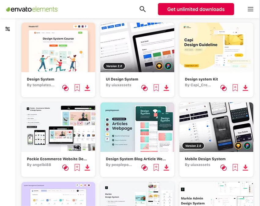
Use UX design system examples for reference. You can also work with a Figma design system template like this one from Envato Elements. It can work as a base to develop your component design.
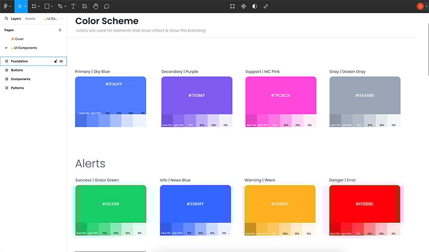
Testing Color Scheme Consistency
For example, we can test if our color scheme respond to our design needs.
According to Figma color design tips, 60% of color on screen should be neutral, 30% our primary design color and 10% our secondary or CTA color.
Variations of colors can be applied for components such as: messaging, status, priority or actions.
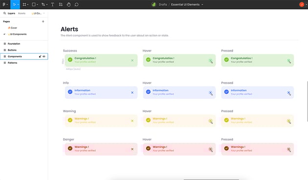
Working with our Figma design system template, let’s make sure the color scheme is correctly applied to the Alert components in our design.


Make sure each state responds to the user’s interactions.


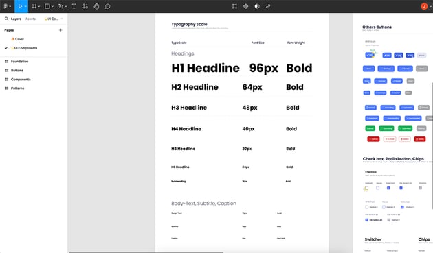
Testing Type Scale Consistency
Your type system must be readable and aligned to your brand personality. Now, for consistency, you want to make sure scale responds to readability and font use.
A base text style is often 16 px, which can be multiplied to create smaller or larger text sizes. Make sure your UX design system includes a variety of scales to give information hierarchy to your design and content.

2. Make Sure Naming is Consistent
We want our naming system to make information easier to find and understand. This way we make sure our components will be applied in the right way throughout the design.
Start by defining naming conventions. These include:
- Component types: buttons, patterns, alerts
- States: default, hover, pressed
- Sizes: body-text, headline, subheading
For example, we can test our button naming conventions using our Figma design system template. Our naming convention could be Category / Use / Variation.
You can see this applied in our design. Under the button Category we find two different uses: Primary and Secondary. The Use is indicated in the button name: Default, Hover, Pressed or Inactive.


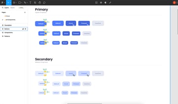
Consistency can also be applied to our naming case. Are you using all caps, Title Case or Sentence case? Replicate this throughout all your design system.
3. Responsive Design Test
It’s important to test all components and layouts of our design. By looking at how our design behaves across different device sizes we can test if our design is responsive.
Here are some questions you can use as a checklist to test if your design is responsive:
- How does the layout adapt to different screen sizes?
- Is the content legible and accessible on all devices?
- Is the navigation intuitive and functional across devices?
Create Frames for Different Screen Sizes
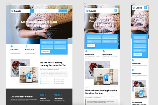
The first thing you can do is to create different frames to cover the most common screen sizes (e.g., desktop, tablet, mobile). This way we can look how our components behave and adapt.
A good Figma design system template must feature a responsive design. For example, we can use this Laundry Services Template as an example of how every component adjusts to different screen sizes.


Use Auto Layout and Constraints
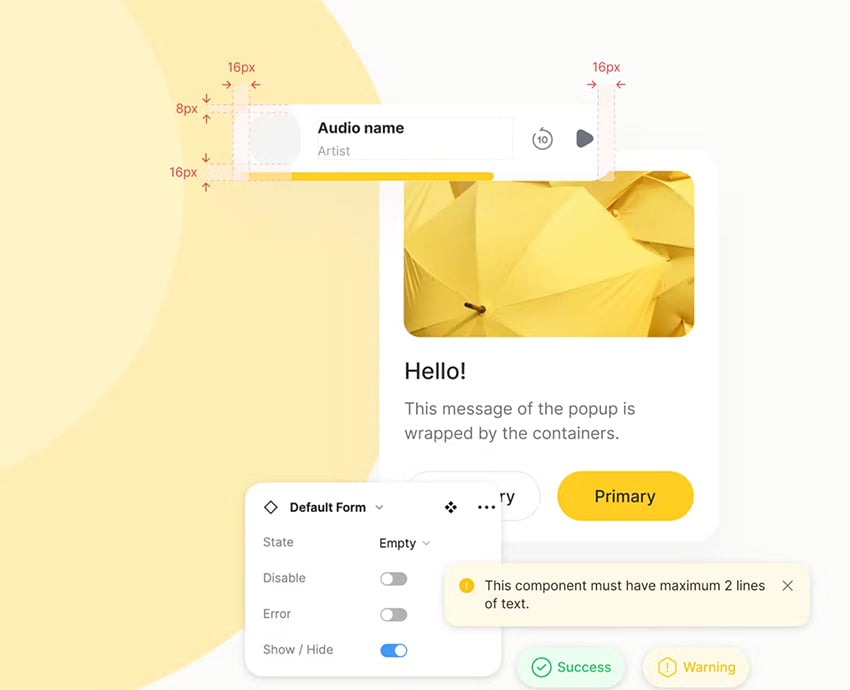
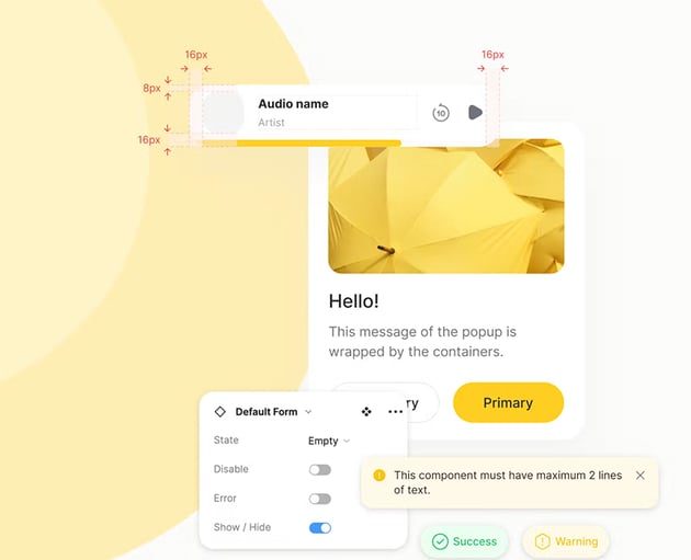
One of the best tools to ensure design consistency is with Figma’s Auto Layout tool. Apply it to all your components and containers.
Constraints help us control the resizing behavior of our design elements.
Learn more about Auto Layout and Figma responsive design tricks:
4. Test Your Design With Real Users
It doesn’t matter how many times you and your team have revised the design. It’s natural for us to miss some errors after viewing a file for a long time.
In this case, your best ally is feedback from impartial users. Try testing your designs and get feedback from other people. Include people with different accessibility needs and backgrounds.
These are some of the questions you can ask them to test your UX design systems:
- Can you describe the design and what the website is for?
- Do you think all elements of the design seem to belong to the same family?
- Did you notice any differences in style or appearance between different sections?
- Did you notice variations in fonts or color styles?
- Did any elements behaves differently than you expected?
Now you have a few actionable tips to test your web design system in Figma!
Start With a Figma Design System Template
Save up some time working with Figma design system templates. Most premium templates come with predesigned components and elements.
You can even find responsive design solutions applying the best design practices so you can use as a base for your projects.
More Figma Resources and Tutorials
Try out new tricks to make your web design process easier. Create great UX design systems working with the best resources and templates: