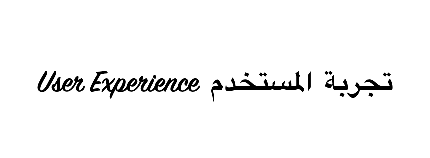
Let’s assume you’ve just been approached with a proposal of working on a highly prospective, Arabic UX project for the first time in your career. Alternatively, your company is looking to expand into the MENA market and needs to design and localize their product to new grounds. Sounds exciting, doesn’t it? Still, your knowledge of… Continue reading Bidirectionality: arabic UX that extends beyond the screen
Category: UX
Bicycles don’t work
Only dumb people use bikes (for Formula 1 racing) The first time I got on a bicycle it didn’t go too well. My next few attempts also just failed and the whole thing was frustrating. It didn’t work. I would have been much better off sticking to walking on my feet. Until I finally got it.… Continue reading Bicycles don’t work
Animation principles in UX — and more design links this week
The ultimate guide to proper use of animation in UX › By Taras Skytskyi. Nowadays it’s hard to impress or even surprise with an interface animation. It shows interactions between screens, explains how to use the application or simply directs a user’s attention. While exploring the articles about animation, I found out that almost all… Continue reading Animation principles in UX — and more design links this week
Redesigning the information architecture of a university website — a UX case study
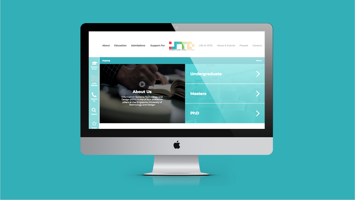
This article is a retrospective piece for a project that was done as part of the User Experience Design Immersive Course in General Assembly (Singapore). Feel free to reach out to me at [email protected] if you’d like to chat more about this project. Thanks! :) The Task We had 10 days to: redesign the Information Architecture… Continue reading Redesigning the information architecture of a university website — a UX case study
The full stack product manager
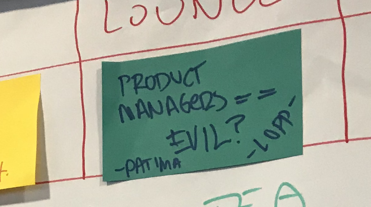
I smiled as I read the title and thought, “Alright Lopp, I’ll bite”. How could I resist? I paired up with the one-and-only Michael Lopp to facilitate the session and it was truly one of the most interesting a-ha conversations that I’ve had the opportunity to take part in for a while. Honestly, this also… Continue reading The full stack product manager
Leveraging accessibility in digital publishing — a UX case study
What is Meredith? Meredith Corporation is a public, diversified media firm dedicated to delivering trustworthy content to audiences of scale that drive financial return for shareholders. The company focuses on magazine publishing, television broadcasting, content licensing, and data/marketing services. As of 2018, Meredith is the largest magazine publisher in America and is recognized as the… Continue reading Leveraging accessibility in digital publishing — a UX case study
Redesigning social interactions on iOS with iMessage
This story is part of a serie that focuses on redesigning existing experiences and trying to bring new coherent features to them. Check out Youtube 2.0, macOS Newton, and iOS Mogi if you want to know more about this serie! Apple introduced with iOS 12 Screen Time that allows you to know the time you… Continue reading Redesigning social interactions on iOS with iMessage
Our app idea already exists, but we’re going to do it anyway
Existing Apps I’ve found while doing research Image found on Wild Edibles Blog Wild Edibles Wild Edibles is an app that primarily focuses on identifying plants using photos, in-depth descriptions of each plant and details of where it can be found. This app has recently announced that it will allow you to add your own notes against… Continue reading Our app idea already exists, but we’re going to do it anyway
The road not taken: dealing with unintended user actions
“So, when the user clicks here, this will pop up” “What if user doesn’t clicks there?” “What do you mean?” “What if user clicks elsewhere?” “Oh. hmmm……..” This was my first design grooming session with PMs and developers. We were discussing about potential designs which would go into the next sprint. I had thought that I had come… Continue reading The road not taken: dealing with unintended user actions
There is no better “growth hack” for SaaS than talking with your customers
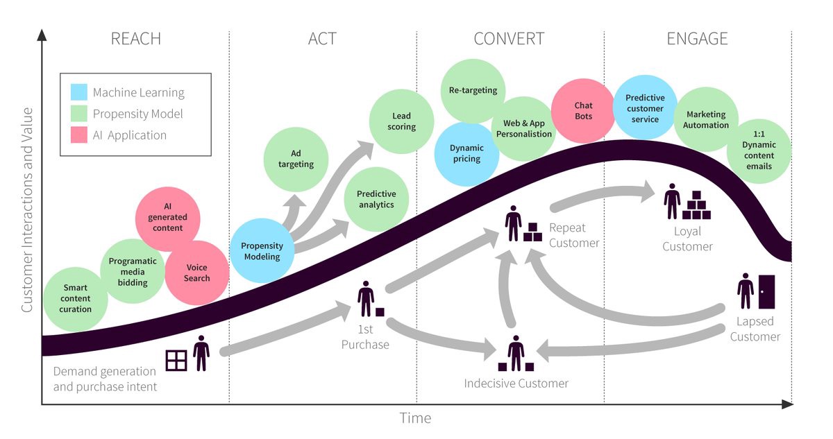
(The Customer Lifecycle. Please let me know if you know the source.) It sounds simple — but it’s not easy: talking with your customers through every stage of the customer lifecycle. There’s been a lot said about the value of talking to your customers before you build the product to ensure market fit, but very little said about… Continue reading There is no better “growth hack” for SaaS than talking with your customers
Stop ‘delivering’ software with Agile — it doesn’t work
When either of these 2 things happen, maybe your best talent starts to leave the organisation. Maybe your product fails to create change for its customers and you stop growing/start shrinking. Maybe your org decides that this ‘Agile’ thing isn’t really for them and moves back to Waterfall. Agile fails because its our belief that… Continue reading Stop ‘delivering’ software with Agile — it doesn’t work
DesignOps or UX Strategy or Design Management or Design Leadership?
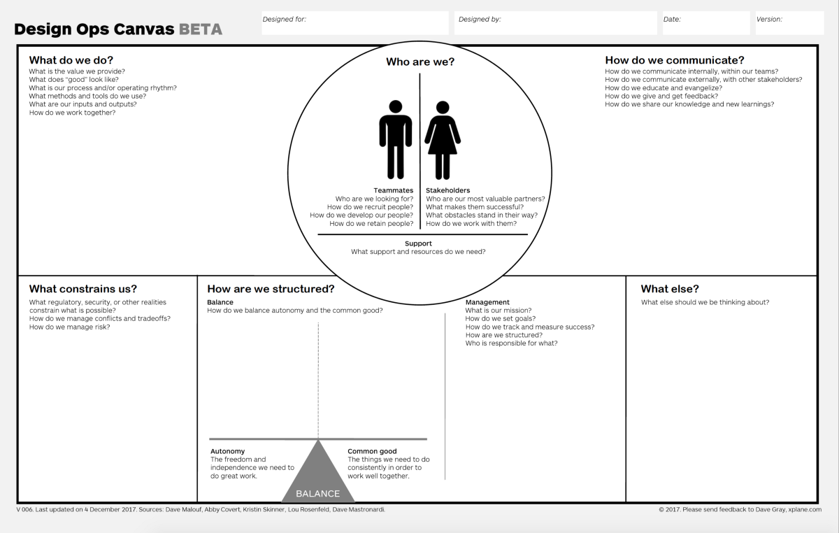
It looks like “DesignOps” is about to supplant “UX Strategy” and other terms to describe digital product design management. The term has appeared more and more in recent years. Now it is riding the wave of a hype cycle with the release of the “DesignOps Handbook” by InVision. However, the concept itself is hardly new — it’s… Continue reading DesignOps or UX Strategy or Design Management or Design Leadership?
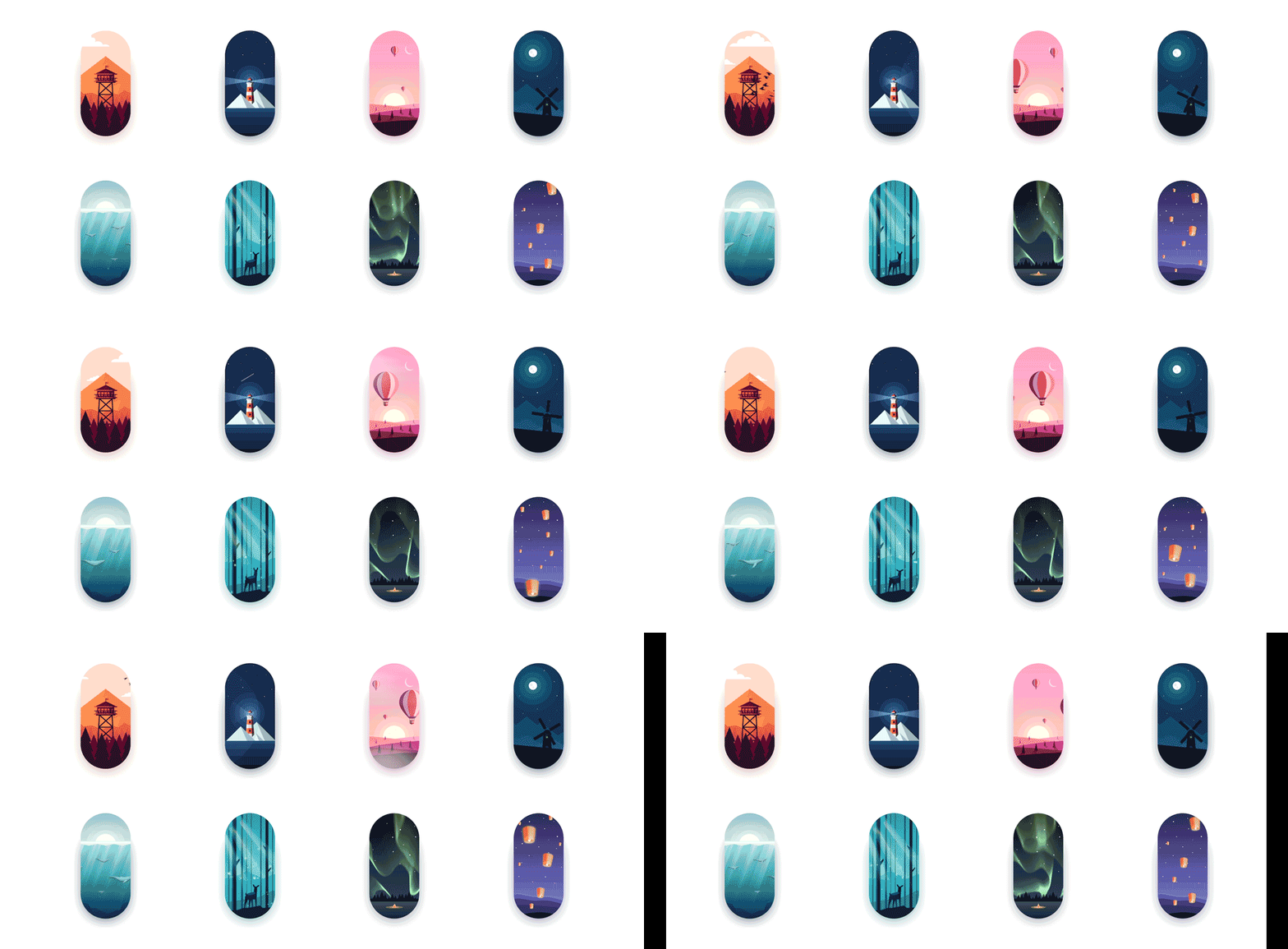
100 days of Motion Design
Reflecting 1. Driven by ideas Once I had an idea, I was driven to bring it to life. It did not matter what techniques I needed to learn. For example, I wanted to express my love for reading. To make my idea of flipping book come true, I found a tutorial Open Your Book on Youtube… Continue reading 100 days of Motion Design
The most common topics from 200+ design mentorship sessions
Photo by Trust “Tru” Katsande For the last couple of years I have been regularly meeting with designers from various countries and backgrounds to offer them mentorship and career guidance. These sessions are one of the most efficient ways I have found to give back to the community some of what I have learned from it — the… Continue reading The most common topics from 200+ design mentorship sessions
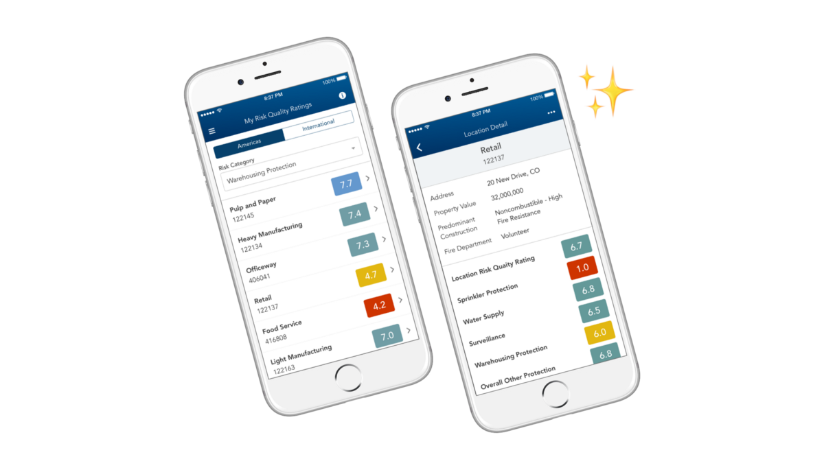
Designing a complex table for mobile consumption (nom)
The User Loss-prevention consultants inspect residential and commercial buildings to help ensure systems (such as fire protection systems and fuel-fired equipment systems) meet local, national, and industry standards. These consultants compare different risk factors across multiple assigned locations. This comparison allows them to make recommendations to property owners of how to mitigate risks and thus… Continue reading Designing a complex table for mobile consumption (nom)
Interaction models
To a western eater, definitely to a Spaniard like me, the first time having ramen breaks a few well-established mental models. Eating out is a social event. Long noodles equals spaghetti, which you eat using a fork. Soup is to be eaten with a spoon, and the person sitting next to you will not hear… Continue reading Interaction models
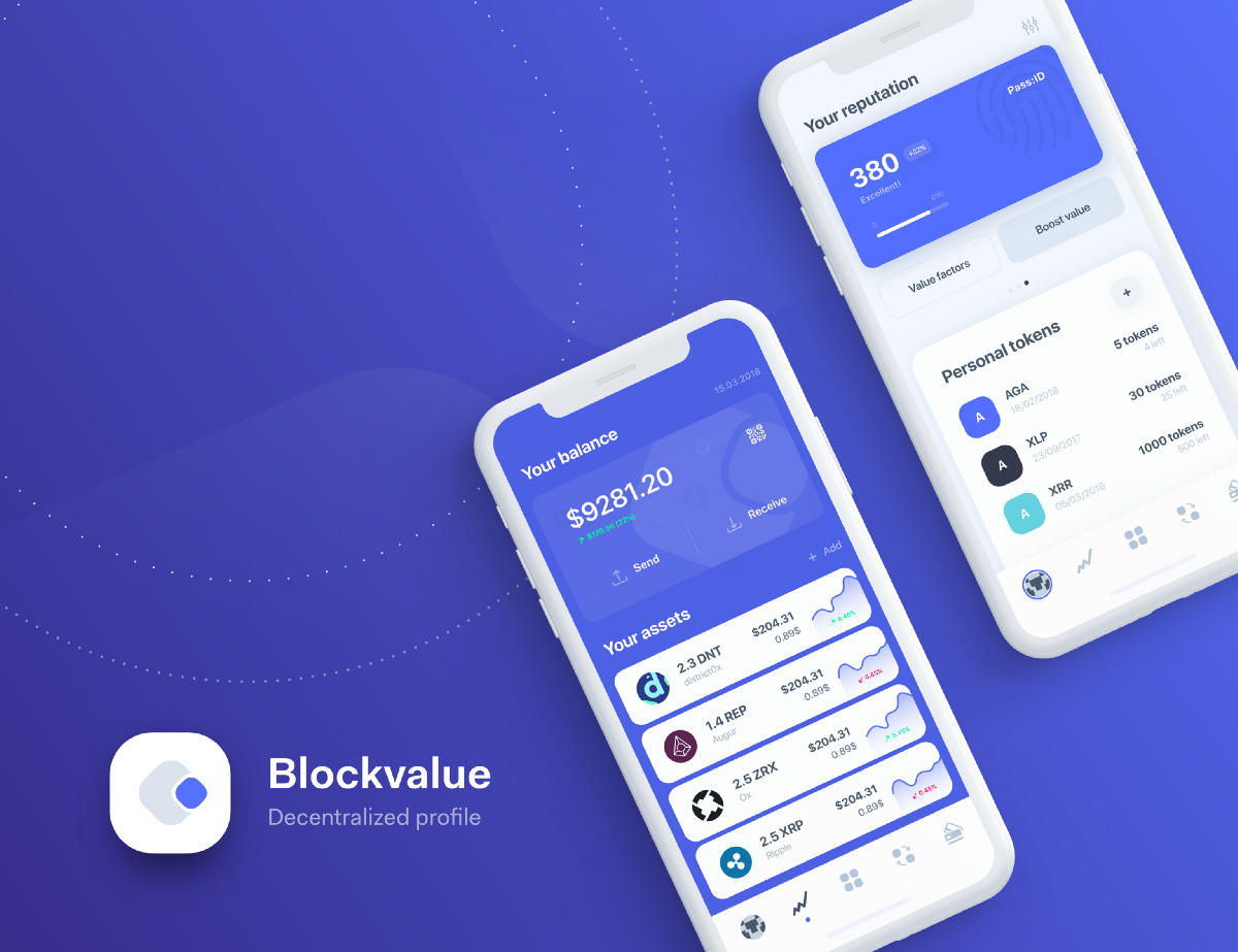
Designing a decentralized profile dApp
We are a few years ahead of where the whole economic system went decentralized including ourselves. Good thing about this transformation is that we are now more than ever in control of what counts towards our own personal value (public records, type of shopping we make, lifestyle choices, social media, job status etc.) and with… Continue reading Designing a decentralized profile dApp
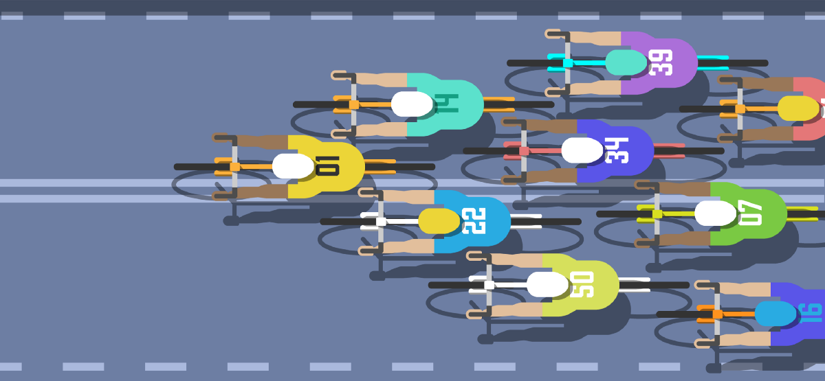
Tour de Workforce — here comes the collective economy
Image Credit: Simon Darby What does a group of lycra-clad cyclists have to do with the future of work? More than you might think. If you’re familiar with road cycling, you’ll have heard the term ‘peloton’ before. If you’re not partial to a hoard of people in spandex on two wheels, then maybe you haven’t. The… Continue reading Tour de Workforce — here comes the collective economy
Building a mobile app UX testing setup for under $50
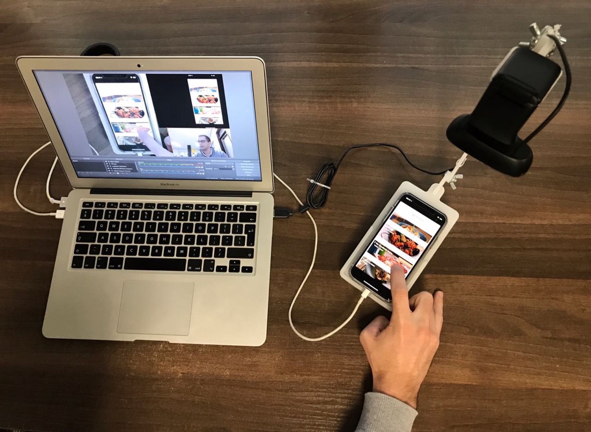
What we learnt testing different versions of the sled: The first version had a flat sled which the user had to hold with the phone in their hand (rather than having it on a flat surface) — whilst this is more in line with how a user will naturally hold their phone it meant that the setup… Continue reading Building a mobile app UX testing setup for under $50
10 steps for a better queer user experience
Do allow users to change or write in their own gender, if this is something your application makes use of. Forcing a user to re-create their whole account if their gender identity should shift isn’t a great experience and it feels like a waste of resources. Consider not having users specify a gender. There are… Continue reading 10 steps for a better queer user experience
The importance of Design QA in digital product design
Great customer experiences don’t happen by accident. In digital product design, the customer experience encompasses everything that the product team does; development, design, DevOps, and QA — everyone’s role impacts the customer experience but especially the design and user experience. Since I’m a product designer, there’s a particular part of the process that I’m obsessed with, and… Continue reading The importance of Design QA in digital product design
The workshop fallacy — and more UX links this week
Workshops won’t solve the whole problem › You are in a meeting, and at some point the discussion goes into an endless loop. People don’t seem to agree on what the ideal solution should be. Different points of view are being thrown into the discussion, and the conversation is starting to heat up. At some point,… Continue reading The workshop fallacy — and more UX links this week
How to hack people loyalty with care?
First thing first: If you have a few friends in your life, care is not designed to fit your skillset. Having a lot of friends proves how much effort and time you have spent to build a loving community around you. Care requires the same effort and it should be mandatory for every startup. “Caring… Continue reading How to hack people loyalty with care?
Sharing work in progress in design — and more UX links this week
If you like the links, don’t forget to ???????????????????????????????????????????????????????? Delivering your work in layers › Some designers like to work on a product piece by piece. They focus on one screen or feature at a time, and dedicate full days of work trying to make that one piece look as polished and finished as possible. Before… Continue reading Sharing work in progress in design — and more UX links this week
