Health problems stemming from stress and loneliness include: obesity, high blood pressure, alcoholism, depression, heart disease, insomnia, and stroke.
The solution
In surveying the landscape, one might think there are already solutions for this problem including traditional mental health solutions as well as new up-and-coming behavioral health startups. Newer solutions often require high levels of customer commitment for efficacy (e.g. Lantern, Joyable, Headspace) or replicate an older model with new technology (e.g. Talkspace, 7Cups, Crisis Text Line, 1docway). Traditional methods, like therapy, psychiatry, and crisis hotlines are often expensive, inconvenient, stigmatized or for extreme situations.
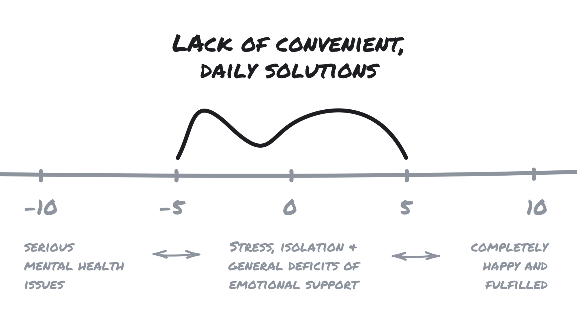
Think of mental health as a scale from -10 (serious mental health issues) to 10 (completely happy and fulfilled). The traditional solutions for mental health issues are well suited for the far left of the scale, while the far right lacks any need for a solution. It is the -5 to 5 range, characterized by stress, isolation and general deficits of emotional support, that is lacking in convenient, daily solutions.
With this in mind, our goal was to create a product that destigamized the sharing of ones thoughts and stresses with a total stranger, on a consistent basis, over the phone. Clearly this is sort of a ridiculous goal. But so was expecting people to feel comfortable hopping in a random persons car and getting out without handing over money.
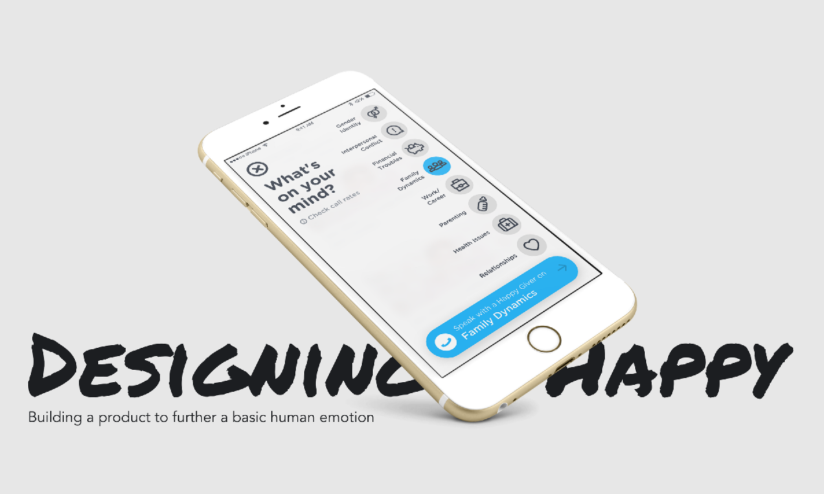
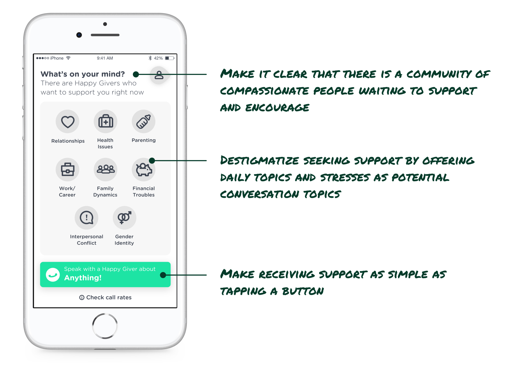
So we built Happy, an app where people can access emotional support — attention, compassion, and encouragement — on demand, over the phone. Happy connects callers with everyday people who have proven themselves to be exceptionally good at supporting others; we call them “Happy Givers”.
We hypothesized that we’d accomplish our goal by adhering to a few tenets.
First, we needed to make it clear that there is a community of compassionate people waiting to support and encourage you. By making it clear that there is a whole community of people, we figured we’d soften the blow of talking to an absolute stranger and make it clear you are not the only one seeking support.
Second, in order to destigmatize seeking support, we wanted to offer examples of daily issues and stresses as potential conversation starters. These make it clear that (a) you’re not the only one going through these issues and in fact they are quite common, and (b) our Happy Givers are equipped to discuss these topics. In our early research, we discovered that without these options, starting a call felt too nebulous and the fear of “what will we talk about” was great enough to deter the call altogether.
Third, and this is the simplest on, make receiving support as simple as tapping a button. Life is hard enough, hell that’s why people need this support, we didn’t want to make seeking it difficult too.
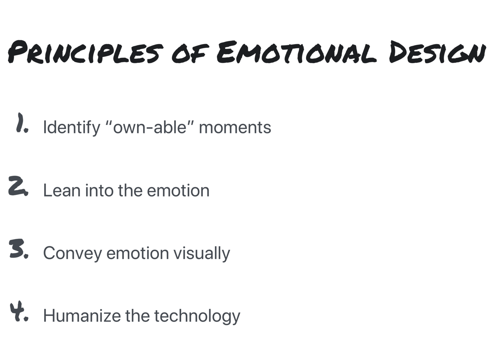
There was clearly a strong emotional design aspect to this project. Our thinking was as follows (based on the Principles of Emotional Design work and conference talks I have previously given):
1. Identify “own-able” moments
The moment we identified was the culmination of stresses and worries that leads a person to download the app. We moved the button to make a call as early in the process as possible and removed the “pain of paying” by making the first call free. Our hypothesis was that if a user could experience a call and talk to one of our supportive “Happy Givers” they will keep coming back.
2. Lean into the emotion
Instead of shying away from the reason why someone is opening the app, we offer up potential and likely reasons. Our hypothesis is that by simply offering reasons why people might call in, this might destigmatize those reasons and the associated emotions and set the expectations for the call they will have with a Happy Giver.
3. Convey emotion visually
The light-hearted color palette, playful icons, and subtle animations make the entire experience feel less intimidating.
4. Humanize the technology
This one was particularly hard. By nature, this product is a perfect juncture of human and technology, but conveying the human aspect was the hard part. We’d love to make it clear who you’d connect with but this is technically difficult and not necessarily a good thing from a human bias standpoint (a man might have reservations about speaking with a man about his problems, while it might have no correlation with the outcome of the conversation). We threaded the needle by making it clear that there is a vast network of compassionate individuals, but not letting you know beforehand who you’d be connected with, as to avert those inherent biases.
Here is a quick glimpse of a key moment in user experience that brings together our product tenets and the Principles of Emotional Design:
Early pilots of this product yielded the following results:
94% of callers reported a significant increase in happiness after using the service
There was a 42% average increase in happiness and 54% increase in calmness
90% of callers want to use the service regularly