2. Hick’s Law
Delivering a good user experience requires that first you find out the functionalities that will answer their needs; second, you need to guide them to the specific functions they need most. If users end up stuck in the decision-making process of “what next?”, they may become confused, frustrated, or leave your website.
Hick’s Law is a simple idea that says that the more choices you present your users with, the longer it will take them to reach a decision. It’s common sense, but often neglected in the rush to cram too much functionality into a site or application.
To make our designs work, we need to remember that a) the user’s time is precious, and b) a user is not obligated to stay on our site. To enhance the user experience, we should consider the following:
- Categorising Choice — Enabling users to find items from higher categories, as if they were looking under sections in a library.
- Obscuring Complexity — Breaking up long or complex processes into screens with fewer options.


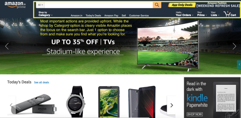
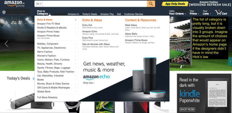
Image 1: Most important actions are provided upfront. While the shop by category option is clearly visible. Amazon places the focus on the search bar. Just 1 option to choose from and make sure you find what you’re looking for. Image 2: The list of category is pretty long, but it is visually broken down into 3 groups. Imagine the amount of choices that would appear on Amazon’s home page if the designer didn’t have in mind the Hick’s Law.
Do you recall Amazon UI from above Screenshot? There’s a compromise between offering all functionality and Hick’s Law, which pressures the product designer to keep things as simple as possible.
With highly complex sites, the use of Hick’s Law requires further implementations of choice. As product people, we notice how we can scatter navigation items throughout the design in small, discrete clusters. These help narrow down huge volumes of information without overloading the user.
The card-sorting method is great to find out about the categories that make more sense to your users. You can use card-sorting to define the groupings of the functionalities and also the labels for these categories. You should do this early on in your project, before starting any sketching or wireframe.
As you move on in the design process, you can use eye-tracking to have a heat map of your site. This can help you work out where future design changes might benefit from further applying Hick’s Law. Heat maps display areas of a site that users look at most, showing problem areas quickly, too.
Hints from analytics:
Once your app or website is launched, it is also important to keep an eye on how Hick’s law might be affecting your users’ experience. Here are some variables that you can use to analyse it:
Time on Site — There is a sweet spot for most websites when it comes to time spent on site. Too little time and the user has likely left without purchasing or registering. Too much time and they may get caught up in information consumption and again fail to make a purchase or register. Just enough time and the majority of users who will make a purchase and register will do so.
Once a site is live, you can start to gauge where that sweet spot is and utilize Hick’s Law either to increase or decrease the average amount of time spent on site.
While simplifying decision making can extend the time spent on site, it might also reduce it. If the decision making is so simple that users make little progress towards their objectives each time they make a decision, they‘ll be as likely to leave as users who find a decision-making process impossibly confusing because they’ve seen too many options at once.
Page Views — Hick’s Law can also affect the number of page views that each user carries out. If the navigation menu is too complex, the number of page views is likely to be lower than if users were offered a navigation menu that better met their needs.
Of course, page views are only important if the users are achieving their objectives while on site. It would be easy to construct a very deep menu system of binary choices that required 10 or more clicks to get to the desired information. Unfortunately, were you to design that, you’d almost certainly find that users would abandon the site long before getting to the information they needed. This approach might deliver more page views at first, but it is unlikely to deliver the results required from your design, either. Read here to know more about its history.

Airbnb taking simplicity to extremes and applying Hick’s law. It prefers to divide the process and simplify it. “Tell me directly where you want to go, then I’ll ask you when and how”.
