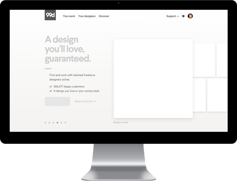
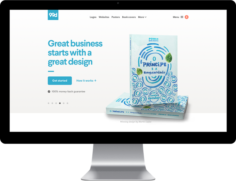
Anytime a company launches a rebrand there’s the obligatory “how we did it” blog post. Uber did it, AirBnB did it and we did it.
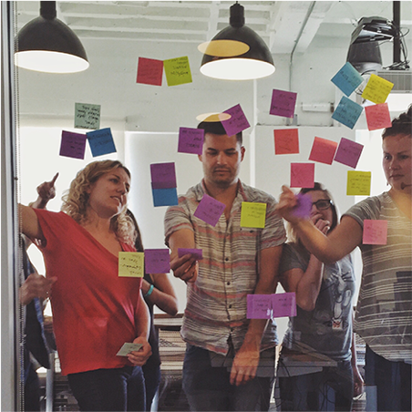
Usually these posts jump right from “good looking people putting post-it notes on a glass wall” to “unveil on an unsuspecting public” stage, and completely skip the really tricky part — going through the company’s website (and other assets), page by page, turning old brand into new brand.
If you’re an Engineering Manager at a startup, there’s a good chance you’ve never had to rebrand a product (as the average engineer employment tenure is lower than the average brand lifespan). If you’re working in the Bay Area, doubly so, as visual styles don’t have a vesting cliff. So let us tell you the story of how we did ours and then dive into a few specific tips on how you can do yours.
Our timeline
—
For the sake of telling a story in a reasonable timeframe, we’ve cut down the timeline to just the essentials, and only the period that the Engineering team was involved. There was a lot of hard work done within brand and marketing before and after this period, but from our point of view it was a six month project all up, three of which were when the bulk of the work was done.
- October: we are told the rebrand is happening and there’s a desire to ship before EOY.
- November: design sign-off with concurrent style guide buildup; design and build assets feature flip system; sketch out timeline and set target of February rollout
- December: build commences in app; we convert old-old pages to Asimov (our component system), if pages are already Asimov, we convert to the new brand
- January: build build build build! Delete pages and products that were nonessential, off-brand or both. Re-forecast schedule and set hard deadline in March.
- February: the whole company assists on QA and dev continues
- March: roll out to customers, PR push, dismantle asset scaffolding
The rebrand was a great success. We did a simultaneous rollout over 4ish products on the day we said we would. We achieved consistent look and feel on every single page of the site for the first time since the original launch of the company.
As the final cherry on top, we managed to remove at least 150k lines of code out of our monolith as we streamlined the product, and moved a lot of marketing content into our new CMS.
Choose your build-and-release strategy
—
You can essentially choose one of three strategies for building and rolling out your new look and feel:
- All at once: freeze all feature dev, grab every engineer, redesign everything and ship in a big-bang of shock and awe
- On the side: pull together a tiger team of front end engineers working in parallel on rebranding while everyone else is business as usual, ship in a big-bang of shock and awe
- Finish it later: rebrand all the key marketing pages and front-of-funnel flows, defer other flow rebrands until they naturally come up for refresh
I can’t say that any specific approach is best, but here are the rough pros and cons of each.
‘All at once’ strategy
Pros: focused, brings team together, reduced rework from feature freeze, cheaper temporary scaffolding.
Cons: expensive, low efficiency with non-specialists contributing, blocks BAU product roadmap.
‘On the side’ strategy
Pros: relying on specialists more efficient.
Cons: high risk of BAU & rebrand schedules blocking each other or needing rework or both, design scope bloat likely without budget pressure.
‘Finish it later’ strategy
Pros: quickest & cheapest to launch due to reduced scope.
Cons: bad UX as customers move between brands on live site, good luck finishing it before the next redesign.
For us, “All at once” was the right pick. We did as much prep work as possible under the “On the side” model, but we all pulled together to do the actual work of converting products from one brand to the other.
We chose this approach for a range of reasons:
- Having inconsistent UX with multiple visual identities live at once undermines the credibility of our brand. We can’t tell customers design is a critical part of business if we don’t live it ourselves.
- We’re committed to our engineering team being “full stack” and having everyone pull an oar is a great opportunity for cultural reinforcement, and for getting our independent teams to cross-pollenate.
- The average length of projects on our product roadmap was shorter than the time we estimated we’d need to do a rebrand, and any project undertaken simultaneous to the rebrand puts you at risk of expensive rework or planning overhead.
- While 99designs.com presents as a single unified site, it’s stitched together from several products in different codebases of different languages and sizes. It would simplify both our feature flag code and our staff planning to make changes everywhere all at once.
Off the top of my head here are a few other contexts that might suit a particular strategy better:
- “Finish it later” if we were an order of magnitude larger. There’s a reason Google isn’t 100% material design yet. Too many people covering too much territory for a single project to be manageable.
- “On the side” is a good choice for a smaller, monolithic team or codebase in a continuous delivery environment. In those cases, parallel development is not too challenging to manage and efficiency matters.
- “All at once” would suit the smaller monolithic team better if you have more of a big-bang deployment model (which is becoming rare for web teams, but is common for mobile apps). To do “On the side,” you would need some intense branch management.
Tech Considerations
—
Content-semantic naming
The top technical tip to make any future rebrand or redesign cheaper and easier would be to adopt some kind of component-based framework for your CSS and HTML. We use an internal framework called Asimov (built on top of Bower) to share CSS components between apps, and BEM as our naming and structure convention. I’ve also used SMACSS in a past role to good success. This post on BEM and SMACSS is a great guide that compares the two methodologies.
In choosing “All in once” as our approach, we had roughly committed to a fixed scope (i.e. how many pages are we going to do? all of them) and a fixed budget (not exactly, but we knew we wanted to get a lot more than the rebrand done in 2016). The only real lever we had to play with was the “depth” of the redesign.
To make the whole thing possible, we aimed at doing a CSS-only redesign where possible. Key marketing pages that needed a radical redesign were simply built from scratch in our CMS on completely separate code paths. Everything else was merely re-skinned with new CSS and assets.
This option — of doing a meaningful redesign that only went skin deep — was only available to us because we spent years slowly moving to a new component system. In the odd instances where the new design needed markup changes, we found a way to backport the structural change into our old brand, deploy to production like usual and then rebrand the component.
Our discipline with BEM helped in two ways. The first is that the emphasis in BEM on minimizing cascade made it a lot safer to make sweeping visual changes without worrying too much about style regression. The second is that by focusing on naming components by purpose (something the kids would call content-semantic naming) rather than appearance helped us avoid any basmati rice moments. .button--primary and .button--secondary afford you a lot more flexibility than .big-green-button and .little-greyed-button.
Build, deployment, and feature flipping
The other technical tip I would offer is to not gold-plate your scaffolding. At 99designs, we run a relatively straightforward continuous delivery pipeline — a github flow style development process — then all master commits automatically move through a Buildkite pipeline, which builds and deploys to AWS. We deploy each of our products many times per day, and when something isn’t quite ready for public consumption we hide it behind a feature flip. Our solution was well suited to the kind of everyday project work we usually do, but didn’t scale up to change everything on every page on every product all at once.
The initial temptation was to try and generalize our feature flipping system to handle broader changes, and move it up one level in the stack so it cut across all products. Looking at how frequently we did this kind of work (i.e. only this one time), this solution didn’t pass a cost/benefit analysis. While your day-to-day front end work style and methodology has a huge effect on the efficiency of a rebrand, the tooling to support a sweeping redesign has almost no benefit through the rest of the product cycle.
We opted instead to build the simplest thing that could possibly work: we continuously delivered single codebases up to the HTML layer, and compiled and shipped two different asset stacks. This also committed us to the “skin deep” rebrand policy. You should be making the decision about how you’ll technically do the build-and-release at the same time you’re picking your management strategy, as there are a bunch of tradeoffs in each that inform the other. Because we knew we could halt other projects affecting the backend and bring all the engineers to bear on the rebrand, we needed minimal guardrails to keep concurrent work isolated from each other.
How the twin-assets plan actually worked was almost embarrassingly simple. The scaffolding went up over a couple of days, and we removed it again afterwards just as easily. Before committing to the approach, we did a test rebrand with our assets prototype, making everything Comic Sans. It was glorious.
We also took advantage of Buildkite parallel steps to add a second asset build step to each of our codebases that would layer any files with rebrand work over the top of our existing assets and bundle them up into a separate folder deployed alongside our web code. We then added a small shim over our asset path helpers that would flip between an assets folder and assets-reskin based on a cookie that staff could set. That cookie was set by a button inspired by Fiona Tay’s talk on evolving Airbnb’s brand.
The final piece of tooling we put in was a widget in our staff UI (which is present on every page) that would let any user know if a page was “Ready for QA”. Any time a dev was finished with a page they’d leave a <div data-ready-qa></div> element somewhere invisible.
You got your waterfall in my agile. You got your agile on my waterfall.
—
If your startup is anything like ours, you’ve been doing agile, incremental, continuous delivery style development for the past few years. Which means your knowledge of how to navigate a months-long secret project that deploys in a single big bang has all but been but forgotten.
A lot of your day-to-day agile processes won’t drive you forward towards your fixed scope and budget, but if you try to wholesale return to waterfall techniques, you’ll find you just don’t have the supporting infrastructure (usually around QA process and tools) to do it safely. Your best bet is to try and blend the techniques. I’ll quickly go through a few process tips and guidelines from our experience.
You should have a master Gantt chart tracking the major work items and their dependencies. We just used a google spreadsheet: rows were “pages” across all the products or other cross-cutting tasks, columns were business days, names in the cells for who was doing what. Estimation was very simple, we picked an arbitrary number of days out of the air per page or component initially, then partway through the project — when we had real data — we just averaged out the work done and time spent to re-forecast based on actual time spent.
Deadlines are not arbitrary for rebrands. You’re basically relaunching your business and getting all the right press and marketing tasks ready to go take time. Don’t feel obligated to pick the deadline too early in the project, but as you get towards the end of the rebrand, your estimates need to turn into a commitment in order for your partners in marketing to succeed. Make sure you front load as much risk and hard work in the timeline to avoid a death march surprise in the final weeks.
Implementing the designs: planning vs. rework.
—
No matter the project, it’s always difficult to pick the right balance between design up front and iterative, just-in-time design. Don’t get too committed to either approach. For key pages, like the homepage or our contest entries page, we decided to run the more traditional pipeline of designer mocks up in sketch then developer implements, but for most of our pages we ran in the opposite direction. The engineer would do a first pass of applying the new styles from our style guide, then quickly run it by UX for review. Most design direction from that point would be verbal and comp-less. If early in the build of a page, or during the UX review, it became apparent the page needed more design consideration, it would default back to a comp-to-dev workflow, usually resulting in an abandonment of the dev work to that point.
The dev rework in that process might look like waste, but in the bigger picture it actually saved effort. We saved on design comps that were never needed (because the initial conversion was good enough) and focussed our efforts on the pages that needed it.
In addition to having our choice of two different iteration loops, we also had a daily dev-design-product sync meeting that would run for at least an hour. In that meeting, everyone would take a holistic look at the day’s progress and identify any themes and cross-cutting problems that were emerging and decide together whether we needed to revisit any past work. By layering in a couple of different feedback mechanisms in the design process as we went, not only did we manage to evolve the new brand as we built it, but we also ensured consistency across everything.
To borrow a phrase, “never waste a rebrand”. It’s a great opportunity to stretch the team. Everyone can bond around the common goal, and because of the cross-cutting nature of the work, everyone gets the chance to collaborate with a different set of people than they do under regular work.
Learnings?
—
The 99designs rebrand was a great success based on all of the measures we care about. Nonetheless, we did learn some important lessons along the way (as is to be expected when you’ve embraced an iterative process). There are two things in particular I would have done differently:
The first would be to include more prototyping and device testing up front, before the executive sign-off on the general visual identity. All of our early design sign-off was based on comps. Comps that were designed on beautiful, bright Apple Retina Displays. It was very late in the game when we finally looked at a built page on a consumer-grade Windows laptop. Between some of our color gradations and typeface choices, we had to revisit a lot of early design decisions for legibility reasons. It wasn’t a huge bump in our schedule, but compared to the cost of buying a lowest common denominator laptop and doing a couple of quick-and-dirty HTML mock ups early, it stung a little.
The second would be to bring SEO considerations to the forefront during the mockup stage. It’s incredibly tempting when you’re deep in sketch to “show, don’t tell”. Doubly so when you’re a design marketplace and want to put the design front and center. While that’s a great choice from a purely user-driven perspective, the Googlebot needs words to know what your brand is actually about. And if Google doesn’t know, neither will your customers. We got on top of this later in the build as well, but it would be so simple (at an initial stage in the process) to compare your current pages as Googlebot fetches to text files of all the copy in the new design iterations. If it’s radically different in volume or content, you need to dive more deeply into the potential repercussions.
No, there is too much. Let me sum up.
—
Phew, we’re more than two thousand words in. Pretty sure I haven’t typed this much (in English) since Uni.
Rebranding any long-running online business is a big undertaking and any pithy summary would be a gross oversimplification. I’ll try anyway.
- Use a good, modular CSS framework or convention for your everyday work to make your life easier when the time comes
- Keep a healthy balance of agile & waterfall techniques to bring it in on time
- Pick a build strategy and technical scaffolding that support each other
- Tackle the hard and risky things early to make finishing easier
