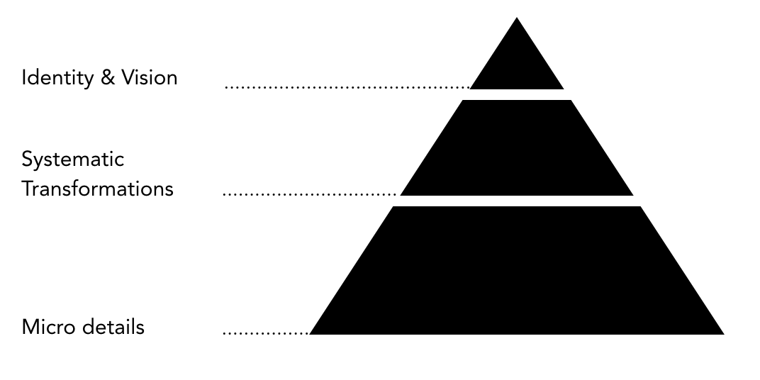
From 6 Feb to 8 Feb, the conference had separate subjects for each of the three days. I am going to recommend and elaborate on one talk for each day to explain the thoughts behind the above statement I made.
At the very end of this article, I will also recommend talks that I think will be worth spending time watching them.
Day 1, Micro, details
The first day started with talking about micro details regarding product development and design. Details we didn’t really pay attention to but have great impact on the experience and design practice.
Make things unknown by Kenya Hara
The talk of that day I would like to reflect on is the talk from Kenya Hara, art director of Muji. The talk is named Make things unknown. The reason I got triggered is not simply because I am an Asian growing up in an Eastern culture or a fanatic Muji fan, it is the concepts of design he talked about in this talk.

Poster from Muji
Let’s start with the famous poster from Muji. How do you think about it?
When I first look at it, it is empty and simple that almost has nothing on it, however, I can still feel something strong.
That brings up the first concept Kenya talked about behind Muji, emptiness.
Instead of giving large amounts of information, offering an empty vessel to act as a receptacle for creativity has the potential to make the recipient’s inspiration wake up, achieving communication without an exchange of words.
— Kenya
To reflect on a personal level, I believe this concept has its root in the difference in Western and Eastern culture and their designs. If we take a look at the pairs of images I found below, we will have a better understanding.


Left: Cutlery in the western culture; Right: Cutlery in the eastern culture
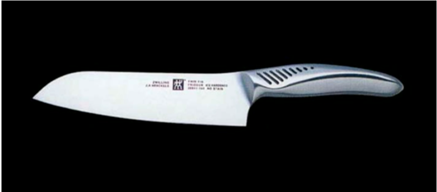

Left: A German designed knife, with precisely designed ergonomic details; Right: a Japanese knife, with simple handle for users to explore the way they use it

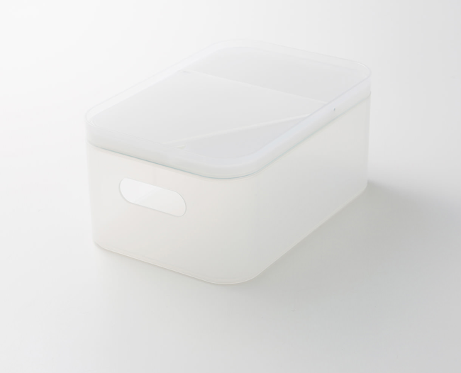
Left: A fruit box with very specified usage in western culture; Right: a food box with open utilities
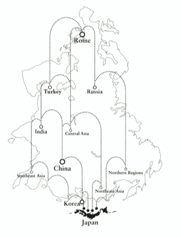
The simplicity of eastern design originates back to its cultural heritages. Kenya provided a smart analogy from the perspective of Japan. If we turn the map 90 degrees, we can see that the world map is like a pinball table, while Japan is at the bottom of that table to receive all kinds of cultural and social aspects from other countries.
As a result, Muji’s design is a design concept to reflect on any special expression but also applicable to any situation.
That is the emptiness in the Eastern design philosophy.
For the second concept, I would like to start with three images.


With the first image, we know clearly it is a plant, it is a sprout. However, when we take a look at the later two images, they are totally unknown for us, possibly meaningless to us and we are curious to figure out what they are.
This raises up the second concept Kenya talked about behind Muji, ex-formation.
We are currently mostly designing for informations, things that are known. But with ex-formation, we design things that are unknown.
Rather than making things known, making people aware of how little they know can inspire greater interest and awaken an active desire to know. Ex-formation derives from realizing that what moves people’s hearts is the unknown.
— Kenya
One project from Kenya and his student is about redefining Nudity.
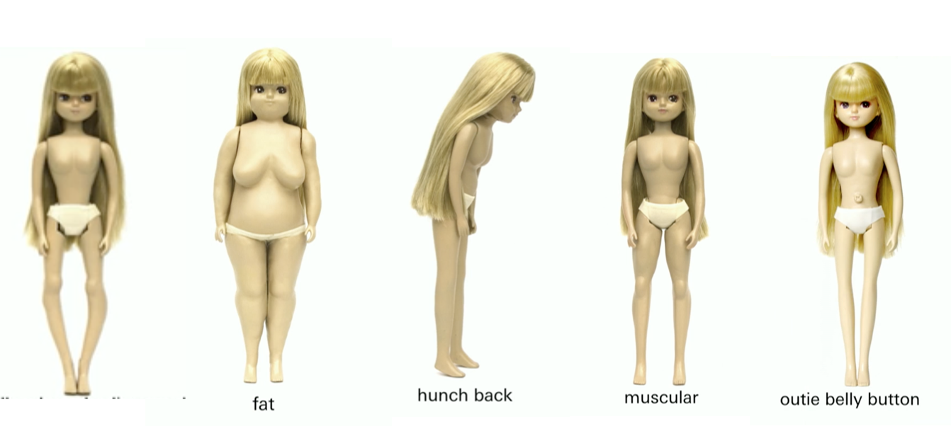
He starts with our shame on our own nudities because our bodies all have certain amount of deviance. Conditions like fat, hunch back, too much muscular, or outie belly button, etc. We are seem to be well aware of our nudity and everything about it. However, what if nudity for us is an unknown subject? Starting with this, Kenya and his student tried to observe nudity as an unknown subject.
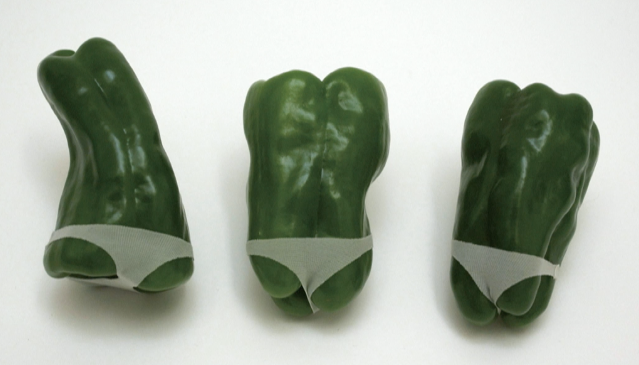

The ex-formation of nudity from Kenya and his student
The result turns out to be funny and provocative. Do you feel ashamed of a fat paprika or the thin legs stretched out from a fork? Or perhaps the definition of nudity is not that simple anymore. We started realizing how little we know about nudity and thus our eagerness get triggered to think and know more.

I find it fascinated to apply these two concepts, emptiness and ex-formation, which help shaped Muji to be applied back to our daily design practises.
Design is not design, it is a channel that designer use to try to inspire the customer and talk with the user. A good design is not merely usability.
Some other talks I recommend to watch from Day1 :
- From blank page to world stage by Cheryl Plaz, design manager at Echo Look
- Embracing friction by Zoltan Kollin, design manager at IBM
Day 2, Meso, systematic transformation
Moving on to the second day, we see a shift of focus from current stage of product development towards a change of mindset on future innovations and the systems behind them.
Growing up in China, where I got my rudimentary knowledge of design. I feel much personal connections with the talk from Rachel, senior UX designer at Google Chrome team, about Learning from emerging market.
Her talk largely focused on the research and product innovation done on the background of Indian market. It however springs up my personal connection with another popular browser, UC browser, in the emerging market.
The talk starts with some facts to address the importance of internet.
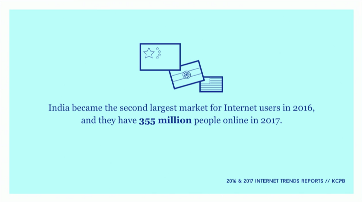
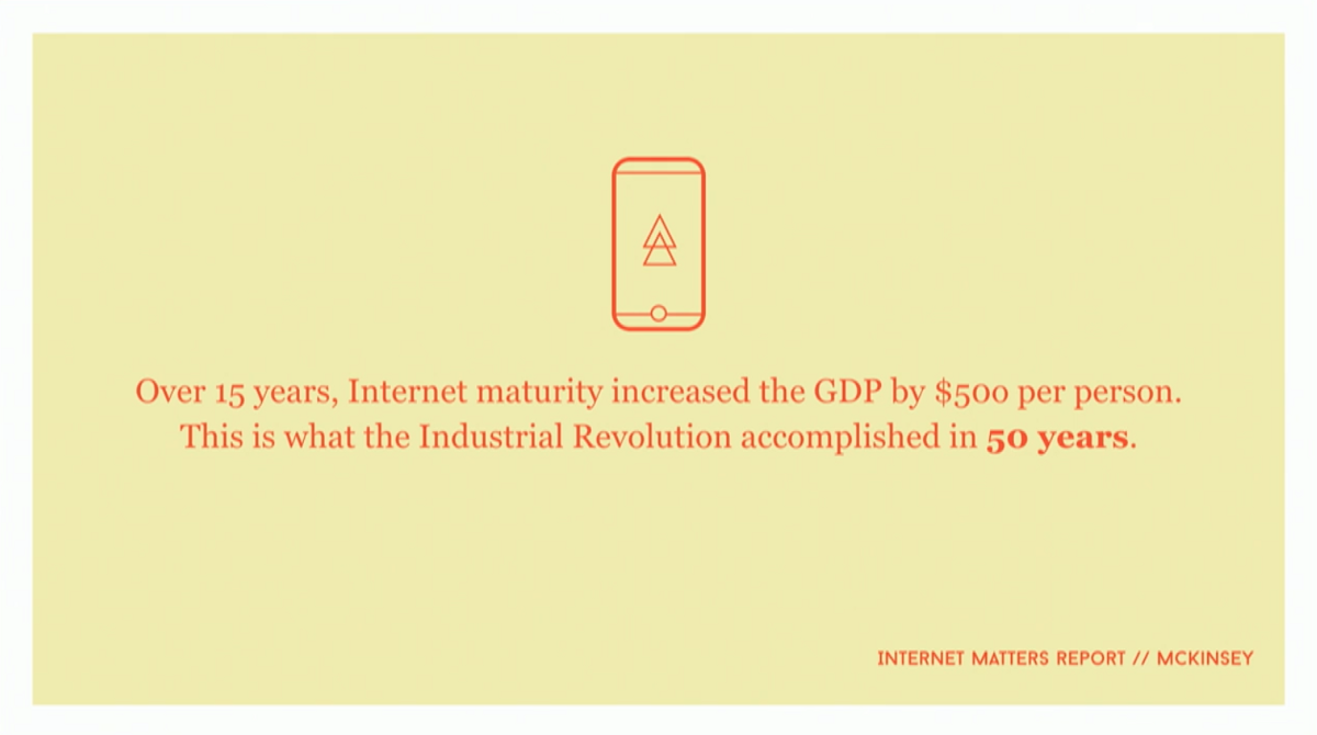
The facts to start the talk
Obviously enough, we all know internet is important, while mobile is mostly important, for the fact that
New users from emerging market (China and India) are always mobile first, the first device they normally use to access the internet is smartphone.
But it is generally a global trend across developed and emerging market alike. Fact? I came across the below matrix in my LinkedIn newsfeed a few days ago, posted by Luke.
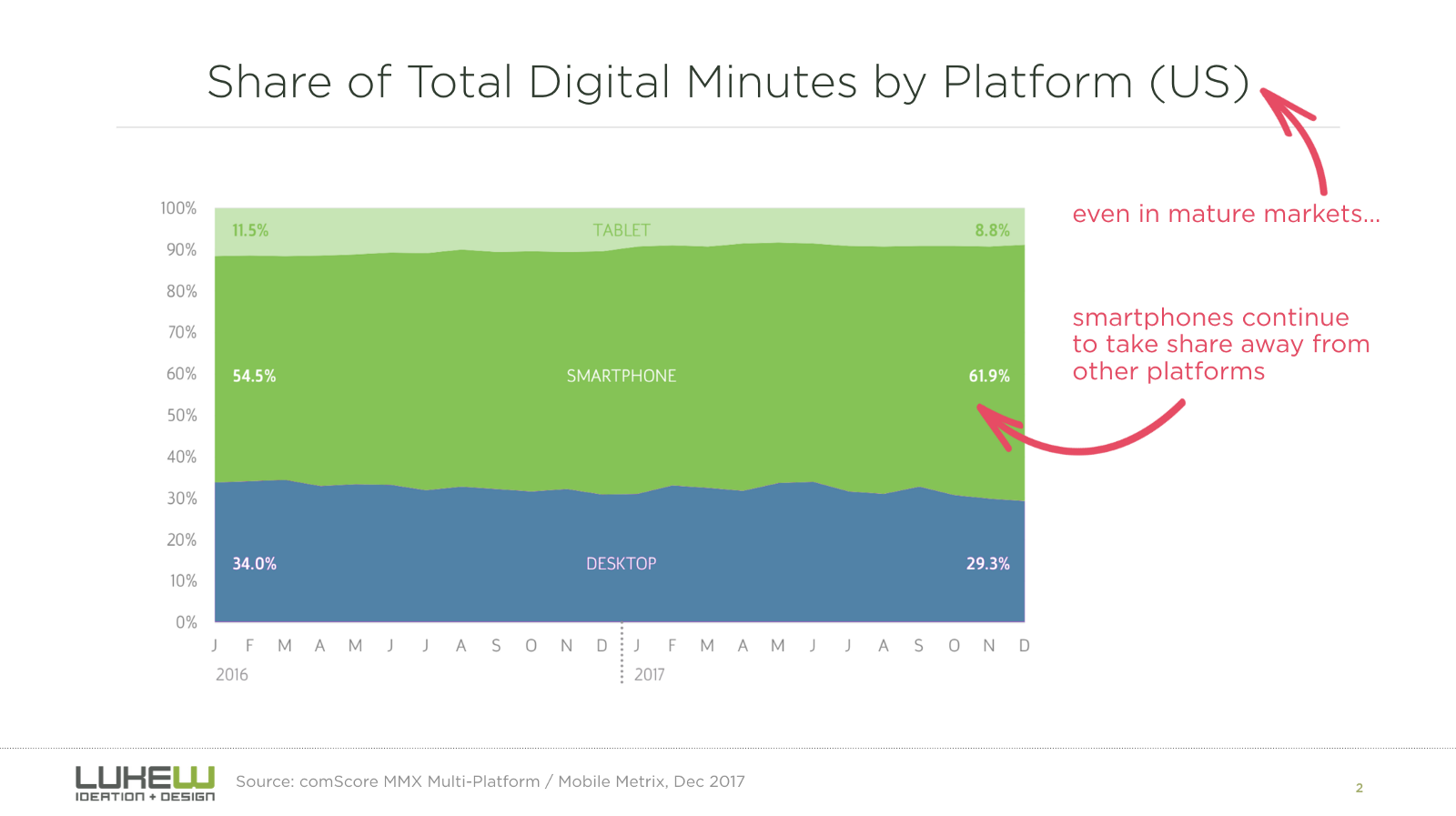
source: https://www.linkedin.com/feed/update/urn:li:activity:6378990222037917696/
Back in the years, the chrome team invested in large amount of time on 80 intercepts, 26 elaborate home interviews and 8 profound vendor visits, trying to define patterns from huge resource of diary studies and literature reviews, to eventually formulate the design principles to improve the mobile experience of Google chrome in Indian market and other potential markets that suffer similar constraints like poor internet connection, limited phone storage, etc. The principles the team formulated are displayed below:

The design principles formulated by the chrome team after user research in India
From there, Google Chrome team started with design improvement and product iteration process, and the process and features bring my memory back to one of the first mobile browsers I used in China when the popular system was still Symbian.
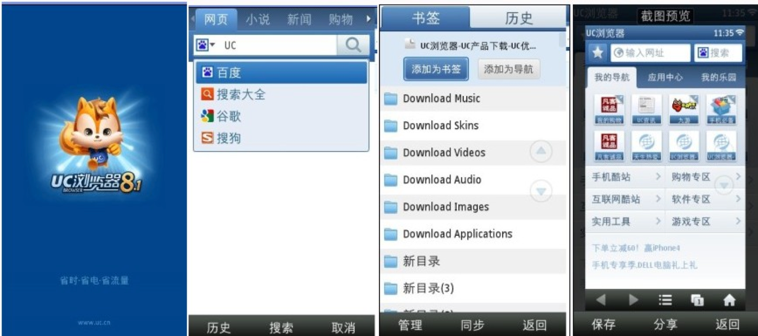
UC browser is a popular browser almost everyone used at the fledging period of China’s internet, and it is still the most popular browser in India, Indonesia and other emerging markets. Below is a piece of information I found from Wikipedia:
UC Browser’s servers act as a proxy which compresses and renders the data of web pages before sending it to users. This process helps to load web content faster. The browser supports parallel downloads and includes a download manager, including pages for offline reading.
Taking a closer look at the screenshots above, it includes features like search bar, file downloads and management, and saved web content from last visit or frequent visit.
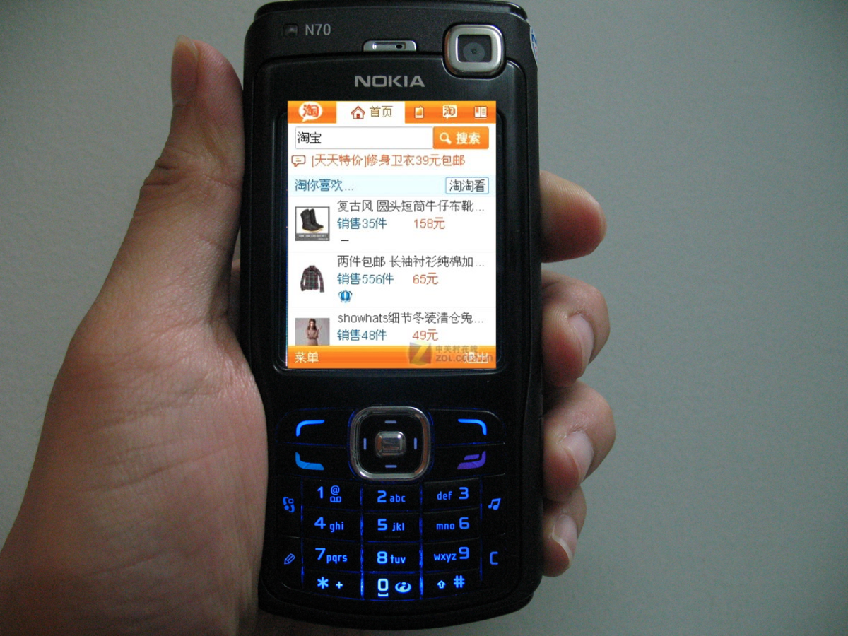
I remembered that I owned an N70 in my high school and I could literately visiting Taobao, the popular E-commerce website in this tiny Symbian screen for online shopping. Of course, Taobao was a desktop website during then, but the data compression enables UC to provide user with the feeling of a mobile app.
Going back to the product innovation and iteration at Google chrome team. One of the first improvements and iterations the team made is adding data saver for offline access of webpages to have a resilient content access in bad connections. If we take a look at UC browser in 2005, it had almsot the same feature on its home page.
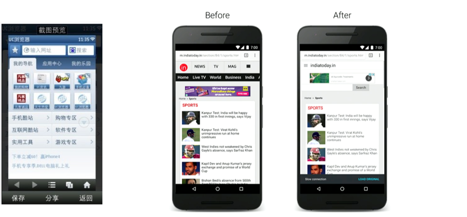
Left: UC browser saves webpages for offline visit on its home page; Right: Google chrome saves webpages for offline visit in its loaded sates
Later on, the research unveils that file management matters. For the fact that, 1/3 smartphone users in India run out of storage space daily; Users felt they had paid for downloaded media, sine the cost of data is high; Users would like to share files with their friends to spare cost and the waiting time.
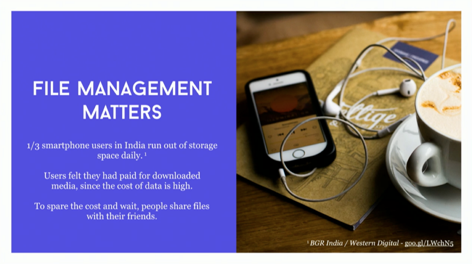
The research insights generated by the chrome team
As a result, the team decided to bring a feature of file management to Google Chrome. They Introduced parallel downloads as an intuitive and resilient solution, file management folders so users can manage and move files in different folders. Obviously enough, it was also an early feature in UC browser. Users can download and manage the pages or contents from a page.
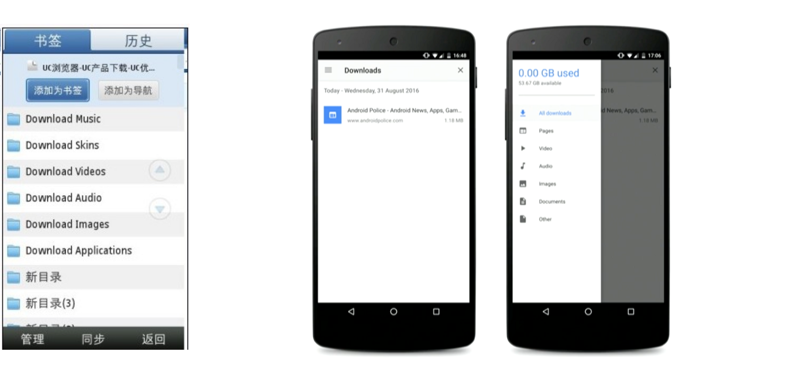
Left: UC browser provides users with parallel downloads and file managements in an earl version; Right: Google chrome introduced parallel downloads and similar file management
As a evolution, Google starts introducing and advocating for Progressive Web Apps as a best practice that satisfied and encapsulated all the design principles.
We all know Progressive Web App is a new trend, because it is light, loading fast even on 2G network. It offers offline experience with notifications and some other possible actions. It is basically a website. By using a set of web technologies it provides users with an app like experience.
Interesting enough, in the early 2000s, the emerging market has already figured out its product solution and features to tackle their own market constraints and problems, when they are still using Symbian system. If we put them, UC browser and PWA side by side, I will say the left one is an early prototype of the right one.
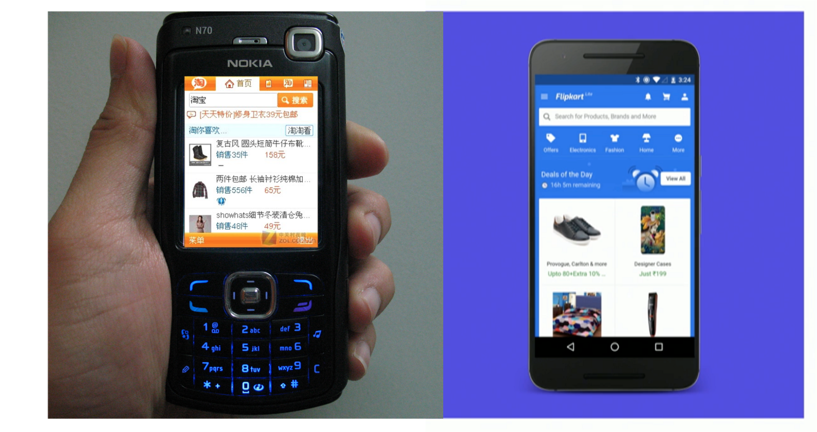
Left: Taobao, the Chinese E-commerce platform in UC browser in 2005; Right: Flipkart, the Indian E-commerce platform in PWA in 2017.
Admittedly, the profound research conducted by Google provided them with full of insights to improve their products. What if you are a startup company that do not have enough resource and money? What if you are a small team trying to improve your customer’s service and expand your market? Do not only do your research and wandering in the developed markets. It is time to look into the emerging market and learn from their best practices. They definitely have some wisdom to get bootstrapped, survived and thrived.

It is common to see similar features being shared on popular platforms in developed and emerging market alike. I will never be ashamed of considering it as copycats, it is a smart shortcut to learn from each other and define what is the best way to apply on each own services and markets.
Design is not design, it is a changing attitude and open mindset towards other emerging occurrences in the world.
Some other talks I recommend to watch from Day2 :
- Restoring “place” in modern market, story of a Chinese e-commerce village by Alice Fang, user experience designer at Google
- The MaaSive future of transport by Apaar Tuli, interaction designer with architecture and urban planning background
Day 3, Macro, future identity and vision
As design continues to gain traction in business and culture, we are adept at discussing the “how” of design, but our inability to discuss the “why” continues to hobble the profession’s further evolution. The talks on day3 level up the professional reflections on our identity and visions as designers.
Thinking critically about design & criticism
I am almost grateful to hear the talk from Khoi Vinh, currently principal designer at Adobe New York. He led us cogitate on our identity and responsibility from a future perspective where innovations happening everywhere, in the meanwhile he provided us with an optimistic statement that our design community can be levelled up.
His talk started with confronting us with tech backlash and design backlash. On Google, if we search for tech backlash, all kinds of critiques and news platforms are trying to swarm into the view. However, if we search for design backlash, we are only able to see a list of non-sense, not even close to the topic.
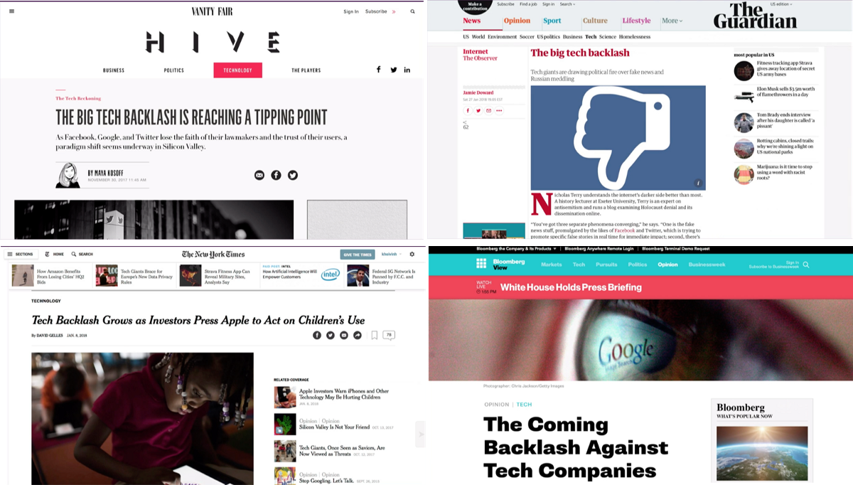

The prominent difference of search result from “tech backlash” and “design backlash”.
Unfortunately, this evidence shows that the society is simply not considering design as a main effort towards problem solution. Obviously enough, they values them a lot on technology problems.
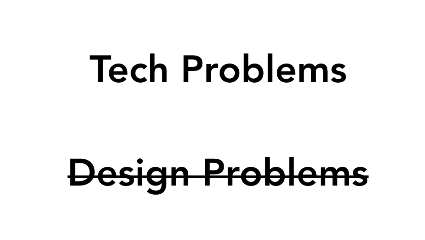
It’s not they think there is no value there. It’s just that when the stuff hits the fan, they turn to our peers, our engineers, or our business leaders. They don’t think design has anything to say in this arena.
— Khoi Vinh
An optimistic statement is
Designers will play an important role in reconfiguring our relation with the digital world.
— Khoi Vinh
For the fact that we do play an important fact in these games.
Taking the example of the false ballistic missile alarm in Hawaii this year as an example. The impact is huge and caused panic and cost lost. If we take a look at the backend system that triggers this alarm. It is a design without thorough consideration. The real alarm is just one block away from the drill alarm.


The false ballistic missile alarm triggered by poor-designed backend system
Why does this happen? Because we cared and biased towards does it work but feel less comfortable with is it good. It feels less quantitative, it feels qualitative; It pushes designer to the corner to think they are the ones only making things pretty, as Khoi said.
Taking a closer look at all the articles writing about design on Medium. They are almost exclusively talking about design, how to design a form, how to design a better data table, how to…This vigorous community is good. Designers talking and writing about design is good. But we need a class of knowledgeable professionals to start thinking critically about design. It can be the next Michael Kimmelman in digital design or not, but we need to start moving towards that direction.
Indeed, there is a conflict of interest in practicing and criticising about the same art form. We have to think about our professionals regarding the interests of our clients, our customers and other designers. It is NOT easy. But being critique helps us to gain independence and being responsible. So we are not only quick in taking credit for success, but also standing out for our failures.
To the moment that when we designed something failed next time, we have enough courage and knowledge to talk about why it failed and why it was not good instead of shutting it down secretly like Dropbox Carousel and Mailbox.

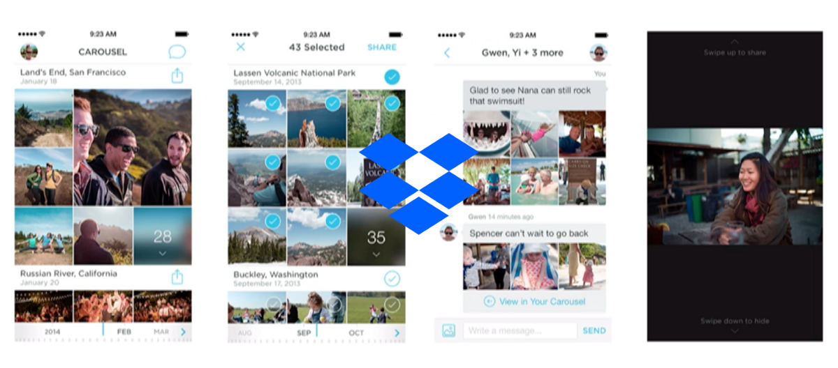
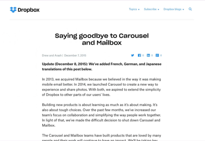
Dropbox saying goodbye to its product Carousel and Mailbox in 2015
To the moment that when we are designing for the attended audience, we are able to think about is it good for the audience, is it good for the community and is it good for the world.
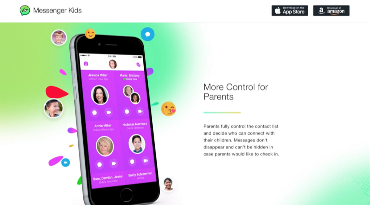
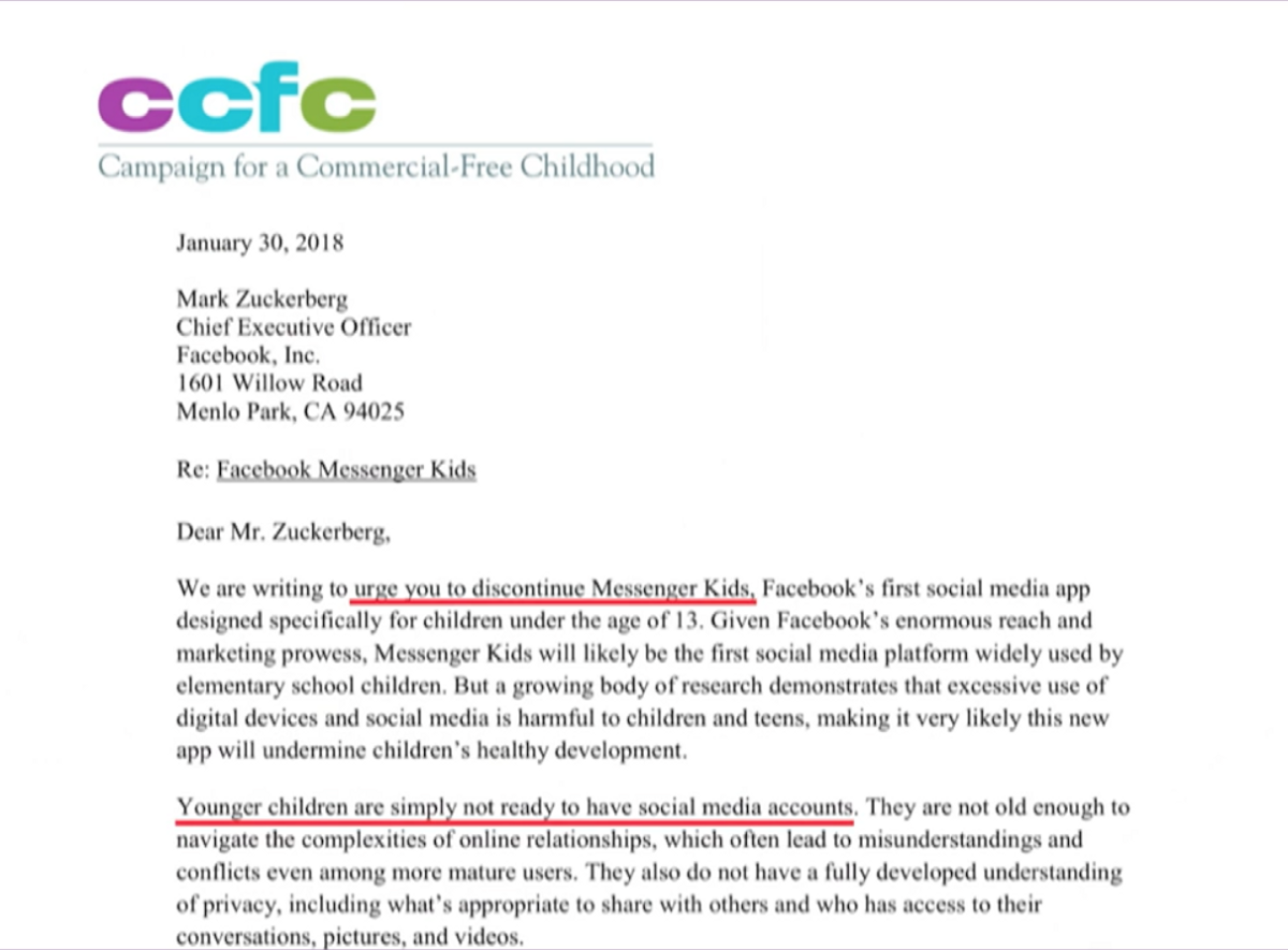
Facebook introduced Messenger kids but was unsurprisingly boycotted by CCFC
Design is not superficial, it is making more and more impact. With it’s great impact we have to take credit for the failure. When we neglect to examine failure, we reinforce the mischaracterisation that design is superficial.

Design is generating huge impact on every aspect of our society and life
When we face the unintended consequences of all kinds of innovations, what will designers’ roles be in those discussions? Unless we level up the way we talk and think about our work, the history will repeat and these will continued to be viewed as technology problems but not design problems. If we want to be the central participants in the conversations, we have to start practising on our criticisms.
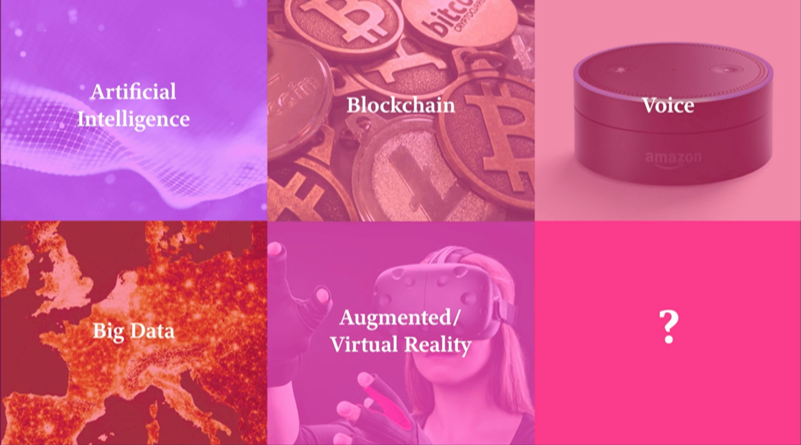
At the end of his talk, Khoi provided us with a simple framework to start.
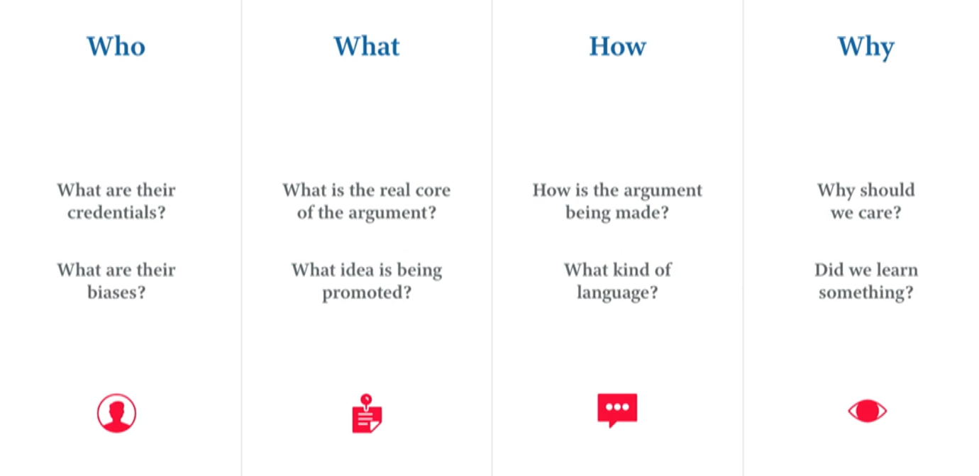
Design is not design, it is being accountable for our failures and responsibilities.
Some other talks I recommend to watch from Day3 :
