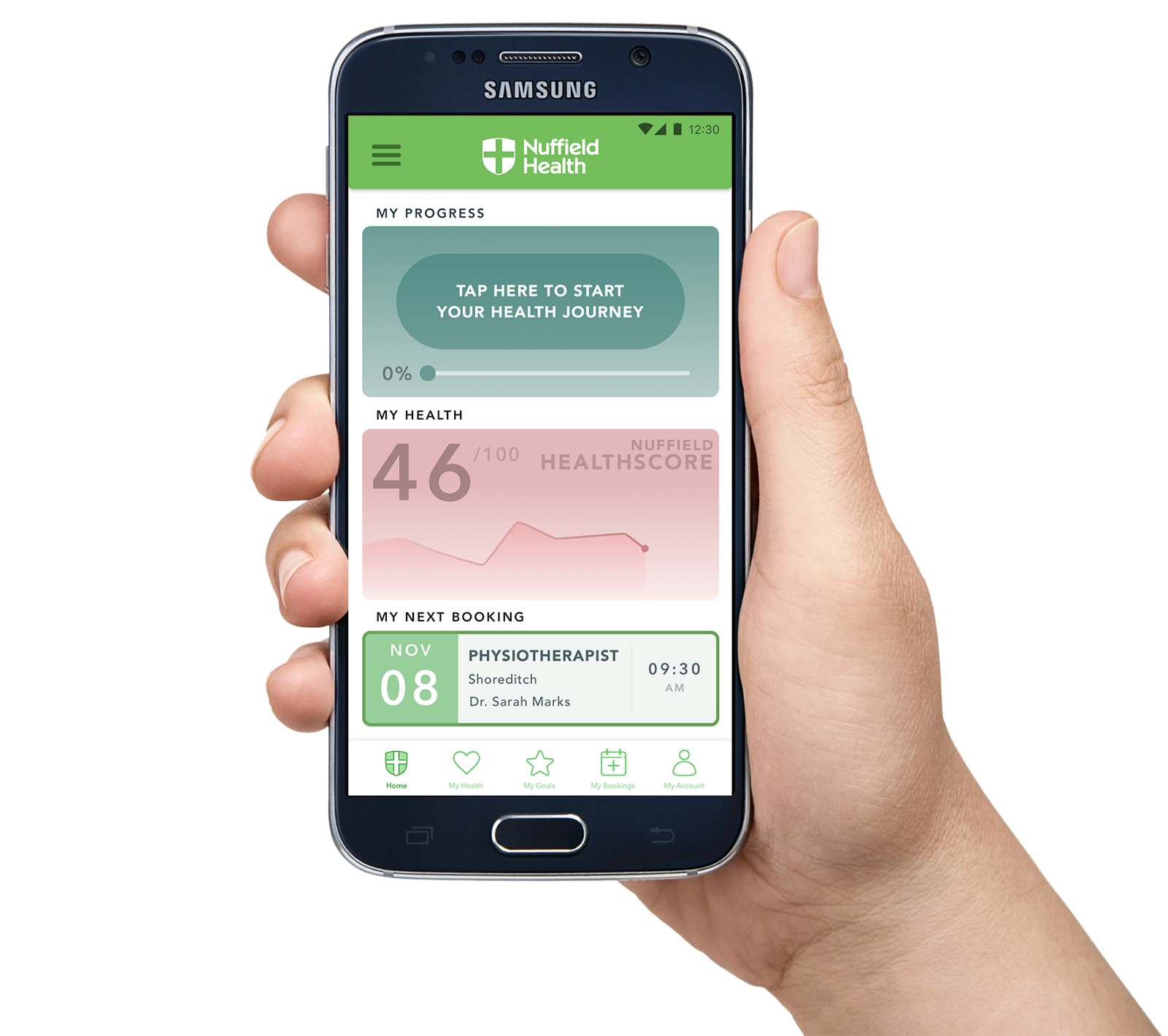
Please note: This was a concept project undertaken as part of the User Experience Design Immersive course at General Assembly and is in no way affiliated with Nuffield Health.

Nuffield Health is one of the UK’s leading not-for-profit healthcare organisations.
They operate a wide variety of facilities and healthcare services, from gym and fitness centres to hospitals and GP surgeries, and as a result are able to offer a connected healthcare provision.
The Brief
The setup for the brief was to design a digital product that would allow customers to book Nuffield Health services, as well as providing a way for them to track their health and encourage them to make healthier lifestyle choices.
The timescale for this design sprint was two weeks and was undertaken with two other designers: Irene Alegre and Hugo Nickols.

Contextual Inquiry
The first step we took was to familiarise ourselves with Nuffield Health and the way the organisation operates.
From visiting a local Nuffield Health centre, we learned that the integration of the fitness provisions along with their healthcare and medical services was key to the company and their goals, and that the two are directly linked, physically, in order to facilitate customers making use of both services.
Competitive Analysis
Along with this we also reviewed the current health app offerings available on the market.
Of course, the healthcare app market is huge. There are thousands of apps to track and manage your health and fitness, with varying levels of effectiveness.
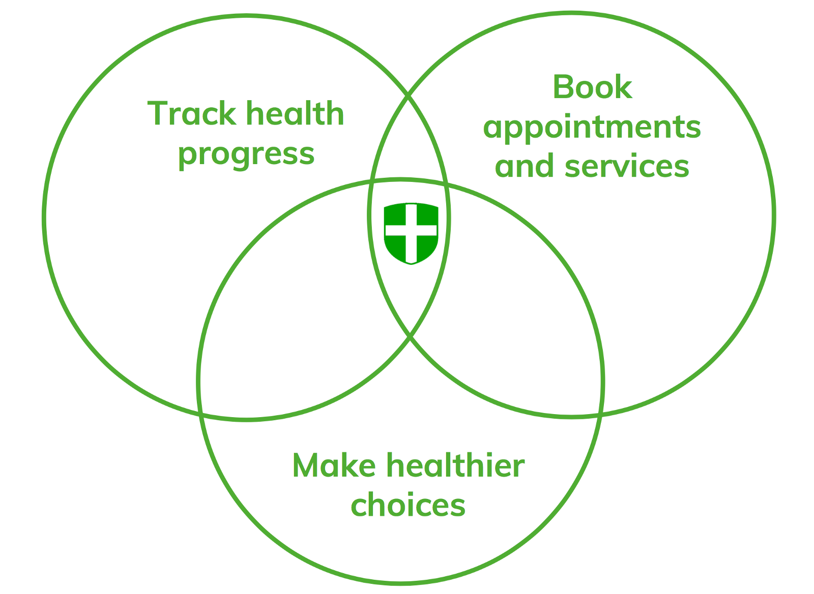
However, we found there was no app that took advantage of Nuffield Health’s unique integrated services approach to combine both an easy booking feature for medical appointments and fitness classes, together with the motivation to make use of them — ‘OneNuffield’.
It was here that we could see an opportunity for Nuffield Health to benefit both the organisation and the users:
User Interviews
We identified our target demographic as those aged between 30 and 50 — people we suspected were most likely to use private healthcare services such as those offered by Nuffield Health, but were restricted in terms of time and motivation when it comes to making positive changes to their health.
We conducted a series of interviews with 12 suitable users, and charted our findings on an affinity map to draw out some insights.
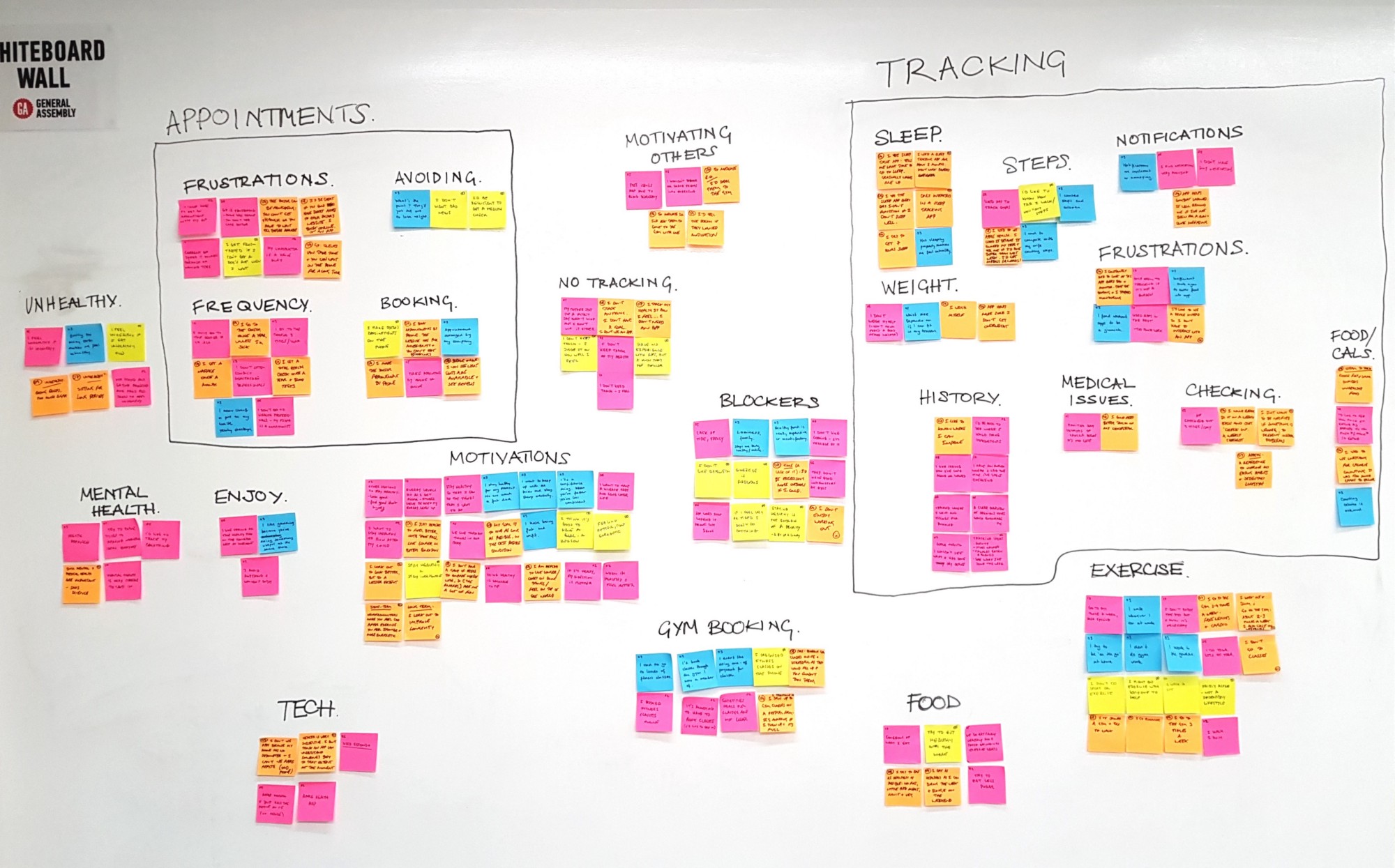
Our user interviews affinity map
Here’s what we learned:
- Life expectancy and quality of life are users’ primary motivators for being healthy
- Users like automated measurements. They find manual data entry and constantly checking apps a bore.
- Users are motivated by being able to clearly see how they are improving.
- Booking an appointment when you need one is frustrating and time consuming — availability is uncertain.
Obviously people do want to be fitter and healthier, but they struggle to build it into their lives and create the daily habits that contribute to a healthy lifestyle
Persona
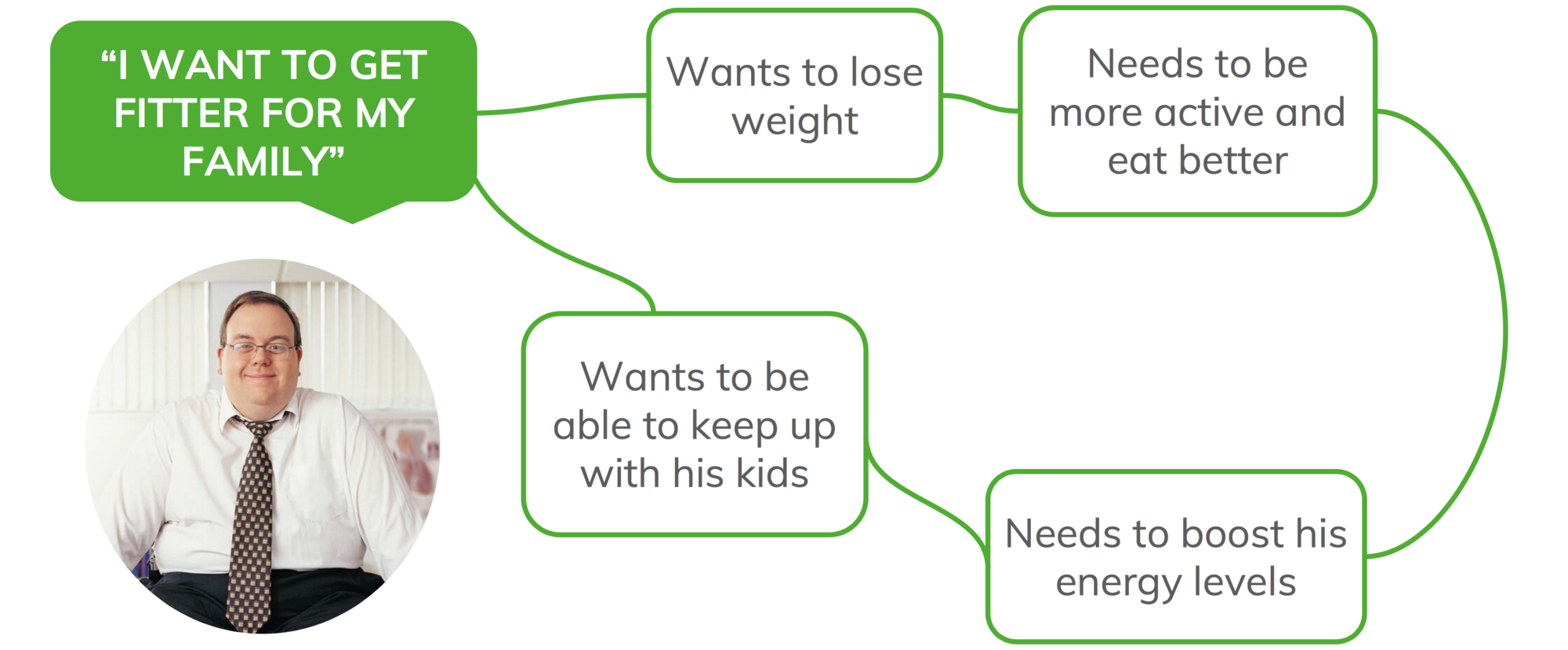
Our persona for the project was Geoff — a 41 year old IT manager, who after 20 years working for corporate companies in a sedentary job has gradually put on a lot of weight.
Now that he’s a father and his kids are running around, he wants to lose the weight and get healthier so that he can keep up with them and be the best he can be for his family now and in the future.
So how can we make Geoff healthier?

1: Making Healthier Choices
Our initial ideation process produced results that were heavily based on data tracking and then displaying that data to the user. In order to prevent the user having to input too much data on a regular basis themselves, we decided that the health information could be derived from Nuffield’s own quarterly ‘Health MOT’ assessments that they offer to their customers.
From these sessions, several key health indicators are assessed and aggregated into an overall ‘Nuffield HealthScore’. This provides a single indicator that can be used to easily track progress.
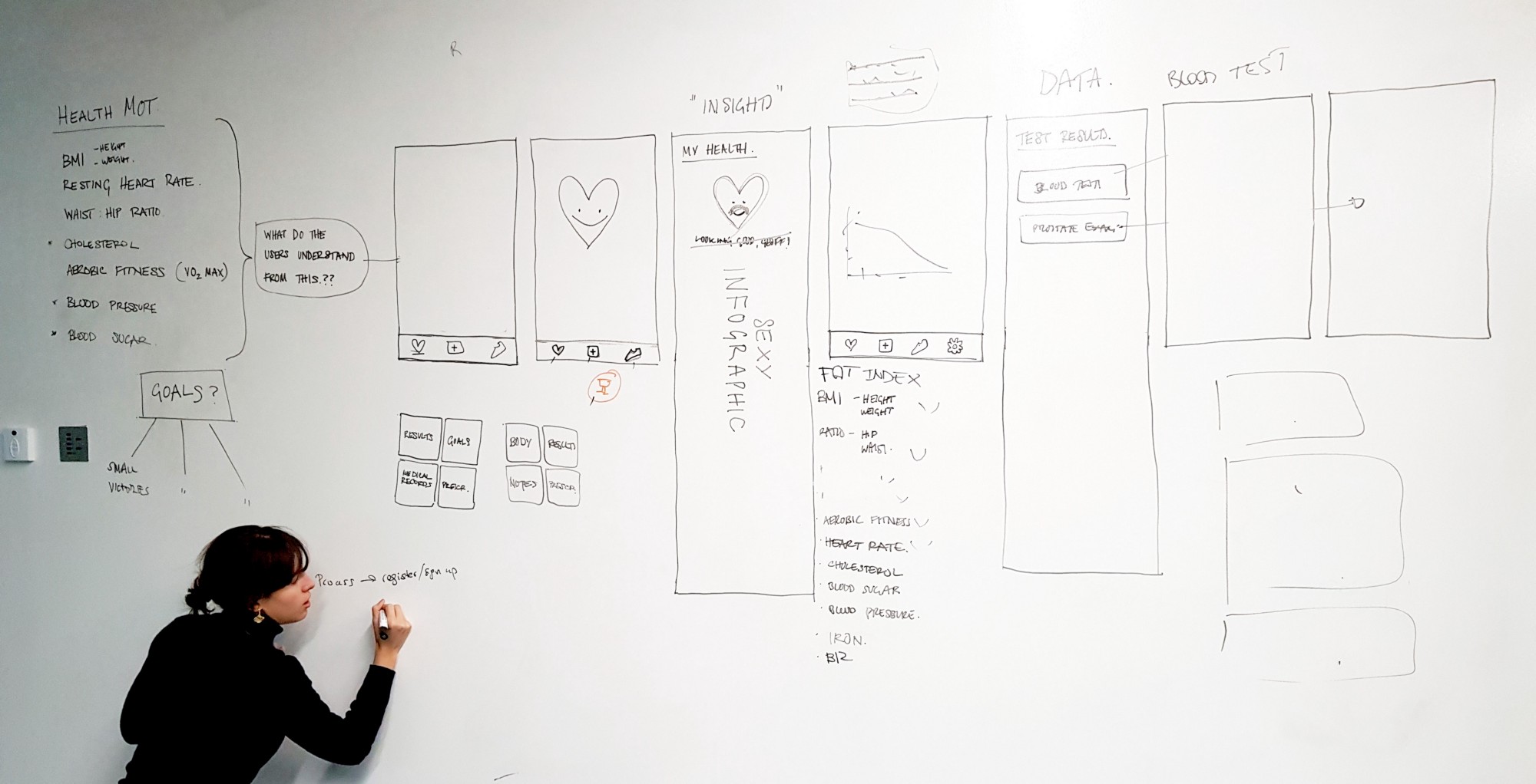
Trying to find a way to represent the data
After producing several sketches around the idea of charts, graphs and other ways of graphically representing quantitative data — as most other health apps do — we got together as a team and asked ourselves this question:
“Why does the user care?”
They might be able to see how their health is changing, but how is that going help them actually make better choices?
We wanted to find a way that would speak to the user in an understandable way and help actively motivate them to make positive changes, rather than presenting them with passive data.
We knew we had to approach the project from a different direction moving forward, and for this we turned to psychology.

Habit-Forming Gamification
We based our new strategy around the idea of creating ‘Tiny Habits’ — small changes to your daily routine that you build on gradually in order to eventually make significant changes to your life, that you then stick to long term.
We looked to apps such as ‘Headspace’ and ‘Fabulous’ as references to help design an effective approach within the limited time available to us in this sprint.
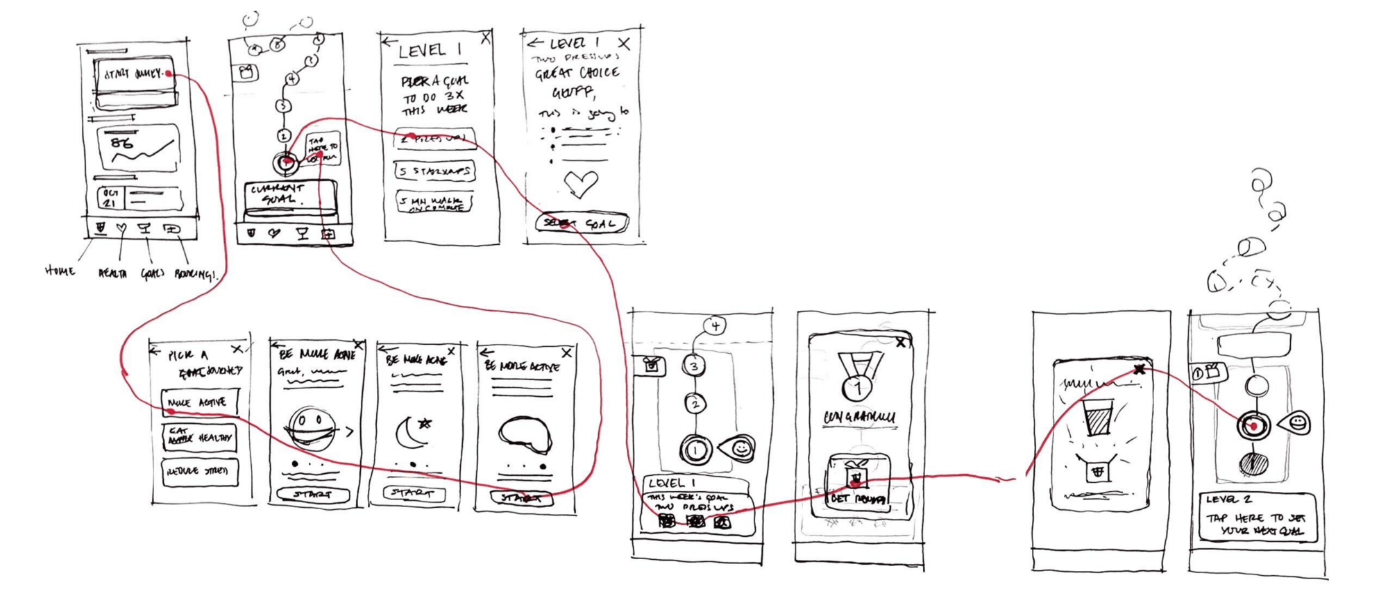
Wireflow showing goal creation and rewards
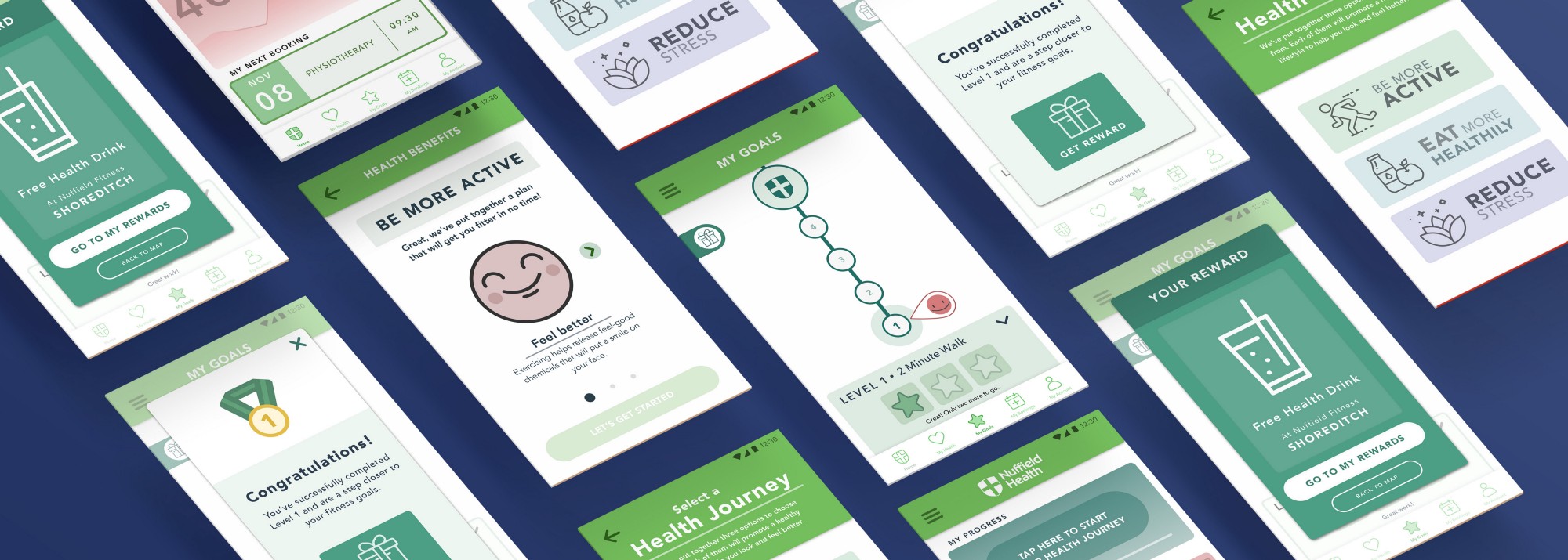
We designed a lightly gamified system of ‘health journeys’ that would guide users towards big changes in their lifestyle through small, manageable goals that initially fit seamlessly into their usual routine before gradually increasing into full sessions.
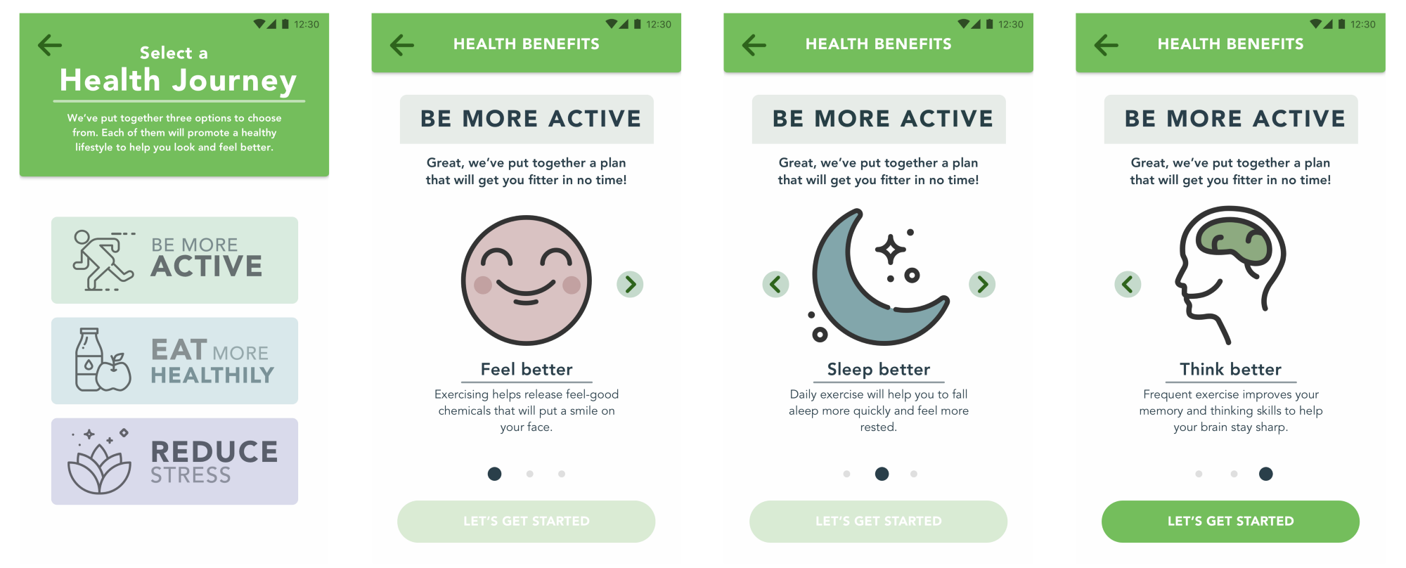
Taking the user on a ‘health journey’
One of the key ideas was to provide ways for users to make contact with Nuffield Health services at frequent intervals, in order to tie in with Nuffield’s integrated services approach. We achieved this by introducing the need to attend fitness classes at Nuffield Health centres or book assessment appointments as part of the level progression.
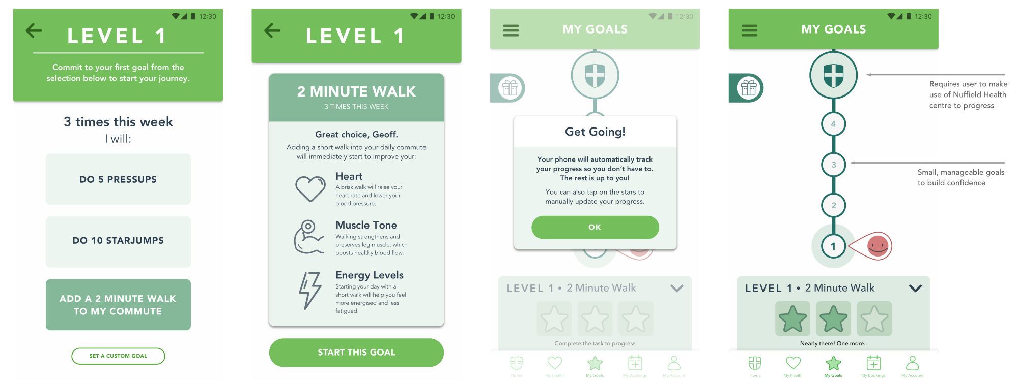
Level based progression with small, manageable goals.
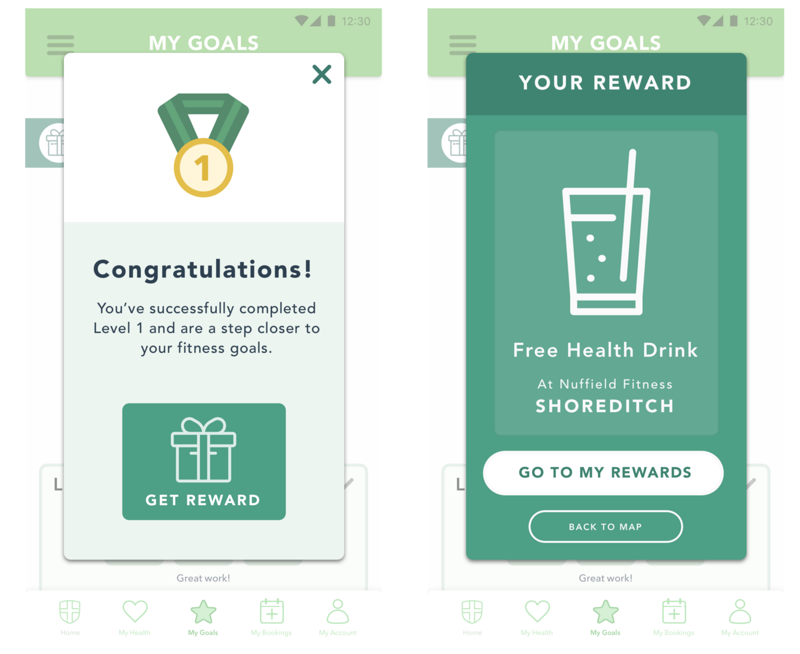
We also realised a unique opportunity to offer users rewards that they can redeem at Nuffield Health centres, such as refreshments at the in-centre cafes to incentivise them to continue to use the app:

2: Booking Appointments
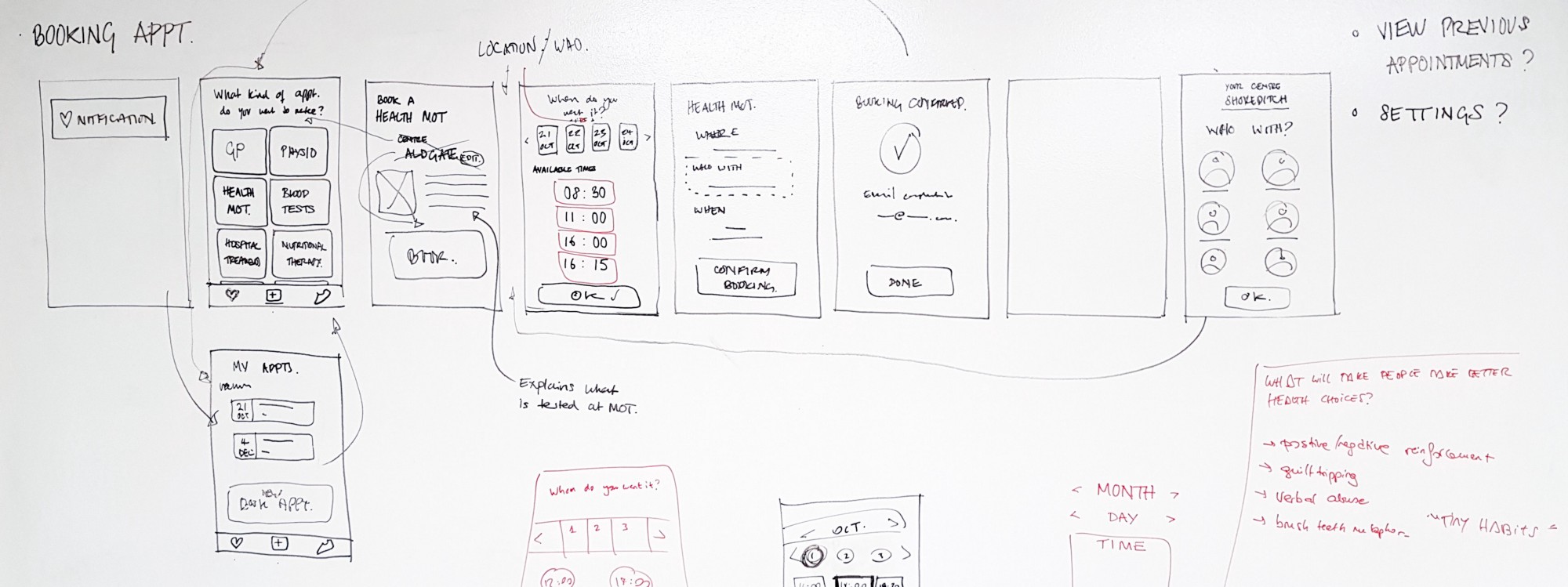
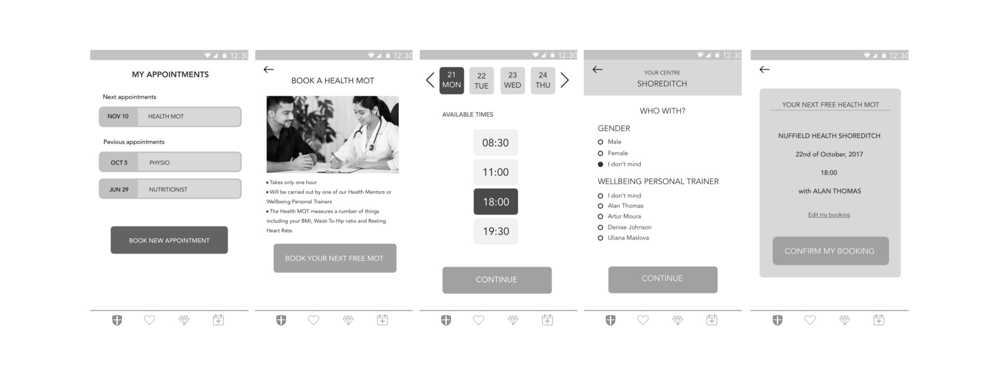
For us, the booking section seemed like something we could solve fairly easily by streamlining the process and reducing data entry to a minimum. You can see how we built up the designs for some of the screens below.
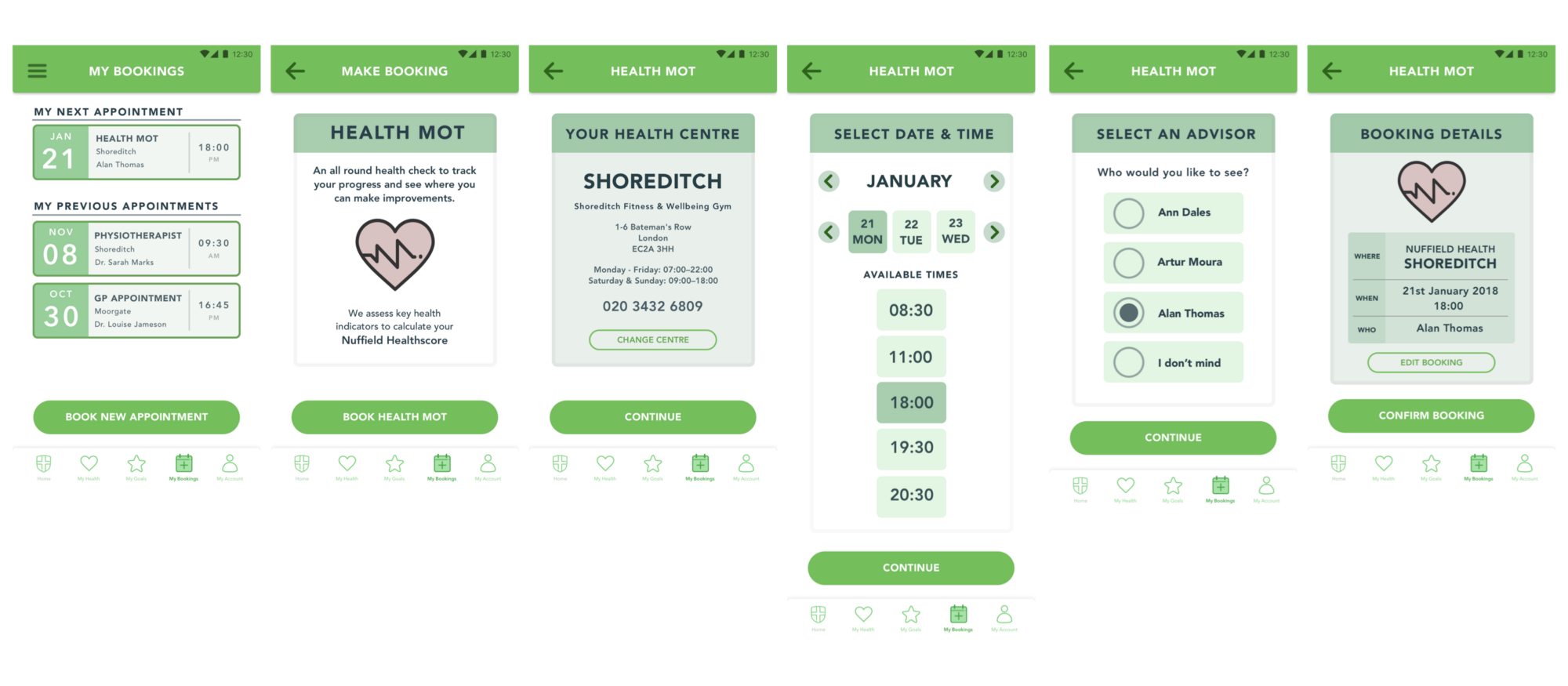

By engaging the user with a rewarding system of improving their health by making one small change at a time, along with providing a platform for them to make appointments and track results, users would be able to have one point of contact with which to fully make use of what Nuffield Health has to offer.
Click to view the final InVision prototype

Next steps
While we feel we have built the foundations of an effective framework to begin to improve people’s healthy habits, there is still much more that could be done.
A few points that we identified as potential ‘next steps’ for the app were:
- Develop a section for users to learn how to be more mindful with guided meditations and breathing exercises
- Develop the ‘My Health’ screen that gives customers a fully detailed overview of their health and appointment results.
- Allow app users to tackle two or more journeys at the same time (eg. being more active and reducing stress)


