Mobile app market seems to be mushrooming like never before. Developers are making the most of on-boarding tactics, inline hinting or tutorials to attract users’ attention for long. Do you which is the best mobile app design found across the globe? It is the one that goes unnoticed. It is rightly said that we humans… Continue reading 7 Common UX Designing Mistakes Found in the Mobile App Realm
Tag: CTA
5 Critical Elements You Need to Know to Build a Genuinely Cool Website
After completing 2 or 3 multi-page websites building a one-pager will take no time at all. Or so you’ve been told. The problem is, whoever told you that never tried putting together a one-pager. Or, at least one that could be bragged about. You’ll discover that cramming all the important information isn’t all that easy… Continue reading 5 Critical Elements You Need to Know to Build a Genuinely Cool Website
How to Design a Powerfully Persuasive Above the Fold Area
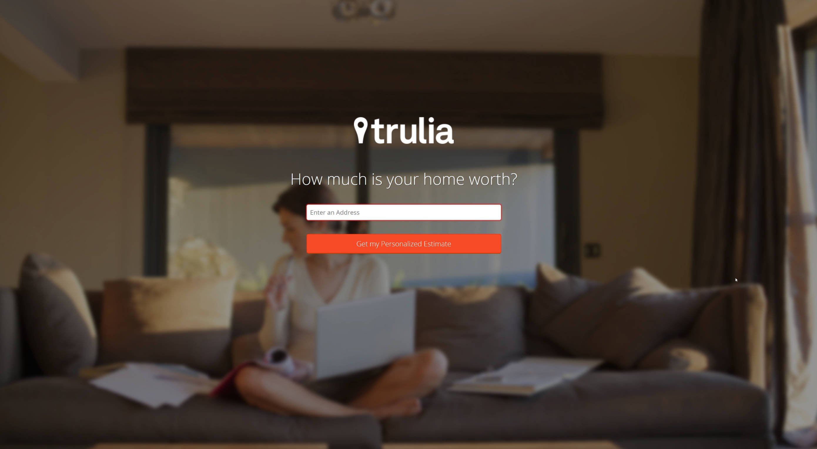
There are few parts of a website that command more attention than the area above the fold. This is the screen section users look at after immediately landing on a website. The punchier and more persuasive the above the fold is, the better your conversion rates. Despite its importance, this crucial real estate often gets… Continue reading How to Design a Powerfully Persuasive Above the Fold Area
4 Insider Secrets to Building Persuasion in Every Pixel
One of the fundamental mistakes you can make as a web designer is to divorce your designs from business goals. Few websites exist just for the sake of it. If you want to be a well-paid designer, you’ll have to align your work with your clients’ business demands. Most businesses have a simple goal for… Continue reading 4 Insider Secrets to Building Persuasion in Every Pixel
Dos and Don’ts of Designing the Perfect Website Form
When designing modern websites, it is important to bear in mind the criticality of creating a well-balanced, user-friendly form as visitors make their first impression about a business by looking at their online portal. In several cases, the design of the form can make or break the future of the website. User experience plays a… Continue reading Dos and Don’ts of Designing the Perfect Website Form
Flawless Website Navigation? Easier to Accomplish Than You Might Think
Website requirements sometimes require complex solutions, or so it would seem. Web designers, on the other hand, seek simple solutions. These “simple” solutions typically involve following best practices. They are basing an overall design on simple and logical structures. This is especially true for navigation paths. They often become difficult to keep simple and straightforward.… Continue reading Flawless Website Navigation? Easier to Accomplish Than You Might Think
10 Best and Worst Fonts for Emails
You are reading this article about fonts, it means you completely agree with us: there’s nothing more important than details. Besides, today’s trends call us to use less pictures, more texts in the newsletters unless it is a greeting one. We’ve done some research and analysis, and now we want to share the results on… Continue reading 10 Best and Worst Fonts for Emails
The 5 Best Video Editing Apps for 2018
Are you a YouTuber? Do you vlog? If you regularly create videos for any online or commercial purpose, then you understand the importance of using a top quality editing app to cut your final videos. It’s a little overwhelming to search through all of the editing apps and software programs available. Every one of them… Continue reading The 5 Best Video Editing Apps for 2018
9 Email Design Inspiration for a Killer Campaign
Email marketing has been rumored to be dead. Don’t believe that just yet. People still read emails. In fact, 80% of retail businesses say that email marketing is the number one customer retention, according to eMarketer. There are many factors for when an email is considered “good.” But right now, let’s talk about design first.… Continue reading 9 Email Design Inspiration for a Killer Campaign
What is a landing page and what purpose does it serve?
So, let’s start off at the beginning! What is a landing page and what purpose does it serve? Well, in brief, it’s the first port of call after a consumer click through on a link, or ad for the product or service they are searching. This is your big chance, that opportunity you have been… Continue reading What is a landing page and what purpose does it serve?
4 Metrics You Should Look At To Measure Website Success
Now that you have a well-designed website that is easy on your reader’s eye and simple to navigate, you still need to determine whether it is truly successful. To do this, you have to dive into data and analytics. Of course, measuring your site’s success is not all about pretty colors, textures and fonts. Google… Continue reading 4 Metrics You Should Look At To Measure Website Success
How to Design a Landing Page That Converts
Every e-commerce website is designed to have one primary goal: to convert visitors. Conversion can range from a completed sale to registering a membership, or filling out a subscription form. Whatever it is, an effectively designed website must be able to convince users to achieve that primary goal. In light of various research and experiments,… Continue reading How to Design a Landing Page That Converts
It’s not you, it’s your form
#4 Give certainty When designing a form, we should present users with all the information they need so they can navigate the form easily. Don’t keep them guessing or be ambiguous. The achievement of the goal should be clear and leave the user with the feeling that the task is (really) done. When examining the previous… Continue reading It’s not you, it’s your form
Landing Zero: Free Bootstrap Theme for Your Website
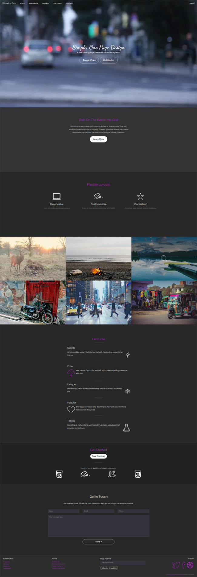
Landing page can help you maximize your marketing efforts, but what makes a great landing page? According to Unbounce, an effective landing page highlights the following elements: your Unique Selling Proposition (USP), the hero shot, the benefits of your products and services, testimonials from real customers/partners, and at least one CTA (call-to-action). Most likely you… Continue reading Landing Zero: Free Bootstrap Theme for Your Website
7 Tips for eCommerce Web Design
Of all the ways to make money on the internet, eCommerce is one of the most popular. Selling products online is much more cost-effective than in a brick-and-mortar store. Even sellers who do have physical locations recognise the importance of using online revenue channels. When you decide to sell products online, the design of the… Continue reading 7 Tips for eCommerce Web Design
5 Above the Fold Elements that Get Your Audience’s Attention
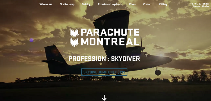
An old study from Nielsen states that web visitors spend 80.3% of their time above the fold – the top area of your site that’s immediately viewable upon loading. Furthermore, Google found out that ads above the fold had 68% viewability, as opposed to ads below the fold with only 40%. Naturally, a lot of… Continue reading 5 Above the Fold Elements that Get Your Audience’s Attention
10 Web Design & UX Trends to Embrace in 2017
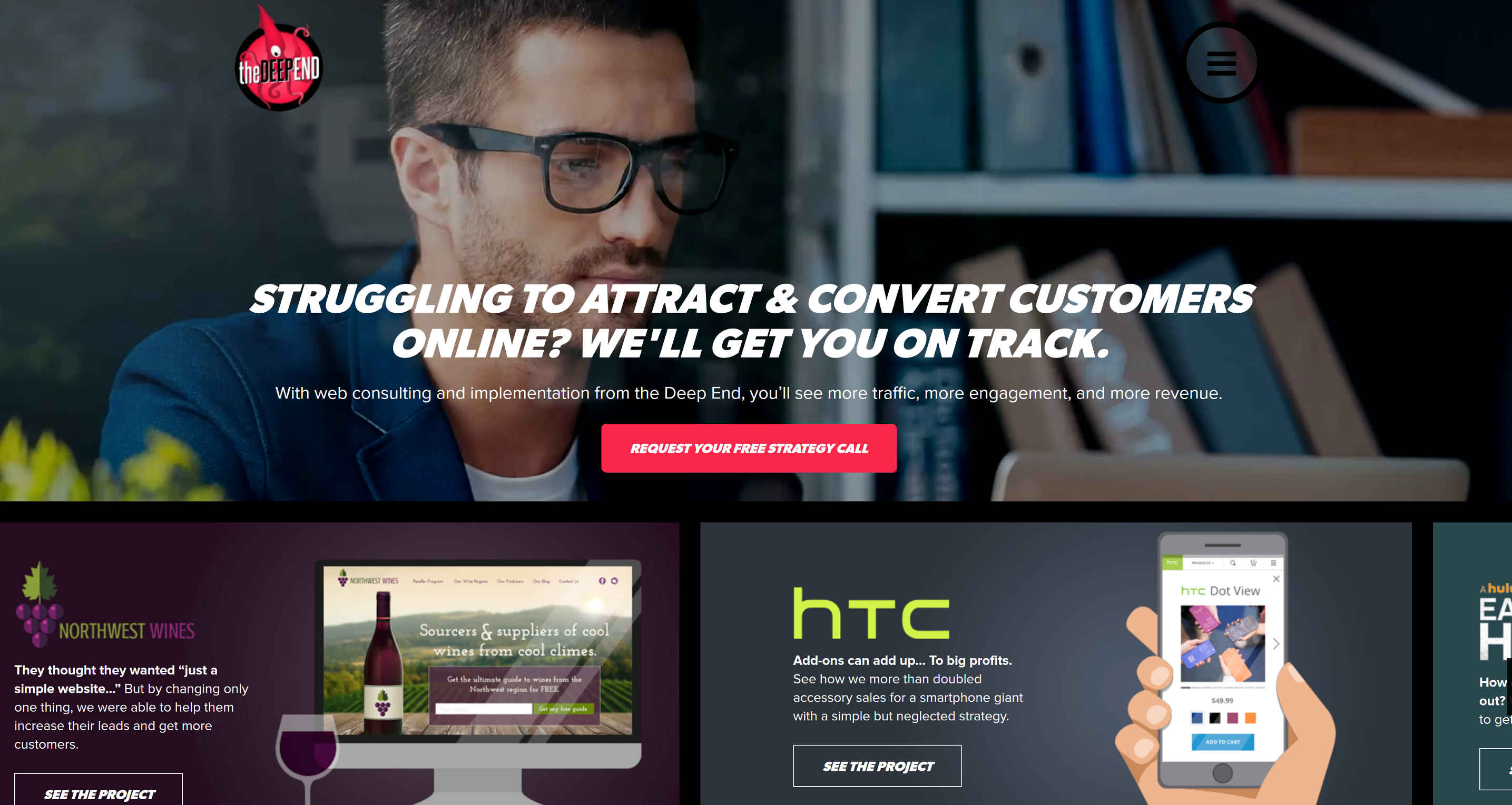
January 17, 2017 by Spyre Studios The team at The Deep End Web Consulting has produced an infographic that not only outlines 2017 Web Design and UX Trends to Boost Conversions — it lets you know why they work. Appearance, UX, and tactics all matter. These tips will give you ideas for putting them together… Continue reading 10 Web Design & UX Trends to Embrace in 2017
Best Looking Free WordPress Themes for 2017
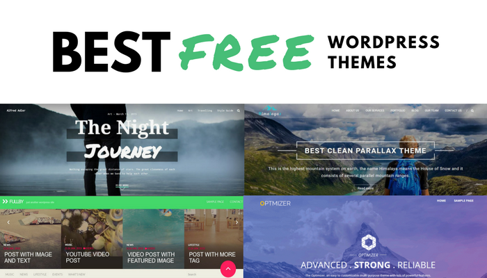
January 12, 2017 by Veronika There are plenty of premium WordPress themes to choose from but the ones that are free usually lack key features and present a badly designed layout.This collection of the best looking free WordPress themes will help you pick the right theme for your WP blog or website without spending a… Continue reading Best Looking Free WordPress Themes for 2017
Choice paralysis: 3 ways the number of choices impacts conversions
Maybe you’ve heard of a phenomenon called choice or analysis paralysis. In short, it’s a situation where a customer can’t make a decision on a purchase because he’s faced with so many choices that they end up paralyzing him. Hence, choice paralysis. In the annals of marketing, there’s this notorious jam experiment that painfully details… Continue reading Choice paralysis: 3 ways the number of choices impacts conversions
Cinemagraphs in web design
If you read any of the countless web design trend reports that came out earlier this year, you likely read about the promise of large, hero-sized cinemagraphs placed prominently on homepages everywhere. So where are they? While a few fashion-forward companies are using them on their websites, the cinemagraph has been largely relegated to showcase… Continue reading Cinemagraphs in web design
Weekly Inspiration: Discoverability and Feedback
Recently Vox, together with 99% Invisible, produced a brilliant short film about a door on the tenth floor of the Vox Media office. Besides many other doors, it featured Don Norman: design icon and celebrated author of The Design of Everyday Things. The purpose of the film was to highlight the usability of products and systems, whittling down… Continue reading Weekly Inspiration: Discoverability and Feedback


