Mobile app market seems to be mushrooming like never before. Developers are making the most of on-boarding tactics, inline hinting or tutorials to attract users’ attention for long. Do you which is the best mobile app design found across the globe? It is the one that goes unnoticed. It is rightly said that we humans are primed to scale the mountains of adversity in the urge to achieve self-satisfaction. Can you take a leap of faith when it comes to achieving that unattainable fruit?![]()
Some of you guys (especially entrepreneurs) believe that mobile app development, implementation, and marketing are some luxury that only corporations can afford. While for others, mobile apps are the easiest way to create a next big thing or perhaps the best option for a startup to gain momentum. Well, as it is known, the truth is out there! The most successful apps are the ones that feature remarkable user experiences and business transforming results; they aren’t likely to be created overnight. Today, user experience trumps everything else when it comes to mobile. It’s a known fact that hybrid apps don’t perform as well as native apps, so if you’re going to choose a hybrid, make sure you’re aware that your users’ experiences will likely suffer.
However, there is no cookie-cutter answer or universal formula that is applicable in the making of a perfect mobile app interface design. To put it in simple words, you will only have one chance to make a potent and lasting first impression on your end users- if messed things up as in slugging performance, load time, even in the tiniest way; you may end up increasing your risk of losing end users right from the get-go. Are you OK with that? Didn’t think so! And that’s the reason why I have come up with this post emphasizing on risky on-boarding mistakes leading to critical consequences of your app’s user experience.
An overview: UI and UX

User Interface, commonly known as UI in the mobile app development realm indicates a lot about the overall functionality and reliability of the product. Better client engagement is the ultimate outcome only if your app is appealing enough. According to several experts, a poor or average user interface is a major turn-off or could be the worst thing that any mobile application could ever have besides offering reliable functionality. Compromising at this point can cost pretty much especially in terms of time and money.
User Experience, commonly known as UX mainly emphasizes on the need of an app being optimized and tested in such a way that it removes complexity and focuses on simplifying the processes. You have to be sure enough that the application is tested by keeping in mind the user perspective. Creating a mobile app means you require serving the purpose of offering nothing but the best in terms of aesthetics and functionality. And you never know, you may come up with something that becomes a big hit in the market, but for that, you require nothing less than a stunning user interface and user experience. Hire a web designing team that analyzes all the exact needs of the users as per the latest trends.
Common Mistakes in UX Design for Mobile Apps
#1 Poor Logic and Architecture
Can you build a good house without planning in prior or drawings? No, right! Likewise, developing a good mobile app becomes impossible without elaborating on architecture, a precise hierarchy, and clear logic. Many of you end up ignoring these stages and end up messing all the interface elements and provide the user with convenient, easy interaction with the product.
In the end, it is very crucial to think over the logic of user interaction with apps and usage scenarios in advance; in fact, this can be done as early as the layout creation stage.
#2 Being prone to hyperbole

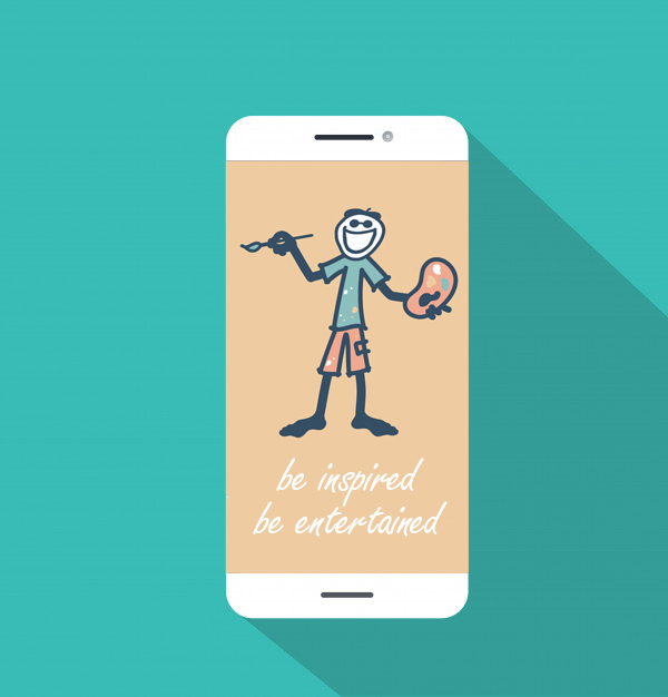
Make sure you remember this, “to exaggerate is to weaken.” It is very important to come up with an app that your app lives up to any bold/ big benefits that you claim or else your app could end up creating a mood of disappointment. Falling into the marketing trap is extremely easy; all you require is using some grandiose words/phrases to try in pull in users. In the end, they will no longer remain at the top of the funnel. Instead, try and focusing on making them understand the precise value/ capabilities they can obtain from staying with your app. For instance, have you checked the front back’s app, “Be Inspired, Be Entertained”- do you think it has the ability to elicit those feelings. Do you think that line will resonate with the user? Will they just quickly swipe past that screen? Of course, we don’t need to remind you how precious screen real-estate is in the mobile realm, use it to your advantage, but be savvy about it.
#3 Complex and confusing personalities
We, humans, hate confusing personalities; mobile apps are no exception. According to Murphy’s Law, “Everything that users can misunderstand, they will misunderstand.” It is very difficult for an average person to understand even something that seems evident to the designer. To avoid this, make sure you ask your professionals to use familiar and well-known symbols in the interface – symbols have unambiguous associations and won’t be confused for anything else.
For instance, green is associated with “yes”, “forward” or “allowed”; red, as a rule, means “no”, “stop” or “prohibited”; the “+” icon usually means add something. Try to avoid symbols that are not immediately understandable, or can be interpreted as meaning two different things.
#4 Overloaded Interface

Unfortunately, I have stumbled upon several websites that are filled with excessive content and interface elements causing the user to experience cognitive overload. Modern smartphones with large screens allow us to display much information, but we advise you to avoid this trap of freedom. Displaying too much content, users can be at a loss and can be easily confused when trying to make out what to click and do next. Your app should display only what is essential for the user at the very moment.
#5 Listing out obvious functions
While listing out all the crucial functions to your app, make sure you don’t come up with something that’s obvious. I mean prioritize well by highlighting and explaining complex functions during user on-boarding instead of easy, intuitive functions and icons. For an average app user, you don’t need to explain things right from the basic. Keep this in mind that your end users’ attention span is fleeting and the last thing you want to do is lose their attention by coming off as redundant. Keep all the things which needs to be kept and get rid of the ones that need to be gone! Also, you should prioritize highlighting the overall value and benefits of your app.
#6 Annoying notifications

Many of you have this misconception that excessive use of notification is crucial to keep your end users updated. Well, in actual sense it is not important at all. Instead, excessive use of notifications is the least you need to do. Imagine yourself surrounded by an annoying friend who cannot understand that you are too busy to connect with him right now. Notifications are much like those annoying friends. Even if the user’s perception of the notifications is positive, there may well be a malfunction when there is no synchronization with the user’s device. No one wants to read the same notices over and over again. Just as in the creation of software, an element of good style is not to repeat yourself.
#7 No call to action

Call to action is the most important factor to take into account. Make sure that your designer and developers tend to hide them, replacing them with gestures to make the app screen look nicer. However, it is a mistake. From buttons to arrows, menu items, and other CTA elements are important interface components that directly impact conversion. Without those elements, users may fail to understand what step should be taken next and what to expect from further interaction with the app.
It’s a Wrap!
Have you made any of the mistakes noted? If so, it’s time to resolve them. I hope this post provides some help in developing the best mobile app across the globe. Dodging all the aforementioned mistakes will increase the chances of success substantially.
