An old study from Nielsen states that web visitors spend 80.3% of their time above the fold – the top area of your site that’s immediately viewable upon loading. Furthermore, Google found out that ads above the fold had 68% viewability, as opposed to ads below the fold with only 40%.
Naturally, a lot of marketers reacted by cramming all their conversion elements and ads right on top of their homepages. The only problem is that greeting visitors with ads, CTAs, and opt-in forms may hurt user experience.
Remember that there’s no such thing as a one-size-fits-all solution when it comes to web design. The same goes for different websites that represent different brands.
To determine the best above the fold elements you should use, start first by understanding your audience:
“Certain” Prospects
If your visitors already know who you are and what products or services you offer, then the following above the fold elements work like charm:
1. Strong Call to Action
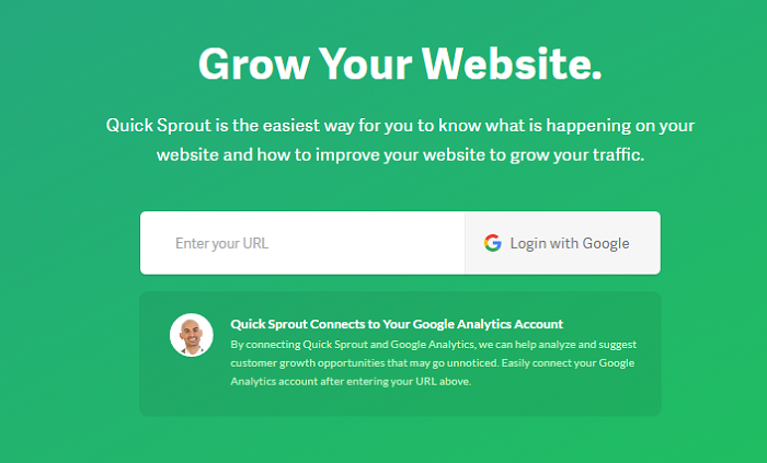
First of all, you shouldn’t keep visitors with strong purchase intent waiting. Show them the next step immediately with a strong CTA and an opt-in form.
For example, everyone in the online marketing world knows Quicksprout as well as the man behind it – Neil Patel. No further introduction is needed, which is why they settled for the following homepage:
They didn’t even bother putting an “About” page to help newcomers understand their trade. Instead, they let countless other blogs and influencers who link to their site do all the talking.
2. The “Service”
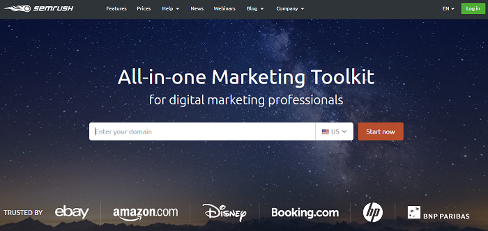
If your visitors already know what you offer, and if what you offer is available through your site, make sure it is the first thing that your visitors see.
SEMrush does exactly this by providing their analytics service right off the bat:
Just like Quicksprout, a lot of visitors came from numerous listicles and blogs that reference to the SEMrush tool. That’s why their website wastes no time and brings users right into action.
3. The Search Bar
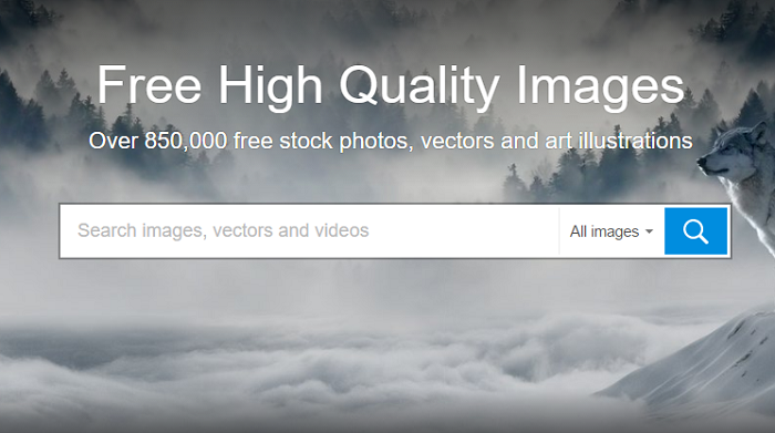
If you run a blog or a stock photo repository site that offers a ton of content, then one of the things you should include above the fold is the search bar.
Pixabay, for example, knows that most—if not all—of their users are content creators in need of stock photography. They know this due to the keyword strategy they use for SEO, which most likely include search terms like “free stock images” or “free images”.
Since bloggers, web designers, and content creators in general already know what Pixabay has to offer, the site handed them the reins immediately and let them search for the exact photos they need. For visitors who are still not fully convinced, scrolling below the fold shows a gallery of the kind of images users can get from the site.
“Uncertain” Prospects
Dealing with certain prospects is all about being straightforward and making the experience seamless for your audience. But when it comes to uncertain prospects, you need to be smarter when it comes to optimizing your above the fold.
4. Simple Value Proposition

The main challenge of captivating new visitors is to quickly and effectively let them know what your site is about. You need to be succinct, direct, and highlight information that will build the audience’s trust.
CMC Markets does this with a specific value proposition and a trust-driven tagline:
Apart from the proposition, notice that there are three things above the fold that can increase visitors’ confidence – the mention of their award, how long they’ve been in business, and the number of instruments that power their platform. They also feature a floating top bar that scrolls with the user.
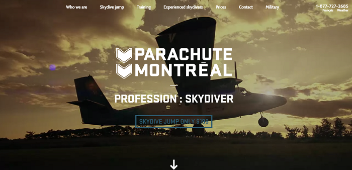
5. Video Background
To get the audience’s attention, UX designers have experimented with different content types such as arrows, full-screen background images, and explainer videos.
Parachute Montreal’s utilizes a combined approach, utilizing a full-screen background video, directional element, and CTA overlay.
The video features actual footage of Parachute Montreal’s service, which is more than enough to educate users on what the company is about. Additionally, the down arrow tells visitors that there’s more to see below the fold – bringing exposure to more content that builds familiarity and trust.
Final Words
Hopefully, the examples above gave you some ideas for your next design project. For further reading, here are other posts you may like: