
There are few parts of a website that command more attention than the area above the fold. This is the screen section users look at after immediately landing on a website. The punchier and more persuasive the above the fold is, the better your conversion rates.
Despite its importance, this crucial real estate often gets ignored. Stale imagery and useless whitespace dominate at the cost of more conversion-focused elements.
So what can you do to create an above the fold area that is more persuasive?
I’ll share four answers below.
Add a Pre-Roll or Welcome Mat
Most of you reading this will have a welcome mat outside your house. Besides giving visitors a chance to wipe their shoes, this mat serves two roles:
– It marks the entrance of the house
– It shows a friendly message or greeting to visitors
Welcome mats or pre-rolls on the website serve a similar purpose – they display a full-screen call to action that shows when visitors land on your website. Think of it as a greeting that also include a CTA.
An effective welcome mat helps you turn any page into a high-converting landing page. Plus, it gives new visitors an idea of the context of your website – a way to digitally mark your website “entrance”.
You may have seen a welcome mat before, it looks like this:

Welcome mats are fully customizable, you can use them to encourage visitors to join your email list or let them check out your popular blog post(s). More importantly, they serve as a way to orient new users when they land on your site. In the above example, the copy makes it clear that you’ll get “free marketing tips”.
Thus, anyone landing on your site would know within seconds that your site was about marketing.
These full screen takeovers are quite effective at converting visitors into leads as well. Fedora, for example, saw a staggering 70% boost in their opt-ins after installing a welcome mat.
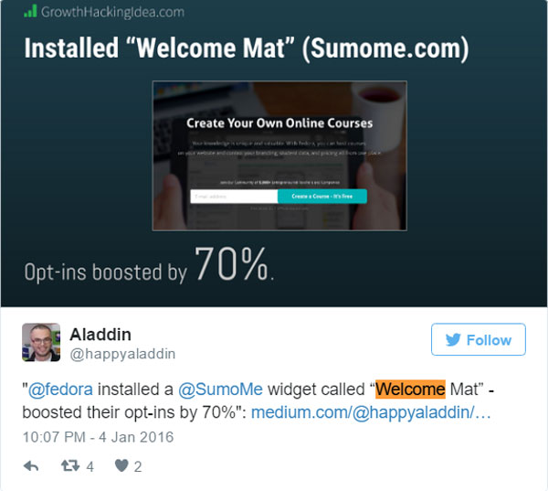
The best part? They didn’t lose any Fedora signups after people saw the welcome mat!
Install a Top Bar/Hello Bar
Hello bar is a full width bar that spans your browser window with some text, placed at top of a website. You must have come across to a few hello bars while browsing. This is what they look like:
Hello bars can potentially generate more than 1000 leads in 30 days.
Just like welcome mats you can use hello bar to direct visitors to your most popular blog or collect emails to send out updates. And just like welcome mats, they can also help orient new visitors to what your site is all about.
I do encourage some caution with Top Bars. The two big issues you have to look out for are:
– Too many CTAs: If you already have multiple CTAs in your navigation menu, adding another one in the top bar can confuse people. They might not know which CTA to prioritize, especially if the CTAs are all of the same color.
– Too many menus: It’s not uncommon for websites to have a main navigation menu followed by a sub menu. In such cases, adding a Top Bar makes the entire header area too top-heavy and makes navigation difficult.
Your best case scenario is to use Top Bars on pages with a single main navigation menu and only a single CTA. The best part is that you don’t even have to hire a designer; there are plenty of customizable plugins that will let you create Top Bars for any page.
Use the Header to Show Context
The header is one of the most important areas of your website simply because it’s the first thing people look at.
Yet, designers frequently make poor use of this valuable screen real estate and cram it with whitespace or irrelevant imagery.
Instead of simply adding a logo, try to use the header to craft a more recognizable brand for your audience. The idea is to make sure your audience instantly recognize that they have arrived at the right place, even if they are not familiar with your company.
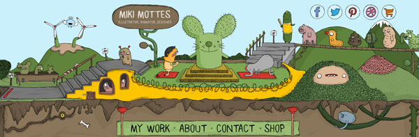
One way to do this is to use imagery in a way that conveys what your website or business is all about.
For example, Miki Mottes is an illustrator and his website’s header makes it quite apparent.
But you don’t have to go all image heavy. Even a bit of introductory text can go a long way in communicating the website’s purpose.
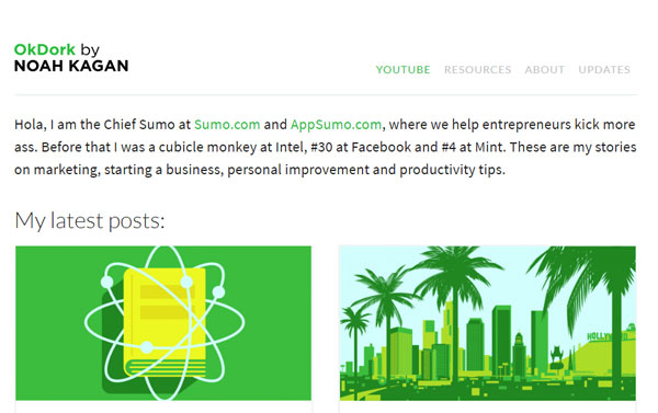
For example, Noah Kagan uses a simple text introduction at the top of his blog. This gives readers a glimpse of his credentials, what he has to say, and why you should listen to him.
This is a simple way to tell people what your brand is all about – the first step to being more persuasive.
Reorganize Your Navigation menu
The navigation menu plays an important role in persuading your website visitors. It is, after all, the “map” through which they’ll travel through your website. How you organize this menu will impact what visitors perceive to be important about your business.
This is how a nicely designed navigation menu looks like:
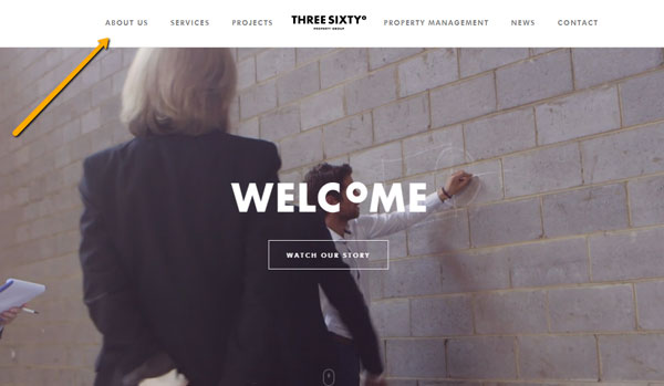
Notice how the navigation menu is equally weighted in both directions with the logo smack in the center? Not only is this aesthetically pleasing, it is also logically organized with the most important items – ‘about’ and ‘services’ placed in the conventional left-right reading pattern.
One of the first things you should know about navigation menus is the serial position effect. This effect describes how people remember a long list of items.
Serial position effect is made of two parts:
– Primacy effect: Primacy effect describes the likelihood of remembering items that are first on the list are stored in long-term memory more easily than items further down the list.
– Recency effect: Recency effect describes the likelihood of remembering items that are last on a list are still in working memory.
Thus, if you want people to remember items in the nav menu, place them either at the beginning or end of the menu.
Let’s take a look at amazon’s homepage as an example.
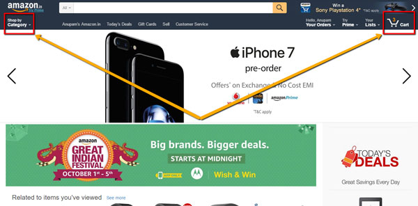
People are more likely to remember “shop by category” and “cart” which are also the most important items in the list.
Think about the organization of your navigation menu. What items occupy the first and last positions? Are these also the items you want people to remember the most? If not, move more important items to these positions.
Over to You
The area above the fold is crucial for persuading users and getting them to act. Simple changes to your header and navigation can have lasting effects on your conversions. Use the tips I shared above to make your website’s above the fold area look and convert better.